Features: August '10
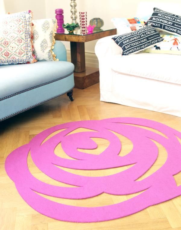
Michelle Mason collaborates with Livia Firth to reveal the Roseta rug.
This gorgeous, eco-friendly rug is sure to bring a feminine touch and beautiful detailing to any floor.
The collaboration between Michelle Mason and Livia Firth has produced spectacular results. Designed exclusively for Eco Age, the duo have created an environmentally-friendly rug which exudes style and boasts excellent sustainability.
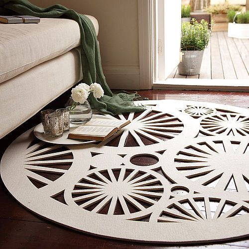
The Roseta rug is uniquely made out of felt from 100% recycled plastic bottles, and will be available in pink and black. However, Eco Age offer a bespoke service which means that the rug can be custom made in a gorgeous range of colours. It has hardwearing qualities but it is soft underfoot and its texture gives a stylish appearance to natural wood floorings.
Livia Firth, Creative Director of Eco Age, has commented on why she chose to work with Michelle on this design: “I fell in love with Michelle's work a couple of years ago when we were sourcing ethical interiors for Eco Age - it is always elegant and unusual at the same time and totally feminine. We are very excited to do this collaboration with her and to have the first ever plastic bottles rug.... By looking at it, you won't believe it!”
Similar to Michelle’s Stella rug, the Roseta is a contemporary take on lace-making with its intricate cut-out style, giving it a very delicate and feminine look. A perfect talking point for any living area or bedroom, the Roseta encompasses the strength of modern design and the ability to create products that are sustainable and kind to the environment.
Michelle will be unveiling the Roseta rug at 100% Design Earl’s Court, London, Sept 23rd-26th, Stand No. H60. The Roseta rug will be exclusively available from www.michellemason.co.uk and www.eco-age.com.
Colour watch: Yellow
Even on a cloudy day, sunshine yellow shades will brighten up your home and put a smile on your face.
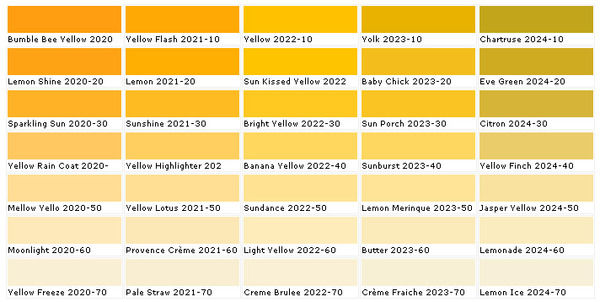
From citrus hues and bright daisy yellows to creamy and buttery shades, yellow is a comforting and warming colour. Yellow denotes happiness and colour researchers have found that it raises self-esteem. Yellow daffodils are associated with unrequited love, but yellow can supposedly sharpen memory and concentration skills. Van Gogh saw the potential and power of colour, and claimed that ‘yellow is capable of charming God’: he observed the strength and influence of yellow on our feelings, and this illustrates the impact that this colour can have in your home.
Choosing the right yellow
When choosing a shade of yellow, think about the mood you want to create and how the lighting in your room will affect the look. Daylight won’t make yellow paint so intense, whereas most incandescent bulbs have a very yellow cast that will strengthen your paint colour. Yellow can have warm undertones such as red or orange, or cooler tones of green or brown: choose warm yellows for warm-toned rooms with dark wood furnishings for example, and cooler yellows for a neutral and natural décor. Decide whether you want to use yellow as the focus or as an accent in your room; a room decorated in soft, creamy yellows can give a quaint, country home style, while a splash of bright yellow in a dark room can make a space look modern and give a cheerful feel.
Tonal scheme
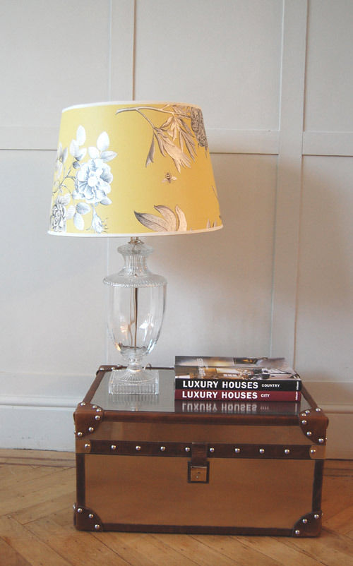
Rich, sunset yellows work well in a monochromatic scheme with black and white because they create a stark contrast whilst neutralising each other’s dramatic effect. While straw and cream shades on walls are offset beautifully by sun-kissed yellows on cushions, vases, lampshades, and other accent pieces. You can compliment yellow with lots of white; drawing inspiration from nature, you can use daisies as an example of how you can create a simple, clean and fresh look. Any living area or bedroom with warm yellow walls can be enhanced and modernised with crisp white furniture, fabric, curtains, throws and mirrors.
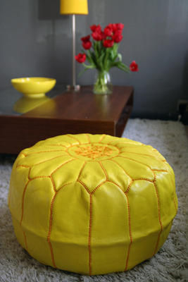
If you want to introduce yellow furniture, minimalism is the key because too many large-scale pieces will not work as well together. Block colour is a desired trend and can work well in this case where you can use a couple of small key furniture pieces in yellow, for example an armchair and a pouffe, to inject the power of yellow into your living room without it becoming too overwhelming.
Complementary colour schemes
Since it is a primary colour, yellow can be paired with almost any other shade: use orange and red hues to enhance the warmth in a room. Choose one dominant shade and one secondary colour to make this scheme work; varying tones can give a room depth and they keep your space feeling fresh.
For visual contrast use purple, the complementary colour of yellow, to create an equal balance of tone and intensity. Purples and blues bring out the cooler tones in yellow; if you are keen to follow a pastel colour scheme try lilacs and pale lemon shades for a calming and relaxing ambience.
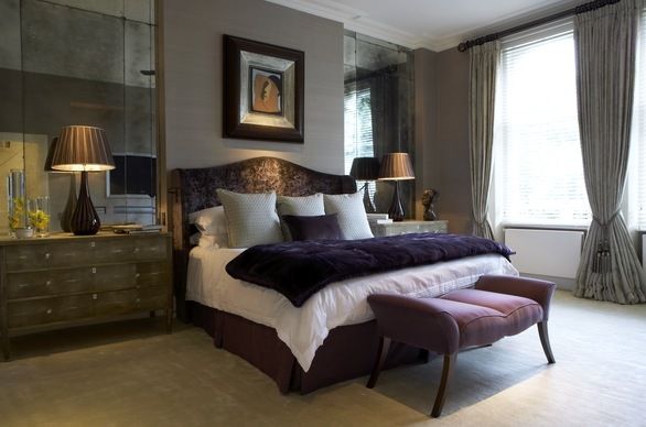
Warmer orange tones of yellow create a sensual and exotic look when combined with luscious aubergines; try this in a bedroom for a rich and sensual ambience.
Accents
Accents are great if you are a bit cautious about decorating all over with yellow; it is one of the most luminous of the colours and reflects a lot of light. Pair yellow with a cooler accent shade such as soothing grey which will neutralise the brighter tones. Choose bountiful floral arrangements to bring a feminine and spring-like feel to any room. Or try gold accents in your artwork, accessories and fabric, to lift your scheme and add a feeling of opulence.
Interview: Turner Pocock
Bunny Turner and Emma Pocock spill the beans.
Turner Pocock is a London-based interior design company providing a tailored service for private residential and commercial clients in the UK and abroad. Established by Bunny Turner and Emma Pocock, the company specialises in sourcing contemporary art and commissioning bespoke furniture. With a keen grasp of design history and an eye for style, Turner Pocock creates sumptuous, liveable spaces in which old and new are deftly combined. A love of colour, pattern and texture is evident throughout, and in a recent venture Turner Pocock teamed up with artist Catherine Cazalet to produce a series of graphic and vibrant wallpapers. We caught up with Bunny and Emma and here’s what they had to say:
How would you sum up the Turner Pocock style?
We’ve been described as having a schizophrenic style because every project we work on is so different – we prefer it that way as it keeps us on our toes! I suppose what defines us is a eclectic approach where we mix contemporary and antique pieces to give a feeling that the room has come together over time – rooms can look over designed and unlived in if everything is new!
You’ve created a series of sophisticated yet playful wallpapers with Catherine Cazalet. What inspired you to create a collection of wallpapers and how the project evolved?
We’d always wanted to get into product design and development and as we use a lot of wallpaper in our schemes it seemed the obvious choice. We also felt there was a void in the market for children’s wallpapers that weren’t clichéd in their use of colour or subject.
What led you to the distinctive sporting and animal prints?
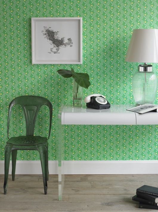
Catherine developed the cricket paper concept while she was in India where they are fanatical about the sport – we felt that the small pattern repeat worked really well and decided to explore other England-centric sports in the same way. Tennis seemed like the obvious second subject. Both sports have a retro feel to them and are quintessentially English. The zebra design stems from Catherine’s paintings/murals of Zebras, which she has become well known for so that was really the starting point.
Who would be next on your list of ideal collaborators?
We’ve got our eye on a fab fashion textile designer who’s based in Singapore at the moment.
As specialists in sourcing contemporary art, how has a love of art influenced your choices in interior design?
Art and accessorising is very important in all our schemes – the pictures/sculptures/objects can make or break a room. Sometimes we will even start scheming from a picture and take the colour/style lead from that point.
Are there particular artists that you look to when thinking about colour schemes?
We don’t have a huge amount of control over this as the choice of artist is driven by each client and varies hugely depending on our brief. Scale is as important as the style – a grid of small pictures can look fantastic and make a small room feel bigger – likewise a large, dramatic painting or photograph can create focus and hold a room together.
Your work shows a real appreciation, and elevation, of material qualities and craftsmanship. Creating interior spaces that are perceived and experienced sensually, which materials to you particularly like to work with?
We love using different textures/patterns - it makes the experience of a room much more interesting. We use shagreen [shark skin] a lot – our furniture collection demonstrates that!! But we also like to mix the use of stone, wood, lacquer, mirror on wall/floor/joinery finishes. Walls are also a great place to add depth and texture – either with a patterned wallpaper, or grass cloth and polished/textured plaster. Then we finally look at the fabrics and make sure that there is as much variety as possible – mohair, linen, silk, satin. Geometric patterns, plains, stripes!
Many of your furniture pieces have an Art Deco feel to them. Do you have a favourite historical period in terms of interior design and furnishing style?
We mix styles and periods – each era produced fantastic iconic pieces and it’s a question of mixing the best from each period to create a fusion of styles that doesn’t feel over-designed.
How would you advise people on combining historical references and contemporary styling in one space?
They should buy what they love and that way their taste will be what unites the scheme.
Which have been you most enjoyable/memorable interior design projects?
One of our first projects was for a client who didn’t say no to anything! He trusted us and had great existing furniture for us to work around. We’ve also worked on some fantastic projects abroad – in Bahrain and the South of France – it’s amazing how the different lifestyles/environments/light affects the way we design. We love the variety.
If you could design a room for any person (dead or alive), who would it be and why?
Matthew Williamson – he has a great sense of style and colour which we’d love to work with.
Which current homeware designers do you particularly admire?
Tom Dixon, Kelly Wearstler’s rugs and fabrics, Ashley Hicks and Neisha Crosland’s rugs and fabrics.
What’s your favourite high-street and high-end home furnishing brand/store?
The Conran Shop and Andrew Martin.
What’s been your best interiors bargain?
We’re both magpies and always keep our eyes out for beautiful useful things. We’re particular fans of framed antique flags and pick them up whenever and wherever we find them – usually from flee markets. Maps are also another favourite find and they don’t cost the earth.
Which three objects would you save if your house was on fire?
We’re both constantly changing how we want our homes to look so the objects are less important –think we’d have to say it would be people and pets! And maybe some precious pictures. It would also give us an excuse to redecorate.
What do think will be the next big trends in interior design?
Hopefully an end to neutral/taupe colour schemes! Luckily we don’t tend to follow trends so it’s not really important to us!
What’s next for Turner Pocock?
We’re working on some exciting projects in the UK at the moment and hope to introduce some new wallpapers to the existing range towards the end of the year. The main aim for Turner Pocock is to do a ski chalet – we’ve both enjoyed living in the Alps at different stages in our lives and have dreamed about creating the perfect chalet ever since!!
Find out more about Turner Pocock’s interior design service and bespoke furniture collection at turnerpocock.co.uk. The wallpaper collection can be viewed and purchased online at turnerpocockcazalet.co.uk.
RIBA Stirling Prize 2010
2010 Stirling Prize Shortlist unveiled by RIBA.
The Royal Institute of British Architects (RIBA) Stirling Prize is awarded to the best new building in the UK and Europe designed by a British architect. The 2010 shortlist of six buildings has just been released and the winner will be announced at the RIBA Stirling Prize Dinner on October 2nd. Named after the great British architect Sir James Stirling (1926-1992), the prize is run in association with the Architects’ Journal and Benchmark. The Stirling Prize is presented to the architects of the building judged to have been ‘the most significant for the evolution of architecture in the past year’.
This year’s shortlist includes two schools for the first time in the award’s 15-year history; a message perhaps to the axe-wielding education secretary, Michael Gove, on the value of good design. Ruth Reed, president of the RIBA, didn’t mince her words: "Investment in well designed schools demonstrates to teachers and pupils how much they are valued and has measurable impact – attendance and results rise; truancy and bullying fall. With the programme to improve our extremely poor school estate now much reduced it could be some time before we see such exemplar school buildings on the Stirling shortlist again." Another first in Stirling history, a total of three museums have made it on to the shortlist. An extension to the Ashmolean Museum in Oxford, a reworking of the Neues Museum in Berlin, and the newly built MAXXI Museum in Rome are all in the running for the £20,000 prize money. Reed described the projects as demonstrating ‘three very different ways of building and rebuilding museums and galleries’ and, again alluding to public sector funding cuts, explained that these buildings ‘are the fruits of an economic boom in the last decade and sadly may represent the end of an era’. The final contender for this year’s prize, and the smallest of the six projects short-listed, is a mixed-use development in east London, combining a studio, art gallery and office space with four private apartments.
Here’s a rundown of the six nominees vying for the prize:
Neues Museum by David Chipperfield Architects with Julian Harrap Architects
Berlin’s Neues Museum was originally built in 1859 to showcase the Prussian Empire’s archaeological and scientific capability. Sustaining bomb damage in WWII, the museum has been sympathetically restored and reshaped by David Chipperfield and Julian Harrap Architects. The creative reworking of the museum, in which the major new material is pre-cast concrete, has been praised by the RIBA as an exemplar of ‘understated beauty’. The revamped museum has proved a hit with Berliners and David Chipperfield, who received the 2007 Stirling Prize for another German museum, is tipped by many to triumph again this year.
MAXXI National Museum of XXI Century Arts by Zaha Hadid Architects
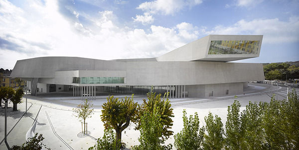
British-Iraqi Zaha Hadid is perhaps the best-known woman architect in history, but her work has struggled to gain acceptance in the UK, and she’s yet to complete a major building on home soil. (The first will be the London 2012 Olympic swimming pool and diving centre.) This is Hadid’s fourth nomination to the Stirling shortlist, but the prestigious prize has so far evaded her grasp. This lack of recognition, and the fact that RIBA considers the MAXXI to be Hadid’s best building yet, has the Rome museum ranked as odds on favourite at the bookies, with William Hill offering odds of 11/10. Located in the suburbs of the Italian capital, the MAXXI National Museum of 21st Century Arts is a building of sinuous curves and multiple intersecting levels; unwinding ‘like a ribbon in space’, says Hadid. The judges described the serpentine routes and pathways and the elegant unfurling of space as the ‘quintessence of Zaha’s constant attempt to create a landscape, a series of cavernous spaces drawn with a free, roving line’.
Christ’s College School by DSDHA
Once the target of firebombing and casual vandalism, Christ’s College School in Guildford now features a £14.4m extension by DSDHA, the firm of Deborah Saunt and David Hills. Both pupils and teachers have commented that a sense of pride in the new building has directly influenced an improvement in behaviour and that the wide, light-filled corridors and stairwells have reduced opportunities for bullying. This is a great example of how thoughtful planning, progressive architecture and humane design have far-reaching implications for individual wellbeing and social cohesion. Along with Clapham Manor Primary, Reed described the new building as a model of ‘what all schools should be: light, well-laid-out and well-equipped environments in which all students can flourish’.
Ashmolean Museum by Rick Mather Architects
A project to double the size of the Ashmolean in Oxford, the oldest museum in Britain, was completed by Oregon-born, London-based architect Rick Mather, without disturbing the neoclassical original. Erected by Mather’s team, the complex arrangement of new galleries is situated behind Sir Charles Cockerell’s 1845 Grade I listed building. The disorderly late-Victorian galleries at the rear have been replaced by a six-storey building adding 34 new galleries for the permanent collection and four for temporary exhibitions. The entrance hall now opens on to the light-filled atrium of the new extension. Surrounded by buildings on three sides, Mather maximised available light by putting a glass roof over the central space, creating an 80ft atrium traversed by steel and glass bridges. Either side of the central space double height galleries for major displays alternate with auxiliary galleries with lower ceilings.
Clapham Manor Primary School by dRMM
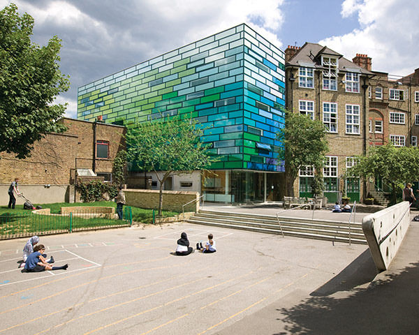
De Rijke Marsh Morgan’s extension to Clapham Manor Primary School is clad in vibrant multi-coloured glass panels. A freestanding addition to the school’s original 19th century building, the Stirling judges applauded ‘an inventive and uplifting example of what the next generation of school buildings could be’. Inside there are no enclosed corridors but galleried walkways; classrooms are accessed from the central atrium and pupils flow freely through a series of adjoining spaces.
Bateman’s Row by Theis and Kahn Architects
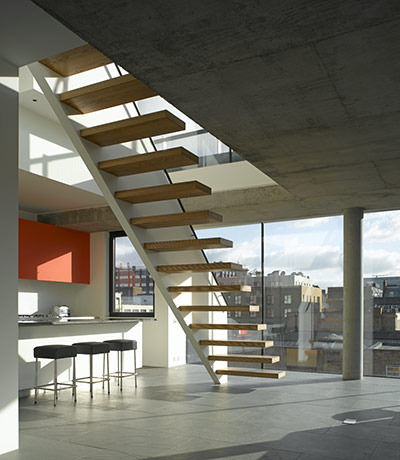
Bateman’s Row in Shoreditch east London was built by architect couple Patrick Theis and Soraya Kahn. The mixed-use development houses an art gallery, studio and office space along with four flats. The building provides several rentable units, while Theis and Kahn live on the top three floors, complete with roof terrace and stunning views of London. The project took ten years to complete and the panel said it was executed with ‘extraordinary care and judgement’. On a small footprint, the scheme maximises light and space by building vertically in distinct phases over five floors and introducing wide expanses of plate glass. Internally exposed concrete throughout and rough-hewn edges at ground level respond to the building’s industrial origins and local setting.
The Stirling Prize judging panel will be visiting the six buildings nominated in the next few weeks before the winner is announced in October.
Focus on: Michelle Mason
Introducing one of the hottest designers of the moment, designer-maker Michelle Mason.
Michelle Mason has become renowned for her contemporary interior products, and since launching her début collection of home wares in 2006 her colourful and exciting surface patterns have been very well received. Before becoming a successful designer, Michelle graduated in Fine Art and has a BA in illustration. Since then she has conquered the world of interior design, and achieved many prestigious awards including winner for ‘Best Press Profile’ from the Hidden Art Annual Awards in 2009. Michelle’s unique Stella wool rug was shortlisted for the Homes & Gardens Classic Design Award, 2009.
Inspired by repeating plant forms, nature and everyday life has influenced Michelle’s bold graphic style and characteristic organic designs. Michelle’s products are British made, and locally sourced and manufactured in the UK to ensure that only environmentally friendly materials are used. The first collection included Perspex laser-cut table lights, and fabric lampshades that are printed onto eco-friendly unbleached cotton satin. Michelle says that “everywhere I look I find inspiration- I keep my eyes wide open and try never to miss a design opportunity.” Also, commenting on her cushion collection featuring digital prints of London life, Michelle said: “I’ve thoroughly enjoyed working on this collection and the opportunity to return to my first love of illustration.” Her love of design and drawing on aspects of everyday life shines through in her work which draws on poignant childhood memories, and is inspired by old picture postcards, vintage biscuit tins and fabrics, and walks in the park.
Egg Candle Holders
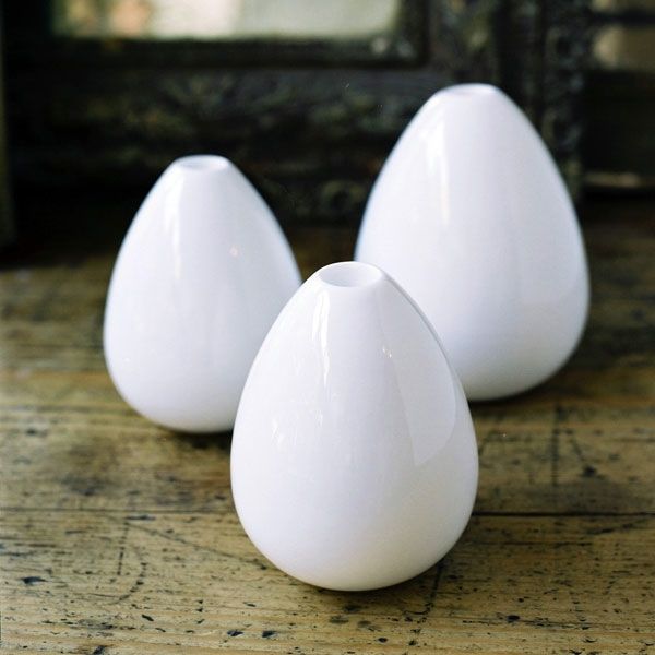
Made with English fine bone china, the egg candleholders have an aesthetically pleasing shape. Happy childhood memories of dipping bread into soft boiled eggs were Michelle’s inspiration behind the design. The design was selected for the Hidden Art Select Collection due to its originality and it was launched at 100% Design in 2007. This unique piece brings together style and functionality; it can hold a standard 20mm diameter candle, and it can also be used to hold a single flower head, plant cutting or a bamboo stem.
Stella rug
The Stella rug is Michelle’s ‘hero’ product because of its decorative style, and the naturally irresistible texture makes it a talking point for any room. It is made from 100% wool felt, a biodegradable and sustainable material that is soft to the touch. Elegant and stylish, the rug is ideal for living or bedroom areas for textual interest, but due to its cut-away nature it is not intended for high-traffic areas such as hallways. Michelle’s inspiration came from wanting to recreate in large scale the fine detail of antique lace. The design exemplifies a new, contemporary take on lace-making, and it’s beautiful surface and texture looks equally stunning on carpet or natural wood floors. It is available in black, natural cream and purple but can be made to order in a variety of colours that can work individually or be used in multiples on a large floor space.
‘London Calling’ cushion collection
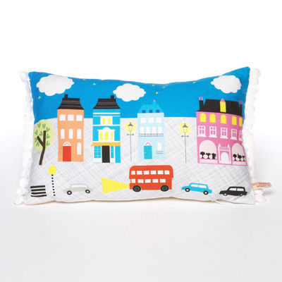
The London Night cushion is one of the newest illustrations to Michelle’s collection of cushions called ‘London Calling.’ Its quirky illustration depicts a fanciful evening scene in the busy Capital and it links in with the other cushions in the collection which similarly show familiar scenes from London life, some feature the iconic red Routemaster bus or a black cab, and other famous buildings. The designs are digitally printed onto soft but hardwearing cotton satin and backed with unbleached calico. Her illustrations bring colourful scenes and each one tells a story which makes them a unique and quaint addition for your home. The Flower Market cushion is my personal favourite, featuring east London’s famous Columbia Road Flower Market, because it tells an imaginative story of the colourful and exciting aspects of everyday life.
Complementing her range of cushions, Michelle’s Melamine mugs, tumblers, trays and tea towels follow the same London theme including prints of London Art Deco tube stations. The London Transport Museum shop commissioned the mug and tray designs to coincide with their exhibition, Suburbia.
Excitingly, Michelle’s up-and-coming project sees her working with the National Gallery on a range of products to be launched this year. She launched several new designs at Pulse London 2010 in June including her All Aboard cushions, London Life Trainer cups, and further illustrations of the London Life cushions.
Michelle will be exhibiting her products at 100% Design in Earl’s Court Arena, 23rd-26th September 2010, at stand H60. Visit michellemason.co.uk for further product information and stockists.

