Features: January '11
Trend Watch: Texture
Experiment with and combine playful textures in your home for a look that is right on trend.
Experiment with and combine playful textures in your home for a look that is right on trend and an ideal way to give your home a tactile and interesting look.
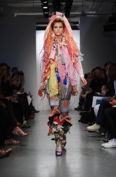
If Louise Gray’s Spring/Summer 2011 collection is anything to go by, we can expect bright and playful textures and colours to inspire the world of interior design. Make this on trend patchwork look work in your home with some gorgeous textures such as Johnstons Patchwork Berry Striped Lambswool Throw [http://furnish.co.uk/items/107513-johnstons-patchwork-berry-striped-lambswool-throw] or Clarissa Hulse’s handprinted Silk Patchwork Cushion http://furnish.co.uk/items/45239-clarissa-hulse-briar-neoncobalt-silk-patchwork-cushion, both available from Heal’s.
Wallcoverings
The Ribbed wallpaper from 95% Danish in turquoise and gold will give a stunning look to any room. The look and feel of the wallpaper appeals to your senses making it great for a feature wall.
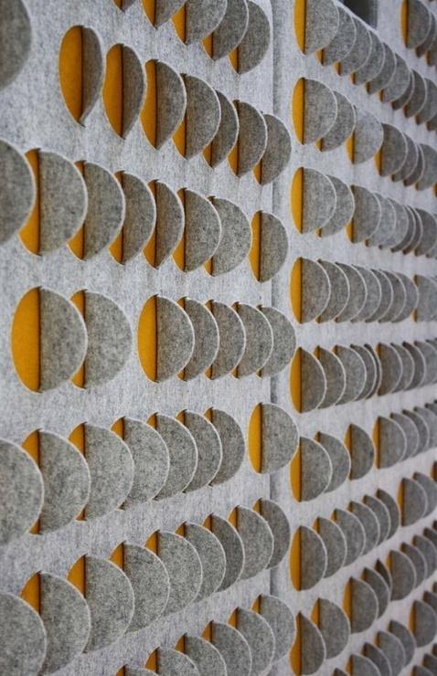
Or why not try wallpanels; they’ve recently become an exciting way to create a statement in any room. They’re ideal for defining areas in open plan spaces, for creating a tall headboard in a bedroom or for highlighting an alcove. Leila is the newest intricate felt wallpanel from Selina Rose. It’s made from 100% wool and it can be used as acoustic wall panelling. The specialist acoustic foam in Selina’s innovative wall panels is made from recycled glass bottles. The felt is sourced from renewable and sustainable sources and there are 26 environmentally friendly dye colours to choose from.
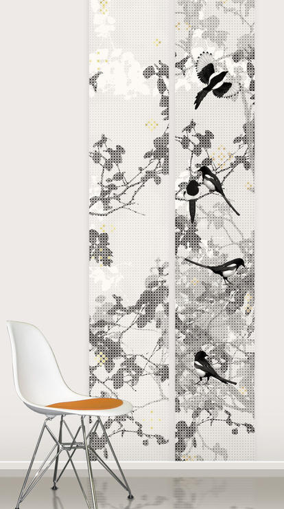
I love Scandinavian Surface’s Magpie Panel Piece, available from Garrendenny Lane interiors. It’s made from a beautiful grey silk and it features a number of magpies against a grey leafy background, creating a quirky and interesting textural backdrop.
Flooring
Carpets and rugs are a great way to bring texture to your home, especially if you have wooden or laminate flooring. Floor Couture offers a selection of sustainable floor coverings such as seagrass, coir, wool, jute and sisal. Seagrass, for example, has an even, geometric texture and natural colour which makes it an effortless and practical addition to any room. Natural flooring is a good choice all round because it offers good durability and it’s hardwearing as well as maintaining an inviting appearance.
High pile rugs are ideal for bedrooms and living rooms, whereas low pile rugs are more suited to high traffic areas such as hallways and living rooms. The delicious dark Chocolate sheepskin rug from Coco Male has a luxurious appearance and feel. Scatter a few sheepskin cushions on your sofa to complete this cosy look; I would love to snuggle up on my sofa with one of these Round Sheepskin Cushions from Heal’s.
Accessories
Texture is all about playful fun and experimentation; you can mix different textures in one room and layering is a fantastic way to create visual impact. For example, you can really bring a warm and welcoming feel to a bedroom or living room with some textured and luxurious throws, cushions and window treatments. The Pebble cushions from Found Home Store are made from a super soft chamoise fabric and they are also hand stitched on a non slip backing making them incredibly tactile.
If you’re decorating a bedroom, it’s important to use plenty of textures to create a warm and snug feel. It’s perfectly acceptable to splash out on some luxurious bedding, so why not choose this gorgeous silver blue Velvet bedspread from Primrose & Plum. Or become inspired by traditional Swedish folk art with the quirky design on Bird Blanket, also from Primrose & Plum. Perfect for a chilly evening, this blanket would be perfect for a children’s room with its bold, playful print.
Balancing soft and hard textures in the kitchen is often tricky when you have lots of cold surfaces and hard angles and edges. However, you can introduce softer textures such as tea cosies, tea towels, tablecloths and blinds. This adorable Embroidered Elephant tea cosy from Cocoboat is the perfect addition to a busy family kitchen.
So, experiment with texture to give your home a welcoming and warm feel; combine different accessories and furnishings for a fresh, modern and tactile style that will make your house feel like a home.
The Colour of the Year 2011: Honeysuckle
Pantone Colour of the Year - Honeysuckle 18 - 2120
Pantone, the emperor of the colour world, has decreed that Honeysuckle 18 – 2120 is the colour of the year for 2011 and it’s little wonder why. It’s not even February yet and we’ve already been hit by increased VAT, atrocious weather and depressing stories in the news. But, fear not – Honeysuckle can help us through the horrendous winter mire.
“Honeysuckle is a captivating, stimulating colour that gets the adrenaline going – perfect to ward off the blues,” says Leatrice Eiseman, Executive Director of the Pantone Color Institute. “Honeysuckle derives its positive qualities from a powerful bond to its mother colour red, the most physical, viscerally alive hue in the spectrum.” This makes it perfect for beating the January blues and providing welcome distraction from failed New Year’s resolutions.
Honeysuckle has the power to uplift and embolden, and as the importance of environment for one’s wellbeing is undeniable, it’s well worth introducing a dose of this vibrant beauty into yours. Eiseman also says that the “intensity of this festive reddish pink allures and engages. In fact, this colour, not the sweet fragrance of the flower blossoms for which it was named, is what attracts hummingbirds to nectar.” If we apply this principle to interior-design, honeysuckle in the house means that your home will become a hive of social activity – perfect for boosting the spirits in troubled times.
Honeysuckle is, essentially, a glorious meshing together of red, the colour of passion and courage, and pink, the colour of softness and femininity. This means that it’s perfect for men and women alike, and its cheerful, reddish-pink hues will look great in both male and female homes. A splash of honeysuckle is just the ticket for a dash of dynamic decorating: rose-tinted spectacles for the interior. It is, says Pantone, the colour of “verve and vigour”, and will instil in us the “confidence, courage and spirit to meet the exhaustive challenges that have become part of everyday life”.
And, despite its strong and vibrant tones, it works fantastically well with a huge variety of other colours. Setting it against a neutral palette will make the colour really pop – imagine this Mosaic Silk Cushion from Heals on a pale sofa or chair. The contrast between the two would be fantastic, and as we’ve all got a piece of furniture that could do with a lift, choose honeysuckle as the colour to reinvigorate yours. It also looks brilliant set against a punchy turquoise (ironically, turquoise was Pantone’s colour of 2010). That might sound a little over the top – but trust me, it looks fantastic. Turquoise is, says Pantone, the colour of “escape”, whereas honeysuckle is the colour to spur us on through the challenges of modern life. So, the two together are a great combination for the home that demands both calming and energising. I also think that honeysuckle and orange look brilliant together, and as colour-clashing is set to be huge this year, very on-trend too. Again, you might think that the combination of the two could be hideous, but it truly works (probably because they share the same mother colour). If you’re still not convinced, check out the amazing Clarissa Hulse Larch Amber and Fuchsia Silk Cushion from Heal’s and you will be very surprised indeed.
If you’d rather have your honeysuckle in a more artistic form, consider introducing a print of the fantastic Andy Warhol Flowers Red/Pink into your home as a great focal point for any room. Warhol is synonymous with being utterly cool, and he clearly recognised the power of honeysuckle hues way back in 1964 – thus, we know honeysuckle belongs in trendy interiors. Pantone also say that honeysuckle is “guaranteed to produce a healthy glow when worn by both men and women”. This is the perfect reason to paint a wall of a room or your hallway with this delicious colour; it’ll be like an instant detox (never a bad thing after the excesses of the festive season).
So, there you have it. Honeysuckle is the colour of the year, and it’s a rather wonderful thing too. A colour to elevate, soothe and inspire; what more can you ask for? In the words of Pantone, it’s “a colour for everyday – with nothing ‘everyday’ about it”.
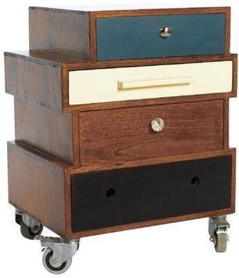
Mixed Up Side Table from Rose & Grey
Keep your storage stylish with this Mixed Up Side Table from Rose & Grey. £425
I’ve been searching for a bedside table for what seems like an age but nothing has seemed quite right.
I want drawers but not too many, something stylish but not overbearing and most importantly enough room to rest a glass of water and a good book.
I had almost given up all hope but then a quick tour around Rose & Grey and I found just what I’d been looking for in a matter of minutes.
The Mixed Up Side Table is a truly eclectic piece of furniture comprising of four differently-designed drawers stacked together.
I love the off-centre arrangement which makes it feel like a vintage-shop find and this table isn’t just perfect for the bedroom either; try it as a telephone table in a hallway, or even as stylish alternative to a filing cabinet in your home office.
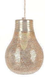
Filisky Pear Pendant Light from Liberty
Add some Eastern charm with these Filisky Pear Pendant Lights from Liberty. From £65
If there’s one shop in the world I could happily wander around all day, it’s Liberty.
I adore everything about it, from the wonderful service (even Mary Portas would be hard pushed to find something to moan about in here) and the bag department (where I lose my heart each time I go) to the brilliant interiors floor.
Here you’ll find rugs that cost the same as a small car next to affordable bits and bobs for the home; which is what I think I love about Liberty the most – its inclusiveness.
So as impossible as it is to choose a favourite from Liberty, these Filisky Pear Pendant lights have definitely caught my eye.
Available in two sizes, they’re made from punched, silver-plated copper and will add a touch of the East to any room.
Trend watch: Nauticals
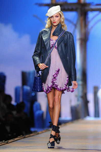
This year’s Spring/Summer catwalks have revealed a refreshing nautical look to bring the seaside home.
The latest Christian Dior collection brings together a mixture of marine themes with bright tropical colours such as turquoise, orange and fuchsia pink. A new spin on seaside chic perhaps? Well, never fear as alongside this are the more conventional nautical favourites of red, white and navy with a good smattering of Breton-chic.
I love the Alejandra cushion from Occa Home with its fresh summer lime shade which would pair nicely with navy accessories, and creates a clean modern look when combined with white fabrics. Or try the gorgeous peacock blue Ripple throw from Primrose and Plum; this soft textural wavy throw would brighten up a plain bedspread or sofa and gives the impression of ripples in the water or soft waves in the sea. Perfect for dreaming about the long summer days to come.
The skinny stripe is out and broad bands of colour are in. We think you can give your living room or bedroom an instant lift with the Briscoe aqua striped rug from Designers Guild. Or if you want to sail away with a traditional blue stripe, the Duffy cushion from Occa Home is stylish and will add depth when contrasted against pure white.
Create a laid-back, coastal look with white-washed wood combined with fabrics in ticking stripes. For natural woven fabrics with a ticking stripe, we suggest you choose Ian Mankin for a great selection. Go for lightweight fabrics such as linen and cotton to replace your heavy winter tablecloths and throws and to give a fresh summer look.
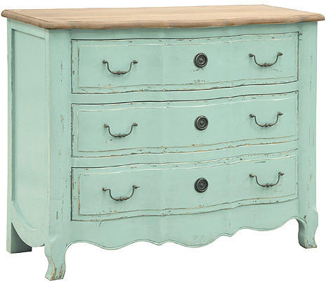
Bring pastel shades to your nautical theme; anything from candy floss pinks to turquoise sea blues will evoke holiday memories and give summer sunshine warmth to a room. We love the beautiful stripe upholstered dining chair in whitewashed oak from Sweetpea & Willow It’s perfect for laid-back dining, and the cabriole legs suggest a French elegance. Or the Sea Shore Chest from The French Bedroom Company has a gorgeous aqua blue finish to its Provencal style.
For a stylish but easy to maintain look in living and dining areas, choose wood flooring with natural fibre rugs. The Natural Rug Company has an exclusive collection of Roger Oates stair runners, famous for their colourful stripes. This will add texture and interest to any hallway and can also draw the eye into your home.
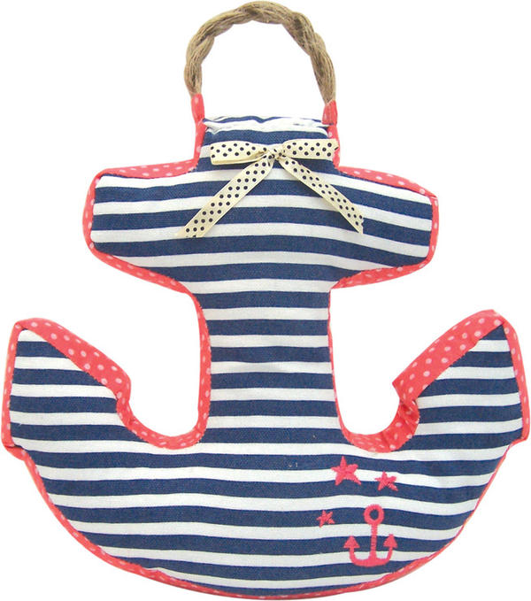
Accessorising the nautical look is easy; with navy or pale blue, pillar box red, white and ivory are the staple nautical colours you can’t go wrong. If you want to add some fun to a kids bedroom or for a nautical themed bathroom, choose the Pretty Anchor Doorstop from Hunkydory Home. It features a navy stripe and pink polka fabric design with plaited hessian handle.
Bring a homely feel to those cosy evenings in with the white Nautical lantern from The Contemporary Home is based on the design for old ship’s lanterns. Or place a few of these lovely painted pastel blue Hurricane lanterns from Nordic House at the bottom of your fireplace. They have a heart cut-out and a rustic twisted handle giving them a perfect feminine nautical touch.
Artwork and prints are a simple and brilliant way of bringing the seaside into your home. Get lost at sea with the Driftwood canvas wall art from Nordic House.
You can easily go overboard with this theme so keep your accessories simple; introduce bold stripes, and opt for sophisticated, whitewashed furniture so your scheme is more Riviera Chic than Captain Pugwash.
Interview: Mini Moderns
From quirky 1950’s textile designs to vintage toys and games, Mini Moderns has it all.
British design duo, Keith Stephenson and Mark Hampshire of Absolute Zero Degrees, a graphic design based outfit, are behind the wonderfully quirky Mini Moderns collection.
We interviewed Keith Stephenson to find out more about their exciting, retro collection….
If you had 3 words to describe your collection what would they be?
Contemporary, Soft, Modernism.
How would you describe the idea and aim behind your slogan: ‘Homeware for design conscious families’?
When Mark and I created the Mini Moderns wallpaper collection we wanted it to appeal to kids and, what we were calling then, “kidults”. No one else was appealing to a cross generational market at this time. We wanted the consumer to be able to buy something cool that their kids would love but that they could also live with happily.
Despite having a fantastic following and reputation with the kids products, we have always created products that we’d love too. This, I think, gives our print designs a lot more depth than papers produced purely for adults – which are usually trend driven – or pure kid’s patterns, which are often twee. I think it is very easy to spot a Mini Moderns design.
What would you choose as one of your favourite design classics of all time?
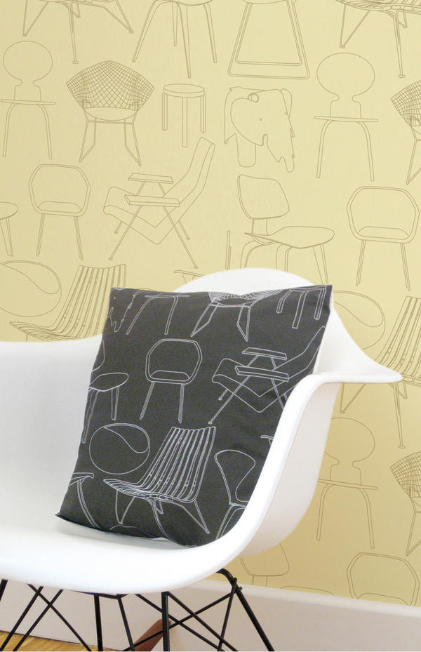
Mine is the Eames rocker; Mark’s is the original Mini car.
What inspires you to combine retro and modern styles and what do you feel this brings out in your products?
We’ve always had this mix in our collection – there’s something optimistic about mid century modern designs in print – so we wanted to capture some of that – but giving them a contemporary edge – not a rose-coloured vision of the past.
You operate a predominantly ‘Made in the UK’ policy, how important do you believe it is for the future of interior design to become more eco-friendly?
We’ve always produced in the UK – it has been our policy from the word go. We wanted to utilize the amount of great UK producers and build good relationships with them, that way we know that our products come from sweat shop free environments. It also means the products travel less so we try to keep an eye on our carbon footprint so even when we export the amount of journeys is limited. The only products which we don’t produce in the UK are our rugs. These are a license product and are produced with a company who approached us. However, we make sure that the rugs are delivered direct from the factory to the customer so they don’t arrive with us and get dispatched again on an extra unnecessary journey.
What’s the most popular design from your collection and why?
We have several ‘hits’ in the collections which shows the cross generational appeal of our products. The ‘Town’ print still continues to be popular even though it was produced in 2005, and has been influential to other designers. This has been used in dining rooms and children’s rooms. Our ‘C60’ retro tape cassettes wallpaper has also been a hit with dads and older children – and has recently been used in the refurbishment of the BBC Radio 6 studios.
Recently our ‘Pet Sounds’ wallpaper has had great success – which I think is indicative of a Mini Moderns design – no-one else would have even thought of using the imagery and combination of imagery we used. It’s easy to produce something ‘out there’ but the skill is making it still something that people want to spend everyday living with.
Can you tell us a bit about your new ‘Festival’ wallpaper and what the story behind it is?
We’ve collected festival of Britain memorabilia for a long time now. The Festival of Britain in 1951 was an exciting glimpse into the future, celebrating the new wave of British design, with design for all available via the introduction of Hire Purchase schemes. New design was everywhere. It’s the optimism we love, and over the years we’ve amassed a number of items celebrating it. The C.O.I.D. book Design in the Festival is a particularly inspiring find. Having been huge fans of the Festival of Britain, it was an honour to be commissioned in 2008 by the Southbank Centre to reproduce as wallpaper, one of the Festival’s signature patterns, Net and Ball. This had been designed in 1951 by the architects of the Royal Festival Hall, Peter Moro and Leslie Martin, as a carpet pattern for the Hall. Our obsession culminates in our new wallpaper in commemoration of the Festival’s 60th anniversary, featuring our favourite pavilions and sights.
How do you experiment with colour and how important is this to the finished print?
Colour is very important to us and Mark is a great colourist. Because we’re fundamentally print designers more than product – it’s this aspect of our designs that excites us! The prints tend to be rich and dense with imagery so getting the balance right with colour is very important. We don’t work seasonally or are trend driven with colour, instead we go with what works with the print. These colours then go into our Mini Moderns colour book, and are used in future ranges so that you can mix up our patterns and there is still a synergy across all our collections. We also have fun with the names of the colours too – like “milk chocolate” or “powder paint blue” etc, most of which relate to a collection or product. Our ‘Harvest Orange” colourway was an homage to the Neil Young album ‘Harvest’ as it was first introduced in our Folk Rock collection last year.
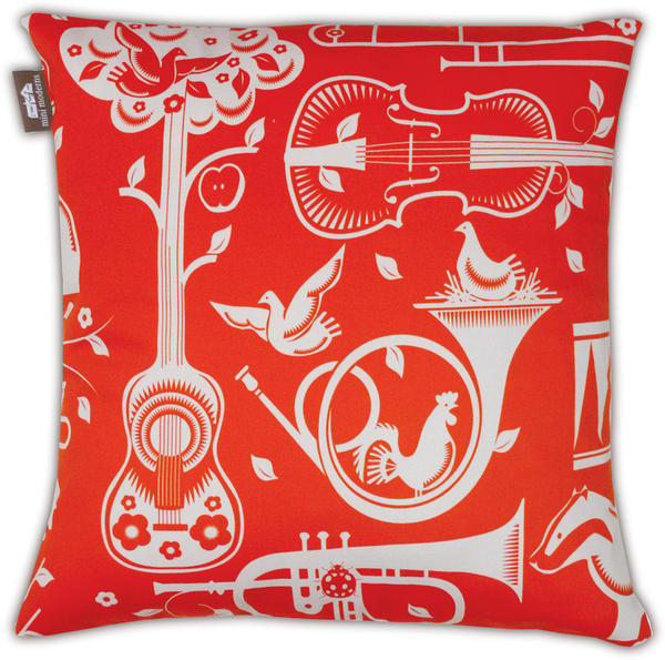
I love your Folk Rock cushion collection (If I had a camper van, which I’ve always wanted, then I’d fill it with these!). What inspired this collection of prints?
The ‘Folk Rock” collection was inspired by a very rare holiday for us to the West Coast of the US. We spent time in LA, the Big Sur and San Francisco. Pet Sounds was a mix of two concepts for prints we’d been working on and the time away helped us to focus and consolidate it into one. We had been working on a musical instrument print and a British wildlife print and then decided to combine them to make our Woodland cacophony – which was originally called ‘Fanfare’ – but when we realized where the collection was going – a nod to the Beach Boys seemed appropriate. After all we were in California. ‘Alice’ was also a print which, finding a section of a dirty piece of vintage barkcloth fabric in a thrift store in California, took on a life of its own. Our friend Alice had asked us to design a wallpaper for her house – and we had always thought – ‘if Mini Moderns did a floral – what would it look like?’ so we used the vintage fabric as inspiration and created the print. As it was part of the Folk Rock collection we thought Alice was a good name for it, and as Lewis Carroll’s heroine had long been an inspiration for 60’s West Coast psychedelic artists – like Jefferson Airplane – so Alice it was. We supplemented the cushion collection with our ‘International Cocktail Hour’ range of found vintage fabrics with a Trader Vic’s atomic/Tiki edge.
How do you think your prints can transform a room?
Prints give a room more character and depth.
How do you see print design progressing in the future?
Our prints develop from season to season. We’re more confident in our aesthetic now. Initially it is daunting as you have no audience for your product, so it’s easy to lose your direction and then you stand back and can’t quite understand what your designs are trying to say about you as a brand. We had to have the courage to just put our ideas out there and it has seemed to work.
What did you last buy for your own home?
Our last two purchases were two lamps: One is a “base lamp’ by Tom Dixon – it was rather expensive but beautiful! The other was by Group Design and it’s a sleek white reading light – which wasn’t as expensive but is by no means less beautiful…
What advice would you give to anyone thinking of introducing print to their home?
Most people will send out wallpaper samples but be focused about what colours you want for a room. Otherwise you end up with a confusing mess of hundreds of pieces of paper. The process should be fun. Also, try and go with an independent designer, there are more like us out there, and most wallpaper is produced in a handful of factories across the UK. Even the smallest independent designer will have the same high quality as a larger company. That way your room will have individuality.
If you could collaborate with any designer who would you choose and why?
I’ve previously worked with Wayne and Gerardine Hemingway when I was a print designer at Red or Dead. Also, recently both Mark and I have worked with them as part of a team curating areas for their Vintage festival – they are great to work with and when you do you become almost part of their family. We will be working with them again for Vinatge at the Southbank in July.
Other designers that we would work with would need to be someone who didn’t overlap with our skills, like product designers, that share our philosophy and aesthetic. Mark would love us to work with someone like Terence Conran – as he is a lifelong hero of his, and Russell Pinch is also fantastic. We were extremely excited when the Conran Boundary hotel specced up our wallpapers for a number of their rooms. A forgotten vintage brand would also be good to work with – we had always wanted to work with someone like Ercol – but someone like Gplan or a company like Ercol who have embraced their heritage would be great.
What new projects are you working on and what do you hope to achieve in the future?
We’re currently getting our new collection together. “Festival” is the first in this collection which launches as a whole in September. The collection is called ‘Daytripper’ and celebrates British holidays, hobbies and pastimes. We’re also creating new accessories designs for mugs and bags. We have a wealth of prints now in our back catalogue and are able to pull these into different products – so as well as new prints – there will be some old Mini Moderns favourites on other items too.
Interview: Ghost Furniture
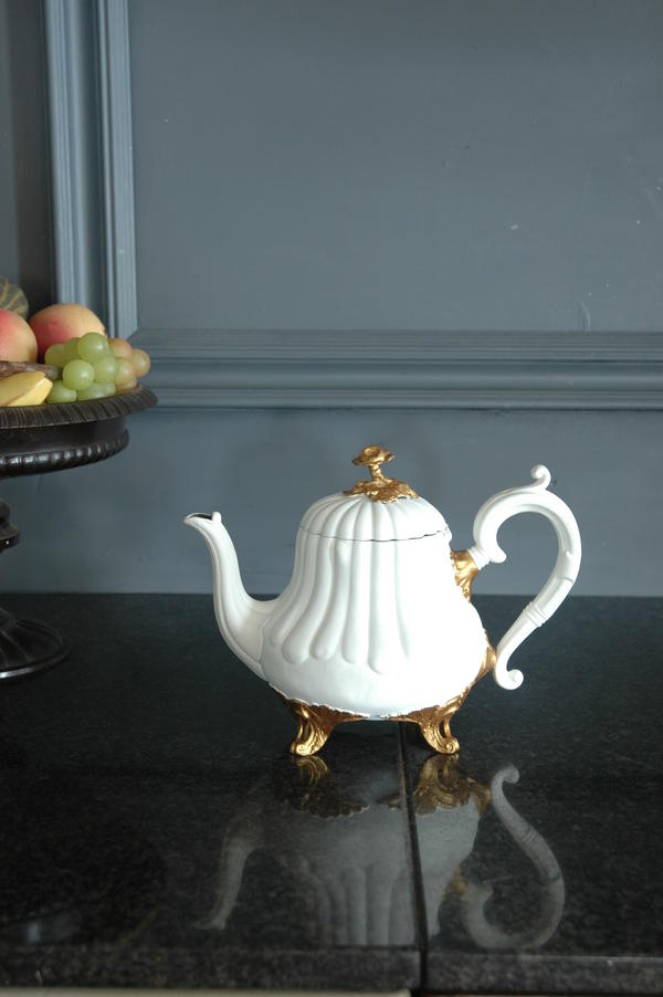
Hauntingly beautiful: The Ghost furniture collection makes a striking impression
We caught up with Di Overton to find out more about the collection and what gives it its ghostly beauty.
If you had 3 words to describe your collection what would they be?
Eclectic, eclectic and eclectic.
How would you describe the idea behind ‘Ghost Furniture’ and what makes it ‘hauntingly beautiful’?
The original idea was to create something new from discarded items. Not shabby chic but eco chic. I’m no eco warrior but it saddens me when I see formerly beautiful items cast aside when they still have some life in them. We use the term ‘hauntingly beautiful’ because we always try to let the original piece show through the new design making it somewhat ghostly.
How did you first become interested in creative design?
I think I was born creative. No doubt I would have re-designed the labour ward had I had the skills. I think it’s in the genes. I seem to have spent my life re-creating things.
What would you choose as one of your favourite design classics?
The Egg Chair by Arne Jacobsen without a doubt. It wraps itself around you; will sit in any interior design scheme, and it’s timeless.
What inspires you to take vintage designs and turn them into something that’s eco-chic?
I’m inspired every time I look up. I live in The Northumberland National Park and am surrounded by beauty. That beauty is not manmade but I do believe it can be translated into product design. I seem to have the sort of brain that takes in a view and turns it into a design, how I do not know but it seems to work.
How important do you believe it is for the future of interior design to become more eco-friendly?
Landfills can only take so much. It can only go on for so long this throwaway society of ours. I like to think that interiors can be treated like fashion – take a little black dress, add an accessory and you get a totally different look. So why not do that with interiors?
What is the most popular design from your collection and why?
There are two – Chairs and Blackboards without a doubt. I think chairs are popular because we
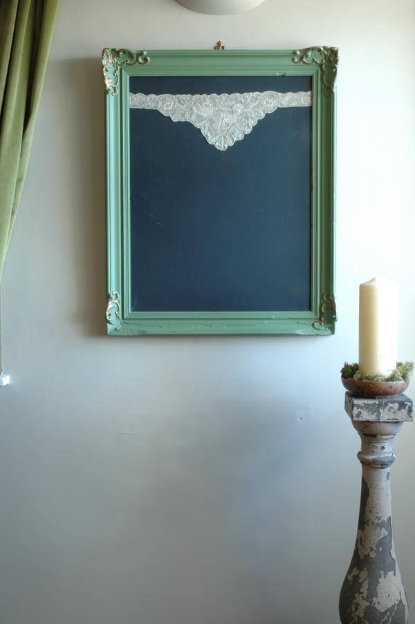
design them to fit into any room in the house; they make a statement about the people who buy them and blackboards because they’re so useful. Chalking up a message is so much more
glamorous when in an ornate vintage frame, don’t you think?
You use dead flat matte paints which are sourced in France and that are specially mixed for you. How does this paint make your furniture unique and what look does it create?
In the UK there is no such thing as a dead flat matte paint for wood and metal, the flattest we can get has 5% sheen. Dead flat matte hides a multitude of sins and needs no preparation which means we can keep the price down. It’s like applying double cream to the furniture, sometimes I have to stop myself licking the paint brush it looks so delicious. It creates an antique look without all the chips and scratches that have to be done when creating shabby chic. I’d like to add here that I do love shabby chic but only when it’s shabby with age not with a paint effect. I want to see the history of a piece shining through.
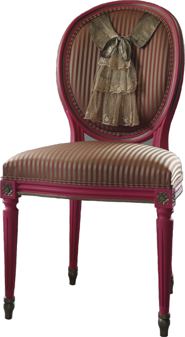
I particularly love the Marilyn chair, could you explain how Marilyn’s famous photo pose inspired this furniture piece and what materials you used to create it?
I found a 1930s satin pillowcase at a brocante in Paris on a very windy day and immediately thought of the famous photo of Marilyn Monroe when it was billowing up in the wind. The only way I could think of re-creating that effect was to fill the back panel of a salon chair with of much of the fabric as possible. My mind works in mysterious ways.
What do feel your furniture and accessory pieces can bring to a room?
A story. Every piece has a history and its story is told to the buyer when they purchase it. This is most important to me and, from what I can gather, to them also.
What did you last buy for your home?
A huge spiral staircase made from cast iron with lattice work treads. The light casts down on it from a roof light above and creates a beautiful pattern on the floor.
What advice would you give to anyone shopping for a unique furniture piece?
The same advice I would give to anyone buying anything – KNOW THAT YOU LOVE IT – any doubts don’t buy it. A piece of furniture should be a reflection of you and your life so you can live in harmony with it.
If you could collaborate with any designer who would you choose and why?
I think I’ve already done that. In 2010, I collaborated with Kathy Dalwood the sculptor of fabulous concrete busts. Together we created a range of Concrete Tassels cast from vintage originals and trimmed with vintage passementerie from the merciers of Paris. It was a fabulous experience and I doubt whether anyone else could surpass it.
What new projects are you working on and what do you hope to achieve in the future?
I have just created a new effect by using a lace stencil and creating two different textures but in the same colour. I’ve just finished the first piece which is a Regency console table and have used the effect on the table top which has made it look as though it is made from lace. The whole piece is black and looks very dramatic.
A future achievement would be to be able to continue creating new and innovative pieces at a pace that is pleasurable, up to now I have achieved that and would love to keep it that way.
View the whole collection...
Trend watch: Chunky cable knits
Cosy up with chunky knits
Fabulous textures are in style, so don’t drop a stitch; treat your home to some cosy chunky knits. We show you how the knitted look can bring a cosy charm to your home.
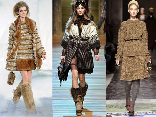
Chunky cable knits are no longer just a catwalk fashion trend; you can bring them into your home in the form of cosy cushions, luxurious throws and even stylish stools. Whether you want to bring texture, warmth or colour to a room, a knitted accessory is a great choice. This trend celebrates an oversized, voluminous style, and what’s great is that you can introduce knits to any room of your house.
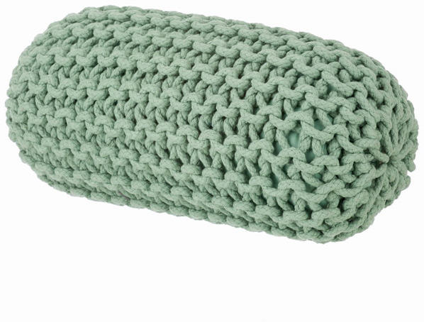
The Knitted Floor Cushion in yellow from 95% Danish can bring bold colour into a room and provide versatile but comfy seating for you and your guests. You can sit on them, lean against them or simply stack them to suit your needs. Or try their Knitted cylinder cushion, available in green and coral, to give a splash of colour to an otherwise neutral scheme.
Knit one, purl one…knitting has always been associated with grannies but the tradition of crafts lives on and in fact, the world of interiors has taken on a whole new knitted perspective. There’s a renewed interest in crafts, particularly knitting, and the traditionally loved style of the cable knit is being used in more ways than one to bring a homemade element into your home.
Who needs chandeliers and extravagance when you can have something with a personal touch? I adore the hand-knitted thick, woollen threads of the ‘Granny’ pendant lamp by Pudelskern for Casamania. These lamps are made from pure natural sheep’s wool and each lamp can be traced back to the flock where the wool came from. A natural treatment is applied to make the wool flame resistant and to avoid moth and mite infestation.
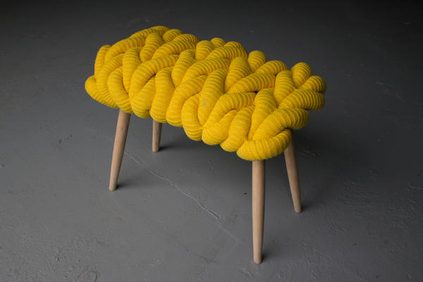
If you’re looking for a stylish furniture piece, Claire-Anne O-Brien’s statement collection is inspired by elements of the knitted stitch itself such as rings and loops. Her chunky knit stools are all handmade in ash with hand-knitted seats in either lambswool or a merino wool and mohair mix. The stools are also available in chunky British sheep’s wool which are all undyed in their natural colours. One of these stools would be a fantastic way to introduce the chunky knit trend to your home, combining style, colour and comfort.
Layer beds and sofas with knitted throws and cushions for a luxurious style that will mean you’ll never want to venture outside again. One of these chunky knit merino wool blankets from The Wool Company would be perfect for a cosy evening in. Or the chunky aran knit throw is perfect to cuddle up to; the pure new wool gives it a chunky, warm look and feel.
Add texture to your pencil pots and vases and bring a warm and comforting feel to your living room or study with a Ferm Living Knitted Vase from Stylish Life. And if your home is in need of added storage, why not choose these knitted storage baskets, available in three sizes, from Rockett St.George. These gorgeous knitted baskets are made from 100% cotton rope and come in three different colours to suit your colour scheme.
With interior design becoming more eco-friendly, it’s no wonder that the knitted trend is proving popular. Wool is naturally flame retardant, it helps control humidity, and it’s even good at absorbing sound. So go for a luxurious rug to make the perfect feature piece on wood flooring in a living room.
This is certainly a popular traditional trend that can be kept alive with a little imagination and a modern twist.
Colour watch: Coral
Bring optimistic coral hues into your home
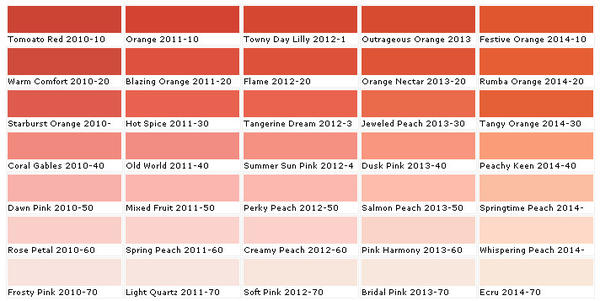
Start the year afresh in your home with the vibrant, optimism of coral hues. This soft orange tone has a cheerful and feminine feel that will bring warmth to any room. It’s the perfect shade to banish those winter blues and prepare your home for the spring.
Coral easily pairs with other colours and it works well within existing schemes that simply need a fresh splash of colour. Choose a coral shade of paint to bring warmth to a cooler room which will also create a more welcoming feel. Fired Earth offer a selection of natural and organic shades from Coralline to Cinnabar red which evoke colours found in exotic coral reefs.
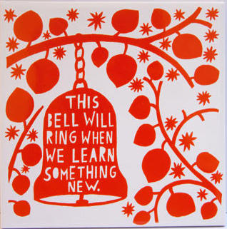
To instantly add a splash of coral in your kitchen, try these quirky Orange ceramic tiles designed by Rob Ryan from Liberty. Or pick a bold feature piece such as this Tolix Square Table from Pedlars. This design is practical and stylish; the electric orange shade gives this table a striking and modern appeal.
Tonal scheme
With its spectrum ranging from deep pinks to reddish orange tones, coral is a very appealing and positive colour to decorate with. Mix it with earthy tones or pastel shades for a stylish look; this sea anemone shade brings a warm ambience to a room without being as harsh as red can be. Coral also complements wooden floors and works well in living and dining rooms.
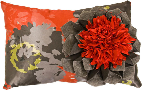
If you want to go for a dramatic statement, go for a coral colour scheme that is highlighted by black accents. I absolutely adore Lorna Syson’s Pasadoble Dahlia cushion which has a vibrant coral orange floral sculpture. Floral cushions are a great way to add pattern and texture to a room and they will also accentuate and enhance the colours in your scheme.
Combine coral with white to give a clean, crisp look; this monochromatic scheme would work well in a dining room, bedroom or bathroom. Colour blocking is a great way to get this style, so try painting with a bold coral shade and create a pleasing contrast with some white curtains or a white picture frame.
Complementary scheme
Teal and green are opposite red-orange coral on the colour wheel meaning that together they work well to create a big impact and an exciting combination. The Teal Turned Wood Table Lamp from Heal’s has a velvet shade which will add texture and colour. A teal vase, ceramic bowl or a set of coasters can simply set of your colour scheme without making a loud statement.
Accents
You don’t have to complete redecorate to introduce coral shades into a room; use smaller accessories and accent pieces for the finishing touch or to give a room a new lease of life.
Choose some gorgeous blooms such as coral coloured roses for an uplifting and feminine touch. Or bring stunning orange and pink coral shades into a room by scattering a few of Clarissa Hulse’s Silk Cushion from Heals’. Or try this interesting cylindrical shaped table lamp from Habitat to add colour to your room.
Coral can be a dominating colour in a room, so use it in moderation. Try this painted metal coral candle holder from OKA on your dining table for an ideal conversation piece. A framed piece of artwork is an excellent way to inject colour into a room; a dreamy sunset canvas, for example, could be the perfect personal touch.

