Colour watch: Pink
Make your home blossom in pink.
A typically feminine colour, reminiscent of little girls bedrooms and roses, we take a look at how pink can work in the home.
Choosing the right pink:
As pink is not a primary colour, it is important to consider mixing various shades and tones to provide a balanced colour scheme. Its versatility makes it an easy colour to decorate with, and we think it’s time you discovered the decorative opportunities that pink has to offer. ‘Shocking pink’ was fashion designer, Elsa Schiaparelli’s signature colour and she described it as: “life-giving, like all the light and the birds and the fish in the world put together, a colour of China and Peru but not of the West."
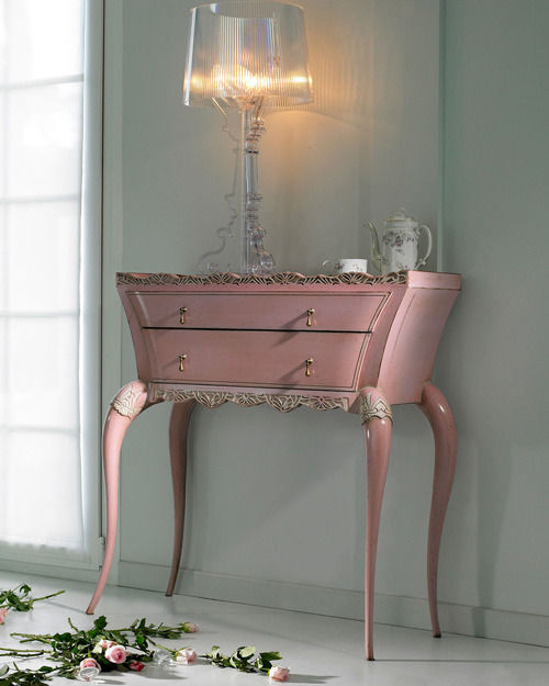
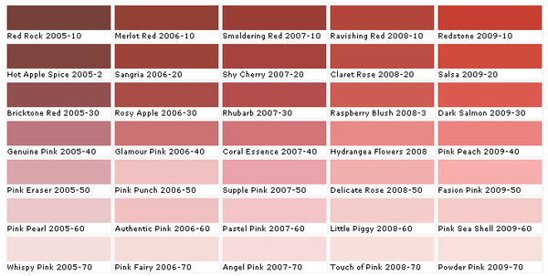
Subtlety is a key element because sweet candy shades can turn sickly, so keep your pinks sweet and innocent and play around with various tones to create a balanced colour scheme. Take your testers home and check how pink looks on your walls depending on the light; choose pinks with a warm undertone to give your room a blushing look and use pale, pastel pinks as base colours and as backdrops on walls. For a living area or bedroom, brighter and deeper shades of pink look dramatic and sharp, invoking drama and excitement. Or for a chic home office or study, add the vibrant, fuchsia pink French Kiss armchair from Sweetpea & Willow to remind you that life is not all about hard work.
Tonal scheme
Hot pinks work well with white and grey in a monochromatic scheme because when combined they give a sophisticated look and enhance the calming tones of pink. Generous amounts of white will keep your room feeling fresh and airy, whilst adding grey will give a more masculine feel. If you want to give a cool or dark room warmth, burnt oranges and reds work particularly well with magenta pinks on rich textures and fabrics, for example, try the Clarissa Hulse patchwork cushion from Heal’s which combines the rich colours on this silk, cotton and velvet cushion cover. These are considered to be warm tones but too much of them in a room can create an uneasy ambience, so restrict these colours to highlight feature pieces and they will look fabulous.
Complementary scheme
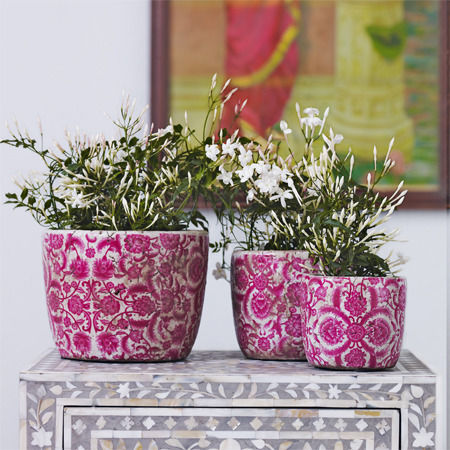
Green complements pink because it gives a stark contrast, and you may not normally think of using these colours together; however they provide a fresh and natural look that will never look outdated. For a modern look choose a pastel palette of pink and green that will give your home a fresh spring look throughout the year. Think of pink flowers in nature combined with the beautiful green foliage, and you will have instant inspiration to start accessorising with flowers and vases. Go for the Vintage ceramic rose plant pots from Graham & Green to give your room some character and choose floral wallpaper or fabrics to marry your theme together; the Rose-print cushions from Graham & Green, for example, will highlight blush pinks shades in your room to give your home a retro, period look.
Accents
Using pink as an accent offers the perfect way to inject some colour into your scheme without going over the top. Try adding a few cushions to a neutral sofa or a mixture of different shaped and textured vases along a mantelpiece. Stick to one shade of pink throughout the room for a cohesive look that will work well alongside a base shade.


