It's our Interior Design Magazine!
The hottest interior design ideas, fab finds for the home and buying advice. We're always looking for new finds, designers to feature or anything else lovely for the home, so if you've seen something gorgeous and would like it featured in our interior design magazine, please get in touch!
10 essential tips and myths about wooden furniture
Solid wood, veneers and laminates - our expert guide on what to look out for and what to avoid.
Wood is wood - right? Wrong. There are solid woods, veneers and laminates, each with their own options, looks, characteristics, durability and price ranges. Our guide will arm you with some expert technical and practical knowledge about wood and wooden furniture, dispel some of the myths and show you how to make the right choices for your home.
Solid wood
We often hear people say that they'd only buy solid wood furniture because anything else would be a compromise. But if that were true, how come we see all those TV adverts for solid oak furniture at low prices? If oak is such a premium product, how is that possible?
The truth is that it’s not the furniture being solid wood that makes it high quality; that's largely irrelevant. It’s the fact that solid wood is a material that lends itself to being crafted, and where expert craftsmanship is combined with a high quality wood, the resulting furniture can be fabulous. But where low quality wood is used alongside mass-manufacturing, the result is something less impressive.
The quality of timber, size of 'staves', number of knots and construction processes all play a key part in what you end up with.
1) Myth: Solid wood is the premium choice for wooden furniture
It’s true that solid wood pieces such as dining tables stand the test of time, and cared for correctly can be used for years to come. It’s also true that antique and vintage pieces are typically constructed from this, and hold a certain authentic charm.
However, solid wood can be prone to warping and cracking over time, especially if used in moist areas such as near a bathroom or kitchen, or if poorly constructed, sealed or maintained. It’s not uncommon for low quality cabinets to end up with doors that don’t quite close properly or for joins to open up into cracks.
Of course, if you're after a more rustic look, then this works to your advantage because minor cracks and blemishes within the furniture can add to its charm.
2) Tip: Check your staves
A ‘stave’ is a name for a strip of solid wood, typically 20-50mm wide and the full thickness of your worktop, drawer front or cabinet side. Because trees don’t come in the shape of dining tables or worktops, furniture is typically made by taking ‘staves’ of wood and joining them together side-by-side. You can normally see this by looking at the furniture; you’ll see these strips as a pattern in the finish, much like floorboards.
(Be careful not to confuse staves with veneer strips. Staves are chunks of wood, whereas a veneer is a thin slice of wood on an MDF or plywood base. Veneer strips will be much larger than staves.)
The wider and longer the stave, the better the furniture will generally look because it seems more like a solid uninterrupted piece. Larger staves normally equate to more expensive furniture because cutting wider and longer staves from a tree results in more wastage than smaller staves. Conversely, furniture made with small staves may end up looking more like a jigsaw and is cheaper because staves can be made from much more of the tree with less wastage.
So check the stave size on any solid wood furniture or worktops you’re looking to buy. If you don’t mind smaller staves - or perhaps you particularly like the look - you can pick up something at a good price. And where furniture is painted, rustic or has a darker stain, the size of the staves may not bother you.
3) Tip: Check your knots
The general rule is that the fewer the knots, the more expensive the wood, hence the more expensive the furniture. That’s because much of the tree timber contains knots, so there’s a lot of wastage in using only ‘clean’ timber. So, as with stave size, make sure you check the knot content before buying any furniture advertised as solid wood. Cheaper furniture will typically be more knotty. Of course, if you’re looking for a rustic look, then knots work well.
Despite the above, remember that the highest end and most expensive furniture typically IS solid wood because it’s meticulously crafted by hand rather than processed by machine.
Veneer
A veneer is a thin slice of real wood. Veneers are produced in several different ways that determine how the wood grain pattern appears. Some veneer types are cut from the tree trunk using a rotary action - much like unravelling a roll of kitchen towel - to produce a wide continuous veneer sheet. Others are sliced straight from the tree into uniform thin strips and then glued together side-by-side to form larger sheets. This often involves 'book matching' when each alternate strip is flipped to make it appear that the veneer has a continuous pattern.
Veneered furniture typically uses a base of MDF or plywood, which is then topped with a 0.6-1mm thick veneer. Veneer is more flexible than solid wood, which means it can be used to create everything from curved furniture to being used on ceilings to create a retro, cabin-style home.
Veneer also allows for a ‘burr’ finish, which is where a particular tree has grown in an abnormal way resulting in stunning patterns in the grain that are sliced to form the veneer. Burr veneers are often seen on more traditional furniture with a high gloss finish, but are also in vogue on ultra-modern furniture such as the door fronts of a top-end kitchen.
4) Myth: Veneer is not real wood
Many people confuse veneer and laminate and assume that veneers aren’t real wood. That’s not true. A walnut veneer is real walnut.
5) Myth: MDF is bad
MDF has a poor reputation largely because (1) it’s often confused with chipboard, and (2) it is often thought to be a compromise over using solid wood. The truth is that MDF is an engineered highly stable product that doesn’t warp, expand or contract over time. So it (or its HDF cousin) is perfect as a base for veneers or paint and it’s used heavily by high-end modern furniture designers. And it’s not a compromise; it often is the best product for the job due to its stability and good surface for bonding.
There will always be people who claim that MDF is used to make only low quality furniture, but the truth is that, like solid wood, there's both high quality and low quality MDF furniture. It's not the use of MDF that makes it bad.
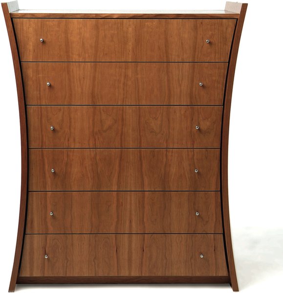
The main limitation of MDF in furniture design is that it usually comes in flat sheets. That’s fine if the furniture being made has flat sides, but it doesn’t work for curved furniture. Curved furniture will use plywood instead of MDF because plywood (which is thin layers of wood glued together with their grains at right angles) is also very stable but can be bent into different shapes.
A disadvantage of veneered furniture is that it can be less durable than other finishes and more difficult to repair. If you accidentally damage a veneered table such that the damage goes through the veneer (which is often under 1mm thick), the MDF or plywood base will be exposed which can look poor. And because veneer is real wood, it’s relatively soft compared with laminate and so it’s not too difficult to take a chunk out of it by accident, especially out of corners.
Similarly, if the veneer gets something spilt on it such that there’s a permanent stain, it can’t always be sanded down and re-finished because you’ll most likely sand straight through the veneer.
So…
6) Tip: Consider the furniture’s use before choosing a veneer.
If the item is likely to get regular abuse (e.g. a table top) or risk being damaged (e.g. by young children), then a veneer may not be the best option, and something in a solid wood may be more appropriate.
7) Tip: Ensure your furniture uses an MDF or plywood base beneath the veneer rather than chipboard.
Furniture that uses chipboard as the base will be low quality. Chipboard is cheap and damages easily and so, when combined with a wood veneer that is also relatively soft, you end up with furniture that will damage and deteriorate quickly and easily. If you are working to a limited budget, then a chipboard base will certainly keep the price down, but don’t expect your furniture to stay in pristine condition for very long.
8) Tip: Check the veneer grain and how it is ‘matched’.
Veneers are typically made by slicing the tree trunk into strips and then gluing the strips side-by-side. If these strips are badly matched, then one part of your furniture may have a very different grain to another part and this can look a little odd. The more expensive the veneered furniture, the more effort that is likely to be put into ensuring a well matched veneer is used.
Laminate
Often used in flooring, worktops and flat-pack cabinets to imitate a wood finish, laminate consists of several layers, the top one of which is a photographic image of the desired finish. Laminate offers a cheaper option which is easy to clean and can be a good choice if you have a busy home with young children.
9) Tip: Try not to fake it with laminate.
Laminate has its place in a modern home given the multitude of colours and patterns that are available. So don’t be afraid to use laminate honestly to provide funky or single colour furniture that cannot be otherwise achieved. But it's best to avoid furniture that uses laminate to fake a different material such as wood as it tends to look pretty bad.
The only exception here is, confusingly, "laminate veneers". This is where a real wood veneer is laminated to give both the appearance of a natural wood grain with the durability of a laminate finish.
Combining and matching different woods
The wood you choose comes down to personal choice and style, but one thing we’re regularly asked is how to be sure that a new item of wooden furniture won’t clash with an existing one. So we’ll attempt to explain.
10) Myth: Walnut is a dark wood and oak comes in colours from light to dark
Walnut is actually a light purplish wood and oak has definite tones of yellow. Admittedly, there are various species of each but these don’t particularly affect the darkness of the raw timber.
The myth of wood colours is due to the fact that walnut ‘stains’ are typically dark and oak stains come in various different darknesses. The result is that people think this is a property of the wood, but it’s not. This is important because it means that you can’t assume that one walnut item will necessarily match another, because the colour is almost entirely determined by the stain used and not the wood itself.
And one for luck...
11) Tip: Avoid limiting yourself to mixing furniture ranges of the same wood
There’s a temptation that if you already have several items of a certain wood in a room, that you supplement them with more of the same wood. Design-wise, there’s nothing particularly wrong with this, however, an alternative approach is to contrast woods. Wenge is a great wood for this as it normally comes with a very dark brown stain, close to black. So wenge works well with walnut or oak as there’s no chance of clashing. It also works well to mix wooden furniture items with other non-wooden furniture, such as fabric or metal, or with a single colour such as white.
Our guide to the perfect bathroom
Our handy guide is full of hints and tips to help you create your dream bathroom.
Often the smallest room in the home, bathroom planning can be a bit of headache, with dilemmas such as what flooring to choose and whether you should have a shower or a bath raising a multitude of questions. Our handy guide is here to help you through the process and create the bathroom you really want and need.
Planning and measuring
Planning and measuring your bathroom should be fairly easy; particularly if you’re planning on leaving every component, e.g. bath, basin, shower, etc in the same place. It’s then just a simple case of measuring your existing bathroom furniture and making sure everything fits. If you’re thinking of a complete overhaul including moving baths, basins and showers around, then you’ll need to enlist the help of a plumber who will be able to show you exactly what can go where according to where the water supply comes in.
Deciding whether you want a bath or shower really comes down to space and personal choice, but the general thinking is that it doesn’t have to be one or the other. If you have room, opt for both. After all there’s nothing like an invigorating morning or after-gym shower to get you going, while equally you probably want a relaxing bath after a hard day at work.
If you don’t have room for a shower cubicle, consider an over-bath shower. There’s a wide range to choose from which will suit both classic and contemporary schemes. Choosing to have both a fixed large showerhead along with a moveable one attached to a riser is a good idea as the larger fixed head will provide a powerful shower while the moveable showerhead can be used for cleaning and washing hair over the bath.
When it comes to toliets, technology ranges from heated seats to models with jets that will wash your bits and pieces! If you’re happy with a bog-standard (sorry about that) toilet design, the only decision you’ll need to make is whether to opt for freestanding or wall-hung, the latter of which saves valuable floor space. This is the same when it comes to basins; a pedestal basin can look great but one which is hung on the wall will take up less room and make your bathroom feel less crowded.
Basins now come in a plethora of materials from concrete to marble, glass to copper so you’re guaranteed to find one which suits both your budget and your style. Unless you have loads of room or are desperate for one, consider leaving out a bidet – they’re best left to hotels and only take up unnecessary space.
Choosing tiles
When it comes to tiles, the choice is almost endless with hundreds of colours, numerous materials and a wide choice of designs available - again, it really comes down to personal choice and budget. A whole tiled bathroom can be expensive but looks great and is easy to keep clean. If you can’t afford to tile the whole bathroom, don’t skimp around the basin area and ensure you tile as high as you can around the bath. Over the last few years, tile layouts have become increasingly more interesting than simply stacking tiles on top and by the side of each other so, if you want to create an impressive display, think about choosing brick, mosaic or herringbone layouts to add some interest.
If you’re going to have a tiled floor in your bathroom, consider opting for a darker tile (and/or darker grout), which won’t show up every speck of dirt and will be easier to keep clean.
Walls and floors
It’s not just tiles that can bring bathroom floors and walls to life, there’s a whole host of other ways to add pattern and colour. When it comes to flooring, it might sound obvious but avoid carpet – it will only smell mouldy when wet. Rubber, vinyl or specially treated wood/laminate flooring is a good idea and all three come in a wide range of colours and styles.
Walls should be painted with a product designed for the bathroom so it can cope with heat and condensation; there’s a good range of colours available from all the well-known paint manufacturers so you’re bound to find something that fits in with your colour scheme.
If your bathroom is particularly small, consider mirroring one wall, which will add a feeling of increased space and light.
Furniture and accessories
Bathrooms create lots of clutter so storage furniture is a must. Fitted furniture is a good idea if you want to make the most of your space. Look for wall hung cabinets which can be used to hide away all your lotions and potions while shelves or racks can be used to stash fresh towels.
When it comes to accessories, as well as adding the usual toothbrush holder and soap dishes, try decanting shampoos, conditioners and shower gels into pretty glass bottles for a more glamorous look.
Taking care of your bathroom
There’s little point in creating a beautiful bathroom only to not look after it and keep it looking its best. Bathrooms are notoriously prone to damp, condensation and mould which, left untreated, can damage walls and floors, look unsightly, as well as being bad for your health. Ventilation is key to helping prevent mould forming so, if you don’t have a window, make sure you have a powerful extractor fan.
If you opt for an enamel bath, these can easily become chipped; repair kits are available which can make the enamel look as good as new but it’s always best to repair a chip as soon as it appears. It might sound obvious, but regular cleaning will ensure your bathroom looks its best. Non-abrasive cleaners are best, especially when it comes to cleaning chrome and delicate or decorative tiling.
How to add bold pattern
Go brave and find out how to add bold pattern to your home.
If you crave some excitement and are fed up with boring white walls and dull furniture, then read on to discover how you can get a whole new look by adding some bold pattern to your home.
Wallpaper
While it might seem an obvious choice, using wallpaper to add bold pattern to your walls is a pretty fail-safe move.
If you’re wanting to go full-on bold, you can go the whole hog and paper the entire room, which is certain to create a strong style statement. However, selecting a bold pattern in subtle, neutral tones can make it easier to live with.
Take time choosing your pattern to make sure you will still like it a year down the line by hanging large samples of your favourite options before committing to papering the whole room.
Flooring
Good news is patterned carpet is no longer considered naff and, even better, there’s a plethora of designs to choose from. Vinyl flooring also now comes in a range of contemporary and classic designs allowing you to have a different patterned floor in every room in the home from the kitchen to the office!
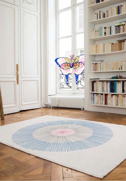
Rugs offer a hassle-free alternative to permanent flooring. Look out for designs which have a bold central pattern, such as a large flower or a repeat geometric print, which work well in both contemporary and classic schemes. Faux animal print rugs can look particularly striking on hardwood floors or a neutral carpet.
Paint
If you thought paint was just for creating plain walls, think again. Paint can be used to create a wide range of bold patterns, which are perfect for transforming your space.
The simplest design to start with, and probably the best for novices, is stripes. Stripes are timeless when it comes to interiors and suit all styles; all you need is a steady hand, your chosen paint colours and some masking tape. Then simply mask the widths of your stripes and get painting.
Thick stripes in two colours will create a bold statement or you could try a candy-stripe effect and paint thinner stripes in a range of colours for a seaside, beach-hut look which works particularly well in the bathroom.
Furniture
Most people play it safe when it comes to choosing furniture, but the odd statement piece or two covered in a boldly patterned fabric can create a strong style statement.
Contemporary and bright patchwork armchairs and sofas are popular and work well when used as an accent piece teamed with other neutral furniture.
Introducing an upholstered headboard for your bed is a great way to bring bold pattern into your bedroom. Team it with bed linen in a complementary colour for a really polished look.
Accessories
If you’re still not feeling brave enough to go for furniture or wallpaper, accessories offer the perfect way to add some bold pattern with minimum fuss and commitment.
There is a huge range of patterned cushions to choose from - from bold florals and psychedelic, retro prints to brave geometrics - so it completely comes down to personal choice.
A patterned throw or bedspread will instantly lift dull chairs, sofas and beds while patterned china is great for livening up a boring dinner table.
The trick with boldly patterned accessories is to stick to the same colour palette so it doesn’t feel too overbearing.
Our guide to the perfect kitchen
Check out our tips for making your kitchen the perfect heart of your home.
Renovating a kitchen can be expensive and, as one of the most important rooms in the home, it pays to get it right. From measuring to choosing lighting and appliances, read on as we take you through a step-by-step journey on how to create the perfect kitchen for you.
Measuring
When renovating a kitchen, correct measuring is essential. After all you don’t want to splash out thousands of pounds only to find the end cupboard door can’t open because there’s a wall in the way. Make sure you have a friend with you as trying to use a tape measure and write numbers down on your own will only lead to confusion. If you don’t feel confident in taking the measurements yourself, get a professional in to do it for you.
Taking pictures of the space can also help you and others working on the renovation, so take quick snapshots of each area, print them out and label with the corresponding measurements. Once you have all the details, you can start planning your dream kitchen.
Planning the layout
There are lots of different kitchen layouts to choose from but whichever you go for, you should ensure that the elements you use together are in close proximity so that the kitchen works harder for you. So, ideally, the sink should be next to the dishwasher, and you should allow a decent sized preparation area next to the hob and oven.
In terms of style, a galley-type kitchen (where units run down either side of the wall) will make the most of a narrow space, while an L-shaped kitchen maximises space using a corner of the room, perfect, for example, if you want to have an open plan kitchen and dining space.
When planning the layout also consider whether you want to incorporate a breakfast bar or kitchen island, or what you want to place in front of any windows. Remember to think about where the doors are and how they open, and where you’ll want to incorporate freestanding appliances.
It's great if you have room to include a kitchen table and chairs, alternatively a breakfast bar with stools works well if you have less space available.
Choosing a style
There is a myriad of kitchen styles available so it really does come down to personal choice. You needn’t feel pressured to choose a kitchen style which fits in with the age of your house - for example a high gloss, contemporary kitchen can look great in a period property - so don’t be afraid to experiment.
You will also need to consider if you would like fitted or freestanding furniture. Fitted furniture is best if you want to maximise every inch of space, while freestanding furniture is great for those who want to give their kitchen a bespoke feel. If you like the idea of both, try mixing and matching, by incorporating fitted base units with open wall shelves and freestanding furniture such as kitchen islands and pantries.
Think carefully about what you’re going to use your cupboards and drawers for before deciding on your configurations. For example, deep drawers are often better as a hiding place for big saucepans and dishes than cupboards, while dividers for your drawers are essential if you want to keep them clutter free.
Picking appliances
There is a plethora of kitchen appliances available, so what style you choose again comes down to personal choice. Go for the biggest fridge and freezer combination you can and, if you don’t have room for both, consider housing your freezer in the garage, utility room or basement – ditto the washing machine.
There can be a desire to buy every small appliance you can lay your eyes on but, to avoid cluttered worktops and cupboards full of once-used bread makers, try and stick to just what you need.
A colourful kettle and toaster will add a pop of colour and interest to your kitchen and remember to leave plenty of worktop space for appliances which get regular use, such as mixers and coffee machines.
Flooring and lighting
Flooring in a kitchen should be super easy to keep clean and as waterproof as possible, so it may be worth opting for vinyl, rubber flooring or tiles. Another option, which has become popular in recent years, is concrete floors - these can be expensive, but are a great option if you want to achieve an industrial-style kitchen.
Getting your lighting right in the kitchen is vital. Maximise the most of your natural light by getting rid of unnecessary window treatments and think carefully about where to put your electric light. If you have mounted wall units, installing lights under these is the perfect way to illuminate worktops, while having spotlights, which can be directed towards your hob and oven, are a must.
Pendant lights can look particularly striking when hung in a row above a kitchen island while wall lights can work well in a dining area to create an atmospheric glow.
Editors Choice: Our favourite wardrobes
Keep your glad rags organised beautifully with our pick of the best wardrobes around.
Wardrobes are essential bedroom kit, that’s if you don’t like your clothes covering the floor, chair, bed, etc, and being the stylish lot we know you to be, we’re guessing you don’t.
Before you get stuck into choosing one on its style credentials, consider what your practical needs are first. For example, if you haven’t got room for a separate chest of drawers, then a design that incorporates drawers is a must. Or do you own lots of long dresses which you need to keep pristine? Then one with a high hanging rail will stop them from draping on the floor.
We’ve chosen our favourite three and given you the lowdown on each of them, so all you have to do now is pick the one that’s right for you.
The Slimline One
Being short on space doesn’t mean having to compromise on style, and this Hanoi Slim Black Lacquer Oriental Wardrobe (see above) ticks the boxes both for looks and for practicality. Its slimline profile means you can squeeze it into even the tightest of spaces without having it dominate your bedroom.
Made from solid wood, it’s been finished with an understated black lacquer complemented with subtle brass handles, which makes it a fantastic option for a sophisticated oriental style boudoir.
Inside there’s a generous hanging rail for clothes as well as two shelves, one which can be removed to give you more height for shoes and boots should you need it.
Also available in a white lacquer finish, this sleek and stylish wardrobe is part of a wider bedroom collection which includes a chest of drawers, console/dressing table and mirror.
The Guest Bedroom One
Guest bedrooms often lack one crucial piece of bedroom furniture - a wardrobe! How many times have you stayed with a friend or family member and found yourself desperately searching for somewhere to hang your clothes, or felt guilty that your own visitors have had to live out of their suitcase?
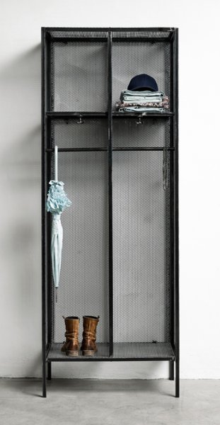
This Industrial Open Wardrobe by Out There Interiors is the perfect model for a guest bedroom. Narrow in dimension, it will easily slot into even the tightest of alcoves and the smallest of spare bedrooms.
Ideal for those who want to inject a bit of industrial style into their scheme, this open-fronted wardrobe is reminiscent of changing room lockers – but in a good way.
There’s plenty of room for guests to hang their clothes on the rail, and two shelves - one perfect for jumpers and tops, and the other for shoes - which means it really is the only piece of furniture you need in your spare room.
The Versatile One
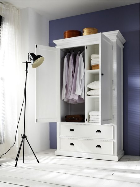
As wardrobes go, this one is a bit of a beast, and is the next best thing if you don’t have space for a walk-in wardrobe.
Made from solid wood, this timeless piece is probably best suited to a classic scheme but could work well in a more contemporary bedroom when teamed with vibrant punches of colour.
Style aside, this wardrobe will be an utter godsend if you have lots of clothes to store.
With an generous interior, there’s plenty of space for even the bulkiest of winter coats and jumpers so you needn’t worry about having to find somewhere else for out of season clothes.
Split into hanging rail space and shelves means there’s tons of room for hung or folded items, while the two bottom drawers can be used to stash tops and underwear.
Our guide to storage
Get your clutter sorted with our handy guide to storage for every room in the home.
No one likes a messy home but keeping it neat and tidy can be difficult and frustrating, especially if you are short of space or don’t have the right storage. Our handy guide shows you how to make the most of your space to keep it clutter free from the living room to the hallway.
Living Room
Shelving units or bookcases are essential for keeping books in an ordered fashion, while a sturdy magazine rack will keep your papers and favourite monthlies neatly stored.
If you’re lucky enough to have a real wood fire or stove, invest in a large basket to keep your logs and kindling neatly stored yet close at hand.
Those who are short on space, or who want their storage to work harder, should look for clever dual-purpose pieces. These include coffee tables with hidden storage or footstools whose lids lift up to reveal space to stash everything from out-of-season throws and cushions to magazines and paperwork.
Dining Room
A decent sideboard is an essential piece of dining room kit, especially if you entertain a lot. As well as providing surface space to display favourite accessories, it will help to keep your formal china and cutlery separate from your everyday dining items, and give you more room in the kitchen.
If you don’t have room for a floor standing design, opt for a wall-hung version, which is a great alternative and will still provide you with ample storage space.
Kitchen
Most kitchens have lots of cupboards and drawers, which are great for keeping all manner of clutter neatly tidied away. Make your cupboard space work even harder by placing items that you only use occasionally at the back of the cupboard and everyday items at the front. Open shelves work equally as well to stash plates and serving dishes as well as non-perishable food stuffs.
If you don’t have cupboard space for fruit and vegetables, consider opting for a freestanding vegetable rack. And when it comes to utensils, if you’re short on drawer space, look for pretty pots and holders which can keep everything near to hand, and keep knives safely stored in a drawer or within a worktop knife block.
Hallway
If you have the room, a console table is a hallway must-have for keeping post and other hallway paraphernalia neat and tidy. If your hallway is narrow (as most are), a deep wall-mounted shelf is a good alternative to a traditional console table. To ensure coats, jackets, hats and scarves are kept neatly in check, install strong coat hooks along one wall and add baskets or shoe racks to keep the area clutter free.
Bedroom
Supplementing essential bedroom storage such as wardrobes and chests of drawers is a great idea to keep your boudoir looking neat and tidy. If you have space under your bed invest in specially designed boxes and crates, which can be pushed under to store out-of-season clothing and bed linen.
If you get fed up with your necklaces getting tangled in dressing table drawers, make a feature of them by using a pretty row of hooks and displaying them on a plain wall. If space is limited, look for multi-functional furniture such as bedside tables with drawers and shelves or tallboys that incorporate mirrors so you won’t need an separate dressing table.
Bathroom
Often one of the smallest rooms in the home, it can be hard to keep bathrooms free of clutter. If you’re short of floor space, wall hung storage is a great solution. Whether you opt for closed cabinets or open shelves, try making the most of your space by utilising the area over the basin to keep all your lotions and potions neatly stored.
Finding room for towels can be a nightmare especially if you don’t have an airing cupboard; to solve this problem, try keeping your neatly rolled towels in check by storing them in cube shelves. Finally, over-the-door hooks provide the perfect place for stashing bathrobes and towels, which are in regular use.
Shop the look...
Clever ways with walls
We show you some great ways to breathe new life into your old walls.
Walls really don’t need to be boring - so, if you’re finding yourself reaching for the old fail-safe white paint again, stop and read on to find our tops tips for livening them up.
Wallpaper
Wallpaper may seem like an obvious choice, but it’s only for the past decade or so that covering your walls in paper has been back in vogue. Papering a whole room in a small-scale pattern won’t feel suffocating, but if you’re brave with your decorating you can choose to go the whole hog and use a bold pattern. Alternatively, consider papering alcoves or behind bookshelves, and paint the rest of your space in a complementary colour.
Framing wallpaper is also a good option and doesn't involve having to commit paper to wall permanently, making it the perfect choice for those living in rented properties. Simply frame off-cuts of patterned wallpaper in varying designs but in the same colourway, place in plain frames and display on a wall in a random fashion.
Wall Stickers
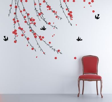
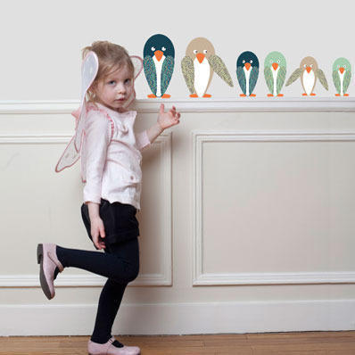
Wall stickers offer a great alternative to wallpaper, and are relatively fuss free to use. They come in a myriad of designs, colours and themes. In fact there are so many available, the hardest part is deciding which design to go for!
If you have a large plain wall, bring it to life with a mural wall sticker, which will create a strong focal point, while inspirational quote wall stickers are great for home offices or anywhere you need a bit of encouragement.
Paint
The 1980s gave us rag rolling, stencilling and stippling but paint effects, thank heavens, have moved on. Today’s styles are far bolder and fresher but work equally as well in both contemporary and classic spaces.
Stripes are a popular choice and work well in rooms throughout the home. As a rule of thumb, horizontal stripes will make a space appear larger while vertical stripes will create a feeling of increased height. To achieve this look, a good quality masking tape is an essential piece of kit. Use it to mask how wide you want your stripes to be, and paint over the exposed part of the wall in your chosen colour(s). Once you've finished painting, you then need to carefully remove the masking tape to avoid causing any damage to the base colour or your stripes.
Artwork
Artwork is such a personal choice that we wouldn’t dream of telling you what to choose, but whether you opt for original prints, reproductions or posters or even your own designs, walls are instantly lifted with a piece or two of artwork.
Creating impressive displays using a selection of prints isn’t as daunting as it sounds. Simply choose your prints or photographs, select a collection of different style frames in the same or similar hues and frame your artwork. Then lay the frames out on the floor until you're happy with your display, take a quick picture and replicate the layout on the wall. Voila, you have an art display worthy of a gallery and a newly refreshed wall.
Decorative Tape
Forget using them to wrap up presents, decorative tapes are big news when it comes to interiors and are perfect for applying to walls, especially for those looking for a temporary solution.
There’s a plethora of designs and colours available, which work well for both contemporary and classic schemes so the only thing you have to worry about is what works for you.
Use scissors to cut your tape to size for a polished look or carefully tear them for a more rustic look; then apply them to create decorative focal points on walls or use them to frame pictures or prints.
Editors Choice: Our favourite coffee tables
Finish off your living room perfectly with our pick of the best coffee tables.
Coffee tables are an essential bit of kit for a living room; not only do they provide the perfect spot for, well, your cups of coffee, they can also be a handy place to store the TV remote, display your favourite magazines and, if you really like showing off, house your favourite design books.
We’ve picked three of our favourites to review and give you the lowdown, so all you have to do now is choose which is right for you.
The Retro One
Mid-century inspired furniture has been the big hitter these last few years and continues to be a strong trend. Alexander and Pearl has a great collection, giving you the look without having to endlessly trawl flea markets and auctions houses.
Amid their collection is this lovely Vintage Oval Coffee Table (see above) which screams 1950s Mad Men style effortlessly. Made from solid American White Oak, the table has a generous sized top, which provides plenty of room for all your living room essentials.
There’s no added storage space with this table, so you’ll have to be super strict on the clutter but it's bound to become a piece of furniture you’ll treasure for years to come.
The One With Storage
Living rooms are meant to be just that - for living. No one wants to live in a show home or a museum, but keeping your living space clutter free can be tricky.
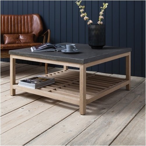
This Manhattan Loft Square Table by Viva Lagoon ticks all the boxes; it’s both stylish and practical, and will help you keep everything neatly stashed away.
Underneath, there’s a generous, sleek but stylish slatted solid French oak shelf which is perfect for stashing your books, mags and TV remotes. While up top, this understated table has been finished with a concrete resin top, which adds a distinctly industrial feel.
As well as being good looking, there’s plenty of room to display your favourite books, house a cuppa while you have a natter with friends and there’s even space to display a vase full of fresh blooms if you wish.
The Super Cool One
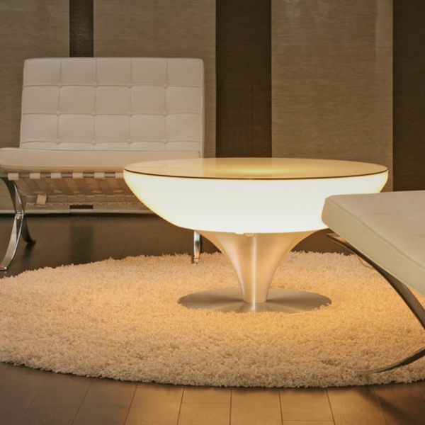
We love clever, innovative furniture here at Furnish and we have a whole host of it, but this Lounge Table by Naken Interiors is one of the cleverest pieces we’ve seen for a long time.
Resembling something from a 1960s sci-fi series, this seriously cool table is perfect for those looking for something a little different when it comes to decorating the home.
Available in a range of sizes, this ultra cool coffee table has built in LED lights, which gently illuminate the top of the table. Finished with a stainless steel curvaceous base, this table is ideal for creating a strong style statement and looks great when teamed with sleek contemporary furniture.
Looks aside, this table is super practical too, with plenty of room on top to house all your living room essentials while the elegant shaped based won’t take up too much precious floor space.
Colour combination: Yellow/grey
Colour combinations can be tricky, but yellow and grey is a match made in heaven.
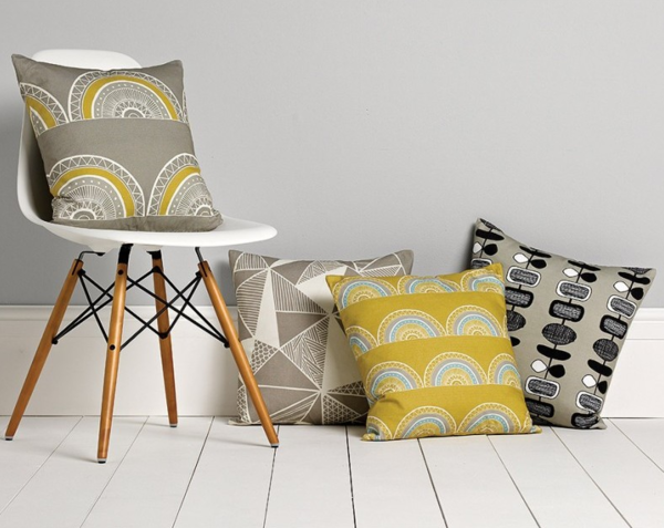
There are probably hundreds of scientific reasons why yellow and grey go together so well, involving contrast, balance, tone, etc. but the simple fact is that no matter what shades you use, they work together brilliantly. They seem to work in any room in the house from the bedroom and the kitchen to the living room and hallway and, to top it all, this colour combination suits both classic and contemporary schemes.
Whether you choose a dark charcoal and neon pop or a subtle primrose and dove grey, our handy guide shows you to how to make it work in your home.
Furniture
Having a favourite piece of furniture re-upholstered in a yellow or grey or combined fabric is a great way to incorporate this colour team into your home. Make sure you check that your chosen fabric can be used for re-upholstering and enlist the services of a experienced upholsterer to carry out the work.
Alternatively, there’s a huge range of yellow or grey furniture available which can combine to create a truly striking scheme.
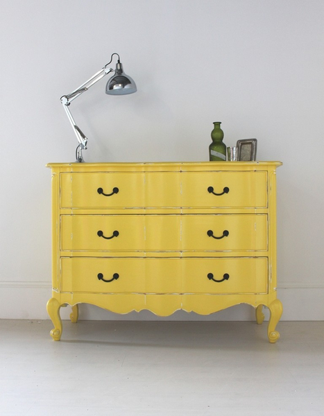
Options such as a grey sofa with a glossy, yellow side table or armchair, painted grey dining table with painted yellow dining chairs, or a yellow upholstered bed with grey bedside tables all also work well with the colours reversed.
Walls
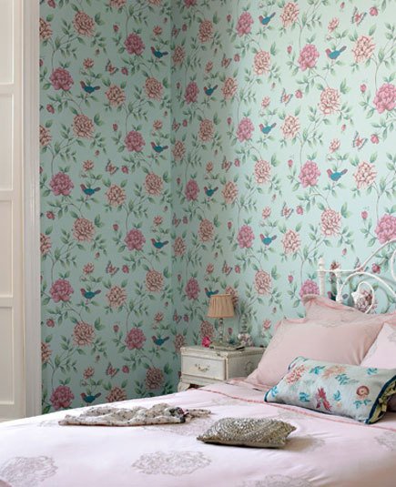
Yellow and grey wallpaper is the easiest way to inject this colour combination onto your walls and there’s a plethora of both classic and contemporary designs available.
Similarly, using paint on your walls is an easy and extremely effective way to incorporate the colours into your scheme. When it comes to ideas with paint, the list is almost endless but painting the walls in grey and the woodwork in yellow creates a striking effect, as does using masking tape to create alternating wide stripes in the two colours. If you favour one colour over the other, use that to create a bold statement by painting a chimney breast or alcoves to create a focal point.
Floors
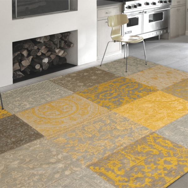
Grey flooring is far more forgiving than yellow, so it’s best to use flooring designs in the darker colour. That doesn’t mean you can’t highlight and accent with details - a yellow rug on top of a dark grey carpet can create a striking look and provide a much-needed pop of colour.
If you’d rather avoid using carpet, painting floorboards grey and combining with a yellow painted trim or skirting board looks equally impressive. Make sure you use paint intended for floors to get a really professional finish, and avoid choosing high traffic areas such as hallways and kitchens.
Textiles
When it comes to choosing window treatments, a combination of yellow and grey works well all-year round. Try layering the colours at your window by choosing a blind in either colour and complementing with curtains in the other.
Other ways to use textiles to incorporate this colour duo into your home include using yellow cushions on a grey armchair or sofa, using a grey throw to cosy up yellow bed linen or adding pops of colour to a bathroom by storing towels in both colours on a towel ladder.
Accessories
If an all yellow and grey scheme isn’t for you and you prefer white walls but still want to add this great colour combo into your scheme, using accessories is a simple and effective way to achieve this.
Try grouping together yellow and grey ornaments on a white mantelpiece to add colour and interest, or brighten your walls by painting varying sizes and styles of photoframes with yellow and grey paint to create an eclectic gallery effect.
When it comes to the dining table, layering plates and bowls in the two colours is simple yet striking, and looks particularly effective when used on top of a white table cloth or plain wooden tabletop.
How to style your home for summer
Hints and tips on how to get your home ready for summer.
A new season offers the perfect excuse to update your home interior and add some summertime touches. Here are some great tips and ideas to give your home a fresh look.
Wallpaper
While we’re not suggesting you re-paper your entire home, choosing to refresh the wallpaper in a bedroom or living space will give your home a much needed summer boost. Look for light colours and patterns, which you can use with complementary paints and other furnishings to create a cohesive look.
If you don’t want to wallpaper your walls, why not try papering the inside of a cupboard or lining a bookcase or display unit to freshen up your furniture. Using new wallpaper needn’t be a permanent choice either; try framing off-cuts of patterned wallpaper in similar hues, framing them and creating an interesting and eclectic display that can be changed with the seasons.
Paint
Changing your wall colour is a great way to ring in the new season. Don’t feel you have to stick to traditional colours, but opting for a sophisticated pastel or bright shade will help inject some of the new season into your home. As with wallpaper, paint isn’t just for walls so why not revamp a tired piece of furniture with a lick of paint or give some old accessories a new look by spray-painting them.
While paint effects such as stippling and colourwashing may well belong in the 90s, consider using tape to mask off areas and create stripes or geometric patterns which is a great way to update a wooden table top or blanket box.
Floors
Flooring can be expensive to replace so if you don’t want to rip up your carpet or hardwood flooring, consider using rugs in soft shades and materials to give your floors a lighter feel.
If your wooden floorboards have seen better days, painting them in a neutral colourway is a perfect way to celebrate the new season and help increase the feeling of light and space.
Make sure you use a professional floor paint to avoid chipping. If your floorboards are in good condition, whitewashing them will give them a nautical feel.
Window treatments
Summertime is the perfect time to ditch heavy window treatments and go for something much lighter. Blinds are a good option as you can control the amount of light you let in, while curtains should ideally be light cottons or voiles in neutral colours and patterns to make the most of the extra daylight.
Shutters work well too, but be sure to go for ones which have been painted in light colours and can be adjusted. For rooms where you want extra privacy such as the bathroom but don’t want to cut out any extra light, consider using window film, which is available in a range of patterns and styles.
Bed linen
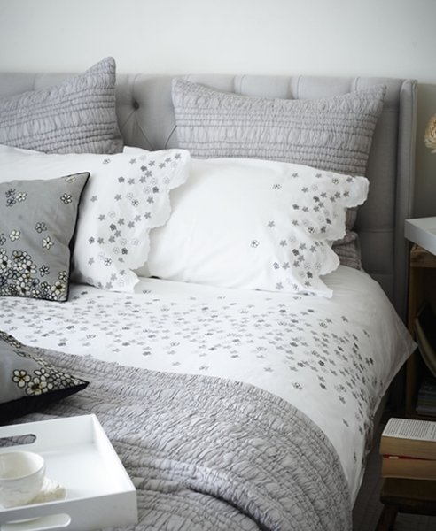
Summer means it’s time to get rid of all those heavy throws, quilts and cushions and lighten up your bed linen. Look for natural, breathable materials such as cottons and linens when it comes to duvet covers and pillowcases, and choose light colours such as sophisticated neutrals and subtle nudes.
It’s time to put your velvet and woolen cushions away too and instead opt for lighter materials and patterns to give your bed a lighter look that’s still super comfortable. And don’t forget to change your duvet too; all those months with a high tog will be a distant memory as soon as the temperatures start to get higher.
Our guide to the perfect home office
Create a productive yet pleasing space for the perfect home office.
Whether you work from home or just want somewhere stylish to sort out your paper work, our handy guide shows you how to create the ideal home office.
The desk
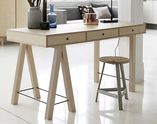
There’s a plethora of desks available in a huge range of styles, so the first choice you need to make is whether you want something classic or contemporary, simple or funky. Once you’ve decided on the style, it’s time to think about size. Make sure you carefully measure the room you’re going to use for your home office as it’s important you have space for all the other furniture you’re going to need.
Next think about the surface area; with monitor and keyboard (if you have a desktop computer), accessories and storage trays all jostling for room, you need to ensure you have enough space. Also consider whether you want a desk with drawers, they can be handy and provide extra storage but can also limit under desk space and provide a tempting place to hoard clutter.
The chair
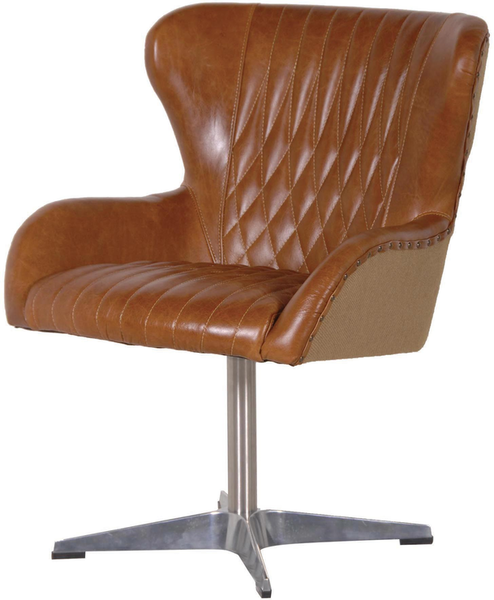
The most important thing to consider when choosing your chair is comfort especially if you’re going to spend a lot of time sitting in it.
Choosing one with wheels means you’ll be able to easily manoeuvre around the room, and opting for one which can be adjusted height wise means you can get one that’s just right for you.
When it comes to style, that’s purely down to personal choice but adding a bright or leather chair offers the perfect way to add some interest and a pop of colour to your scheme.
Storage
Plenty of storage in a home office is essential, especially if you’re using a small room. A sturdy filing cabinet is a good idea - be sure to choose one that can be locked if you need to store confidential paperwork. If you don’t want to take up lots of floor space, consider wall shelves or wall-hung storage units as an alternative.
Magazine files and storage boxes are a must for keeping paperwork, magazines, documents and other bits and bobs neat and tidy. House near your desk or on shelving units and make sure they’re labelled so you can see what's in them at a glance.
Lighting
Getting the lighting right is essential, especially if you’re going to be burning the midnight oil! If your room doesn’t have a window, opt for a central light with a bulb that mimics natural daylight. When it comes to desk lamps, there’s a huge range of styles to choose from but it’s well worth choosing one that’s adjustable so you can direct the light just where you need it.
Accessories
This is the fun part! The best thing about having a home office, especially one which you work from on a daily basis, is that it doesn’t have to look like your usual run-of-the-mill office.
Brighten up the walls by choosing a fun colour or patterned wallpaper, and add favourite artwork, not forgetting to add an interesting calendar so you can keep track of your important dates and appointments.
Resist the usual desk accessories and instead choose pretty or unusual vases, ceramic tumblers or mugs to house your pens and pencils while paperclips, rubber bands and the like can be housed in vintage trays and dishes. Finally, a throw on the back of your chair is a good idea so you can keep cosy when working late.
How to spruce up a rented home
Update your rented space with minimum fuss and cost.
More and more people are renting these days, but living somewhere that’s not strictly your own doesn’t mean you can’t make it feel like home. Our guide shows you how to transform your space from boring magnolia to a home you’re proud to show off.
Walls
While some landlords will let you paint the walls (if you ask nicely) quite a few won’t allow it. But all is not lost as there are lots of ways to transform your walls without ever reaching for a paintbrush.
Wall stickers are a great choice and can be applied and removed with minimum fuss. Whether you choose to opt for a whole wall mural or transform a small section of one of your walls, they instantly breathe new life into a scheme.
If you’re smitten with wallpaper but it’s strictly banned, framing it is a good way to incorporate it into your scheme. Look out for off-cuts of your favourite designs in complementary colours, frame them in charity shop frames in varying shapes and sizes, and you will have created your very own piece of artwork.
Rugs
Rented properties have a history of having either really dull or really hideous carpet.
Using rugs not only makes a space feels more cosy, but they’re great at hiding a multitude of carpet sins such as red wine stains and threadbare patches.
Fun and funky rugs work really well and provide the perfect basis for a room’s colour scheme. To pull your look together, pick accessories such as cushions and throws in accent colours from the rug.
Great for the living room and bedroom, a cheerful runner will also instantly improve a dull hallway. However, think carefully about what colour rugs you choose to use where. A pale rug is fine for the bedroom but is a no-no in high traffic areas such as living rooms and hallways. For these areas choose a patterned design or perhaps a dark colour.
Art Work
Prints and posters offer an ideal solution to brightening up a scheme. Whether you opt for a huge canvas or a series of smaller, complementary prints, it’s the perfect way to spruce up a boring wall and really add some personality to your scheme.
If you’re short on cash and are feeling creative, using favourite snaps of places, friends and family is a great alternative. Montage frames allow you to display a multitude of pictures in one handy frame or if you’re feeling imaginative, you could try creating your own eclectic display using different shaped frames.
Accessories
From cushions to candlesticks, a well chosen, well-placed accessory can make all the difference to making somewhere feel like home.
If your sofa comes with your house or flat, then a couple of throws and cushions will give it a fresh look and make it extra comfy. Choose two or three complementary colours or stick to using varying shades of the same colour to create a real statement.
Mantelpieces and sideboards are perfect for displaying your favourite vases, photo frames, candles and other trinkets. Copy a well-known interior designers’ trick and group items in threes to create a really stylish look.
And if all else fails, plants and vases full of colourful blooms work well. A bunch of fresh flowers each week needn’t break the bank so long as you choose ones that are in season.
Finally, a clock is not only practical but can brighten up a plain wall in a flash. To create a bold statement, go as large as you dare and if you favour the retro look a gold starburst clock looks particularly impressive.
Garden furniture reviewed
Get your garden ready for summer with our pick of outdoor furniture.
While the Great British Summer usually comes and goes in the blink of an eye, getting your garden ready now so you can make the most of it when the sun does appear is essential. Here we've chosen three different options and given you the lowdown so you can choose the one that's right for you and your space.
Great for entertaining
The Italian Essence Reclaimed Teak Garden Dining Table and Chairs Set by Viva Lagoon is the perfect choice if you have a large family or plan on doing a lot of entertaining this summer. It is a great investment buy as it’s both sturdy and super stylish, and is available in a choice of four, six or eight chairs, so that you can choose the exact seating configuration to suit your needs.
Made from reclaimed teak and aluminium, the generous teak tabletop sits on a sleek aluminium frame. The all-white chairs, meanwhile, are understated yet stylish and beautifully complement the table. Crafted from all-weather Textilene, they can be left outdoors even when the weather takes a turn for the worse meaning you don’t have to worry about finding room to store them.
Top style tips: Brighten things up with patterned, colourful melamine plates and bowls, acrylic glasses and a funky oilcloth tablecloth, or keep it sleek and sophisticated with white linen napkins, elegant glass tea light holders and contemporary white china.
Great for relaxing
Garden furniture used to be a simple choice between iron, wood and plastic, and most sets consisted only of a dining table and chairs. However, garden lounge furniture has been increasingly popular and is great for those who want to relax.
If you’re a fan of comfort and want to create an outdoor living room, then look no further than this Shawna Two Seater Rattan Sofa Set by Out There Interiors, which beautifully mimics living room furniture but for your outside space.
Perfect for relaxing on a lazy, sunny Sunday afternoon with the papers, this comprises a sofa, two armchairs and a coffee table. This furniture set is crafted from all-weather synthetic rattan with generous cushions which have been made from shower-proof fabric so you won’t have to make a mad dash for it with them should the heavens open.
Top style tips: Ideal for a decadent, al fresco afternoon tea, choose pretty, vintage style floral tableware and lace trimmed napkins to complete the look and of course, don’t forget the cakes!
The clever one
We love clever furniture here at Furnish and you don’t get outdoor furniture much cleverer than this Garden Trough Dining Table by The Orchard.
Simple and understated, this chunky and substantial set is made from Canadian Yellow Pine and is finished with a clear, protective varnish. While matching benches are also available, if you want to create an eclectic look try teaming the table with brightly coloured, metal chairs and stools.
But what’s really special about this table is the sunken zinc trough which sits neatly in the middle of the table. Great for growing herbs in, this clever trough can also act as an ice bucket; simply fill with ice and use it to keep soft and alcoholic drinks nicely cool – perfect if you can’t be bothered to keep heading indoors to visit the fridge.
Top style tips: When not in use as an ice bucket, keep small colourful potted plants in the trough to add colour and interest or use to house pillar candles to create a special effect when dining al fresco in the evening.
Guide to creating the perfect dining table
Check out our tips for creating a delectable dining table.
Whether it’s for a casual weekday supper or for something a little more formal, our top tips show you how to create a dining room table to be proud of.
The dining table and chairs
There is, of course, a plethora of choices when it comes to choosing your dining room table and chairs. From solid wood to glass and metal, it really comes down to personal choice and available budget.
Once you’ve settled on a style, it’s important to think about how you’ll use it. If you have a small family but entertain a lot, investing in an extendable table is a good idea. If you do go for this option, look for additional chairs that can be stacked or folded away when you don’t need them.
The most important thing to consider when it comes to the dining chairs is comfort. Once you’ve got that sorted, you can choose designs which match your dining table for a cohesive look or those which contrast for something a little more eclectic. Brightly coloured painted wooden or plastic chairs can look great with a wooden or sleek gloss table.
Table linen
While you might not use table linen everyday, it’s a good idea to have an assortment of choices on hand. Plastic coated tablecloths are ideal for young families as they can be wiped clean after every mealtime and come in a variety of designs and colours to add interest to your table.
For more formal occasions and those times you really want to impress, a linen tablecloth and napkins are a must. With a huge range of patterns and colours available, it can be hard to choose but white or off-white linen always looks stylish and works in both contemporary and classic schemes.
If your dining table is particularly precious, think about investing in a table protector, which will safeguard against any knocks, spills and burns.
Cutlery
Choosing hard-wearing, dishwasher-safe cutlery is a good bet for everyday use. If you fancy something a little grander for supper parties and special occasions, there’s a huge range to choose from, whether sleek, modern designer styles or ornate, classic collections.
If you want to create a vintage look, consider collecting a mish mash of designs from second hand shops. Cutlery that is only going to be used occasionally should always be stored in a felt-lined box to prevent it from getting damaged.
Glassware
When it comes to special occasions, it’s important to think about what glassware you’ll need. Red and white wine glasses are essential, plus tumblers and jugs for water and soft drinks. Strictly speaking, clear glass looks the most stylish but coloured glass can look good if you’re going for a particular theme.
Tableware
From the all-important plates to bowls and serving dishes, choosing your tableware is where your style personality can really come into play. White tableware looks the chicest whatever your style but if you want to add some colour and pattern, think about adding side plates and serving bowls and platters in different colours and styles.
For an impressive dining table, try layering soup course, first course and main course plates and bowls in varying colours or patterns to give a restaurant feel.
Accessories
Flowers look beautiful on a dining table, especially for special occasions. Opt for low vases and think about the height of flowers so you don’t have guests straining over them to see one another.
Placemats are a good idea for both everyday and special occasions; as well as protecting your table they’ll also add pattern and colour while candlesticks are great and instantly pretty up a dining table. Apply the same principle as flowers and make sure they’re low enough for guests to see over.
A smattering of tealights is an affordable, hassle-free way to create a simple yet stylish display.
Editors Choice: Our favourite bedsteads
Searching for the perfect bedstead? Here’s our top three, and what makes them stand out from the crowd.
We've scoured our gorgeous range of bedsteads and put them under intense scrutiny. Here’s our top three, and what makes them special.
Everyone loves sinking into a comfy bed at the end of a hard day, but having a comfortable mattress doesn't mean you have to compromise on style, as our selection of stylish bedsteads prove. So it’s time to ditch the divan and use your bed to create a statement in the bedroom with our pick of the best bedsteads around.
Best for…contemporary cool
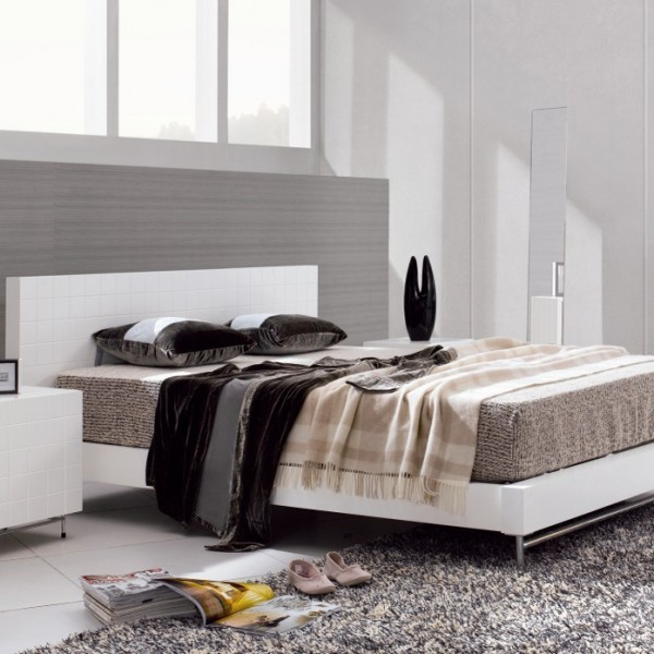
This simple yet ever so stylish Barcelona White Bed by Coco Male (see above) screams hotel chic.
With sleek lines and a high gloss white finish, this super cool bedstead offers a minimalist way to create a striking style statement in the bedroom.
Generous in size, the bedstead comes complete with sprung slats, which ensure your mattress is kept in place securely and gives you a great nights sleep, while the headboard features an understated grid design which adds subtle texture and pattern.
And if white’s not your colour, you’ll be thrilled to hear the Barcelona is also available in walnut, and the range includes a matching bedside table, mirror, wardrobe and console/dressing table so you can create a cohesive look throughout your scheme.
Top tip is to keep your decorating clean and simple to complement the sleekness of this bed and add in pops of colour by using attractive cushions on the bed and statement artwork on the walls.
Best for…classic style
Cane bedsteads have been popular for centuries but can be a little fussy in their design.
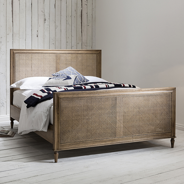
This Classic Weathered Cane Bed by Primrose & Plum is far from fancy and is ideal if you want to add a classic look to your bedroom but like to keep things simple.
Perfect for a modern country bedroom, the bed is made from solid ash and features a simple yet elegant handwoven cane head- and foot-board, which have been gently weathered to give a sophisticated, shabby chic look. Available as a king size, this large bed is perfect for creating an elegant style statement and will add a stylish focal point to any bedroom.
A great styling tip with this bed is to use delicately patterned wallpaper in subtle colours such as a faded floral or simple stripe design, with elegant white bed linen and textured cushions and throws.
Best for…French chic
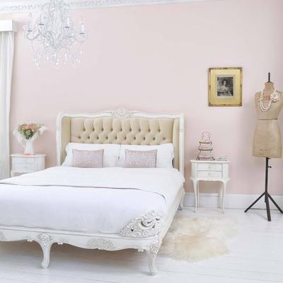
If you love French-style furniture and regularly channel Marie Antoinette when decorating your home, then this Provencal Velvet Upholstered Bed by The French Bedroom Company is just the thing for you.
Perfect for adding a vintage touch to the bedroom, this elegant bedstead is finished in a simple ivory paint and features intricate carved wood detailing on the head- and foot-board. The real piece de resistance however, is the decadent headboard.
Gently curved, the high headboard has been covered in sumptuous neutral velvet which has been gently buttoned and adds the final grand touch to this glamorous bed. And if you love the classic French look, you’ll be pleased to hear this bed is also available with a matching choice of bedside tables, dressing table, chairs and storage options.
To make the most of this luxurious bedstead team it with a sophisticated pastel colour palette such as dusky pinks and elegant greys, keep bedlinen simple by choosing a subtly textured white design, and choose a mohair or silk throw to add an additional touch of glamour.
Guide to creating the perfect kid's room
With our handy guide, decorating your kid's room is as easy as ABC.
Decorating your little one’s room needn’t be a chore. In fact, with our handy guide of what and what not to do, it’s as easy as ABC.
Walls
Making sure walls are bright and interesting should discourage little people from grabbing the nearest marker and decorating the walls themselves! There’s a huge range of child-friendly wallpapers available to instantly brighten a scheme, or you could opt for wall stickers, which are much easier to install than wallpaper, and are easy to change and replace.
When it comes to paint, look for those which are washable and scrubbable so you can keep your paintwork looking as good as new even after attacks from sticky little fingers.
Furniture
A child’s room needs plenty of storage for clothes, books and toys. Choose furniture which will grow with your little one, for example a wardrobe with moveable clothes rails that can be adjusted as your child grows.
The bed is all-important so opt for sturdy designs which can withstand rough and tumble; a truckle bed is a good option if your child often has friends over to stay, while a design that incorporates a desk or seating area is a good choice for older children.
If you don’t have room for a traditional desk, look for those that can be folded away or are wall-hung to save on space and make the room work harder.
When it comes to storage, look for boxes which can be stacked so they don’t take up valuable floor space. Clear boxes are a great idea as they allow you to see the contents at a glance but, if seeing your clutter puts you off, try wooden boxes which have chalkboard labels allowing you to scribble their contents on the side.
Flooring
Flooring for a child’s room is a bit of a Catch 22; on one hand you want it to be comfortable in case of any falling little knees but it also needs to be easy to clean. Rubber flooring is a good option as it’s soft enough to feel comfortable yet extremely easy to clean.
If you choose to have carpet, go for dark, bright colours or patterned options which can hide a multitude of sins, avoiding anything with a deep pile which can make cleaning tricky. Natural flooring such as sisal and coir may be a bit too rough underfoot for a child’s bedroom and doesn’t lend itself to be played on. If you opt for wooden or laminate flooring, remember to add a brightly coloured, patterned rug for increased comfort.
Accessories
Choosing accessories for your child’s room can be extremely enjoyable, especially if you get them involved too. If they’re old enough, work with them to create moodboards of how they would like their room to look and choose accessories together.
Prints and framed posters offer a good way to brighten up a wall while patterned and colourful cushions and throws are great for adding interest to plain bed linen.
When it comes to window treatments, black out blinds are a must particularly during the lighter months while window film can be a good option for maintaining privacy while still allowing in light.
Lighting
Lighting is important in a little one's room and you should consider various types of light sources. Create a statement with your central light fitting by choosing a decorative pendant shade (there is a plethora of child-friendly designs available) and complement with a bedside table lamp.
Look for designs which offer a soft glow and can be left on during the night to comfort very young children. For older children, a desk lamp is an essential piece of kit; look out for ones which can be adjusted easily so your child can position the light just where they need it.
Editors Choice: Our favourite console tables
Check out our top three favourite console tables.
Console tables are an essential piece of hallway kit. Whether your space is big or small, narrow or wide, a console table not only adds interest to your hallway, but is practical too. From somewhere to keep your post and keys safe to stashing away items you’d rather have out of sight, no hallway should be without one.
We’ve picked our favourite three and put them under the spotlight to help you decide what’s best for your space.
Our top console table for... adding glamour
When it comes to interiors, glamour is back with a vengeance and, while we’re not suggesting you go all Liberace in the home, a touch of glamour here and there will instantly lift your space.
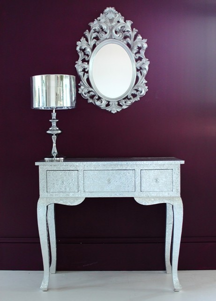
The Embossed Silver Metal Console Table by Out There Interiors (see above) is the epitome of glamour and will create a real statement in any hallway.
Finished in embossed silver metal, this beautiful table has gently curved legs and elegant clear glass handles on the drawers.
But it’s not just stylish, it’s practical too - with a wide tabletop, there’s plenty of room to display all your hallway essentials such as a phone and table lamp. Then there’s the three handy, spacious drawers, which are perfect for keeping everything from phone books and keys to gloves, hats and scarves neatly stored.
Our top tip for using this console table in your hallway is to keep the rest of your decoration simple yet elegant, so combine with subtle patterned wallpaper, sophisticated neutral paint colours and unfussy flooring to let it really stand out and be the focal point of the room.
Our top console table for… adding industrial chic
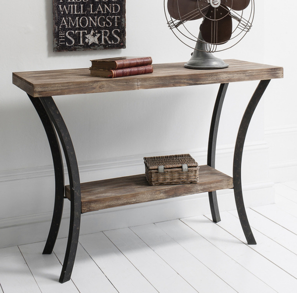
Inspired by loft living and disused factories, the industrial trend continues to be a strong one when it comes to decorating the home, and this Loft Console Table by Alexander & Pearl is a perfect example which would look great in a retro or contemporary hallway.
Crafted with a conscience, this table is made from reclaimed timber, and its simple design is completed by gently curved, metal legs.
Featuring two sturdy shelves, the top one is generous in size meaning there’s ample room to keep even the messiest of hallways neat and tidy. The top shelf provides space for post, address books and other hallway paraphernalia while the bottom shelf could even be used for storing the odd pair of shoes.
While this console table has no drawers to keep your bits and bobs hidden away, there’s plenty of room under the bottom shelf place to some sturdy, metal storage boxes which will give you even more space to store your clutter.
Our top tip for this table is to choose your accessories carefully and opt for a factory-style table light and retro phone to keep the industrial look going.
Our top console table for… a minimalist look
If you like things sleek, simple and ultra modern, the Modern Glass Top Console Table by Coco Male is the perfect choice for your home.
Simple, understated, and very elegant, the brushed steel frame is accompanied by a super sleek glass black top, and is ideal for small spaces as it doesn’t take up too much room.
While there are no drawers to speak of, the tabletop has plenty of space for all your hallway needs, but we suggest keeping clutter to a minimum.
If you do want extra storage in the hallway, a simple, modern coat stand or rack would complement this table perfectly and make sure your space remains clutter free.
Our top design tip for this table is to keep things plain and simple by keeping your paint or wallpaper choices neutral and adding a splash of colour with a modern, sculptural vase.
Get the Look: Hotel Chic
Find out how with our guide to getting the hotel look at home.
Most of us come away from fantastic hotels wishing we could replicate the look at home - well now you can with our guide to getting the hotel bedroom look at home.
While you might not have a maid or 24-hour room service, that doesn’t mean your home can’t look as amazing as any of the best hotels around. With some careful planning and beautifully chosen pieces, your bedroom will soon be given the 5 star treatment.
Beds and bed linen
Typically the stand out feature of hotel bedrooms! When it comes to choosing your bed, it is always worth buying the best you can afford and, with its elegant good looks, the Provencal Velvet Upholstered Bed (see above) is a perfect choice.
If you opt for a divan, choosing a headboard will add interest and turn your bed into a stylish focal point.
When it comes to dressing the bed, crisp white linen is a great starting point. Choose designs with high cotton thread count and add interest by accessorising with cushions and throws in varying colours and textures.
Furniture
Most hotels choose simple yet elegant furniture so copy this look by choosing pieces with clean lines. In addition to the all-important bed, bedside tables, a dressing table and, if room allows, a comfy armchair or chaise longue are essential kit.
Look for bedside tables which have drawers or shelves to keep the top clutter free, and leave plenty of room for a lamp and reading material.
Storage is key to keeping the look luxurious and uncluttered. Fitted wardrobes can be a good option as they take up little room, provide a more streamlined look and are great for hiding a multitude of clutter while a chest of drawers or tallboy provides ample space for stashing away jumpers, tops and lingerie.
Lighting
You’ve probably noticed that hotel bedrooms tend not to use central or overhead lighting fittings. If they do, they are usually discreet, recessed spotlights which are connected to a dimmer so you can create and control the mood.
Choosing a combination of well-placed lights is key to getting this look right. Bedside table lights are a must; it's best to choose ones that can be adjusted for bedtime reading.
If you don’t have space for a bedside table, choosing a wall-mounted light is a good option. Wall lights are often used in hotel bedrooms and can work just as well at home. Look for uplighters in materials such glass and porcelain which gently diffuse the light and create a warming atmosphere.
Accessories
Mirrors offer a great way to brighten up a plain wall. Hotels often choose large, decorative ones to create a focal point in the room and this is an easy look to replicate at home. Choosing a classic freestanding design is also a good idea and can instantly update a dull corner.
Choosing artwork is where you can really show off your personality. Most hotels tend to stick to generic landscapes so put your spin on this by choosing something you really love and want to see everyday. Large-scale canvasses look great and can be used to create a dramatic style statement. Look for ready-made prints or have one made using a favourite photo to give your room a personal touch. A sculptural vase filled with fresh blooms is a perfect finishing touch to give your space a sophisticated hotel-style look.
Guide to lighting your home
We show you how to get your lighting scheme spot on and ensure you’re never left in the dark.
When creating a successful interior scheme, one of the key ingredients is getting your lighting right. Whether you have huge amounts of natural light in your home or not, creating an inviting, liveable, interesting and stylish scheme depends a lot, if not entirely, on getting your lighting right.
Here we show you how you can use different lighting sources to create perfect schemes throughout the home.
The Living Room
Your living room offers the perfect opportunity to use a multitude of light sources and, indeed, you should try to do so, as each of them can be used to create different atmospheres.
A central light is a good starting point and, if room allows, choose one that creates real impact and acts as a focal point for the room. Having this connected to a dimmer switch is ideal as it allows you to control the amount to suit your mood.
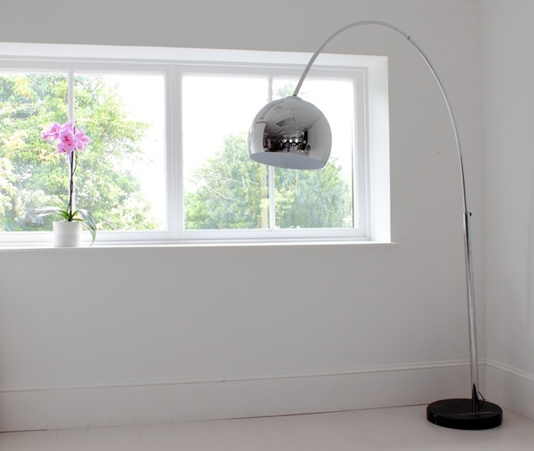
Table lamps are a must in a living room, and can instantly brighten up dimly lit corners, which is especially useful in the darker months. If you like reading in your living room, a curved floor lamp, such as this Large Chrome Arch Floor Lamp by Out There Interiors is a great option. Position it next to a comfy armchair and you have the perfect reading spot in which to relax.
The Dining Room
When it comes to lighting, having a central light carefully positioned over your dining table is a must. Choosing one that can be raised and lowered is a good option, so you can create a more intimate atmosphere when needed.
If you would prefer not to have one single light, a row of pendants such as these Beso One Light Pendant in Bronze by Fields of Blue work equally well and displaying them at varying heights will add interest and create a focal point.
As with the living room, a dimmer switch is a great idea for any dining space, allowing you to alter your lighting to suit the occasion.
The Bedroom
Lighting in a bedroom needs to cater for many different situations from reading in bed to applying makeup.
A central light is a good call for general everyday use and allows you to create a focal point in the room. If you don’t have room for bedside tables, then wall-mounted lights such as these Leitmotiv Buck Grey Wall Lights by Viva Lagoon are a good alternative for reading in bed.
Adding a task lamp to your dressing table, much as you would in a home office, is a good idea. Choose one that allows you to direct the light to exactly where you need to for maximum effect.
The Kitchen
Here again, a central light is a good starting place in the kitchen. If you have a dining table within your kitchen, placing a ceiling light above this is essential to ensure you have enough light for comfortable dining.
Under cupboard lights are a good idea. One a practical level, they provide pools of light while you’re preparing food but can also be used to create a more intimate atmosphere for in-kitchen dining.
The Hallway
Hallways can often be narrow and dark, which means having the right light sources is essential.
A combination of a central pendant together with wall lights will ensure your hallway is lit correctly and create a welcoming glow.
If you have room for a console table, make sure you add a table lamp which, when placed near a window or the door, will create a warming atmosphere.
And while not strictly speaking in the hallway, an outside light installed near the door is both inviting and safety conscious.
The Bathroom
Lights used inside bathrooms need to follow a strict IP rating code. As a rule of thumb, the lower IP rating a light has, the nearer it can be used to a water source, e.g. lights with a IP rating of 1 can be used nearer a bath than those with an IP rating of 2.
Central lights work best when encased which prevents them being damaged by steam and condensation, while an illuminated mirror is an useful bit of kit allowing you to kill two birds with one stone.
However, it’s choosing your bulbs correctly which is really important in the bathroom - as many don’t have windows you want to replicate natural daylight as far as possible so it may be worth taking time to experiment with bulbs until you find the ones which suit you.
Shop the look...
Rodnik Shark Fin Chair
Add some fun to your home with the Rodnik Shark Fin Chair, £449.
The trouble with being obsessed with interiors is sometimes you can take yourself too seriously.
You get so bogged down in the minutiae of everything from choosing the exact shade of paint to spending an age looking for the perfect light, that you forget your home is meant to be somewhere you feel comfortable spending time as well as it looking good.
Case in point is a great video recently released by a team calling themselves Barrow & Fall – a parody on the well-known paint and wallpaper experts. Viewing it reminded me that sometimes we forget that interiors can, and indeed often should, be fun.
Which brought to mind the Rodnik Shark Fin Chair by made.com, which has long been a favourite of ours here at Furnish.
Designed by Philip Colbert’s Rodnik Band label, the Shark Fin Chair is a great statement piece, and is perfect for adding some humour and irreverence to your home interior.
It offers a definite nod to mid-century modern design thanks to its gently splayed, angular legs which are crafted from solid beech finished in classic black, and the “fin” armrests which are reminiscent of a classic 1950s armchair.
However, it’s the upholstery, which makes this chair really special and gives it a pop art vibe worthy of sitting alongside any Warhol or Liechtenstein print.
Featuring a vibrant shark print, the fabric has been carefully positioned to make you feel as if you’re sitting in the mouth of Jaws, which cleverly juxtaposes with the comfortable and supportive seat and backrest.
Perfect for a teenager’s den or a little one’s playroom, this chair is also ideal for big kids and will look fantastic in a neutral room, teamed with brightly coloured accessories.

