It's our Interior Design Magazine!
The hottest interior design ideas, fab finds for the home and buying advice. We're always looking for new finds, designers to feature or anything else lovely for the home, so if you've seen something gorgeous and would like it featured in our interior design magazine, please get in touch!
Interview: Somerville Scott & Company
Bringing together traditional English craft with a fresh and modern approach, Somerville Scott & Company’s collection will embellish any home interior
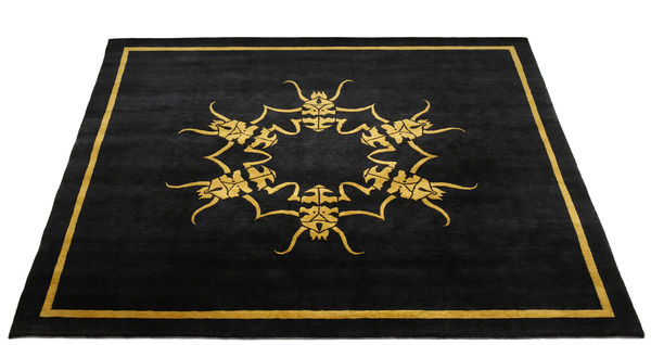
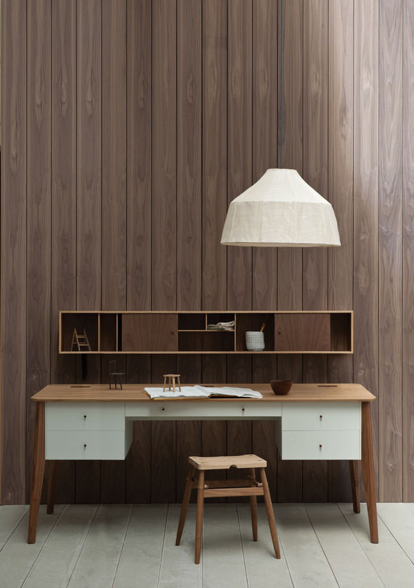
Devoted to producing beautifully crafted furniture, Somerville Scott and Company’s collection of furniture, rugs, cabinetry, desks and tables offers distinctive style and a modern elegance.
We caught up with Amy Somerville and Stuart Scott to discover more about their ambition and style...
If you had 3 words to describe your style what would they be?
Sumptuous, precisionist, modernist.
What is your company’s ‘Hero’ product and why?
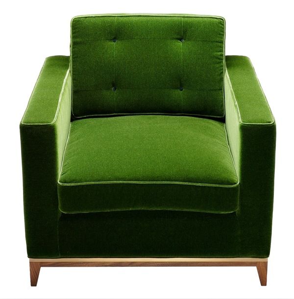
Our curiosity cabinets encompass what Amy and I are able to achieve but the Minx chair was the first product that got us noticed – so it would have to be that.
As a British based design company, how do you feel about interior design becoming more eco-friendly? And how will this improve the quality and durability of interior furnishings in the future?
Product longevity is important, if you design with that in mind with the use of better quality materials and construction methods then the piece becomes eco-friendly, you’re investing in a product for life. If it becomes tired over time then you can simply re-upholster it, instead of throwing it away. Designers can help in considering schemes that have a longer shelf life.
What inspires the combination of modernity and traditional style of your furniture and cabinetry?
Just looking at antiques and how pieces used to be made. Some of the furniture that came out of the Art Deco period was so rich in its use of materials and finishes. Nowadays it’s difficult to replicate these details as materials increase in price, and the craftspeople that are able to achieve this level of quality in furniture are becoming increasingly rare and sought after.
Do you have a favourite traditional piece of furniture?
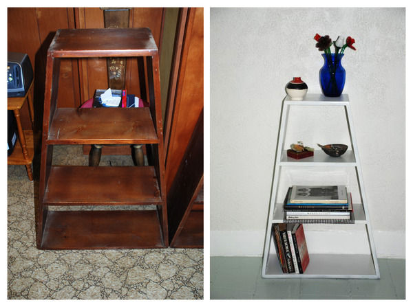
I’ve always been drawn to works by people like Jean-Michel Frank, Pierre Legrain and Ruhlmann. Amy and I both agree that the ‘Skyscraper’ bookcase by Frankl is a bit special.
You have a small range of stunning handmade rugs, what makes your rug collection unique from anything we have seen before?
Our choice of subject matter is often quite unique, the colours and the quality of weave tell them apart.
What is the most recent design product that you have bought for your home?
On a practical level a Dyson vacuum cleaner, on an indulgent level I picked up a Rover Chair by Ron Arad at a recent auction, although it turned out to be a fake, I was mortified!
What advice would you give to aspiring interior designers?
Think practically and design with the user in mind.
Is there anyone that you would like to collaborate with in the future and if so why?
Always used to be Ettore Sottsass but that wouldn’t be possible now. It would have been interesting and quite mad. In terms of a contemporary brand on a purely self-indulgent level it would have to be Aston Martin. We could do a pretty special limited edition interior.
What’s next for Somerville Scott & Company?
Keep designing! Producing more furniture that people aspire to own.
For Somerville Scott & Company's full collection, specification sheets and price list, check out their website.
Interview: Georgia Horton
Naturally beautiful: Georgia Horton’s luxury wallpapers bring the colours and patterns of nature together to create something special
Designer and artist, Georgia Horton is fresh from exhibiting at Decorex where she successfully launched her ‘New Naturals’ collection.
We caught up with Georgia to find out what inspires her and what’s next on the horizon...
If you had 3 words to describe your collection what would they be?
Bold, organic, architectural.
You have described your illustrative wallpaper as “somewhere between organic and architectural”, can you expand on this?
Many of my designs originate from sketches that I have drawn from what I see around me in nature. For me this is a great way to begin because I can put a design down on paper and let it expand and grow from there. For example, from paper to print, I believe that the whole process of designing all the way through to the manufacturing can be described as organic because it feels like a natural, creative process. I think the word ‘architectural’ captures the depth and 3-D quality of my designs.
How have your childhood experiences and time spent in South Africa and Italy influenced your life and your work?
My father was an architect and my mother was an artist so I have grown up with a huge artistic and creative influence in my life. You can see that there are both Italian and wild African styles apparent in some of my designs, although I couldn’t say that there’s any specific place that I have taken inspiration from. I get my inspiration from all over the place and have my eyes open for new ideas all the time.
I particularly love the Lobster Quadrille’ in ‘The One Collection’ because of its quirky appeal. You use a lot of symmetry in your designs and repetition, how do you feel that your artistic background has helped you?
It has helped me understand perspective and scale. For example, with the Lobster Quadrille, scale is important because it offers a different perception depending on your distance away from the wallpaper. On a larger scale you can see lots more of the detailing such as the horizontal trellis.
I’m also intrigued by the patterns and symmetry found in nature which inspires a lot of my designs. I really appreciate Escher’s work because he experimented with symmetrical designs and he explored the idea of reflection.
What is your best selling design from your collection and why?
The Lobster Quadrille is one of our best sellers because it has a unique style that draws you in. This is followed very closely by the Quilt design which is also a very popular choice.
How do you feel that wallpaper will develop, and what direction do you hope it will go in the future in order to keep interior design fresh and exciting?
Wallpaper has been around for such a long time and it has gone through several periods of change. However, I think that this is an exciting time because wallpaper is leading people into a different approach to interior design, and it has encouraged waves of boldness and eccentricity.
How is the quality of your wallpaper improved by your use of hand mixed colours on hand printed paper?
Our paper is of a high quality and it’s sustainably sourced. The hand-printed paper is strong and durable which helps improve the richness of colour and it also gives an appealing tactile quality.
How important do you believe it is for interior design to become more eco-friendly?
I think it’s extremely important! All of my designs are manufactured in the UK, and I do aim to move with technology and keep up with sustainable ways to produce my wallpapers.
What did you last buy for your home?
I’ve recently bought a typical 1970’s retro style easy chair which I have upholstered in my own fabric in the Quilt design.
What advice would you give to aspiring interior designers?
I would say take initiative; listen to your clients and consider their brief but at the same time bring a new edge and individuality to your work.
What are you working on now, is there anything new in the pipeline?
Yes - In fact I’m developing a new collection for 2011 which will have bolder and braver colourways.
I have also just launched my ‘New Naturals’ collection which features organic colours such as pale sage, calico, buttermilk and stone. We created this in response to a high demand for neutrals with strong decorative appeal.
Visit Georgia Horton’s website for more information and to view her whole collection.
Our weekly pick of interiors blogs… Oct 6th
Blogs to get you through the week in style.
A Creative Mint is the creative outlet for Canadian-born LA-based designer, Leslie. After taking degrees in Architecture and Interior Design and a successful career in packaging design, Leslie decided to take a step back. At home with two young children she started the blog as a scrapbook for her interiors projects and photographs. She’s interested in all aspects of design, from architecture to cooking, and this really comes across in the blog. Leslie’s a great photographer and this as well as her love of collage makes the blog really visually appealing. You’ll find all sorts of lovely stuff on here, and if you’re a crafty type A Creative Mint is right up your street.
Adam’s House is a really delightful blog. It’ll be right up your street if you’re interested in getting your hands dirty with a bit of DIY; or you love period houses, architectural salvage and design history. Adam lives in small Victorian village called Potsdam in upstate NY. He teaches high school art and with his upbeat manner and creative exuberance it wouldn’t be a class I’d bunk off. He bought an 1812 Potsdam-sandstone house six years ago and he’s been working on remodeling it ever since; the blog follows Adam’s progress with plenty of design-related asides along the way. He’s trying to keep the décor fitting with the history of the house without it being too themed, traditional or stuffy. We heartily approve.
Lobster and Swan is a charming, beautifully illustrated Hastings-based blog. You’ll find musings on fashion, art, craft and design with shopping tips, travel stories and interiors inspiration aplenty. There are loads of great ideas for creative projects around the home. Hastings is a bit of a Mecca for junk shopping too, so expect evocative lifestyle images with a vintage flavour. This blogger has a wandering eye that always seems to alight on something beautiful or delightfully different. Designed to intrigue and inspire, it’s an eclectic blog drawn together by a consistent and confident sense of style.
As always, get in touch if you write your own design blog and we’ll feature it next time.
Review: 100% Design
Our hot picks from 100% Design.
100% Design delivered a knockout show this year, with impressive displays from exhibitors across the board. Ambushed by eager designers and waylaid by wonderful objects it was easy to get overwhelmed in the throng. With beautiful things at every turn, I got lost trying to find my way back to Print, Tuft & Fold. Expect an interview with the lovely ladies soon. There were spectacular displays of both home grown and international design talent. Wandering about in a beauty-induced trance, here are just a few of the things we homed in on.
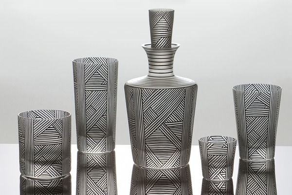
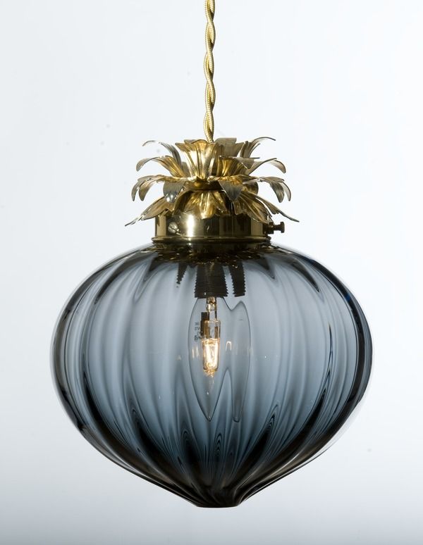
Czech Selection showcased some fabulous glassware including a sleek new collection by Bohemia Machine, featuring stylish angular forms and tactile bands of raised glass dots. Karen Feldman of Artel launched a new collection in partnership with graphic designer Natalia Ogneva. Featuring an intricate pattern of parallel and diagonal lines, the Sequence collection is reminiscent of early 20th century Czech cubism. ‘One of my sources of inspiration for Sequence was the work of Czech-born designer Josef Hoffmann…In particular, his extraordinary feel for lineation’ says Ogneva. Incredibly, each black line in the lattice-like pattern is hand-painted on to the mouth blown vessels. You can find Artel glassware at Paul Smith in the UK. Representing the best of British, RCA Alumni Rothschild & Bickers unveiled a beautiful range of glass light shades. The new Flora collection features delicate bauble light fittings topped with gold pineapple-like leaves. With glorious golden fringing, the domed Tassel Light and fluted Vintage Light have a nostalgic feel, while the distinctive colour palette - teal, gold, black and grey – gives the whole collection a contemporary edge.
At 100% France, I was struck by Atelier Polyhedre’s bold shape-shifting ceramics. Flying the flag and looking particularly dapper, Baptiste Ymonet and Vincent Jousseaume are the creative duo behind this quirky design studio. Fluctuating between minimalist rigour and baroque exuberance, between the geometric and the organic, Vincent and Baptiste have created a fresh and original collection, experimenting with form and style while retaining absolute quality. Stopping to grab a bag for all the ephemera I’d amassed, I spotted Scandinavian Surface exhibiting at 100% Norway. The four Bergen-based designers behind the brand recently launched an innovative new wallpaper concept. PanelPiece is a series of individual wallpaper panels designed to be used separately or in combination. Each panel has its individual identity and used singly will reveal a larger overall design. Mixed and matched, the different designs strike up a dialogue allowing you to create a customized wallcovering.
A cohort of British designers showcased their work as part of Design Event North East, representing the best of contemporary design across the region. Michael Armstrong of Afid Design exhibited a breath-taking collection of bespoke timber furniture. Michael’s designs highlight the beauty of simple forms, celebrating expert craftsmanship, quality materials and subtle detailing. I’m saving up for the sideboard. Design polymath and all round mischief-maker Dan Civico was on hand to demonstrate his artful ChairKit_. These AirFix-like self-build chairs and tables are sold in flat-pack/wall-art form, laser cut from a single piece of birch plywood, and are supplied with all the bits and bobs you’ll need for a satisfying afternoon of DIY. Each kit comes with a signed and numbered, limited edition screen print.
Hidden Art was also supporting emerging talent with its fourth Hidden Art Select range, featuring the work of seven British designers. One of my favourites was Your Placemat or Mine? by Hannah Dipper and Robin Farquhar of People will Always Need Plates. Featuring eight designs, the new range celebrates British domestic architecture through the ages and can be used either individually or placed together as a table runner, charting the history of British homes. Renata Manau of Biscuit Design evoked the exploits of Winnie the Pooh with her Balloon nesting box. Complete with a four-paned ‘window’, the ceramic balloon-shaped birdhouse is designed to be strung from a tree and features a florescent pink string that dangles away underneath. This year Hidden Art also launched a new collection of seating by five independent designer-makers. It was difficult to obey the polite ‘do not touch’ sign next to DesignK’s Dandelion Stool: a tripod construction with a plump knitted ball perched on top. COAL Design’s fifties-inspired Horrice Chair was another winner, with its lacquered walnut frame and vivid yellow upholstery.
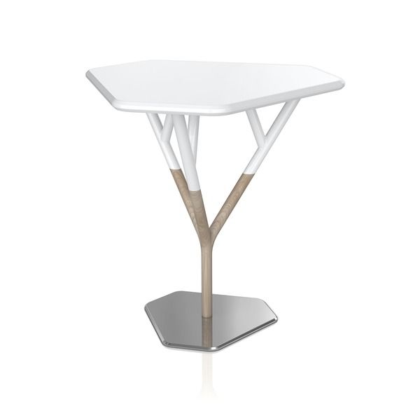
Furniture was a particular draw at 100% Design this year and the impressive selection on show didn’t disappoint. James UK’s range of hardwood, upholstered seating raised the heart rate rather alarmingly, particularly a button-backed fifties-style sofa and a contemporary reinterpretation of the traditional wing armchair. Vitamin launched a new collection of furniture and lighting at the show, of which the Fuse Table was the standout piece. Out of the steel base grows an ash sapling, which splits into three branches to support the white lacquered tabletop. A fusion of geometric and organic forms, and of three different materials, each of the elements feed into one another to create a beautiful, functional object; the tabletop can even be removed to use as a tray. Leading the field in hand-made contemporary furniture, Pinch Design exhibited a beautifully crafted collection with graceful simplicity of form; we’ve got an interview with Russell Pinch coming soon. The influence of fifties design was visible throughout the show, particularly in furniture, so it was great to see the real thing in evidence as well: a much anticipated collection of original Ernest Race designs reissued by Race Furniture. The pipe-toting mid-century designer created the Antelope chair for the Festival of Britain in 1951 and the wonderful lightness of his steel rod constructions articulate the buoyant festival spirit.
It’s a spirit that seemed alive and well at 100% Design. We’ll be following up on lots of the exhibitors in the next few weeks.
Spotlight On: Orla Kiely
With a strong eye for colour and pattern, Orla Kiely explores the nature of shapes and repetitions found in nature in her gorgeous designs.
Let’s face it, who doesn’t have an Orla Kiely bag or cushion on their wish list? Her collections are always eagerly anticipated and her colour-popping prints never fail to impress.
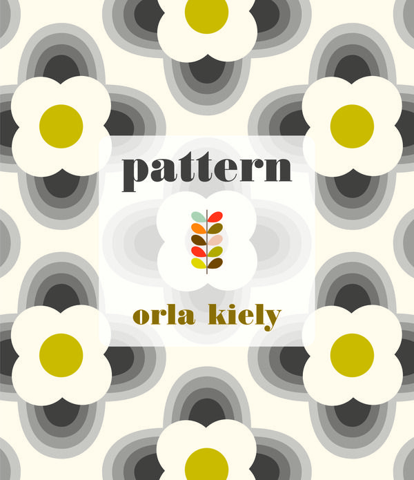
From as young as she can remember, fashion and textile designer Orla Kiely became preoccupied and intrigued by patterns and shapes. Having just published ‘Pattern’, her first book, Orla has revealed how her childhood memories of growing up in Dublin in the late 60’s and early 70’s have inspired her love of retro style furnishings.
Orla studied at Dublin’s National College of Art and has achieved her master’s degree from the Royal College of Art in London. Starting out in the 1990’s, Orla injected a burst of colour into a world of fashion, which was dominated by an abundance of black, with a small collection of bags. In 2005, she opened her flagship store in London’s Covent Garden which showcases the best of her designs including wallpapers, fabrics and accessories, amongst her hugely successful fashion lines. Orla has collaborated with names such as Habitat, Heal’s and Dulux, but she insists that she will not be a slave to fashion trends, instead her designs are distinctly daring and true to her own style.
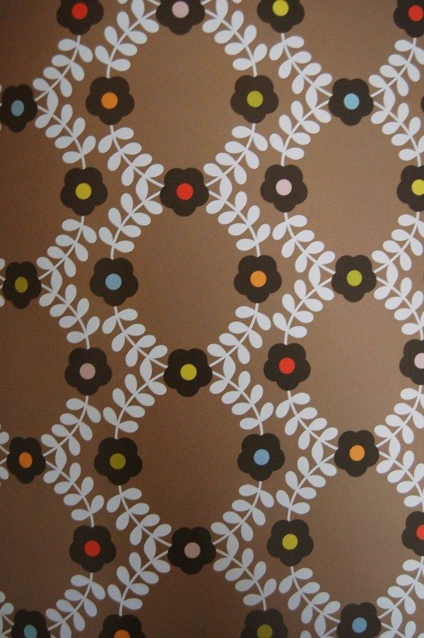
In collaboration with Heal’s, famous for its contemporary furniture ranges, Orla has achieved success with her designs including soft furnishings, linen, and furniture pieces such as sideboards, cupboards and armchairs. Many of these items are available on Furnish, including the Flower Blossom duvet cover (available in lichen or teal), and a gorgeous range of mugs available in several colourful designs, ideal for livening up any kitchen. Among my favourites, is the Lusk armchair [http://furnish.co.uk/items/23662-orla-kiely-lusk-armchair-bute-melrose-fabric-range] which is beautifully crafted from a hardwood frame and upholstered in Bute Melrose fabric in Pumpkin, Henna and Moss.
The Stem design is recognised worldwide and is always a best seller; it has become a core part of every collection that Orla has released, and its appeal shows no signs of wavering. Along with the abstract Pear, the Stem is adored because it has a beautiful simplicity that’s given a sense of order and unique charm in its repetition. Due to its popularity, Stem is modified every season and it is given a new colourway to keep the print looking fresh and exciting. It began in three colourways: olive and chartreuse, pink and red, and orange and ochre. You will recognise the infectious Stem print on a range of products, from wallpaper to mugs, and even Orla’s fashionable range of bags.
“Distilling a form, natural or man-made, into its basic elements, while maintaining a degree of recognition, gives a certain poise and tension to a design, so that it reads in two distinct ways at a time.” (Orla Kiely, “Pattern”)
Orla’s interiors collection boasts a homely and exciting array of designs that are inspired by mid-century modern design, and many are created from her love of Scandinavian design. Visually, her designs are comforting, and they compliment both modern and traditional interiors. She experiments and plays with the scale of her work which helps her adapt her patterns to a variety of interior products such as cushions, mugs and wallpaper. Some of her designs incorporate large and small scale elements in the same print which is a great way of drawing the eye and creating rhythm. Interestingly, Orla keeps all of her print boards from season to season so that she can look back and explore new patterns with an idea of how her prints will continue to work coherently as part of the brand look.
Orla hopes to always be “associated with products that are valued, cherished and not discarded.” We certainly will always treasure and adore Orla’s work, and we’re looking forward to the development of her newly introduced lines including fragrance, kitchen ceramics and bed linen.
Visit Orla Kiely’s website for more information at www.orlakiely.com, and to find out more about Orla’s recently published book ‘Pattern’, read our feature.
Our weekly pick of interiors blogs…
Three more blogs designed to inspire.
First up this week is Swedish blogger Benita with Chez Larsson. Benita’s a crafty lady, an expert home-organiser and self-confessed clean freak; so expect the pure, fresh and light-filled aesthetic of Scandinavian style (and to get a little jealous). It’s actually a really relaxing blog, which to a self-confessed slattern seems at odds with Benita’s bustling abode. It’s a warm and engaging blog with plenty of tips for would-be DIYers, ideas for craft projects and inspiration to get organised at home; all lovely stuff.
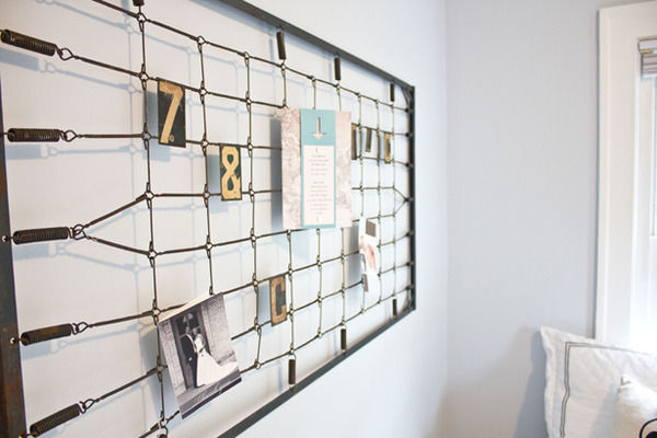
The Lettered Cottage follows Layla and Kevin Palmer as they fix up their little ol’ house and go scouting for junk in the deep Midwest. It’s buzzing with creative ideas – just look what they did with some old bedsprings. If you’re a junkaholic you’ll love The Lettered Cottage but beware the green-eyed monster. The writing evokes a real sense of fun and the there are plenty of before and after photos to inspire your own creative projects.
Aesthetic Outburst is Abbey Handrickson’s brilliantly named New York-based blog. Abbey’s another obsessive junk collector and you only have to look at the yard sale she had recently to see the volume she’s amassed. The blog’s an expression of Abbey’s love of art, design and collecting, with a stream of lovely photographs, interiors inspiration and plenty of every-day gossip thrown in. It’s a beautiful blog, consistently eye-opening and a bubbling source of ideas.
As always, get in touch if you’d like us to feature a blog of your own.
The Scandinavia Show 2010 looks to promote Nordic design
Get a taste of some fantastic Nordic designs at The Scandinavia Show 2010.
Soak up plenty of culture at The Scandinavia Design Show, the first of its kind in London. Whether you have a harboured love of Nordic design or if you simply want to discover new interior styles, the show offers something for everyone.
The Scandinavia Show brings together Scandinavia’s most successful exports including design, fashion, food and travel. The design exhibitions will showcase everything from contemporary lighting, furniture, fabrics and carpets from Scandinavian designers and companies.
Scandinavian design has been inspired by the 1920’s modernist movement which saw intricate and highly decorated products being replaced by functional designs with clean lines. This type of design has developed further and now Nordic style encompasses beauty and durability. Exhibitors will be bringing exclusive pieces to the show to display the beauty of Scandinavian design.
Skandium will be exhibiting some of their finest modern Nordic furniture, lighting, kitchenware, and glassware including familiar names such as Iittala, Marimekko, Orrefors, Muuto, and Fritz Hansen. The Aalto vase from littala has a striking beauty that is inspired by the shapes and colours found in nature, which is representative of Scandinavian design and its unique simplicity. Alvar Aalto’s collection first made an impression when it was presented at the World Fair in Paris in 1937, and since then it has become one of the most famous Finnish glass objects.
Online boutique, Skandi Living, will be bringing the Swedish brand Linum’s Christmas 2010 collection complete with a range of gorgeous cushions and table linen. Linda Swarbrick, Founder of Skandi Living, told us that she is really looking forward to the event because “we are a web based business and don’t usually get to deal with our customers face to face.” Linda has also informed us that they will be showing Pappelina plastic rugs and smaller accessories from other brands such as Himla, Menu and Orrefors.
Also, take a peek at Danish Homestore, specialising in classic Danish furniture. At the show, they will be showcasing a unique collection of furnishings from Arne Jacobsen, Poul Volther, Hans Wegner, and Johannes Andersen. Other exhibitors to look out for include BoConcept, Northlight Design, Bang & Olufsen, Ekornes, Clas Ohlson and Pandora, amongst many others.
Don’t miss The Scandinavian Show at the Olympia Conference Centre, London, 9th -10th November 2010. For more information and Show Opening hours, visit www.scandinaviashow.co.uk.
Style Guide: Art Nouveau
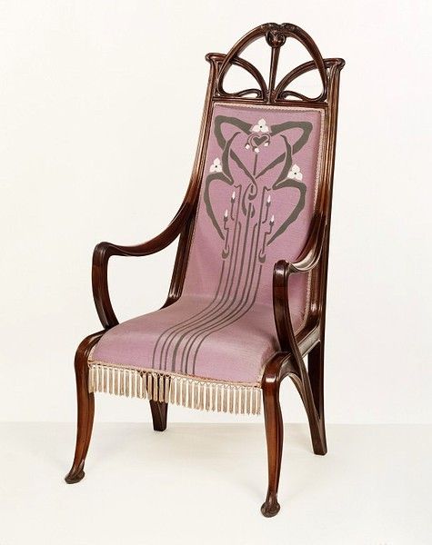
We look at the enduring influence of Art Nouveau and its affinity with biomorphic mid-century modernism.
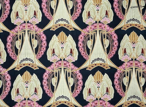
Art Nouveau style emerged in France around 1890 and quickly became internationally recognised and reproduced. It arose at the end of a century that had witnessed momentous upheavals in religious, scientific and political thought. A new modern style was needed to reinvigorate the decorative arts and express the spirit of the age. Proponents of the new style were determined to move beyond the indiscriminate jumble of historic styles and derivative decoration popular in the 19th century. Equally, they challenged the dominant canon of Classicism, which with its strict logic and certainty of proportion seemed to mock the restless fin de siècle spirit. Instead, Art Nouveau designers looked to nature for inspiration and created new vocabulary of design incorporating both desire and anxiety.
Plant forms dominated much of the Art Nouveau style and were used across the whole range of applied arts, as well as architecture, interior decoration and furniture design. Roses, poppies, irises, orchids, cyclamens, fuchsias and lilies were among the most commonly used floral motifs. Plant forms covered the facades of buildings and grew out of furniture; swirling vegetal ornament featured on glass, silver and ceramics; flowers were cast in bronze and carved in wood. Flora and fauna, including dragonflies, birds and insect forms, adorned everything from architecture to jewellery. Furniture had a lightness of dimension and proportion, expressed by elongated, graceful lines and lithe organic forms. Sinuous lines based on plant fronds, stems and tree branches were used to convey the dynamic forces of nature as well as simmering sexuality; flowers were often personified as languid maidens and long flowing hair was another eroticised decorative device. The dynamic whiplash line and the integration of human and plant forms were characteristic of Art Nouveau design.
The decorative details on Art Nouveau architectural facades were carried through to interior design and furnishings to create a remarkably coordinated style. By 1900 almost every item of use or decoration was available in the Art Nouveau style: from cutlery and biscuit tins to lampposts and railings. Hoardings were plastered with advertisements designed in the Art Nouveau graphic style. The Art Nouveau poster became one of the most ubiquitous manifestations of the style. In Paris, celebrated Art Nouveau architect Hector Guimard was commissioned to design several entrances to the metro; Guilmard’s sculptural cast iron entrances were studies in sinuous Art Nouveau detail. The city itself became an expression of the style. Selling Art Nouveau goods, Parisian department store La Samaritaine was housed from 1905 in an Art Nouveau building designed by Frantz Jourdain and decorated by Eugène Grasset. In London, Liberty & Co. commissioned designs for pewter, silver and jewellery in the Art Nouveau manner and its popular printed fabrics and wallpapers were also inspired by Art Nouveau pattern designs.
It’s easy to see an Art Nouveau influence in surface pattern design, particularly at Liberty’s, which continues to produce fabrics and accessories with its signature peacock feather and scrolling Ianthe designs. Timorous Beasties’ distinctive fabrics and wallpapers featuring winged insects, amphibians and plant forms capture the play of desire and anxiety typical of Art Nouveau. Abigail Borg’s bold floral patterns draw on the composition of abstract plant forms in both Arts and Crafts and Art Nouveau designs. Decorative accessories are another area where the influence of Art Nouveau forms endures. The silver flower loop vase and loop candleholder from black + blum exhibit the same sinuous lines characteristic or Art Nouveau ornament. In a beautiful vivid blue, the tactile 2lips vase from 95% Danish has a flower bulb shape and ridged glass detailing. Johnathan Adler’s bird bowl and Graham & Green’s sculptural dove vase recall the menagerie of birds and beasts in Art Nouveau decoration.
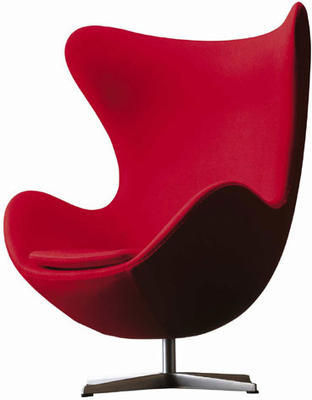
In furniture it’s interesting to look at the link between Art Nouveau and the biomorphic forms of curvilinear modernism in the mid 20th century. The modernism of the 1940s and 1950s reflected advances in biochemistry and nuclear physics; designers looked to organic models in creating a new humane style (epitomised by Eero Saarinen’s 70 MC designed in 1948 - better known as the ‘womb’ chair). The fluid lines and attenuated curves of biomorphic modernism owe much to Art Nouveau. Many of these designs are still in production today. Designed by Arne Jacobsen in 1958, the Swan Chair and Egg Chair manufactured by Fritz Hansen transpose the dynamic lines of Art Nouveau decoration into three dimensions. You can find both chairs at Utility. Another reissue from Utility, the Wishbone Chair designed in 1949 by Hans Wegner has the same grace and lightness of Art Nouveau predecessors. La Chaise by Charles and Ray Eames is an iconic biomorphic design available from the Lollipop Shoppe. A contemporary take on biomorphic modernism, the Tongue chair recalls the whiplash line and sexualised motifs of Art Nouveau.
So you don’t have to go for flower maidens and flowing hair to give a nod to Art Nouveau.
Hot Picks: London Design Festival 2010
Look no further for a rundown of the LDF’s best bits.
Hot Picks: London Design Festival 2010
Look no further for a rundown of the LDF’s best bits.
Taking place over nine days in September and beyond, the London Design Festival celebrates every aspect of design in the world’s creative capital. The Victoria and Albert Museum plays host once again as LDF HQ, so be sure to pay a visit. With events happening right across London, we’ve put together a shortlist of smaller-scale but must-see treats to help you navigate the greatest show in town.
LDF: Central
Lucienne Day Selling Collection
Heal’s, 196 Tottenham Court Road W1, until 26 September. Marking iconic designer Lucienne Day’s death earlier this year and celebrating her 20-year partnership with Heal’s, the furnishing store is presenting a selling collection of Lucienne Day originals and a range of contemporary interpretations. A must see for mid-century modern design fans.Design Against the Clock
Established & Sons, 2-3 Duke Street SW1, until 26 September. Established & Sons’ Mayfair gallery plays host to a selection of London-based designers who’ll be making works live in front of your eyes. You can watch them toil from the comfort of a pop-up café within the gallery space.Home
Tracey Neuls, 29 Marylebone Lane W1, until 26 September. Rekindling childhood dreams of shiny new shoes, set designer Nicola Yeoman and shoe designer Tracey Neuls have created an enchanted wonderland with a large-scale playful shop installation, evoking a world of make believe.A Living Space – Curated by Kit Kemp: commissioning art and craft for the home
Contemporary Applied Arts, 2 Percy Street W1, until 2 October. Design director of Firmdale Hotels, Kit Kemp showcases bespoke one-off creations commissioned from top British craftspeople. A Living Space recreates an imaginary Bloomsbury Group sitting room in the CAA gallery.Tecta: Hidden Classics
110 Drury Lane WC2, until 13 October. Champion of Modern movement in the 1920s and 1930s, German design company Tecta gets its moment in the spotlight courtesy of Arup. The retrospective includes Marcel Breuer’s iconic F41E lounger and Hans Wegner’s CH468 chair.Hands On
Arts Gallery, University of the Arts London, 272 High Holborn WC1, until 29 October. Central Saint Martin’s graduates Studio Xag present a series of delightful theatrical installations and automata using images and models of products by fellow graduates.LDF: West
London Biblio-Geography: a personal A-Z
Few and Far, 242 Brompton Road SW3, until 29 September. Bookbinder and artist Rachel Hazell pays homage to the indomitable Mrs Phyllis Hazell, who walked the length and breadth of the capital in 1936 to create the first London A-Z. You’ll find Rachel squirreled away beneath maps and charts in Few and Far’s exhibition space, crafting typological and cartographical treats from old maps, letters and printed ephemera.RCA at the LDF
Royal College of Art, Kensington Gore SW7, 23 September – 7 October. The RCA is hosting an impressive seven exhibitions for the festival this year; our pick of the crop is the Design Products Collection, a selling exhibition showcasing work by recent graduates and RCA staff tutors.Off the Floor
Retrouvius, 2A Ravensworth Road NW10, until 2 October. Curated by product designer Fabien Cappello and textile designer Daniel Heath, Off the Floor is the first in a series of collaborative exhibitions hosted by architectural salvage and design company, Retrouvius. Exploring the philosophy of re-use, the exhibition focuses on the creative reinterpretation of three materials: limestone salvaged from Heathrow Terminal 2; oak drawer bottoms rescued from the Natural History Museum; and parquet flooring reclaimed from a school in north London.Jaime Hayón for SÉ
221 Brompton Road SW3, until 26 September. British-based brand Sé introduced Spanish design star Jaime Hayón to a network of artisans working in metal, wood and marble to complete a furniture collection presented at the store. Created in Hayón’s distinctive style, collection highlights include the fabulous 50s inspired Arpa armchair.Design becomes Home
Skitsch, 270 Brompton Road SW3, until 26 September. The Italian design brand launches Harry Allen’s ‘Home’ storage system: a doll’s house for grown ups (and every home should have one). The storage system is available in a choice of City or Country ‘architecture’ and comes in modular units for a satisfying self-build.Portobello Dock
344 Ladbroke Grove W10, until 26 September. Contemporary design is riding high at this cutting-edge canal side venue. Furnish favourite Exterior-Interior will be down at the dock displaying iconic designs from Extremis and showcasing a selection of new products never before seen in the UK.LDF: East
Lovely Stüff at SCP
135-139 Curtain Road EC2, until 26 September. SCP launches a brand new collection from London home-ware company All Lovely Stüff, with products designed by founders Ed Ward and Carl Clerkin; all very lovely indeed. Virtuoso knitter Donna Wilson is joining the party with a fabulous new range of colour-popping rugs.Open Studio at Barber Osgerby
35-42 Charlotte Road EC2, until 26 September. Design duo Edward Barber and Jay Osgerby offer a rare treat for nosey parkers. Sneak a peek behind the scenes and check out their new range while you’re at it. Just don’t knock anything over.Midwinter Modernist: the iconic designs of Jessie Tait
Bulthaup, 36-42 Clerkenwell Road EC1, until 1 October. Made to make your mouth water: an exhibition of Jessie Tait’s fabulously fifties crockery, courtesy of designer kitchen company Bulthaup. You won’t want to leave the table.Curate 40 Mini Mart
Studio 1.1, 57A Redchurch Street EC2, until 26 September. Supporting new design talent, Curate 40 has teamed up with illustration designers Eclectcollect to present the latest crop of protégés. The results of their labours are piled high (but not necessarily sold cheap) on the mini mart shelves.Gastrotypographical-Assemblage: the designs of Lou Dorfsman
Kemistry Gallery, 43 Charlotte Road EC2, until 30 October. Almost Mad Men: a showcase of smooth-talking style, documenting American graphic designer Lou Dorfsman’s forty-year career as the ‘ad man’ of CBS Television.Trays from around the world
Jasper Morrison Shop, 24B Kingsland Road E2, until 26 September. Last year design hero Jasper Morrison laid on an exhibition of Jugs, Jars and Pitchers, each piece selected as an embodiment of good design. This time round, the humble tray gets its moment in the spotlight and a dusting of Morrison’s magic. Everyone loves a design geek.If that’s whet your whistle, then check out the Icon Design Trail for loads more listings; it’s the only independent guide to LDF and a must-have festival accessory.
Decorex shaping up to show the best of great design
Sneak a peak at what’s in store at Decorex 2010
Decorex International is renowned as an arbiter of style and an authority on where things are heading in the world of interiors. Offering a sophisticated and inspiring mix of emerging talent and big-name brands, exhibitors are handpicked to represent the best of design globally. An unmissable event for industry professionals, Decorex throws open its doors to the public on Tuesday 28 September; style-seekers and design-devotees take note.
Decorex showcases top-end, design-led interiors products from the finest suppliers, with exhibitors presenting the latest in fabrics, wall-coverings and floor-coverings, to furniture, lighting and accessories. Alongside a vast array of top-notch exhibitors, seminars will be running throughout the event, with speakers addressing hot topics and offering design inspiration. Often referred to as the ‘Oscars’ of the interior design industry, Decorex has launched its own awards this year. Judges will be scouring the show for the Best New Exhibitor and the Best International Exhibitor, with an Outstanding Contribution award going to one of the show’s stalwarts.
A treasure trove of interiors excess, you can expect to be dazzled at Decorex. Lewis Carroll’s novel 'Through the Looking Glass' has inspired Spanish design duo Herme ye Monica to create an installation in which all is not what it seems; rugs will change colour, spatial distortions abound and a secret room reveals a theatre of optical illusions. World-renowned interior designer Nina Campbell is taking a similarly liberated approach with the Sloane Square lobby entrance. Exploring the enchanted story of play and temptation in a grown up wonderland, Nina’s display will include exquisite products from over 50 exhibitors including specially commissioned one-off pieces. Tableware and interior accessories company Harlequin Tabletop is presenting an 'Alice in Wonderland' theatrical display. You’re invited to follow Alice into an underground warren, play a surreal game of croquet and take part in a spectacular tea party, showcasing the world’s finest crockery.
Wit and nostalgia continue at Wilman Interiors. Wilman is presenting the ‘Fairground Attraction’ collection, fabrics with all the fun of the fair, by Nono. The new collection is inspired by the charm and vibrancy of the 1930s fairground, with vintage motifs and carnival brights. Graphic harlequin diamonds, bold geometrics, ‘big top’ satin stripes and taffeta ‘zig zag’ embroideries are designed to mix and match, creating a sense of fun, playful originality and high spirits. Comprising six bold designs: ‘Big Top’, ‘Gigi’, ‘Happy Hour’, ‘Roll up Roll up’, ‘Show Stopper’ and ‘The Right Lines’; the colour palette is a heady mix of candyfloss pinks, dramatic damsons, cool mojito, striking emerald, poppy reds, tangerine and on-trend sunshine yellow.
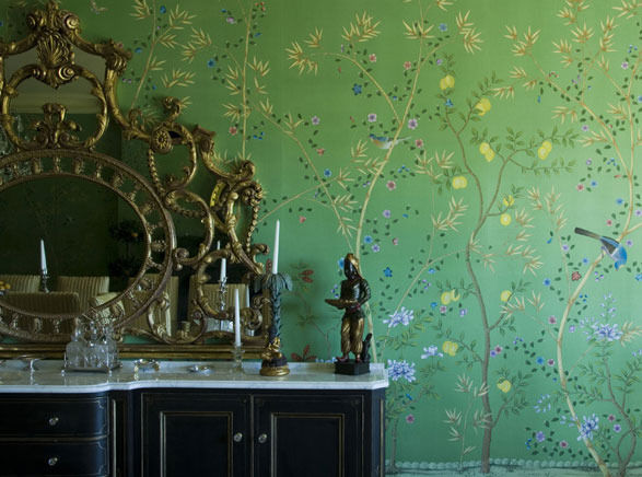
With botanicals reaching new heights in the world of interiors, the Decorex Slone Square entrance takes on a fashionable Kew Gardens feel. Visitors will be welcomed into a glorious summer room, with award-winning floral designs and a unique commission of hand-painted wall-coverings created exclusively for Decorex by Fromental. Winners of Best Stand at Decorex 2009, Fromental strive to create the world’s most beautiful wallpapers. Combining skilled craftsmanship with luxurious fabrics, Fromental’s distinctively British style blends historic classicism with the cutting-edge cool of London’s fashion scene. Fromental’s elaborate hand-painted and hand-embroidered designs, and their now-signature modern take on 18th Century Chinoiserie, have led the revival of the wallpapered interior.
While Decorex has an international flavour and global scope, over a quarter of all exhibitors highlight the fact that their products are made entirely in the UK, using British skills and craftsmanship. A ‘Made in Britain’ stamp certifies authenticity, quality and good design. Celebrating 100 years of ‘Britain’s Finest’ from Fox & Brothers & Co luxury tweed fabrics and Price & Co soft furnishings, Decorex 2010 will also be showcasing the very latest of British design talent. Louise Body’s first and long-awaited fabric collection will be launched at the show. The collection includes fabric to complement each of the wallpapers in the current range as well as new floral and foliage motifs developed from Louise’s ‘Plant Life’ wall panels. Louise is also creating a bespoke entrance to the ladies and gents, bringing a novel approach to the ‘smallest room in the house’.
In furniture, expect to be wowed by traditionally crafted bespoke pieces and cutting-edge contemporary design. Massant has created a line of chairs, armchairs and sofas in Regency, Louis XV, Empire, Restoration and more recently Art Deco and fifties style, respecting the techniques of traditional cabinet makers and remaining faithful to the materials used in each era. Massant’s exclusive products are popular with renowned interior decorators and architects. London’s finest contemporary furniture dealer, ARAM will exhibit at Decorex for the first time this year. ARAM’s range is unrivalled and includes flagship displays from Cassina, Living Divani, Fritz Hansen, Knoll, Arketipo and Vitra as well as the complete range of Eileen Gray’s designs, for which the company hold the worldwide license. ARAM was the first to introduce the designs of, among others, Marcel Breuer, Le Corbusier, Mies van der Rohe and Castiglioni to the UK and the company carries on this tradition today with iconic designs and contemporary future classics.
Decorex promises to be a feast for the senses, and not least in terms of dining in style. Overlooking the River Thames, The Ranelagh Restaurant will be transformed with hand-painted wallpaper by Tracey Kendal, Interior Design Wall Coverings and Barneby Gates. If a light bite’s what you’re after, check out the Silver Birch Café, designed using only materials of organic origin, in partnership with idFX.
Time to clear those diaries and get down to Decorex.
Interview: Camilla Meijer
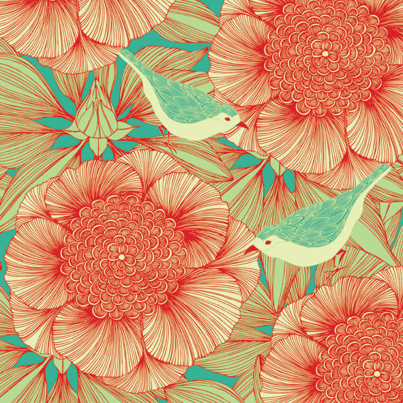
"Bringing the outdoors inside”: Camilla Meijer’s wallpaper and textiles will liven up any interior with an abundance of colour and pattern.
We caught up with Swedish designer, Camilla Meijer, to discuss how she has been inspired by London, nature, and vibrant, bold patterns. It’s a very busy and exciting time for Camilla as she is in the middle of preparing for her exhibition at 100% Design, and she is riding high on a sea of success. Her award-winning work is deservedly loved for her fresh perspective on floral patterns, and we love her detailed hand-drawings and exciting combinations of colour.
Read on to find out more about Camilla’s style and inspiration...
If you had 3 words to describe your style what would they be?
Colourful, fun and beautifully intricate.
You have been shortlisted for the British Design Awards 2010, what does this mean to you?
It means the world to me! To have the recognition for my work, my passion, the work that comes before everything... So, yes very happy and this inspires me to continue sharing my work.
Where does your inspiration come from?
Nature and all nature! I live and work in London so I take inspiration from people’s gardens, the city’s parks and where ever nature has decided to plant itself. I can’t walk down a street without zooming in on a bush with its leaves, or a flower with its quirky way of presenting its petals. Nature and its magical beauty just fascinate me.
How important are colour and pattern to your designs?
They are the key elements in my work! I love colour and love the way it makes me feel, and this I hope to share with others through my work. Pattern is how I give life to my illustrations by allowing them to tell a visual story within the design.
Your designs are possessed by impressionable, bold florals, how do you think floral prints have revolutionised interior design? And how do you think they will be used in the future?
We have always seen floral, nature inspired prints and I don’t think that will ever change. But I believe it’s the style of the design that will always keep florals in fashion.
What’s your ‘hero’ product and why?
I must say it’s definitely the LCW Chair by Charles and Ray Eames because for me it ticks all the right boxes. It’s stylish, cool, and beautiful with its perfect curves, shapes... It makes me happy.
What is the most recent design product that you have bought for your home?
It would have to be the sixth addition to my Moomin cup collection. I love the illustrations and they are just so sweet and colourful!
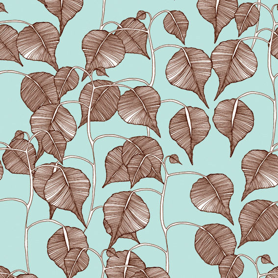
What’s your favourite material to work with and why?
My favourite material is fleece paper, a mix between fabric and paper and this I use for my wallpapers. I love working with it because it absorbs the ink beautifully and gives me this gorgeous print. It’s also really hard wearing which then makes it possible for my patterns to become a feature for a bathroom and kitchen area.
Where do you like to shop for quirky furniture pieces for your own home?
At the moment it’s more about window shopping, so, yes my favourite places would be twentytwentyone, aria, two colombia road, scp, caravan, bohemia... there are just so many lovely places in London selling collective and beautiful design pieces.
What advice would you give to aspiring interior designers?
Believe in what you’re aiming to achieve.
What new projects can we look forward to seeing?
I’m working on my new pattern collection for next year, so yes expect to see more intricate, colourful, cool designs! And at this moment I’m enjoying drawing my blossom print, yeah!
You can view all of Camilla’s designs at www.camillameijer.com. And visit Camilla at 100% Design, K81 on the 23rd- 26th September 2010.
Also, Camilla has been shortlisted for the British Design Awards 2010, and to find out how you can vote read our feature.
Spotlight On: Utility
Under the heat of the spotlight, Utility outperforms on quality and originality.
Since opening its first store in 1999, Utility has become highly renowned for its distinctive mix of contemporary future classics and 20th century design icons. With discernable roots in 1920s and 30s modernism, Utility sidesteps the whims of fashion with designs that don’t date and high quality products that demonstrate the beauty of simplicity and functionality. Furniture, lighting and home accessories are all handpicked by Utility. You’ll find the latest products from independent designers such as Tom Dixon, Ilse Crawford and Marcel Wanders, big brands including B&B Italia, Kartell and Alessi, as well as iconic 20th century designs reissued by Vitra and Knoll.
Celebrating the timeless appeal of good design, Utility’s product range also reveals a commitment to quality, originality and design innovation. The Here You Go coat rack is a great example of inventive problem solving. Simple yet striking, the coat rack is strung from the ceiling, leaving precious floor space uncluttered. Nine metal components link together like a paperclip chain and each has two tactile wooden pegs on which to hang coats, hats and scarves. It’s a beautiful sculptural object in its own right, but also utterly practical. The String shelving system is another ingenious product and an example of Utility’s resurrection of 20th century design icons. Designed in 1948 by Swedish architect Nils Strinning, it’s an award-winning, highly versatile modular storage system. Its simple construction of a powder coated steel frame on which wooden elements hang gives the String shelving system a refined, timeless and unpretentious appeal. Lending itself to both large and small compositions, it’s an investment piece that can be reconfigured to suit changing needs and room sizes.
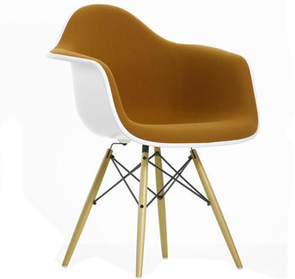
You can count on Utility to be up to date on all the new furniture releases from both established brands and independent designers. Launched at the 2010 Milan Furniture Fair, Vitra has given the classic Eames plastic side chair and armchair a softer new look with upholstery. Chair shells are available in the same mid-century modern colour palette, with Hopsak upholstery in a variety of complementary shades. The DAR, DSW and DSR chairs are all available with this new upholstered fabric option at Utility. Continually expanding and refreshing its product range, Utility has recently become a stockist of De La Espada. As well as producing its own designs De La Espada manufacturers and champions the work of designers such as Matthew Hilton, Ilse Crawford, Autoban and Leif. This beautifully crafted collection is hand made in Portugal, with each piece being made to order.
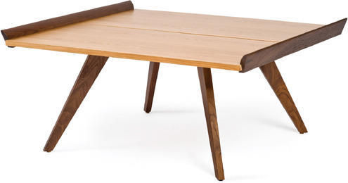
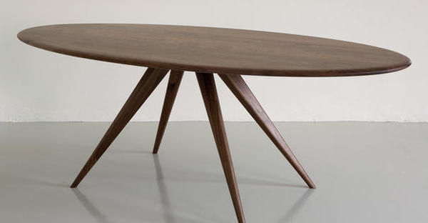
I just so happen to be looking for a coffee table at the moment and I’ve found the perfect candidate at Utility. For me it’s got to be the star product; but whatever you’re looking for there’s a galaxy of equals. Reintroduced by Knoll into the Knoll Studio Collection, the Nakashima splay leg coffee table is a triumph of mid-century design. Designed by George Nakashima in 1948 the beautifully tapered legs complement the angled lip at either end of the table. Available in a choice of timbers with a low sheen finish - a darker American walnut or a lighter Hickory - the splay leg table epitomises Nakashima’s sympathetic treatment of wood and his respect for the inherent beauty of the grain. The table is authenticated with Nakashima’s stamped signature on the underside. At £1,480 it’s an iconic investment piece, but sadly my pockets won’t stretch.
You can shop for Utility furniture, lighting and home accessories on Furnish for gift ideas including Rob Ryan’s new range of oilcloth bags and notebooks.
Our weekly pick of interiors blogs… Sep 15th
Find out what's hot in the world of interiors blogging with our weekly rundown
Contemporist is so slick that it’s really an online magazine rather than a blog; but, hey, we’re including it anyway. The collaborative project of two design devotees, Erin and Dave, Contemporist is a daily source for interior designers and architects to discover new products and projects at the cutting edge of contemporary design. These two never miss a beat and if you want to know what’s up in the world of contemporary design, this is the place to find out. With an international following Erin and Dave’s scope is global, covering the latest in architecture, interiors, furniture, lighting from across the world. Keeping pace with an ever-changing industry, the photographs and write-ups are consistently inspiring.
My Scandinavian Retreat follows a family restoring a summerhouse on the coast of Norway. All the inspiration for transforming the interior is collated on the blog and it’s devoted to Scandinavian style, showcasing a mix of mid-century modern and contemporary design. It was recently nominated for the Best Norwegian Interiors Blog 2010 and you can see why. Fans of Scandinavian style will find all the hallmarks here and the interiors photographs never fail to raise a pang of envy. I’m dreaming of Reiulf Ramstad’s modernist timber-clad beach house. And I’m now even more fixated on a Scandinavian road trip (with a van).
Carrie Can is where graphic designer Caroline de Winter shares her love of interiors, architecture and design. With a wandering eye, she covers a lot of ground, showcasing new products and inspiring designers along with themed posts on everything from wallpaper to storage and rooms with a view. You can count on Carrie to brighten up your day with something beautiful, even if it’s a dirty-clothes basket. There’s always something here to delight and inspire. Carrie recently took a trip to Copenhagen so expect lots of lovely Scandinavian style.
As always, get in touch if you’ve got your own interiors blog and we’ll feature it next time.
Interview: Hunkydory Home
We delve into the world of Hunkydory Home to discover the array of colourful prints and quirky home gifts.
Launched in 2005, Hunkydory Home is Alison Ellerbrook’s creative outlet. Alison found other interior products bland and uninspiring so she set out to create “something a bit different”. With a love of textiles and pattern, she takes pride in her creative handmade pieces and brings an innovative and vibrant style to conventional interior designs. With everything from cushions and lampshades to attention-grabbing accessories and kitchenware, Hunkydory products are bursting with colour and personality.
We caught up with Alison, founder of Hunkydory Home, and here’s what she said...
If you had 3 words to describe your style what would they be?
Quirky, fun, colourful.
Where does your inspiration come from?
I love Scandinavian design which I think stems from spending my early childhood years growing up in Norway. I love children’s products and colour, and I love to find products for grown-ups with a playful feel. I’m always on the lookout for new designers with fresh, new ideas.
Are the products you design for children inspired by your own childhood memories or children’s illustrations?
I make lampshades and cushions using funky fabric prints – I do hark back to memories from my own childhood - the ByGraziela Retro Heart lampshades reminds me of a duvet cover I had in Norway when I was 5 or 6 years old!
What’s your ‘hero’ product and why?
I have to say the lampshades and cushions that I make myself. Hunkydory Home started out just selling my own lampshades and cushions and has grown from there, they are the products that started it all off for me.
How important is colour to your designs/prints?
Bright, colourful funky accessories is what Hunkydory Home is all about so colour is very important. When I started making my cushions and lampshades it was all about creating home accessories that were not the boring beige and cream that was everywhere on the high street.
You use various retro designs on your products, why do you think that this is such a popular trend?
Retro is comforting for so many people, it can be fresh yet familiar. There’s also something fun about something your parents said was naff becoming fashionable again like the ‘ducks flying up the wall’ that we sell.
How do you think that print has revolutionised interior design, and how do you see prints being used in the future?
Print is important because it transforms any product and even changing the colourway of the same print design can give a whole new feel. I think we will see print becoming more integral in people’s interiors as they get braver about using it.
What is the most recent design product that you have bought for your home?
On my summer holiday in Holland, I bought some gorgeous white ceramic birds which are now on my kitchen windowsill. I also recently bought a lovely wooded stool with a colourful crocheted seat for my workroom.
Who is your favourite interior designer of all time and why?
I love Orla Kiely, her prints are fresh and contemporary yet have a comforting retro feel.
Where do you like to shop for quirky furniture pieces for your own home?
I am always on the lookout for things online particularly accessories. IKEA is still great for basics which can be customized or dressed up.
How important do you believe UK manufacturing is to our economy and the environment?
Vital, we have a very strong creative/design base in the UK which needs to be supported. I know so many talented designers with amazing products; I think we need to support small designer-makers and businesses to help grow the economy.
What new projects do you have on the horizon?
Currently we’re launching all our lovely Autumn/Winter products on the website and developing our winter gift guide. We will be working in collaboration with the Mushroom Works design studios in Newcastle in October/November to launch a pop-up shop which is quite exciting.
Browse through more of Hunkydory Home’s gorgeous gifts for your home at furnish.co.uk.
Style Guide: Chinoiserie and Exoticism

Discover Chinoiserie style and spice up your home with a hint of Eastern promise.
Chinoiserie designers tapped into European fantasies of Eastern exoticism. An insatiable desire for exotic goods fuelled the imaginative re-creation of a veiled and mysterious land for European consumption. The East became a magic lantern for the projection of European desires.
Fantasies of Eastern promise and Oriental opulence have stirred the British imagination for centuries. The opening of trade routes with the East had a huge influence on British design and exotic styles reached the height of fashion in the 18th century. A mania for porcelain, silk and lacquer imported from China and Japan inspired British designers and craftsmen to imitate Asian designs, creating their own fantasy versions of the enigmatic East. A generalised impression of mysterious Eastern lands, and the exotic allure of China in particular, inspired a fanciful style that came to be known as Chinoiserie. At the peak of its popularity in the mid 18th century, Chinoiserie was often combined with Rococo, a style characterised by exuberant asymmetrical ornament and sharing similar fantastical elements. Chinoiserie remained popular in the 19th century and Art Deco designers looked to the East once more in the 1920s.
In the 18th century Chinoiserie style was used right across applied arts, as well as for interior decoration, furniture, and garden buildings such as the pagoda at Kew. Objects featured fantastic landscapes, fanciful pavilions, exotic birds and Chinese figures. Interiors often combined genuine Asian elements such as Chinese wallpaper and porcelain with imaginative evocations of the East. Dragons were popular decorative motifs, epitomising for British designers the mysterious allure of Asia. The rooflines of Chinese pagodas were also incorporated into a wide range of Chinoiserie objects, including ornate gilt-framed mirrors and canopied four-poster beds. Wooden furniture was often lacquered, or ‘japanned’, and decorated with imaginary Oriental scenes. Chair legs might take the form of bamboo, and latticework backrests were derived from Chinese screens.
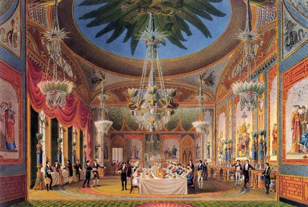
While Chinese was the most popular of the exotic styles throughout the Georgian period, by the end of the 18th century the vogue for exoticism included Egyptian, Moorish and Indian influenced designs. Along with Chinoiserie these styles were often combined in fantastical objects and interiors. A fabulous example of the plurality of exoticism is the Royal Pavilion in Brighton. Between 1815 and 1823 John Nash transformed the original neoclassical building into a fantastic (and fantastically camp) Eastern palace for King George IV. The extraordinary exterior combines Indian, Moorish and Chinese architectural styles. Mogul-inspired onion domes, minaret towers and tented roofs preside over Islamic arches and perforated screens based on Indian jalis.
The interiors underwent several phases of Chinoiserie decoration, designed by Frederick Crace and Robert Jones. Vaulted plasterwork ceilings were designed to evoke the interiors of tents and pagodas. Interior columns took the form of palm trees and oversized bamboo canes, or were decorated with plasterwork ornament in the form of lotus leaves. Serpents and dragons slivered across the walls. The cast-iron balustrades of the central staircase imitated bamboo and the walls in the long gallery, depicting an illusionistic Oriental scene, were partitioned with simulated bamboo fretwork. Painted skylights, lanterns decorated with tassels, and magnificent crystal chandeliers with glass lotus leaf shades lit up the rooms. The whole place was absolutely saturated with colour and pattern. Luxurious wall-to-wall carpets featured elaborate hand-knotted designs, and drew together the decorative elements of each room.
Personally I can’t think of anything much better than a palm tree column to bring a bit of class to a home; but if you don’t want to go for the whole Chinoiserie shebang, you can find elegant Eastern-inspired accent pieces on Furnish. OKA’s Manchu furniture range features Oriental landscapes picked out in gold on a black lacquered ground. The Manchu chest has a different scene on each of its six drawer fronts. In the traditional blue and white glaze, the Kraakware lamp base is hand-painted with Chinese warrior scenes, and crockery is available in the same pattern. The oversized Imperial vase is a striking accent piece, with characteristic blue and white pattern, long slender neck and bulbous base.
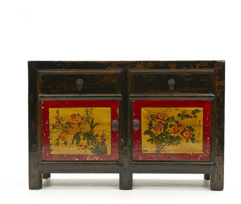
Orchid sources antique Chinese furniture and creates sophisticated Eastern-inspired pieces using sustainable materials. The Mandarin furniture collection is effortlessly elegant, displaying clean lines, lustrous black-lacquered finish and authentic brass handles and door catches. The Mandarin screen features four richly lacquered panels with traditional Chinese fretwork on the upper sections. Evoking the rich colour scheme of Chinoiserie style, Orchid’s reproduction elm cabinets have a yellow-gold lacquer finish and each door features a hand-painted red chrysanthemum in a ceramic-blue vase. Restored antique pieces include a beautiful lacquered elm sideboard (c.1870) with vivid hand-painted decoration in red, yellow and green.
Lombok sources furniture direct from factories in Indonesia and Vietnam. Highlights include the solid wood black-lacquered Canton range with distressed finish and patinated brass handles and drawer pulls. The Canton sideboard and nine-drawer chest are particularly striking. Puji specialises in the design and import of recycled hardwood furniture, which is hand made in Indonesia by local craftsmen. The Shanxi furniture range in white or black lacquer has an understated elegance and would fit in with almost any decorative scheme. I’ve got my eye on the dressing table.
Create an atmosphere of Eastern promise with exotic Chinoiserie-inspired pieces.
Our weekly pick of interiors blogs…
Roll up, roll up, and scroll down for three more lovely blogs.
Heartfire at Home is a great ideas blog. Keeping the home fires burning in Australia, Linda always has something up her sleeve to get you inspired to change things around at home. She’s all about taking risks with décor and going with gut instinct to create a personalised space. The photographs of interiors are full of ideas and indulge Linda’s obsession with colour and pattern. As well as a lovely string of interiors images, there are posts that focus on specific designers, artists and products. There’s always something to spark the imagination and leave you wanting more.
Design Crisis is the collaborative project of two Texas-based creative types, Katy and Erin. Erin’s a photographer, and Katy seems to have fingers in all sorts of pies. She set up the Austin Craft Mafia, a collective of crafty ladies who have their own TV show on the DIY network. Wow. And the blog is fantastic: irreverent, well written and full of design inspiration. There’s a whole section devoted to animals in art and design, which just about sums up the quirky spirit of Design Crisis. These ladies know where to look for great design and the interiors photographs are a constant source of inspiration.
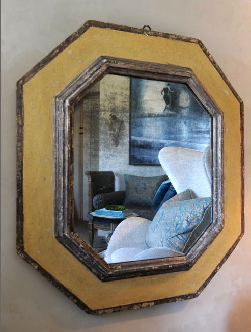
Eye Spy is a daily collection of design images to delight and inspire. From beautiful interiors and cutting edge design, to age-worn objects and flea market finds, it’s chock full of style ideas. An Atlanta-based blogger, Susie’s a graphic designer with a great eye for style. She’s constantly sifting through interiors magazines, design books, catalogues and blogs, searching for things to inspire. There are regular posts showcasing the bargains to be had on 1st dibs, ebay and craigslist. She’s also redecorating at the moment so expect some obligatory ‘before and after’ photos.
As always, get in touch and we’ll feature your blog next time.
Colour watch: Brown
Bring a warm autumnal glow to your home with brown.
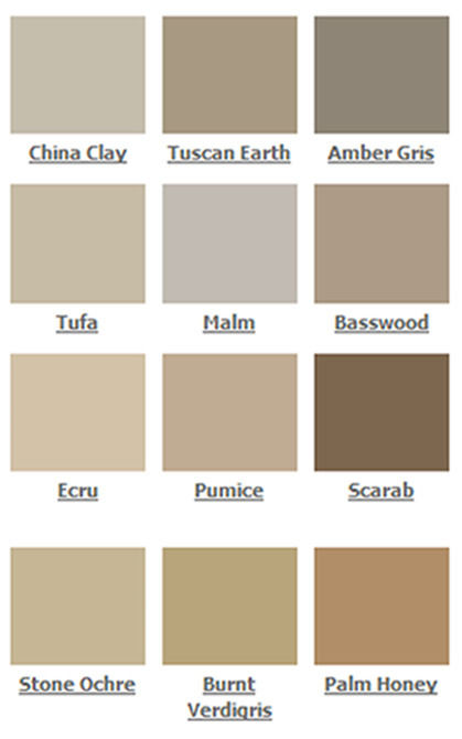
An earthy neutral that will offer a timeless look, we take a look at how brown can bring a warm, welcoming feel to your home.
Choosing the right brown
Brown is softer on the eye than black and it has a timeless quality that can suit either a traditional or contemporary interior. Made up of all the primary colours mixed together, brown hues offer a variety of different undertones that can compliment an interior based in either warm or cool shades. Mochas and chocolate shades are perfect for living areas and bedrooms because they offer warm undertones that give a natural welcoming feel.
Choose lighter browns for walls so as not to make a room feel dark or small; however, in a larger, lighter room you can experiment with darker browns to highlight a feature wall. Ralph Lauren speciality finish paint in the suede look is a good choice because it has been designed to bring a distinctive suede texture and appearance your walls. Try this in a modern bedroom to create an interesting and unique style.
Dark chocolate suede and leather furnishings are popular because they ooze luxury and opulence; both offer a classic and long-lasting element that is perfect for upholstered furniture in a contemporary home. Key furniture pieces such as leather sofas or arm chairs, or headboards or footstools, are a great way of bringing a sophisticated and masculine look to a room. The Vitra Polder leather sofa from Utility is a modern take on a traditional design.
Tonal scheme
Choose a tonal scheme to stop your room from becoming bland; layer your décor in varying shades of brown too add dimension and interest. To give the feeling of space, use darker browns nearest the floor and lighter shades nearer the ceiling. Try the dark brown Sable rug from Puji to add warmth and texture to wooden flooring. Also, try experimenting with pattern to lift your colour scheme; Orla Kiely’s Stem lambswool cushion will draw the eye and add a sense of movement.
.For a clean look, design a monochromatic scheme with whites and creams that will give a natural and earthy appearance that will soften and lighten up your room. You can introduce black into a brown interior, for example, in a bedroom you can accessorise using black blinds, curtains or cushions for a dramatic appearance.
Complementary scheme
Combine brown with rich, burnt tones of red and orange, such as terracotta, for a lavish and inviting feel. Or add a bit of spice to a bedroom with red throws or duvet covers, or choose wall art pieces of dreamy sunsets.
Unexpected combinations of blue, purple or fuchsia with brown can be integrated into your interior by using soft furnishings to add excitement to your scheme. Bright table runners, dinnerware, cushions or throws in these colours will give a cheery pop of colour. Try turquoise on an accent wall or decorative pieces, for example vases or cushions, to add a touch of serenity to your room. Greens can enhance an earthy brown, these colours make a good combination in nature, and you can incorporate this into your home by using plants and decorative vases such as the cylinder vase from Utility.
The Furnish.co.uk guide to bespoke kitchens

Too many cooks may spoil the broth but you can cook and dine in style with our guide to bespoke kitchens.
They say that the kitchen is the heart of the home, and there’s something enticing about designing a room that’s completely unique and full of personality.
Our guide leads you through all the important details that will help you create your own bespoke kitchen.
Planning
When planning a bespoke kitchen it’s important to have an idea of what you want from your space. Search online and through magazines and catalogues, and visit showrooms to see what fittings, surfaces, materials and colours will work best in your kitchen. Take the basic measurements of the area to present to the designer. Practicality is a key element, so make sure you plan for sufficient storage and work top space, keeping the style you want in mind too. Your kitchen should essentially be designed around how you like to cook and dine, whether you eat on the go, cook for a family and use the space for entertaining.
A fundamental part of planning is deciding on a budget and then sticking to it, allowing a little extra for contingencies.
Finding the right company for you
There are a multitude of bespoke kitchen companies out there. One way to determine who the right fit is for you is to see previous work they’ve done. Most will have a online portfolios so you can do some research before even meeting them. Many kitchen companies will offer a complementary design service so take your plan to them and discuss the various options. Gather a few quotes from different companies and decide which one will offer you the best bespoke kitchen design to fit your budget.
Top Tip: Roundhouse Director, Jamie Telford, says that meeting designers is a great idea: “Find someone who you can work with. A good designer will be able to guide you confidently through the whole process to arrive at your perfect kitchen. Designing a bespoke kitchen is a collaboration between you and the designer and it should be fun!”
Setting the brief and budget
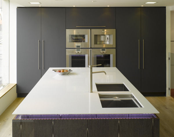
You will discuss options and alternatives with the designer, so be prepared to be flexible with your overall brief. The designer will find the most suitable design to fit your kitchen and your budget. Some of the main points you should cover in your brief are: what style kitchen you want; the measurements and layout; chosen colour scheme, lighting, wall and floor treatments, and your budget limit. Try not to be too swayed by the budget when you meet the designer, while top-of-the range designer taps may be something they view as an essential, you may not agree.
Top Tip: Advice from Jamie Telford, Roundhouse Director: “A new kitchen will add considerably to the value of the property but the budget should be in-line with the re-sale value.”
Choosing your kitchen
Think stylish but functional, and consider what works and what doesn’t work well in your current kitchen. Keep resale at the back of your mind because anything too personal may deter future buyers. The best types of kitchen are functional; create a “universal” room that will be versatile for everyone from children to the elderly. For efficiency, use “the work triangle” as a basis for your design, ensuring that there’s a clear space between your sink, fridge and cooker.
Take into account the amount of natural light that enters the room because too many wall-mounted cupboards can make a room darker. Colour is also an important element in the overall appearance of a kitchen; white has always been popular because it gives a clean look, however too much white can create a cold and sterile feel.
Remember the whole point of choosing a bespoke kitchen is so you can get exactly what you want. Don’t be afraid to ask your designer for something out of the ordinary or different to what they suggest – you’re the one who will have to live with the finished kitchen so it’s important it fits your style and home.
Choosing the extras
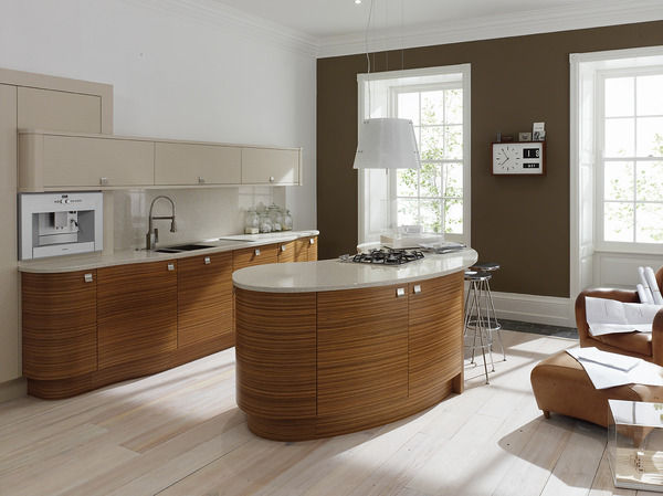
Worktops need to be highly durable, heat and stain resistant, and easy to clean. You can choose from wood, granite, stainless steel, or composite stone, and bespoke versions are available from different designers. Lizzie Beesley, conceptual designer at Metris Kitchens, commented: “The trend for material mix is gathering pace and increasingly more than one surface material is used in the kitchen to great effect. Design-wise, material mix can be used to differentiate work areas or to simply create a contrast between materials, textures and colours. If granite or stone is simply too costly to surface an entire kitchen, then consumers elect to have one area in stone, perhaps an island unit, and then the other areas in laminate.”
Roundhouse offer bespoke splashbacks in glass, stainless steel and veneers as an extension of the work top to protect the walls. However, not all bespoke kitchen companies offer tiles and flooring, so check out Fired Earth’s collection of handcrafted tiles, or Stonehouse’s natural stone tiles to complete your bespoke kitchen.
Avoiding the pitfalls
A common cause of worry is that designers will overcharge or pressurise you into paying for something you don’t want. However, as long as you have researched and found out what’s available and at what cost, you will establish a confident relationship with the designer.
Think about whether your ideal kitchen is realistically going to work in the space that you’ve got; plan around the size of your kitchen and maximise the potential it has with practical and innovative storage solutions.
Top Tip: Jamie Telford (Roundhouse Director) picks up on one of the most common mistakes: “Don’t try and cram too much into your kitchen. Don’t get carried away with your appliance list, and have so many appliances that you have no storage space.”
Style Guide: Arts and Crafts

We look back on Arts and Crafts style and highlight designers upholding the movement’s legacy.
We look back on Arts and Crafts style and highlight designers upholding the movement’s legacy. Celebrating quality construction, skilled craftsmanship, and the beauty of natural materials, the Arts and Crafts movement has renewed relevance in today’s hyper-commercialised world. Ideals of quality over quantity, ‘truth to materials’, and beauty in simplicity are making a resurgence, as concerns over economic and environmental sustainability are reflected by contemporary designer-makers.
Arts and Crafts designers railed against the plethora of poorly made objects and sham historical styles churned out as a result of growing industrialisation and commercialisation in Victorian Britain. Developing in the 1860s as a reaction against stuffy ornament-filled interiors, gaudy commercialism and industrial production, the Arts and Crafts movement sought to restore the link between beauty and utility, material and design, hand and object. Rejecting the division of labour in industrial manufacture as dehumanising, Arts and Crafts designers set up small workshops in which objects were made from start to finish by skilled craftsmen. Handcrafting and taking pleasure in work were seen as morally uplifting, and morality of manufacture was coupled with morality of design. ‘Truth to materials’ was the moral compass of good design. The inherent beauty of natural materials was celebrated and designers were to have a full understanding of the material being worked in order to produce well-designed objects fit for purpose.
The high moral seriousness of the Arts and Crafts movement might be a bit of a turn off. (It’s detailed in possibly the most tiresome tome in the history of design: News from Nowhere, by William Morris.) But a visit to one of the great houses of the Arts and Crafts movement, Rodmarton Manor in Gloucestershire, dispels any misgivings about the actual designs produced. Hallmarks of Arts and Crafts style include simple structural forms (used to emphasise the natural qualities of materials), exposed construction (such as wooden pegs and joints), tactile ergonomic design and organic patterns. All these are evident in the interiors at Rodmarton Manor, while the exterior draws on the bold forms of vernacular architecture in rural Britain.
Designed by Ernest Barnsley in 1909, the house features traditional Cotswold architectural details including gables, stone mullions, leaded lights and tall chimneys. Employing local craftsmen, it was built using local stone and tiles, as well as timber felled from the surrounding area. Much of the furniture was made for the house at Rodmarton workshops and includes designs by Ernest Gimson, Alfred and Louise Powell, Ernest Barnsley’s brother Sidney, and Sidney’s son Edward. Perhaps the very best work, and that which goes furthest to shake off the ‘backward provincial’ tag, is by Dutch émigré cabinet-maker Peter Waals.
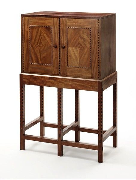
Waals produced two burr walnut writing cabinets for the drawing room at Rodmarton as well as numerous other pieces. Finished to a high lustre, the cabinets show off the beautiful grain of the walnut, featuring raised panels and drawers with chamfered edges, exposed dovetail joints, holly and ebony inlays, and handles with carved finger holds. The rooms at Rodmarton are large, and furniture was built to match: great dressers, chests and cabinets with multiple drawers, tactile grab handles and sliding wooden door catches. But the quality of detailing is remarkable: delicate inlays, turned, tapered and chamfered wood, and multiple timbers enhanced to bring out the grain. Oak floorboards are overlaid with bright hand-knotted rugs; whitewashed walls enhance feelings of light and space; curtains and drapes feature organic patterns based on floral and animal forms. In the library, a huge screen painted by Louise Powell depicts young ferns, spindly trees with delicate blossoms, and frolicking squirrels and birds. After visiting Rodmarton in 1914, C R Ashbee, an influential exponent of Arts and Crafts style, proclaimed that ‘the English Arts and Crafts movement at its best is here’.
Although the Arts and Crafts movement is associated with the country life, it had a strong cosmopolitan base. Arts and Crafts style was popularised by shops such as Liberty and Co. though which designers including C F A Voysey, Ashbee and William Morris sold their work. Liberty adopted Arts and Crafts as its signature style, and continues to produce fabrics by Arts and Crafts designers today. With the current resurgence of interest in craft, and the desire for quality over quantity in economically uncertain times, the ideals of the Arts and Crafts movement are making a comeback. Contemporary designers are spearheading a revival of craftsmanship and traditional skills.
Tom Dixon’s Beat vessels and shades are made from hand beaten brass using a traditional, rapidly vanishing skill from Indian master craftsman. His pressed glass pendant lights are hand cast and each reflects the inclusions and imperfections of the manufacturing process. Dixon established the brand in 2002 with a commitment to reviving the British furniture industry, and his work draws on Britain’s craft heritage. Dixon’s Natural Slab chair has all the Arts and Crafts hallmarks. Crafted from solid oak with a deeply brushed surface, exposing the grain of the wood, visible wooden pegs fix the seat to the frame. Innovation is combined with traditional craftsmanship to create a space-saving, stackable dining chair. Dixon’s Offcut furniture range uses scraps or ‘off-cuts’ of oak that would otherwise have been discarded, and embraces the beauty of imperfection. Arts and Crafts ideals are united with current environmental concerns.
Anna Lockwood of Lockwood Design creates unique, one-off pieces of furniture. She specialises in traditional upholstery techniques and uses natural materials such as hessian, coir fibre, horsehair and calico. Sourcing vintage and antique pieces as well as providing a complete restoration service or a simple recover, her work is environmentally friendly and craft driven. The Holland occasional chair has an Arts and Crafts look about it, with a turned wood frame and seat upholstered in orange felt. The Benjamin wing armchair has the same 100% wool felt upholstery and beautiful bees-waxed legs. It wouldn’t look amiss at Rodmarton Manor.
Running an apprenticeship scheme and employing and training up workers from the local area, Benchmark continues the legacy of the Cotswold Arts and Crafts movement responsible for Rodmarton Manor. Producing contemporary classics with sustainability in mind, Benchmark is founded on a belief in the timeless appeal of good design. Celebrating high quality materials and traditional craftsmanship, the furniture collection is hand made to order from start to finish in the workshops in West Berkshire. The angle-fronted Admiral Cabinet in American black walnut with lacquer finish epitomizes ‘truth to materials’, working to bring out the natural beauty of the wood grain. Crafted from solid fumed oak with a lacquer finish, the Jack Pedestal dining table recalls a design by Ernest Gimson in the Drawing room at Rodmarton. The Darcey table and Furrow sideboard evoke the simple sophistication of Arts and Crafts furniture.
Good design and quality construction never date. Celebrate design innovation and invest in the future of traditional craft skills.
Spotlight on: black+blum
We take a look at how black+blum bring innovative style to your home.
Creative designers Dan Black and Martin Blum complete the Anglo-Swiss partnership of black+blum. Their design consultancy business, set up in 1998, has given them the opportunity to explore and develop their passion for design through their own range of functional products.
What makes black+blum unique is that they don’t create fashion products that only have a short lifespan because they are based on current trends. Instead, their aim is to create designs that will inspire people’s imaginations and give lasting enjoyment. They’re proud to showcase designs that offer longevity; the products all serve a practical use which should still give them value in many years to come.
The Loop candelabra and the Flower loop vase showcase black+blum’s elegant yet minimal style. The Loop designs are inspired by the Fibonacci curve which can be seen throughout nature, giving a balanced and aesthetically pleasing look. The loops can be linked together and used in interesting ways; rotating it offers a different look from every angle, giving the design a fresh and changeable look. Both designs offer good functionality and they’re based on the fact that people, from history and into the foreseeable future, will always have a use for them.
black+blum are renowned for producing designs that have huge amounts of character; so, it is not surprising that one of their hero products is the award-winning James the doorstop who offers plenty of personality. Due to popular demand, this quirky design has also been remodelled into a bookend. James the bookend is made from synthetic rubber, except for the black version which is made from recycled material, and it can be used individually or as a pair. The stainless steel plate fixed to his foot gives him the strength to hold up a number of books. Transcending taste, the James products are widely recognised, and people appreciate the design for its functionality and humour.
My favourite product is the Kind of Magic light which tricks the eye into believing that this is just an ordinary light. However, the shade is suspended from the ceiling with fishing wire so it appears to be floating. This illusion makes it possible to arrange and personalise the light in any way you want; it transforms easily from a floor lamp to a table lamp, creating a fascinating piece of feature lighting.
One of black+blum’s newest products is the high&dry dishrack which took them two years to develop; its distinctive style, inspired by architecture, has recently won an International Design Award in America. Dan and Martin came up with the design when they realised that there was a niche in the market. The design has a unique and appealing sculptural shape that looks good when in use, and also enables it to fold down into a compact size for easy storage. The unique flip spout on the drainage tray gives you the option to drain or not, depending on your kitchen set-up.
black+blum’s products are available on furnish.co.uk, and for their latest news and events visit their website at www.black-blum.com.

