Interview: Georgia Horton
Naturally beautiful: Georgia Horton’s luxury wallpapers bring the colours and patterns of nature together to create something special
Designer and artist, Georgia Horton is fresh from exhibiting at Decorex where she successfully launched her ‘New Naturals’ collection.
We caught up with Georgia to find out what inspires her and what’s next on the horizon...
If you had 3 words to describe your collection what would they be?
Bold, organic, architectural.
You have described your illustrative wallpaper as “somewhere between organic and architectural”, can you expand on this?
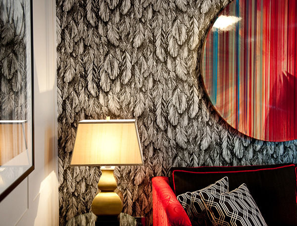
Many of my designs originate from sketches that I have drawn from what I see around me in nature. For me this is a great way to begin because I can put a design down on paper and let it expand and grow from there. For example, from paper to print, I believe that the whole process of designing all the way through to the manufacturing can be described as organic because it feels like a natural, creative process. I think the word ‘architectural’ captures the depth and 3-D quality of my designs.
How have your childhood experiences and time spent in South Africa and Italy influenced your life and your work?
My father was an architect and my mother was an artist so I have grown up with a huge artistic and creative influence in my life. You can see that there are both Italian and wild African styles apparent in some of my designs, although I couldn’t say that there’s any specific place that I have taken inspiration from. I get my inspiration from all over the place and have my eyes open for new ideas all the time.
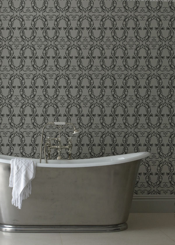
I particularly love the Lobster Quadrille’ in ‘The One Collection’ because of its quirky appeal. You use a lot of symmetry in your designs and repetition, how do you feel that your artistic background has helped you?
It has helped me understand perspective and scale. For example, with the Lobster Quadrille, scale is important because it offers a different perception depending on your distance away from the wallpaper. On a larger scale you can see lots more of the detailing such as the horizontal trellis.
I’m also intrigued by the patterns and symmetry found in nature which inspires a lot of my designs. I really appreciate Escher’s work because he experimented with symmetrical designs and he explored the idea of reflection.
What is your best selling design from your collection and why?
The Lobster Quadrille is one of our best sellers because it has a unique style that draws you in. This is followed very closely by the Quilt design which is also a very popular choice.
How do you feel that wallpaper will develop, and what direction do you hope it will go in the future in order to keep interior design fresh and exciting?
Wallpaper has been around for such a long time and it has gone through several periods of change. However, I think that this is an exciting time because wallpaper is leading people into a different approach to interior design, and it has encouraged waves of boldness and eccentricity.
How is the quality of your wallpaper improved by your use of hand mixed colours on hand printed paper?
Our paper is of a high quality and it’s sustainably sourced. The hand-printed paper is strong and durable which helps improve the richness of colour and it also gives an appealing tactile quality.
How important do you believe it is for interior design to become more eco-friendly?
I think it’s extremely important! All of my designs are manufactured in the UK, and I do aim to move with technology and keep up with sustainable ways to produce my wallpapers.
What did you last buy for your home?
I’ve recently bought a typical 1970’s retro style easy chair which I have upholstered in my own fabric in the Quilt design.
What advice would you give to aspiring interior designers?
I would say take initiative; listen to your clients and consider their brief but at the same time bring a new edge and individuality to your work.
What are you working on now, is there anything new in the pipeline?
Yes - In fact I’m developing a new collection for 2011 which will have bolder and braver colourways.
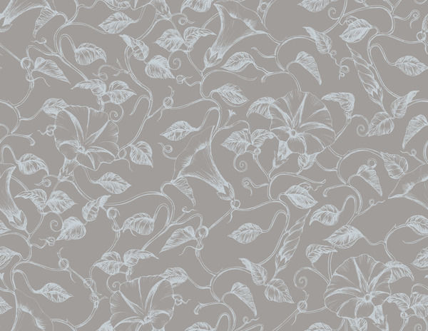
I have also just launched my ‘New Naturals’ collection which features organic colours such as pale sage, calico, buttermilk and stone. We created this in response to a high demand for neutrals with strong decorative appeal.
Visit Georgia Horton’s website for more information and to view her whole collection.


