It's our Interior Design Magazine!
The hottest interior design ideas, fab finds for the home and buying advice. We're always looking for new finds, designers to feature or anything else lovely for the home, so if you've seen something gorgeous and would like it featured in our interior design magazine, please get in touch!
Interview: Mini Moderns
From quirky 1950’s textile designs to vintage toys and games, Mini Moderns has it all.
British design duo, Keith Stephenson and Mark Hampshire of Absolute Zero Degrees, a graphic design based outfit, are behind the wonderfully quirky Mini Moderns collection.
We interviewed Keith Stephenson to find out more about their exciting, retro collection….
If you had 3 words to describe your collection what would they be?
Contemporary, Soft, Modernism.
How would you describe the idea and aim behind your slogan: ‘Homeware for design conscious families’?
When Mark and I created the Mini Moderns wallpaper collection we wanted it to appeal to kids and, what we were calling then, “kidults”. No one else was appealing to a cross generational market at this time. We wanted the consumer to be able to buy something cool that their kids would love but that they could also live with happily.
Despite having a fantastic following and reputation with the kids products, we have always created products that we’d love too. This, I think, gives our print designs a lot more depth than papers produced purely for adults – which are usually trend driven – or pure kid’s patterns, which are often twee. I think it is very easy to spot a Mini Moderns design.
What would you choose as one of your favourite design classics of all time?
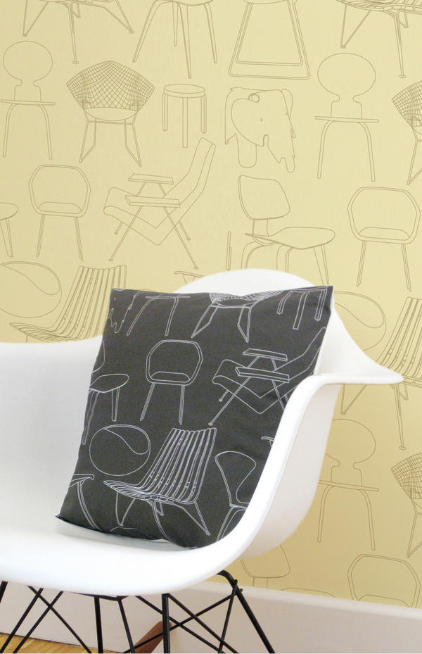
Mine is the Eames rocker; Mark’s is the original Mini car.
What inspires you to combine retro and modern styles and what do you feel this brings out in your products?
We’ve always had this mix in our collection – there’s something optimistic about mid century modern designs in print – so we wanted to capture some of that – but giving them a contemporary edge – not a rose-coloured vision of the past.
You operate a predominantly ‘Made in the UK’ policy, how important do you believe it is for the future of interior design to become more eco-friendly?
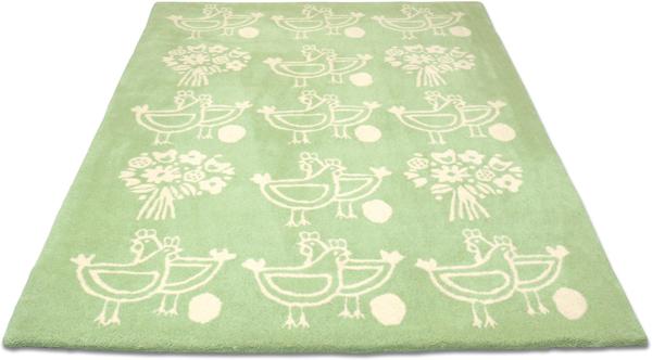
We’ve always produced in the UK – it has been our policy from the word go. We wanted to utilize the amount of great UK producers and build good relationships with them, that way we know that our products come from sweat shop free environments. It also means the products travel less so we try to keep an eye on our carbon footprint so even when we export the amount of journeys is limited. The only products which we don’t produce in the UK are our rugs. These are a license product and are produced with a company who approached us. However, we make sure that the rugs are delivered direct from the factory to the customer so they don’t arrive with us and get dispatched again on an extra unnecessary journey.
What’s the most popular design from your collection and why?
We have several ‘hits’ in the collections which shows the cross generational appeal of our products. The ‘Town’ print still continues to be popular even though it was produced in 2005, and has been influential to other designers. This has been used in dining rooms and children’s rooms. Our ‘C60’ retro tape cassettes wallpaper has also been a hit with dads and older children – and has recently been used in the refurbishment of the BBC Radio 6 studios.
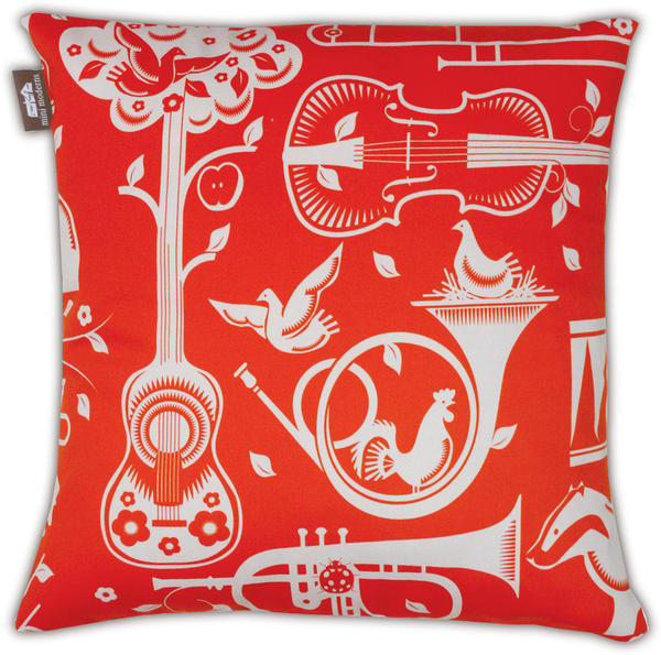
Recently our ‘Pet Sounds’ wallpaper has had great success – which I think is indicative of a Mini Moderns design – no-one else would have even thought of using the imagery and combination of imagery we used. It’s easy to produce something ‘out there’ but the skill is making it still something that people want to spend everyday living with.
Can you tell us a bit about your new ‘Festival’ wallpaper and what the story behind it is?
We’ve collected festival of Britain memorabilia for a long time now. The Festival of Britain in 1951 was an exciting glimpse into the future, celebrating the new wave of British design, with design for all available via the introduction of Hire Purchase schemes. New design was everywhere. It’s the optimism we love, and over the years we’ve amassed a number of items celebrating it. The C.O.I.D. book Design in the Festival is a particularly inspiring find. Having been huge fans of the Festival of Britain, it was an honour to be commissioned in 2008 by the Southbank Centre to reproduce as wallpaper, one of the Festival’s signature patterns, Net and Ball. This had been designed in 1951 by the architects of the Royal Festival Hall, Peter Moro and Leslie Martin, as a carpet pattern for the Hall. Our obsession culminates in our new wallpaper in commemoration of the Festival’s 60th anniversary, featuring our favourite pavilions and sights.
How do you experiment with colour and how important is this to the finished print?
Colour is very important to us and Mark is a great colourist. Because we’re fundamentally print designers more than product – it’s this aspect of our designs that excites us! The prints tend to be rich and dense with imagery so getting the balance right with colour is very important. We don’t work seasonally or are trend driven with colour, instead we go with what works with the print. These colours then go into our Mini Moderns colour book, and are used in future ranges so that you can mix up our patterns and there is still a synergy across all our collections. We also have fun with the names of the colours too – like “milk chocolate” or “powder paint blue” etc, most of which relate to a collection or product. Our ‘Harvest Orange” colourway was an homage to the Neil Young album ‘Harvest’ as it was first introduced in our Folk Rock collection last year.
I love your Folk Rock cushion collection (If I had a camper van, which I’ve always wanted, then I’d fill it with these!). What inspired this collection of prints?
The ‘Folk Rock” collection was inspired by a very rare holiday for us to the West Coast of the US. We spent time in LA, the Big Sur and San Francisco. Pet Sounds was a mix of two concepts for prints we’d been working on and the time away helped us to focus and consolidate it into one. We had been working on a musical instrument print and a British wildlife print and then decided to combine them to make our Woodland cacophony – which was originally called ‘Fanfare’ – but when we realized where the collection was going – a nod to the Beach Boys seemed appropriate. After all we were in California. ‘Alice’ was also a print which, finding a section of a dirty piece of vintage barkcloth fabric in a thrift store in California, took on a life of its own. Our friend Alice had asked us to design a wallpaper for her house – and we had always thought – ‘if Mini Moderns did a floral – what would it look like?’ so we used the vintage fabric as inspiration and created the print. As it was part of the Folk Rock collection we thought Alice was a good name for it, and as Lewis Carroll’s heroine had long been an inspiration for 60’s West Coast psychedelic artists – like Jefferson Airplane – so Alice it was. We supplemented the cushion collection with our ‘International Cocktail Hour’ range of found vintage fabrics with a Trader Vic’s atomic/Tiki edge.
How do you think your prints can transform a room?
Prints give a room more character and depth.
How do you see print design progressing in the future?
Our prints develop from season to season. We’re more confident in our aesthetic now. Initially it is daunting as you have no audience for your product, so it’s easy to lose your direction and then you stand back and can’t quite understand what your designs are trying to say about you as a brand. We had to have the courage to just put our ideas out there and it has seemed to work.
What did you last buy for your own home?
Our last two purchases were two lamps: One is a “base lamp’ by Tom Dixon – it was rather expensive but beautiful! The other was by Group Design and it’s a sleek white reading light – which wasn’t as expensive but is by no means less beautiful…
What advice would you give to anyone thinking of introducing print to their home?
Most people will send out wallpaper samples but be focused about what colours you want for a room. Otherwise you end up with a confusing mess of hundreds of pieces of paper. The process should be fun. Also, try and go with an independent designer, there are more like us out there, and most wallpaper is produced in a handful of factories across the UK. Even the smallest independent designer will have the same high quality as a larger company. That way your room will have individuality.
If you could collaborate with any designer who would you choose and why?
I’ve previously worked with Wayne and Gerardine Hemingway when I was a print designer at Red or Dead. Also, recently both Mark and I have worked with them as part of a team curating areas for their Vintage festival – they are great to work with and when you do you become almost part of their family. We will be working with them again for Vinatge at the Southbank in July.
Other designers that we would work with would need to be someone who didn’t overlap with our skills, like product designers, that share our philosophy and aesthetic. Mark would love us to work with someone like Terence Conran – as he is a lifelong hero of his, and Russell Pinch is also fantastic. We were extremely excited when the Conran Boundary hotel specced up our wallpapers for a number of their rooms. A forgotten vintage brand would also be good to work with – we had always wanted to work with someone like Ercol – but someone like Gplan or a company like Ercol who have embraced their heritage would be great.
What new projects are you working on and what do you hope to achieve in the future?
We’re currently getting our new collection together. “Festival” is the first in this collection which launches as a whole in September. The collection is called ‘Daytripper’ and celebrates British holidays, hobbies and pastimes. We’re also creating new accessories designs for mugs and bags. We have a wealth of prints now in our back catalogue and are able to pull these into different products – so as well as new prints – there will be some old Mini Moderns favourites on other items too.
Interview: Ghost Furniture
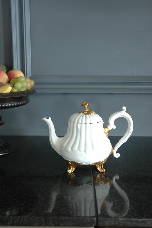
Hauntingly beautiful: The Ghost furniture collection makes a striking impression
We caught up with Di Overton to find out more about the collection and what gives it its ghostly beauty.
If you had 3 words to describe your collection what would they be?
Eclectic, eclectic and eclectic.
How would you describe the idea behind ‘Ghost Furniture’ and what makes it ‘hauntingly beautiful’?
The original idea was to create something new from discarded items. Not shabby chic but eco chic. I’m no eco warrior but it saddens me when I see formerly beautiful items cast aside when they still have some life in them. We use the term ‘hauntingly beautiful’ because we always try to let the original piece show through the new design making it somewhat ghostly.
How did you first become interested in creative design?
I think I was born creative. No doubt I would have re-designed the labour ward had I had the skills. I think it’s in the genes. I seem to have spent my life re-creating things.
What would you choose as one of your favourite design classics?
The Egg Chair by Arne Jacobsen without a doubt. It wraps itself around you; will sit in any interior design scheme, and it’s timeless.
What inspires you to take vintage designs and turn them into something that’s eco-chic?
I’m inspired every time I look up. I live in The Northumberland National Park and am surrounded by beauty. That beauty is not manmade but I do believe it can be translated into product design. I seem to have the sort of brain that takes in a view and turns it into a design, how I do not know but it seems to work.
How important do you believe it is for the future of interior design to become more eco-friendly?
Landfills can only take so much. It can only go on for so long this throwaway society of ours. I like to think that interiors can be treated like fashion – take a little black dress, add an accessory and you get a totally different look. So why not do that with interiors?
What is the most popular design from your collection and why?
There are two – Chairs and Blackboards without a doubt. I think chairs are popular because we
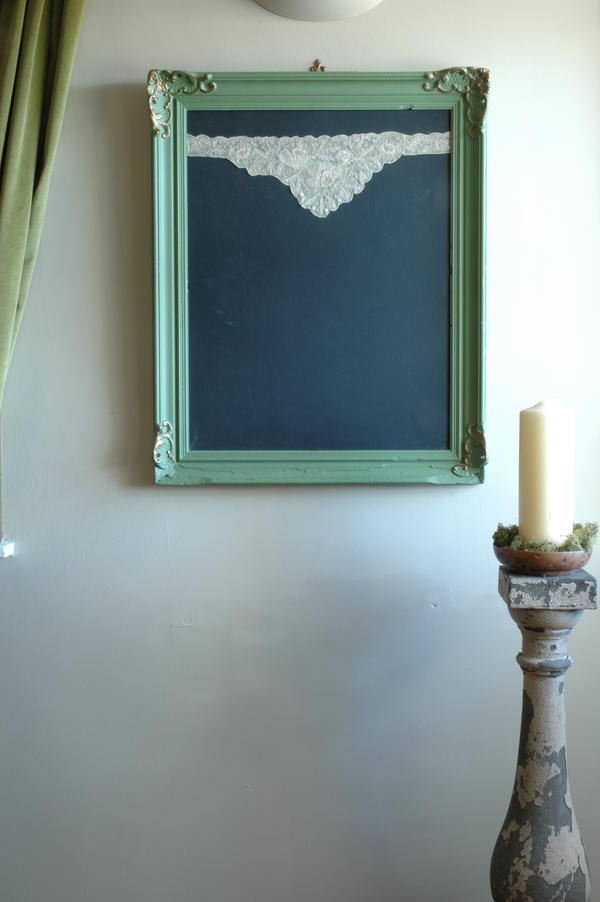
design them to fit into any room in the house; they make a statement about the people who buy them and blackboards because they’re so useful. Chalking up a message is so much more
glamorous when in an ornate vintage frame, don’t you think?
You use dead flat matte paints which are sourced in France and that are specially mixed for you. How does this paint make your furniture unique and what look does it create?
In the UK there is no such thing as a dead flat matte paint for wood and metal, the flattest we can get has 5% sheen. Dead flat matte hides a multitude of sins and needs no preparation which means we can keep the price down. It’s like applying double cream to the furniture, sometimes I have to stop myself licking the paint brush it looks so delicious. It creates an antique look without all the chips and scratches that have to be done when creating shabby chic. I’d like to add here that I do love shabby chic but only when it’s shabby with age not with a paint effect. I want to see the history of a piece shining through.
I particularly love the Marilyn chair, could you explain how Marilyn’s famous photo pose inspired this furniture piece and what materials you used to create it?
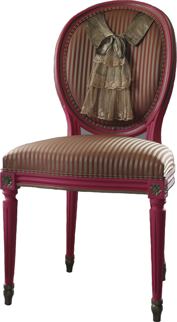
I found a 1930s satin pillowcase at a brocante in Paris on a very windy day and immediately thought of the famous photo of Marilyn Monroe when it was billowing up in the wind. The only way I could think of re-creating that effect was to fill the back panel of a salon chair with of much of the fabric as possible. My mind works in mysterious ways.
What do feel your furniture and accessory pieces can bring to a room?
A story. Every piece has a history and its story is told to the buyer when they purchase it. This is most important to me and, from what I can gather, to them also.
What did you last buy for your home?
A huge spiral staircase made from cast iron with lattice work treads. The light casts down on it from a roof light above and creates a beautiful pattern on the floor.
What advice would you give to anyone shopping for a unique furniture piece?
The same advice I would give to anyone buying anything – KNOW THAT YOU LOVE IT – any doubts don’t buy it. A piece of furniture should be a reflection of you and your life so you can live in harmony with it.
If you could collaborate with any designer who would you choose and why?
I think I’ve already done that. In 2010, I collaborated with Kathy Dalwood the sculptor of fabulous concrete busts. Together we created a range of Concrete Tassels cast from vintage originals and trimmed with vintage passementerie from the merciers of Paris. It was a fabulous experience and I doubt whether anyone else could surpass it.
What new projects are you working on and what do you hope to achieve in the future?
I have just created a new effect by using a lace stencil and creating two different textures but in the same colour. I’ve just finished the first piece which is a Regency console table and have used the effect on the table top which has made it look as though it is made from lace. The whole piece is black and looks very dramatic.
A future achievement would be to be able to continue creating new and innovative pieces at a pace that is pleasurable, up to now I have achieved that and would love to keep it that way.
View the whole collection...
Trend watch: Chunky cable knits
Cosy up with chunky knits
Fabulous textures are in style, so don’t drop a stitch; treat your home to some cosy chunky knits. We show you how the knitted look can bring a cosy charm to your home.
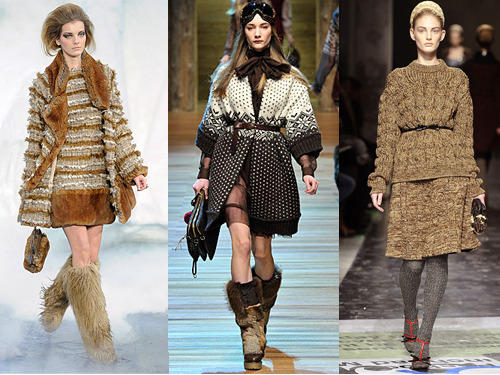
Chunky cable knits are no longer just a catwalk fashion trend; you can bring them into your home in the form of cosy cushions, luxurious throws and even stylish stools. Whether you want to bring texture, warmth or colour to a room, a knitted accessory is a great choice. This trend celebrates an oversized, voluminous style, and what’s great is that you can introduce knits to any room of your house.
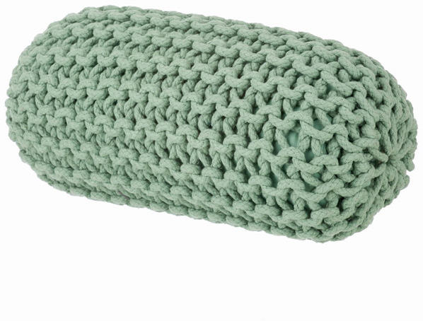
The Knitted Floor Cushion in yellow from 95% Danish can bring bold colour into a room and provide versatile but comfy seating for you and your guests. You can sit on them, lean against them or simply stack them to suit your needs. Or try their Knitted cylinder cushion, available in green and coral, to give a splash of colour to an otherwise neutral scheme.
Knit one, purl one…knitting has always been associated with grannies but the tradition of crafts lives on and in fact, the world of interiors has taken on a whole new knitted perspective. There’s a renewed interest in crafts, particularly knitting, and the traditionally loved style of the cable knit is being used in more ways than one to bring a homemade element into your home.
Who needs chandeliers and extravagance when you can have something with a personal touch? I adore the hand-knitted thick, woollen threads of the ‘Granny’ pendant lamp by Pudelskern for Casamania. These lamps are made from pure natural sheep’s wool and each lamp can be traced back to the flock where the wool came from. A natural treatment is applied to make the wool flame resistant and to avoid moth and mite infestation.
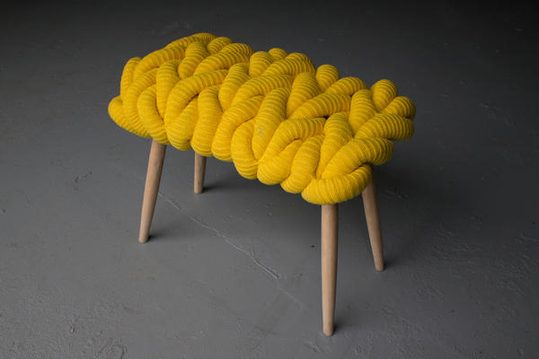
If you’re looking for a stylish furniture piece, Claire-Anne O-Brien’s statement collection is inspired by elements of the knitted stitch itself such as rings and loops. Her chunky knit stools are all handmade in ash with hand-knitted seats in either lambswool or a merino wool and mohair mix. The stools are also available in chunky British sheep’s wool which are all undyed in their natural colours. One of these stools would be a fantastic way to introduce the chunky knit trend to your home, combining style, colour and comfort.
Layer beds and sofas with knitted throws and cushions for a luxurious style that will mean you’ll never want to venture outside again. One of these chunky knit merino wool blankets from The Wool Company would be perfect for a cosy evening in. Or the chunky aran knit throw is perfect to cuddle up to; the pure new wool gives it a chunky, warm look and feel.
Add texture to your pencil pots and vases and bring a warm and comforting feel to your living room or study with a Ferm Living Knitted Vase from Stylish Life. And if your home is in need of added storage, why not choose these knitted storage baskets, available in three sizes, from Rockett St.George. These gorgeous knitted baskets are made from 100% cotton rope and come in three different colours to suit your colour scheme.
With interior design becoming more eco-friendly, it’s no wonder that the knitted trend is proving popular. Wool is naturally flame retardant, it helps control humidity, and it’s even good at absorbing sound. So go for a luxurious rug to make the perfect feature piece on wood flooring in a living room.
This is certainly a popular traditional trend that can be kept alive with a little imagination and a modern twist.
Colour watch: Coral
Bring optimistic coral hues into your home
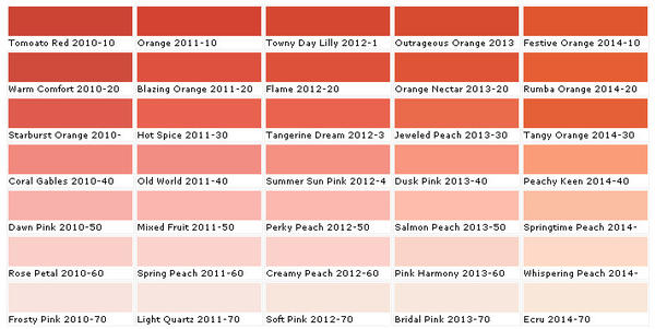
Start the year afresh in your home with the vibrant, optimism of coral hues. This soft orange tone has a cheerful and feminine feel that will bring warmth to any room. It’s the perfect shade to banish those winter blues and prepare your home for the spring.
Coral easily pairs with other colours and it works well within existing schemes that simply need a fresh splash of colour. Choose a coral shade of paint to bring warmth to a cooler room which will also create a more welcoming feel. Fired Earth offer a selection of natural and organic shades from Coralline to Cinnabar red which evoke colours found in exotic coral reefs.
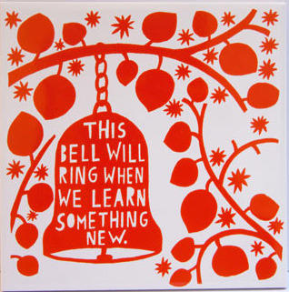
To instantly add a splash of coral in your kitchen, try these quirky Orange ceramic tiles designed by Rob Ryan from Liberty. Or pick a bold feature piece such as this Tolix Square Table from Pedlars. This design is practical and stylish; the electric orange shade gives this table a striking and modern appeal.
Tonal scheme
With its spectrum ranging from deep pinks to reddish orange tones, coral is a very appealing and positive colour to decorate with. Mix it with earthy tones or pastel shades for a stylish look; this sea anemone shade brings a warm ambience to a room without being as harsh as red can be. Coral also complements wooden floors and works well in living and dining rooms.
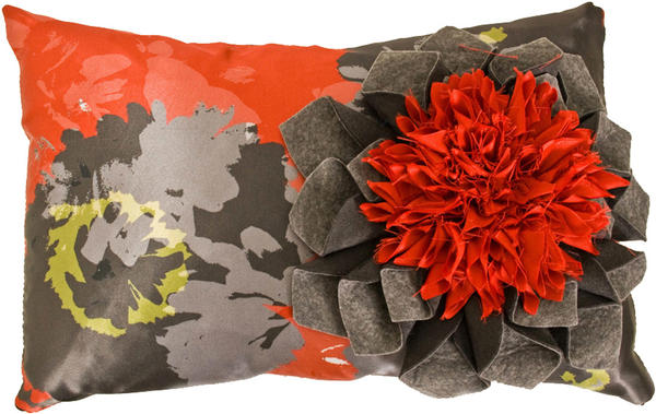
If you want to go for a dramatic statement, go for a coral colour scheme that is highlighted by black accents. I absolutely adore Lorna Syson’s Pasadoble Dahlia cushion which has a vibrant coral orange floral sculpture. Floral cushions are a great way to add pattern and texture to a room and they will also accentuate and enhance the colours in your scheme.
Combine coral with white to give a clean, crisp look; this monochromatic scheme would work well in a dining room, bedroom or bathroom. Colour blocking is a great way to get this style, so try painting with a bold coral shade and create a pleasing contrast with some white curtains or a white picture frame.
Complementary scheme
Teal and green are opposite red-orange coral on the colour wheel meaning that together they work well to create a big impact and an exciting combination. The Teal Turned Wood Table Lamp from Heal’s has a velvet shade which will add texture and colour. A teal vase, ceramic bowl or a set of coasters can simply set of your colour scheme without making a loud statement.
Accents
You don’t have to complete redecorate to introduce coral shades into a room; use smaller accessories and accent pieces for the finishing touch or to give a room a new lease of life.
Choose some gorgeous blooms such as coral coloured roses for an uplifting and feminine touch. Or bring stunning orange and pink coral shades into a room by scattering a few of Clarissa Hulse’s Silk Cushion from Heals’. Or try this interesting cylindrical shaped table lamp from Habitat to add colour to your room.
Coral can be a dominating colour in a room, so use it in moderation. Try this painted metal coral candle holder from OKA on your dining table for an ideal conversation piece. A framed piece of artwork is an excellent way to inject colour into a room; a dreamy sunset canvas, for example, could be the perfect personal touch.
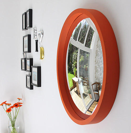
Cosmo mirrors from Omelo
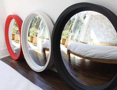
Brighten up your room with one of these Cosmo mirrors from Omelo. £355
Omelo is a new interiors company to me but I am sure glad I’ve found them as sell some of the nicest mirrors around.
All of Omelo’s mirrors are convex which means they’ll bounce even more light around your room, which is perfect is you’re lacking in natural light.
There are a whole host of designs to choose from classic to contemporary but my favourites are these Cosmo mirrors.
Deliciously simple, these round, thick-rimmed mirrors make the perfect choice for hallways, bathroom and bedrooms alike.
Available in Orange, Off White, Black and Red, one of these mirrors will instantly add a pop of colour to your room’s scheme.
But that’s not all, Omelo also offers a bespoke service which allows you to choose from a range of colours and finishes and even flat mirrors if convex ones aren’t your thing.
All they need to do now is introduce a wedding list service, as one of these mirror would definitely make it on to mine.
(We don’t list these products yet but sign up to our newsletter and we’ll let you know if/when we do)
Spotlight On: Tom Schneider
We take a look at Tom Schneider’s curvy, contemporary designs...
With a passion in creating distinctive bespoke furniture, Tom Schneider succeeds in bringing a new look and feel to contemporary interior design.
Furniture designer, Tom Schneider began his career working in a small workshop, making bespoke furniture for individual clients. His first collection which was launched in 1996 includes the Swirl coffee table and the DNA shelves which have become his most popular designs to date.
The collection includes contemporary, curved furniture which is available in a selection of veneers to suit any interior. Every piece is individually handmade by a team of craftsmen, ensuring that the final product is unique and unlike any other.
We asked Tom what he hopes his designs achieve and what inspires him, and he told us that “the aim is to create contemporary classics. The designs should give pleasure and enhance the look and feel of the customers home or office space. My inspiration comes mainly from nature with the female form featuring frequently.”
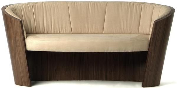
The Eclipse Sofa is a prime example of Tom’s work. This beautifully shaped piece, available in a two or three seater and would work equally in any classic or contemporary home. The Eclipse collection also includes a console table, dressing table, and shelves, epitomises the beauty of Tom’s work and proves that their simplicity will ensure it remains a contemporary classic for years to come.
The fluidity in shape and form of Tom’s furniture can be closely compared to the modernist design which emulates organic forms found in nature. Tom’s work boasts flowing curves which are created by laminating plywood to form strong shapes, and then these are skilfully veneered by hand.
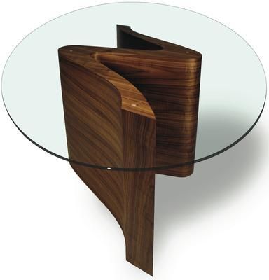
Tom claims that his “most loved” design is “the Serpent dining table because it’s a beautiful sculpture and a practical dining table, many people would not be able to accommodate the two but with this table they can have both!” Another reason why this design is a popular choice is because its versatility allows you to combine two serpent bases to create a stunning large dining table to accommodate for dinner parties.
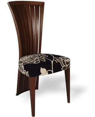
One of my favourite pieces is the Empress Dining Chair because it combines style and comfort in an extremely modern and sophisticated look. The fan shaped back covers the full length of the chair giving it a graceful elegance; these dining chairs perfectly complement any of Tom’s dining tables.
The Indulge Chaise Longue brings a new perspective to a classic eighteenth century design. The curvature of the design shows how it has been influenced by Tom’s love of nature and architecture. Its soft curves make this a very attractive piece of furniture that expresses continuity and fluidity, emphasising Tom’s intention of creating a feeling of movement with his work.
The stylish chair is not only a pleasure to look at but also to sit or lie on, making it an ideal feature piece for any living room or study. You can choose from an array of veneers and also have the chair upholstered in a selection of complementary fabrics to suit your interior needs.
Tom believes that “it’s essential that all designers are aware of and are using environmentally responsible materials. Designers are helping to make the decisions with their clients and these decisions must be environmentally friendly.” The team source their wood from parts of the world where they’re confident that there is no illegal logging.
Tom is excited to announce that he will be launching many new products and some new ranges next year, kicking off with a lounge chair which will be launched in January. All of Tom’s furniture is made in the UK and you can even choose and customize your own unique piece of contemporary furniture which will be designed especially for you.
Spotlight On: Rose and Grey
We take some time to find out more about the wonderful world of the brilliant Rose and Grey.
For all interior-design mavericks who want something quirky and individual for their home, Rose and Grey should be the first port of call. The company is run by husband and wife Lyndsey and Guy, who launched Rose and Grey after finding it difficult to find beautiful things that weren’t incredibly expensive for their own home. So, instead of shrugging their shoulders and having a KitKat (like most of us would), they decided to do something about it. Lyndsey and Guy began to source lovely furniture and decorative accessories themselves and sell them online, and so Rose and Grey was born.
Rose and Grey is a small, family-run business which is reflected in the obvious care and dedication that goes into selecting the products that are sold – this is no big mean corporate machine. The website features a veritable Aladdin’s cave of delights, and even though every item is extremely eclectic you still feel that you could buy every single thing on it, scatter it around your home and it would somehow still look stylish (if a little crowded). This is the key the success of Rose and Grey – they clearly love every product they sell, and have the knack of knowing that their customers will too. There’s no pretension to the company at all, reflected in the extensive Kids section on the website. Lyndsey and Guy have two young boys themselves so understand the need to have stylish but child-friendly home. Even things like dog bowls are made tasteful with the brilliant Ornate Iron Stand.It’s the ability to turn products that are usually dull/ a little gross (come on, you’d hardly want to party in the dog bowl) into something quite charming and lovely, combined with great attention to detail, that is what I really love about Rose and Grey.
There’s a product for everyone to be found on the website, and they’re also environmentally-aware – very important in this day and age. They ensure that they group deliveries together into as few as possible, use biodegradable and recycled packaging, print their leaflets and letterheads on recycled paper and send all their paper, cardboard, plastic and glass for recycling. So, not only do Rose and Grey pave the way for stylish living, they also set an example for being eco-conscious. This should be very annoying as Lyndsey and Guy do seem to err on the perfect side, but they are so darn good at what they do that we forgive them. The masses of press attention they’ve received, from magazines as diverse as Livingetc, Red and Harpers Bazaar confirms this. Rose and Grey are a great company, and should be celebrated.
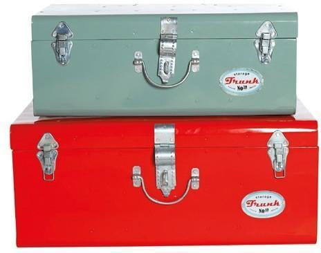
I find it hard to choose just one product from the exquisite range of delights on offer, but I do think that the selection of stylish storage boxes and trunks available is second to none. Too little storage in the home is a problem that most of us have, but nobody wants to use those hideous plastic boxes that belong on a budget airline. I love these Retro Storage Trunks; they put me in mind of gorgeous vintage suitcases, and will be a great place to pop all your bits and bobs. I also adore the Rustic Wooden Storage Box on wheels – tasteful and practical, the winning combination. If you’ve got children they’re an excellent place to store toys. I would use mine to house my extensive DVD collection and prevent my boyfriend from whinging about the mess; there’s no clutter with one of these around.
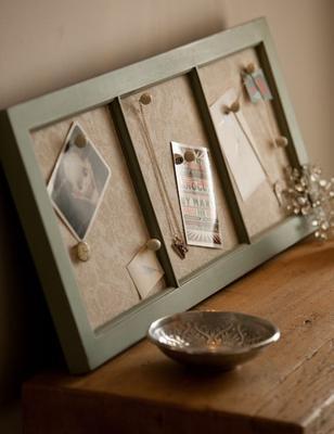
Rose and Grey also have a deep appreciation for the importance of nostalgia, which really appeals to me. Their fantastic Antiqued Wooden Memo Board is a wonderful way for you to treasure some of your most important memories, be it an old photograph, letter, or a picture one of your children drew for you. It’s truly the sweetest thing I have seen in a long time, and would make a beautiful present for a loved one.
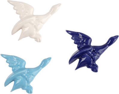
Finally, I’d say that the the amazing selection of vibrant and quirky wallpaper and wall stickers available is another one of Rose and Grey’s USP’S. I love the brilliant Birds on a Wire Wall Sticker; it’s an excellent way to give a plain room a lift without spending a fortune, and it looks so very cool. The selection of wallpaper for kid’s rooms is fantastic, and hammers home the family-focus of Rose and Grey. Simply put, Rose and Grey are a gorgeous company, and deserve every success.
Spotlight On: Designed In England

A fantastic ‘Sayings In Stitch’ mug will add a touch of humour and heritage to your morning cup of tea.
Check out our feature on the genius Designed In England brand for style inspiration.
Designed in England is an innovative and vision-led company that cherry-picks and brings together the best of British design and manufacture to sell from their online boutique. Their ethos seems particularly fitting at this moment in time, thanks to the widespread feeling of patriotism the Royal engagement has sparked. An off-shoot of Andrew Tanner Design, it is the only place to sell the entire collection of Tanner’s brilliant work, as well as showcasing specialist designs through ‘Designer’s Row’ and ‘To Die For’. It’s the Burberry of the online interior-design world, and a force to be reckoned with.
Even if you don’t know who Andrew Tanner is, it’s very likely you’ll have come across his work. His products are stocked in all sorts of trendy and traditional places, including Paul Smith, Westminster Cathedral, Liberty, DKNY and The Royal Festival Hall. Ridiculously talented and brimming with ideas, Tanner was one of the founders of HUB, a design house that embodied the movement of the British-Design-Maker that was emerging in the late ‘90s, before he launched Andrew Tanner Design in 2002. He’s created bespoke ceramics and glassware collections for clients such as the powerhouse Crabtree and Evelyn (who wanted to attract the ‘design conscious buyer’), won Designer of the Year in 2005 (as well as dozens of other accolades), launched his own design book this year – Batch; Craft, Design and Product – and won the prestigious Young Entrepreneur in Design Award from the British Council. He’s also been described (by Elle magazine, no less) as the ‘William Morris’ of his generation. That sums it up, really: Tanner is as synonymous with contemporary British interior-design as Morris was with Victorian wallpaper. However, his feel for the traditional and the importance of heritage is highlighted by his roles as Head of Design for the historic Poole Pottery, as well as Head of Design for the British Ceramic Manufactory, Royal Stafford. Tanner aims to bridge the gap between traditional manufacturers and contemporary design whilst celebrating the best of quirky Britishness.
So, take all that Tanner talent and vision, weave it into a fantastic online boutique and you have the sublime Designed in England. If a product is exciting, beautiful and created on the British Isles, it will be featured. The company aims to include the stories and backgrounds of the designers and makers of the products they feature to make sure they’re ‘bringing the pieces to life’. I think that’s a great sentiment; we want to know where our food is grown and how it was treated, why not the objects we have in our homes? Designed in England have tapped into Britain’s eco-consciousness in a super-stylish way, satisfying the desire to be as ethical as possible without a hemp rug in sight. Instead, we have gorgeous products and lovely designs.
The company stock wonderful home accessories from a variety of great British designers, including fantastic cushions, bone china wall-plates, retro ’50s-inspired flying ducks and a staggering selection of ceramics. They’ve also got cool fashion accessories and lovely children’s wear – truly something for everyone.
I adore the kitsch ‘Sayings in Stitch’ Collection, designed by Tanner and supported by The Arts Council. It features a range of mugs, decorated with funny regional sayings from across the British Isles in a cross-stitch pattern. It appeals to my whimsical nature and Luddite tendencies; don’t we all occasionally wish that life was a little simpler, a little less technology-driven, that we all had time for some sewing, a cup of tea and a really good chat with an old friend? Tanner has recognised the modern-day desire to switch off and the importance of British heritage, and ingeniously found a way of bringing it into our homes in mug-form. So simple, so smart, and so effective. The next time you’re feeling particularly stressed, make sure you’ve got one of these mugs to hand. It’ll make you smile and things suddenly won’t seem so bad after all.
I also love the brilliant bone china cluster light by Kathleen Hills. The contrast between the old-fashioned china (it looks like the sort your grandmother would have her elevenses from) and the ultra-modern, slightly OTT cluster is genius. Hills has fused together the old and the new to brilliant effect; I have seen these lights in many a trendy London home.
It’s this striking paradox I find in these products that is at the heart of Designed in England; it will always surprise, and I hope it continues to do so for a long time.
Getting ready for Christmas: How to create the perfect dining room
Bring some winter magic to your dining room for a perfect Christmas dinner
Hosting Christmas for your family can be an exciting challenge (not simply a hectic rush to get prepared and organised) So, we’ve found plenty of festive-inspired furnishings and accessories to help you create the perfect dining room.
The dining table
Remember that your table will be the focal point of your dining room, so it should shout style and elegance. We aren’t suggesting that you buy a brand new table just for Christmas, but you might need to think about extending and extra tables if you’re expecting lots of guests.
Lombok’s Canton Black Lacquer extending dining table has a distressed finish, and its grandeur will make it a perfect feature piece in your dining room (this is a keeper for all year round, not just for Christmas).
The dining chairs
Sitting down to a delicious feast at Christmas is the one time of the year that allows us to eat as much as we want, but one which means we cannot move for a long time afterwards. So when considering your dining room seating you should be thinking of comfort and style; don’t consider compromising one for the other because you’ll only regret it later.
If you’re looking for a new set of dining chairs, why not consider Tom Schneider’s distinctly curved Poise Carver Chair, which looks fabulous and provides comfortable support.
Most importantly, make sure you have enough chairs for the number of guests you’re expecting, and extend your table if necessary. If it’s a squeeze, try stools or benches as a space saving solution.
The table linen
Be sure to have your best linen on show to impress your guests. Firstly, wash and iron your tablecloth, runner and napkins, and then lay your table. Check that your tablecloth is large enough to cover the table; do this a couple of weeks before so you don’t have a panic on Christmas Eve.
This Star Bright Runner from John Lewis will spruce up a plain tablecloth with its rich burgundy colour and gold star design. Top tip: make sure that your runner hangs evenly at either end of the table for a perfect look.
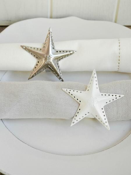
Your napkins should be folded neatly on top of each main plate; you can fold every napkin into a pocket and insert a name card just inside so your guests know where they can sit. Or why not use these pretty metal star napkin rings from Nordic House for a lovely addition to your table.
The tableware
Your tableware checklist should include some pretty plates, bowls and dishes, along with plenty of serving spoons. Why not serve up your Christmas cake on this Robin plate by Emma Bridgewater.
This is the perfect time to get your finest cutlery and china out; lay these first so that you can see how much room you have for decorative pieces. Remember to lay your cutlery in order of use, working from the outside in.
Allow for a water glass, wine glass and champagne flute for each adult guest. A Champagne flute is a tall, thin and elegant glass which will ensure you get the best from your bubbles. This set of four flutes, made from mouth blown glass by LSA from Pelican Pear, is certainly no exception. If you’re celebrating with red wine, go for glasses with a wider bowl to release the bold aromas, and choose a narrower bowl for white wines.
Decorating
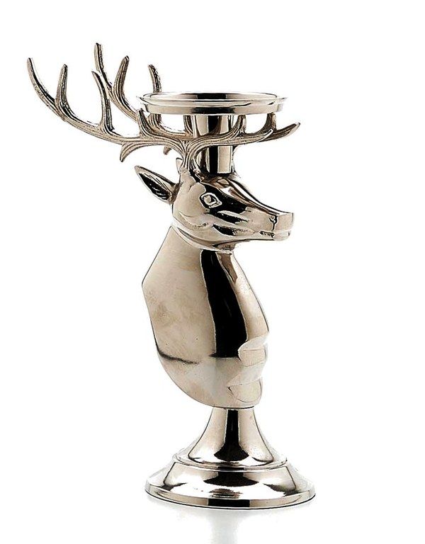
The best tip for decorating your table, especially for when you’re expecting plenty of hungry people, is to keep the look minimal. Large centre pieces and lots of unnecessary table decorations will only spell trouble with a capital ‘T’. Add small, decorative touches to your table with festive candle holders such as the Nickel Plated Reindeer candle holder from The Contemporary Home. This will truly bring character and a majestic charm to your table, leaving your guests in awe.
With a few inexpensive but impressive table decorations, you can create a beautiful table display. Try a few sparkly baubles in decorative bowls lined along the centre of your table, or a sprinkling of glittery stars on the tablecloth for an effortless look. We think you’ll love these silver Scatter Stars from Cox and Cox because they will instantly bring glitz to your table and you can also get creative and stick them to your place cards to bring your theme together.
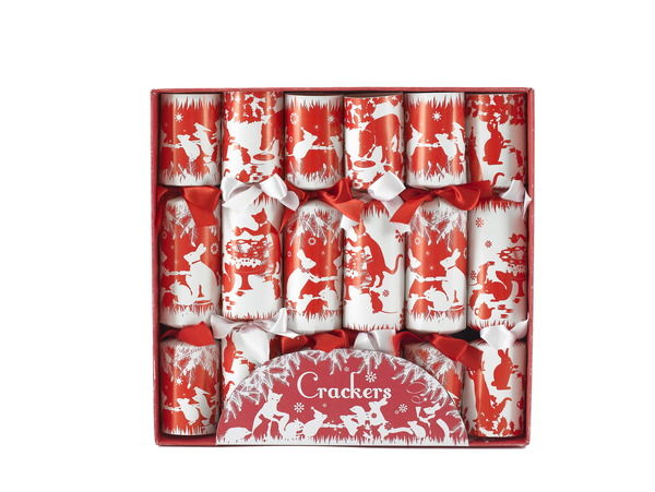
These handmade, silver plated snowflake crackers from The Conran Shop look absolutely stunning and they’ll add a glamorous sparkle to your table. However, I have fallen in love with these ‘Charming crackers’ from Pedlars; the vintage and illustrative design features animals such as cats, rabbits and mice humorously pulling crackers and enjoying the festivities.
Fill your glasses, pull your crackers and tuck in! Merry Christmas everyone!
Getting ready for Christmas - How to create the perfect hallway
How to create the perfect festive hallway.
The 25th of December comes but once a year, and in the bleak midwinter (carolling, anyone?) it ‘s important to keep our spirits high in lieu of freezing conditions, cancelled trains and general low spirits. Everyone knows that first impressions count, which is why we’ve put together this indispensable guide to giving your hallway a festive makeover. Merry Christmas!
Flooring
One of the cheapest and best ways to create a festive-feeling entrance is with a welcoming doormat. I adore this (above) delight from the Dotcom Gift Shop It has a simple, old-fashioned charm about it, which is a refreshing antidote to the ‘spend spend spend’ culture that surrounds us all at this time of year. Your guests will feel jolly the moment they set foot in your home.
If you have tiled-flooring in your home and want to give it a Christmas makeover, try some brilliant Stars Tiles Stickers from Spin Collective, available from the Furnish website. They come in 20 different colours, including festive red, silver and gold.
Lighting
The correct lighting is essential to make the festive entrance to your home perfect (especially if you want some romance under the mistletoe). I personally believe that you can never go wrong with tea-lights; they are extremely cheap and create a wonderful atmosphere. Buy a packet, pop them in these beautiful Puji tea-light holders and place them around the entrance. If you want something a little funkier, you need fairy-lights. String them around the doorway, the banisters – anywhere you can! Try this brilliant garland-light. It has 8 multi-functional settings and can be moulded to fit around anything.
Or, check out the excellent table-top lights.They are battery-operated, so if you’ve run out of sockets it doesn’t matter. Try draping them along a console table to add some festive cheer.
Paint and Wallpaper
Now, I’m not going to suggest that you completely redecorate your home just for Christmas, but with a few little tricks you can make your entrance spectacular. Why not buy a length of claret and gold wallpaper from Rockett St George and pin it on one wall to make your entrance feel super-decadent? The design is the epitome of quirky-British, and the colours are gloriously festive: the perfect backdrop for Christmas gluttony. For a less expensive wall decoration, buy a roll of brown paper, some Christmassy stencils and pot of glitter-glue or paint and unleash your inner artist! Your finished paper will look so very retro and charming, and any that you don’t use to decorate can be recycled as wrapping-paper.
Furniture
A console table is the perfect place on which to scatter your candles, or your nibbles, or glasses of mulled wine to greet your guests with. If you don’t have anything suitable, try this stylish black console table from The French Bed Company. Decorate it with table-lights or a sprinkling of Christmassy confetti. Even when the festive season is over this table will look great in your home.
Decorations
Now, for the best part of all – decorations. First and foremost, you need a great wreath. Without one, you’ll look like Ebenezer Scrooge. I love this simple wicker wreath. You can personalise it with your own baubles or place holly on for a more traditional vibe – whatever takes your fancy.
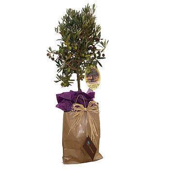
A lovely little tree in the hallway is a must, but it’s hard to get hold of small Christmas trees that aren’t fake, and therefore very tacky. As an extremely stylish alternative, buy this beautiful Large Olive Tree . It will look wonderful if decorated with some burgundy ribbon.
I love a good paper-chain, but like fake trees, they can err on the vulgar side. However, the Dot Com Gift Shop comes to the rescue with their charming 50’s vintage-style paper-chain kit. You can loop these around anywhere you feel needs a touch of retro-festive charm.
If you fancy a very old-fashioned feel to your hallway, buy some cheerful Christmas bunting from Laura Ashley, available from their online store. The range is brilliantly kitsch and will look fantastic in your home.
Next up: baubles. The wonderful thing about these is that they can go on the tree (obviously), or you can tie some to a length of twining to make your own personalised garland. My mother hangs them around mirrors, which looks stunning. I love this antique-style glass-ridged bauble,it has something of the 1930’s about it. I like to mix up bauble styles, so will be placing this alongside something sweet like a scattering of felt robins from The Contemporary Home. They look adorable; I’d like to eat one up, and I imagine your guests will too.Getting ready for Christmas: How to create the perfect guest room
Take pleasure in making your guests feel really welcome over Christmas with an inviting and homely guest room.
From storage and lighting to the smaller touches, you don’t have to worry about finding the best pieces because we’ve done it for you.
Bed linen
Ensure that your guests are comfortable and get a good night’s sleep with fresh, clean bed linen. For Christmas warmth, choose a warm colour scheme that includes ruby reds with gold and silver accents. A gold duvet cover like the Riva Paoletti Chelsea duvet set from The Pole House will bring an opulent feel.
Blankets and throws are a great idea for added warmth so keep them in an easily accessible place such as a wardrobe or chest. Go for luxurious fabric such as Egyptian cotton, merino wool or cashmere to bring texture and comfort to the room. This Soft Blue Lambswool Throw from Graham and Green is perfect for snuggling up with on a cold winter’s evening. Scattering a few colour co-ordinating cushions on the bed will help create a cosy feel.
Home comforts
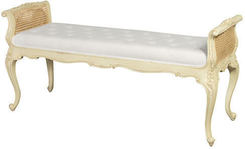
Make your guest room feel like a home from home with a couple of traditional furniture pieces such as an armchair or an elegant chaise longue. Rococo influenced designs with soft, curved edges and intricate details will bring an enchanting charm to the room. For example, the Parisian Foot End from The French Bedroom Company is a stunning piece, hand finished and upholstered in pale cream fabric. Or the Gold Gilt Emmanuel Ribbon chair from Sweetpea & Willow, made with real gold leaf, will instantly lift a corner of the room.
Towels
Place some towels on the end of the bed for your guest’s arrival. The luxury organic cotton towels from The Fine Cotton Company will impress your guests with their plush feel.
Storage
Your visitors will need suitable space to store their clothes and luggage so make sure that the room has a wardrobe, chest of drawers and a dresser. For a fabulous feature piece, choose the large Colonial chest from Sweetpea and Willow with beautiful leaf handle details.
If you have space for a dresser, choose one that has a sleek and sophisticated look and one which will complement your wardrobe and drawers. The Orchard’s Classic two drawer dressing table offers a vintage inspired look that will add character to your guest room. It’s a perfect place to display pretty trinkets and perfume bottles.
Lighting
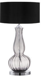
Lighting is an essential part of creating an inviting and cosy ambience in a bedroom, and it will also serve a functional purpose, allowing your guests to read before they go to sleep. A bedside lamp with a highly decorative base can be an ideal talking point in your guest room. The Stockley brass table base from Lombok can be mirrored on both sides of the bed for a balanced and desirable style. Or create this look with the super stylish Fluted Drop Grey table lamp from Heal’s. Its smoky glass base with the gorgeous co-ordinating silk shade gives it a stunning look.
Magazines and books
To take the pressure off yourself and keep guests entertained by providing some books and magazines that you know they’ll enjoy. A magazine rack or holder is one of the best ways of keeping your guest room clutter-free and it provides neat and stylish storage. Choose this Faux leather magazine holder from John Lewis, or if you want to save on floor space, try these Bark Floating shelves from Mocha for displaying your favourite paperbacks.
Little touches
Attention to detail will give a sense of personality to your guest room and tie your colour scheme or theme together. Choose gorgeous scented votive candles, such as the Home for Christmas Jar candle from Puji, to fill the room with a sweet vanilla and cinnamon aroma. Place a couple of candles on the windowsill, and choose from cranberry and orange or mulled wine to fill the room with a warm, festive feeling.
A decorative mirror on a dresser will ensure your guests can get ready without having to leave the room. Try the Vintage Dressing Table Mirror with corsage flowers from Bombay Duck for a beautiful, decorative touch.
A stunning vase can be a perfect focal point, so try the Silver Drop Vase from Mocha to complement warmer colour schemes that include reds and chocolate browns.
A carafe of water on a bedside table shows that you have really thought about your guest’s needs. If you’re looking for something that has elegance then go for the handmade LSA Grand Malika Carafe from John Lewis with its beautiful clear glass and artistic fluid swirl.
A century of chairs
We uncover the design history of the chair and its transformation through the last 100 years
We look at some of the most iconic chairs of the last 100 years and consider how aesthetics as well as comfort have played a large role in the design process.
In Ancient Egypt, chairs were of great richness and magnificence, and they were made from ebony and ivory, or of carved and gilded wood. Nobility and royalty were allowed to enjoy the comfort and grandeur of the chair whilst the rest of society were used to sitting on stools. It wasn’t until the Eighteenth century that we saw the golden age of the chair throughout England and France; it was no longer a privilege of state, instead the furniture piece became a standard item for anyone who could afford it.
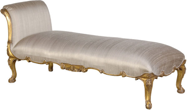
Early in the twentieth century, there was a period of continued experimentation in chair design which brought a fresh, modernist approach to the way we think about the world around us, particularly domestic objects. However, amongst the need for geometric, ordered shapes, there was still the desire for comfort to be achieved through design. In 1928 the ‘chaise longue’, the precursor of the sofa was developed, and it adopted the French name which means ‘long chair’. Charlotte Perriand (1903-1999) came up with the design when she was asked to design a series of chairs to furnish Maison La Rouche. The chaise longue is indulgent of eighteenth century Rococo, with beautifully delicate cabriole legs and traditional gilt finished carved frames. This furniture piece was the first of its kind, but it’s still widely popular today and can effortlessly give a boudoir a glamorous and sophisticated feel.
The Modernist approach to thinking changed the concept of design, and saw intricate and delicate detailed carvings in furniture being replaced with simplicity and order reflected in geometric forms and smooth lines. In the 1930’s, despite the economic crisis, there was significant progression in the design of the chair with designers such as Alvar Aalto in Finland, moving away from metal and experimenting with different types of wood. Aalto’s stool 60, designed in 1933, is defined by its striped pattern on the profile of the legs, which is veneer inserted into a solid piece of beech in order for it to bend. Aalto achieved one of the goals of modern furniture design which allowed for the mass production of furniture.
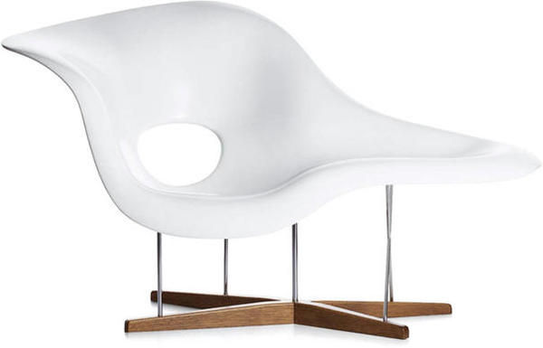
Aalto’s innovative work inspired American designers Charles and Ray Eames, who were at the forefront of design in the 1940’s. Charles and Ray Eames designed La Chaise in 1948 for a competition at the Museum of Modern Art in New York. Their inspiration came from the “Floating Figure”, a sculpture by Gaston Lachaise. The French sculptor’s appreciation of the female form was reinterpreted by the Eames’s who captured the aesthetic beauty in shapes and forms in life all around us. Not only is this chair aesthetically pleasing from all angles, it also enables any number of sitting and reclining positions which is very appealing.
The characteristic silhouette of the Egg chair (1958) has contributed to its popularity as a design classic; it combines modernist ideals with the Nordic love of naturalism. This piece was one of Arne Jacobsen’s three famous chairs of the 1950’s; the others include the Ant chair (1952) and the Swan chair (1957). It was originally created for the SAS Royal Hotel in Copenhagen where Jacobsen took on the project of designing everything from the building itself right down to the taps. The comfort and stylish sophistication of this chair makes it a perfect addition to any modern living space or office.
Whilst the Pop art movement was taking the art world by storm, Vernon Panter’s designs combined the fluid and futuristic style of the 1960’s which introduced the Pop aesthetic to interiors. A revolutionary piece, the Panton chair (1968) was the first cantilevered chair made from a single piece of plastic. Painted with a gloss lacquer, the Panton Chair Classic has a sleek, futuristic look, and its organic ‘s’ shape has been widely used since this design was unveiled.
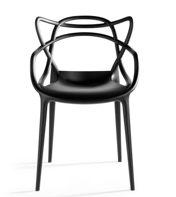
In the eighties, Philippe Starck emerged as one of the world’s most famous furniture designers. The Masters chair sees Starck pay tribute to three icons of contemporary design- the Series 7 chair by Arne Jacobsen, the Tulip chair by Eero Saarinen and Charles Eames’ Eiffel chair. If you love classic twentieth century designs then this would be the perfect addition to your home. This is definitely one to look out for in the future as a classic design in its own right.
Orla Kiely Storage jars from Bloomsbury
Keep your kitchen organised and colourful with these storage jars by Orla Kiely from Bloomsbury. From £18.95
I've been on the hunt for some new storage jars for my kitchen for what seems like an age.
Turns out I am a extremely fussy person and haven't been able to decide on a simple thing such as kitchen caddies - well, until now that is because I have fallen for these Orla Kiely storage jars from Bloomsbury.
Available in various sizes, the jars come in a range of pattern-queen Orla's signature prints, each one as gorgeous as the next.
And as well as safely storing your tea, coffee and other essentials, these pretty jars will add a touch of retro colour to brighten up even the dullest of kitchens.
Interview: Emily Burningham
We interview British textile designer Emily Burningham
British textile designer, Emily Burningham, has a beautiful collection of versatile fabrics inspired by the patterns and colours in nature. We caught up with Emily to find out what inspires her and what new projects she has on the horizon...
If you had 3 words to describe your style what would they be?
Balanced, stylized, English.
Where does your inspiration come from?
Japan, with its fascinating culture and history has a strong influence on my designs. The boldness, simplicity and use of colour in Japanese textiles have inspired a great deal of my work. Design of the 1920’s and 1930’s is perhaps the other greatest resource for my patterns. English and French textiles from the turn of the century, ceramics, furniture and design of the Arts and Crafts movement have inspired designs such as Poppies and Trees in Pots amongst others. Also, the traditional flowers of an English Garden in summer with an abundance of Hollyhocks, Roses, Delphiniums, Lupins and Foxgloves and an array of visiting insects is a happy, comforting place for me to be.
How have your travels inspired your designs?
Visiting other countries where colour in design is used boldly particularly in traditional regional clothing when enhanced by the light and hot climate is a huge inspiration in contrast to the often subtle, muted tones of England. Saris from India spring to mind.
How important are colour and pattern to your designs?
Colour and pattern are the core of my work and often the most difficult aspect to work with. It’s so easy to get it wrong! One also has to remember that people have to live with the designs and never tire of the pattern.
How do you think pattern and print will continue to keep interior design fresh and exciting?
Pattern, colour and trends are always changing, with many different influences such as a countries political, social and economic circumstance. These changes reflect in all areas of design which has been apparent through the ages. As a result interiors, product design and fashion, all absorb these changes and push boundaries which keeps design fresh and exciting. Not sure what’s going on at the moment though!
What’s your favourite material to work with and why?
I love working with many different materials such as paint, paper, clay, cloth. I have just printed on some 100% linens which I am really pleased with, and also some cotton lawn for dress fabric. I think natural fabrics which feel irresistible and hold colour well are my favourite. I look forward to working with some silks.
What’s your ‘hero’ product and why?
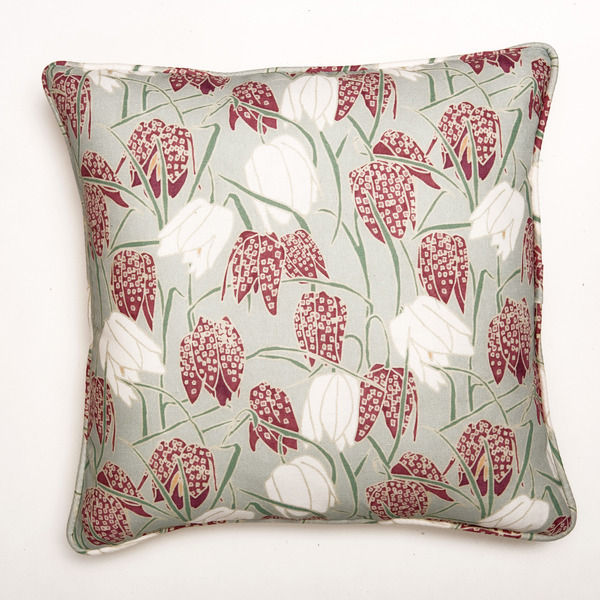
The Fritillary pattern has been hugely popular. It was inspired by the delicate flower which my grandmother was very fond of and we planted together in her garden. We used to marvel at how nature managed to make such detailed accurate patterns on its petals. A lot of people also seem to have the same appreciation hence the popularity of the design.
What is the most recent design product that you have bought for your home?
I recently bought an old 1930’s sofa which was completely falling apart which I had reupholstered in one of our designs. It’s wonderful to refurbish something to its former glory and then add a modern twist with a new fabric.
Where do you like to shop for quirky furniture pieces for your own home?
I strongly believe in salvage. I use ebay for purchasing vases, tiles, pieces of fabric and furniture can be addictive! Antique shops are also a happy place for me to be – however, sadly there seem to be less and less around. My father has taught me to never pass a skip without taking a look inside – one never knows!
How important do you think it is for interior design to become more eco-friendly and why?
As designers and consumers we have a great responsibility to make a difference by choosing careful and considerately manufactured products. As a manufacturer I am up against cheap imported items, where one does not know the true process of manufacture. For us as a business working with UK suppliers we are confident in knowing that our products have been created with respect to the environment and to those who carry out the work – which our customers appreciate.
What advice would you give to aspiring interior designers?
Work with design you believe in, don’t be afraid of using something new or unknown – if its good design and you can see it working go for it! So many people are timid and stick to the same old formula.
What new projects can we look forward to seeing?
I am always working on new designs and ideas for future product ranges. Having just launched our second collection of textiles at Decorex, I will now begin the new range, hopefully including some wallpapers. We are soon to introduce a selection of quilted wash bags in some vibrant small scale patterns...
Interview: Aiveen Daly
We interview furniture designer Aiveen Daly
Inspired by haute couture gowns, Aiveen Daly’s collection boasts hand-upholstered designs with intricate detail and a gorgeous chic look.
Read on to find out more about Aiveen Daly’s style and inspiration...
If you had 3 words to describe your collection what would they be?
Luxurious, contemporary, different.
What inspired you to get into the world of interior design?
I love colour and textiles and wanted to spend my life doing something more creative.
Your collection is hand upholstered, how do you feel that this enhances the quality and aesthetics of the designs?
My team are meticulous to the point of obsession. We work on fabrics that come from all over the world sometimes they have been specially produced at hundreds of pounds a metre so we can’t make any mistakes! Doing things by hand allows for more creative fluidity. It makes each piece totally unique compared with mass production where a lot is done by computer and huge machines.
You have a selection of beautiful vintage pieces, how do you think vintage-inspired furniture will continue to add personality and character to both modern and traditional interiors?
We love to revive old pieces and dress them in something contemporary. Old furniture is often magnificently built and so literally lasts hundreds of years. BBC Homes & Antiques magazine suggested the Aiveen Daly collection would be the antiques of the future. We really build our pieces to last.
Your designs are inspired by haute couture gowns and Saville Row tailoring, which are your favourite pieces and why?
My favourite Stiletto chair is the Love Knot as it is simple and classic like your favourite piece of clothing or jewellery that never goes out of style.
What is the key link between fashion and design for you, and how do you think 2011 fashion trends will influence interior design?
Fashion for me has always been more experimental and quirky than furniture design. Tailoring is big again with very classic cuts – simplicity with attention to detail will be important. I think a new minimalism will emerge that is much warmer than the last wave.
All of your work is manufactured in Britain, how important do you believe it is for interior design to become more eco-friendly and to help build the British economy?
I think it is so important to keep traditional trades alive. Britain has always been renowned for high end craftsmanship. I think it should be more clearly labelled on furniture where it has been manufactured as it definitely influences customers. It is much more sensible to invest in something that you will keep for years and pass down to your children than to buy cheap imports that you have to replace every time you move.
What is the most recent design product that you have bought for your home?
My new Aphrodite lampshades in pale grey silk with hand braiding.
Where do you like to shop for quirky furniture pieces for your own home?
Merchant Archive and Retrouvius.
Do you have any new collections on the horizon?
We have just made a magnificent 4 poster bed called Arabian Nights with hand beading and stud work. We will be doing a lot more with embellishment in the near future.
How to... create the perfect dining room
Get ready for Christmas with our guide on how to create the perfect dining room
With Christmas just around the corner (just over eight weeks to go) it’s essential you get your dining room sorted in preparation for entertaining guests. Perhaps this is your first time hosting the main event or you just want to give your dining room a makeover. Whatever your budget, style and reason, our guide shows you how to create the perfect dining room for the festive period and all year round.
The Table
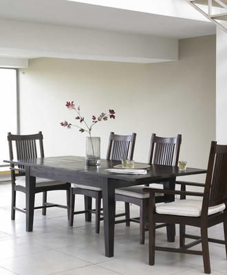
The dining table is an essential bit of kit. A good option is to choose one that’s extendable, that way you’re always have room for the extra guest who just happens to turn up unannounced. The Malang Dark Teak Extending Dining Table will add a touch of oriental –chic to your scheme while the refectory-style Ash Extending Dining Table from Sweetpea & Willow is perfect for those that want something a little simpler. If you don’t have room for an extending design, opt for a round one, which is much more sociable and guaranteed to get even guests who don’t know each other chatting.
The Chairs
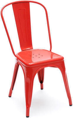
The days of having to match chairs to your table are long gone. Of course, if you want to match your chairs to your table then there are plenty of options. However, mixing and matching chairs is a great way to give your dining room a unique look. Brightly coloured chairs such as the Tolix A Chair from The Lollipop Shoppe work well with a plain, wooden table. Comfort as well as style is important when it comes to dining chairs, make sure you opt for ones that your guests will want to stay in long after pudding rather than running for the hills before the starter has arrived. If you’re going to use benches instead of chairs, make sure there’s plenty of room to manoeuvre them and add some colourful cushions for extra comfort.
The Lighting
Lighting, as in every room, plays an important part in the dining room. Firstly, it’s important to choose a central light to create drama and atmosphere. A pendant light such as the Clarence Pendant Shade from Heal’s is a good choice. Make sure it’s connected to a dimmer switch so you can alter the mood of the room accordingly. Candle light is a must for any dining room, whether you opt for a dramatic candelabra such as the Medium Abbey 5 Arm Candelabra from Alexander and Pearl or subtle tea light holders (Also Home has a good choice), they’re a sure fire way to add some atmosphere to any scheme.
The Tableware
Choosing your tableware is as important as the food you serve on it. White is best, it looks classic, is timeless and means should things get a little out of hand or the washing up chaotic, pieces can be easily replaced. Don’t be afraid to mix and match, decorative plates such as the Art of Entertaining collection by Andrew Tanner from Designed in England look fabulous with plain white china.
Follow these simple tips and you’re ready to entertain, now all you need is to get cooking...
Interview: Emily Bond
We interview British fabric designer Emily Bond
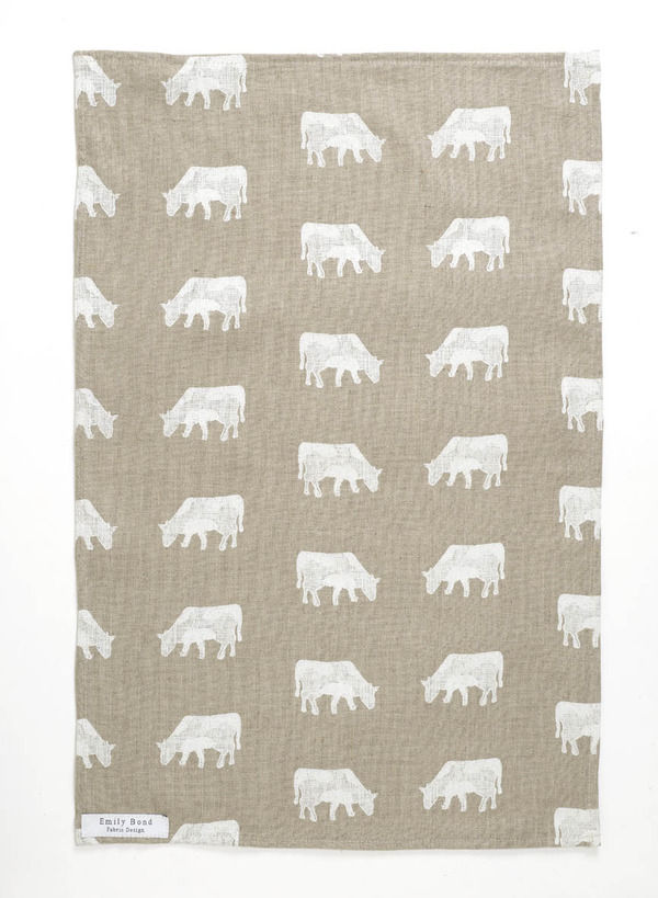
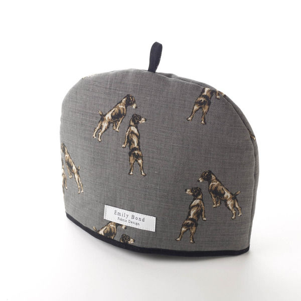
British fabric designer Emily Bond designs beautiful fabrics inspired by animals and the countryside.
We find out more about Emily, her inspiration and her style...
If you had 3 words to describe your style what would they be?
Eclectic, country, fresh
Where does your inspiration come from?
My life, my childhood and all people and animals in it.
What is it that you endears you so much to British countryside?
There is nothing quite like an Autumn day walking with the dogs through the country side, there Is nowhere I’d rather be.
Why do you choose to feature animals in your designs and what do you feel they bring to a variety of home interiors?
I love animals on fabric it brings an element of fun into your interiors, but the way I put them together and the colours and fabrics I use it makes them sophisticated and classic at the same time.
What’s your ‘hero’ product and why?
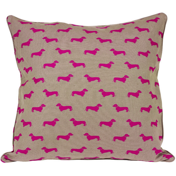
My blue dachshund tea towel is started the business, people love dachshunds!
How important is pattern and repetition to your designs, and how do you think pattern will continue to keep interior design fresh and exciting?
It’s very important and each design is very repetitious which is what I love about my designs. I like simply fresh designs.
What’s your favourite material to work with and why?
I love linen because it so natural.
What is the most recent design product that you have bought for your home?
The last product I bought for my home was an Anta foot stool, I love their checks in my home and they complement with my fabrics beautifully.
Where do you like to shop for quirky furniture pieces for your own home?
Reclamation yards.
How important do you think it is for interior design to become more eco-friendly?
I think it’s a difficult one, as I agree we must be as eco as possible, I love old things, antiques quirky finds in reclamation yards which are not made in an eco way! So I think if we can bring it into interior design somewhere along the line that can only be a good thing.
What advice would you give to aspiring interior designers?
Go and look for things different and look for small little company like me because we are individual, unique and fresh.
What new projects do you have on the horizon?
A children’s collection, which I’m really looking forward to designing.
How to create... the luxe hotel look
Give your bedroom the five-star hotel treatment with our tops tips and ideas
We all talk about how we love to stay in luxury hotels, so why not create the look at home? Here's how.
Furniture
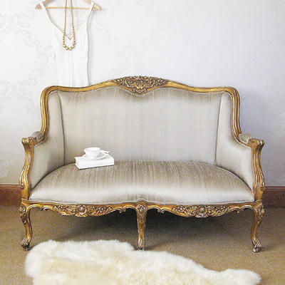
Hotels always have sumptuous armchairs or sofas and it's easy to create this look at home. If you have the space, a small sofa or chaise will add a touch of luxury. We love this Versailles Bedroom Sofa from The French Bedroom Company. Its gilt finishing and silk upholstery is just the ticket if you want to inject some French glamour. To make it extra cosy, add mohair throws and sumptuous cushions for a decadent scheme.
Lighting
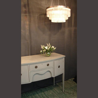
Lighting is all about getting the right atmosphere. Copy the chicest hotels around by adding a multitude of light sources to your boudoir. Start with a stunning chandelier such as the Silver Chain Swallow chandelier from Tigermoth Lighting and add wall lights (The Tom Tom from Diffuse lighting is a good choice). Finish the look with elegant, statement table lamps (try Brissi for a good range) dotted around on bedside tables.
Bedlinen
There's nothing nicer than sinking into a hotel bed but if you're a homebody then it's easy to create the same sumptuous feel at home.
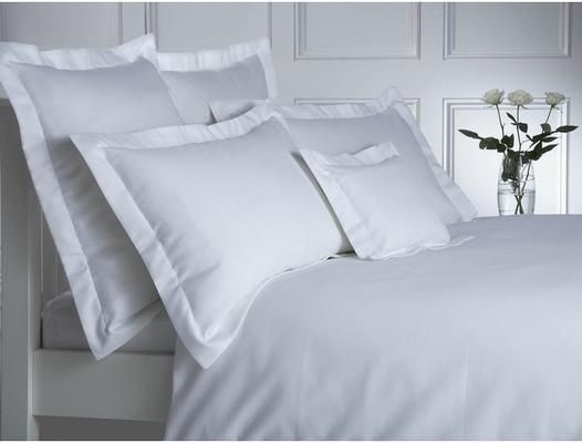
Opt for good quality sheets, pillowcases and duvet covers - the best you can afford. The Milan Organic Cotton Waffle collection from The Fine Cotton Company is a good choice and being white provides the perfect canvass for you to add some colour to. To create a really decadent feel, layer up with scatter cushions, throws and bedspread.
So, while we can't promise room service, we can promise that with these tips, you'll turn your bedroom from the mundane to the magnificent.
Just don't forget the Do Not Disturb sign...
Interview: Tracy Kendall
Tangible yet beautiful wallpapers: Tracy Kendall designs something a little bit different for your walls.
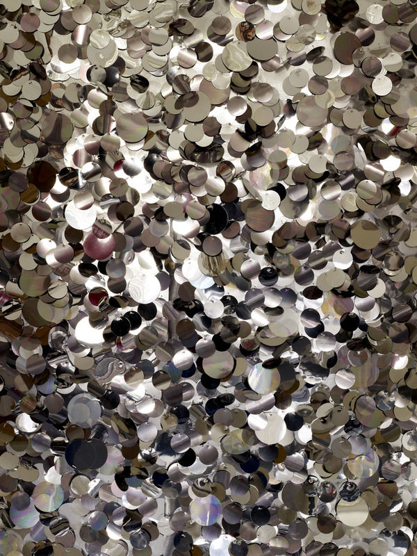
London based wallpaper designer, Tracy Kendall offers a beautiful collection of contemporary wallpapers and just recently exhibited at Decorex and won an award for her stunning Sequin design.
We caught up with Tracy to find out what inspires her to keep creating and designing...
If you had 3 words to describe your collection what would they be?
Simple, original, touchable.
You recently exhibited at Decorex and won an award for your stunning ‘Sequin’ wallpaper. What does this mean to you and what do you hope that your wallpapers bring to home interiors?
It means a great deal to me to have such a prestigious award given to me. I work in such a bubble sometimes, I don't design for anyone other than myself and all the collection are my designs so to have such a great recognition of what I do is really special to me. I hope that it can inspire people to take risk but with products that they fall in love with, to have in their home items which have won their heads, rather than their heads all the time, i.e., not the safe option.
Since starting the production of your hand-produced graphic range in 1996, how have you developed and experimented with different designs and scales?
I've moved into more textural work, adding different textures as I find different manufacturing partners along the way. Sometimes the designs can only be made in house, such as the sequins, but with others I have been able to use external specialized manufacturers for which is great.
What inspires you to keep designing and creating?
Curiosity; I love to challenge myself both visually and technically with my work.
You have taken 3-D wallcoverings in a new and exciting direction. So, what are your favourite materials to work with and why do they work so well?
Paper is still my favourite material; having studied fine art printmaking I am always struck by how much paper can do or be made to do.
Your wallpapers could be described as tangible, and I particularly like love the sequins and also the stitched text. Why do you think that wallpaper should be something that will create an impact and evoke a reaction when people see it?
I don't think that is limited to wallpaper, chair or cup can give the same reaction but my chosen medium is wallpaper and by hopefully creating a wallpaper that gives people more than one option of sense in which to view the paper helps to make them fall in love with it.
What is your best selling design from your collection and why?
It’s probably still the fork design, the first but it is so simple, so easy to use in the home or commercial spaces, it is big but not over powering, it makes a statement but doesn't yell for attention all the time, it just works very well, thank goodness.
How do you feel that patterned wallpaper will develop, and what direction do you hope it will go in the future in order to keep interior design fresh and exciting?
There are so many new and exciting wallpapers coming out, I hope that they continue to have a aspect of respect for the environments they are going into and don't try to over whelm them, its wallpaper, it is meant to have mirrors and pictures on top of it and chair in front of and your back to it as well!!
How important do you think it is for interior design to become more eco-friendly?
Very, not always in such obvious "what materials" do we use way, it's more about how much we change interiors rather than grow them and how much material we waste as a part of the manufacturing process. as I make to order, I have very little waste, all my waste then goes into sampling for sending out which works very well for me.
What is the most recent design product that you have bought for your home?
Nothing new, brought some amazing brass table legs to make a table up with and then had a friend make the table top for me, a lovely mix of old and new.
What advice would you give to aspiring interior designers?
Have passion, lots of passion.
Is there anyone that you would like to collaborate with in the future and if so why?
I never plan who I am going to work for or with, I love not knowing what or which client will ask me to make whatever for them next, the element of surprise helps to keep everything fresher and better for the client as well.
What are you working on now or do you have anything in the pipeline?
I’ve just finished a new design to be launched at Maison and Object in Jan 2011 and I’m also working on another to launch there as well and doing lots of projects for mainly domestic clients at the moment but have a restaurant in London that I am also working closely with and a shop opening in Vancouver which will stock my work which is exciting as well.
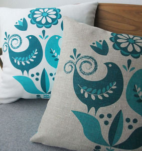
Happy Birds cushions by Roddy & Ginger
Add some retro flair with these Happy Birds cushions from Roddy & Ginger. £25
I have a thing about retro textiles, which I mostly attribute to a 70s bedspread my Mum had when I was growing up. It had huge, brightly coloured flowers and was my favourite, so the passion for all things retro obviously started at a young age.
Which is why I adore the range of cushions from Roddy & Ginger. The sweetest owls sit alongside bold geometric prints but my pick is these Happy Birds cushions.
Available in teal and turquoise and grey and olive, they’re screenprinted onto natural linen and hand made.
I love the vibrant colours and gorgeous attention to detail in the design.
Perfect for adding a pop of colour to a living room or bedroom, I’m going to use mine on a neutral chair.
See this product at Roddy & Ginger...
(We don’t list this product yet but sign up to our newsletter and we’ll let you know if/when we do)

