Interview: Mini Moderns
From quirky 1950’s textile designs to vintage toys and games, Mini Moderns has it all.
British design duo, Keith Stephenson and Mark Hampshire of Absolute Zero Degrees, a graphic design based outfit, are behind the wonderfully quirky Mini Moderns collection.
We interviewed Keith Stephenson to find out more about their exciting, retro collection….
If you had 3 words to describe your collection what would they be?
Contemporary, Soft, Modernism.
How would you describe the idea and aim behind your slogan: ‘Homeware for design conscious families’?
When Mark and I created the Mini Moderns wallpaper collection we wanted it to appeal to kids and, what we were calling then, “kidults”. No one else was appealing to a cross generational market at this time. We wanted the consumer to be able to buy something cool that their kids would love but that they could also live with happily.
Despite having a fantastic following and reputation with the kids products, we have always created products that we’d love too. This, I think, gives our print designs a lot more depth than papers produced purely for adults – which are usually trend driven – or pure kid’s patterns, which are often twee. I think it is very easy to spot a Mini Moderns design.
What would you choose as one of your favourite design classics of all time?
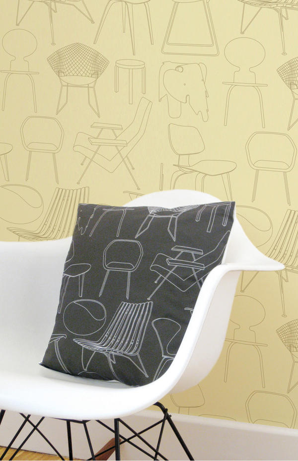
Mine is the Eames rocker; Mark’s is the original Mini car.
What inspires you to combine retro and modern styles and what do you feel this brings out in your products?
We’ve always had this mix in our collection – there’s something optimistic about mid century modern designs in print – so we wanted to capture some of that – but giving them a contemporary edge – not a rose-coloured vision of the past.
You operate a predominantly ‘Made in the UK’ policy, how important do you believe it is for the future of interior design to become more eco-friendly?
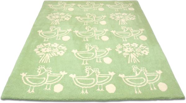
We’ve always produced in the UK – it has been our policy from the word go. We wanted to utilize the amount of great UK producers and build good relationships with them, that way we know that our products come from sweat shop free environments. It also means the products travel less so we try to keep an eye on our carbon footprint so even when we export the amount of journeys is limited. The only products which we don’t produce in the UK are our rugs. These are a license product and are produced with a company who approached us. However, we make sure that the rugs are delivered direct from the factory to the customer so they don’t arrive with us and get dispatched again on an extra unnecessary journey.
What’s the most popular design from your collection and why?
We have several ‘hits’ in the collections which shows the cross generational appeal of our products. The ‘Town’ print still continues to be popular even though it was produced in 2005, and has been influential to other designers. This has been used in dining rooms and children’s rooms. Our ‘C60’ retro tape cassettes wallpaper has also been a hit with dads and older children – and has recently been used in the refurbishment of the BBC Radio 6 studios.
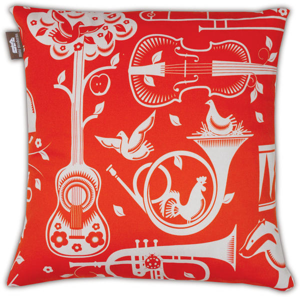
Recently our ‘Pet Sounds’ wallpaper has had great success – which I think is indicative of a Mini Moderns design – no-one else would have even thought of using the imagery and combination of imagery we used. It’s easy to produce something ‘out there’ but the skill is making it still something that people want to spend everyday living with.
Can you tell us a bit about your new ‘Festival’ wallpaper and what the story behind it is?
We’ve collected festival of Britain memorabilia for a long time now. The Festival of Britain in 1951 was an exciting glimpse into the future, celebrating the new wave of British design, with design for all available via the introduction of Hire Purchase schemes. New design was everywhere. It’s the optimism we love, and over the years we’ve amassed a number of items celebrating it. The C.O.I.D. book Design in the Festival is a particularly inspiring find. Having been huge fans of the Festival of Britain, it was an honour to be commissioned in 2008 by the Southbank Centre to reproduce as wallpaper, one of the Festival’s signature patterns, Net and Ball. This had been designed in 1951 by the architects of the Royal Festival Hall, Peter Moro and Leslie Martin, as a carpet pattern for the Hall. Our obsession culminates in our new wallpaper in commemoration of the Festival’s 60th anniversary, featuring our favourite pavilions and sights.
How do you experiment with colour and how important is this to the finished print?
Colour is very important to us and Mark is a great colourist. Because we’re fundamentally print designers more than product – it’s this aspect of our designs that excites us! The prints tend to be rich and dense with imagery so getting the balance right with colour is very important. We don’t work seasonally or are trend driven with colour, instead we go with what works with the print. These colours then go into our Mini Moderns colour book, and are used in future ranges so that you can mix up our patterns and there is still a synergy across all our collections. We also have fun with the names of the colours too – like “milk chocolate” or “powder paint blue” etc, most of which relate to a collection or product. Our ‘Harvest Orange” colourway was an homage to the Neil Young album ‘Harvest’ as it was first introduced in our Folk Rock collection last year.
I love your Folk Rock cushion collection (If I had a camper van, which I’ve always wanted, then I’d fill it with these!). What inspired this collection of prints?
The ‘Folk Rock” collection was inspired by a very rare holiday for us to the West Coast of the US. We spent time in LA, the Big Sur and San Francisco. Pet Sounds was a mix of two concepts for prints we’d been working on and the time away helped us to focus and consolidate it into one. We had been working on a musical instrument print and a British wildlife print and then decided to combine them to make our Woodland cacophony – which was originally called ‘Fanfare’ – but when we realized where the collection was going – a nod to the Beach Boys seemed appropriate. After all we were in California. ‘Alice’ was also a print which, finding a section of a dirty piece of vintage barkcloth fabric in a thrift store in California, took on a life of its own. Our friend Alice had asked us to design a wallpaper for her house – and we had always thought – ‘if Mini Moderns did a floral – what would it look like?’ so we used the vintage fabric as inspiration and created the print. As it was part of the Folk Rock collection we thought Alice was a good name for it, and as Lewis Carroll’s heroine had long been an inspiration for 60’s West Coast psychedelic artists – like Jefferson Airplane – so Alice it was. We supplemented the cushion collection with our ‘International Cocktail Hour’ range of found vintage fabrics with a Trader Vic’s atomic/Tiki edge.
How do you think your prints can transform a room?
Prints give a room more character and depth.
How do you see print design progressing in the future?
Our prints develop from season to season. We’re more confident in our aesthetic now. Initially it is daunting as you have no audience for your product, so it’s easy to lose your direction and then you stand back and can’t quite understand what your designs are trying to say about you as a brand. We had to have the courage to just put our ideas out there and it has seemed to work.
What did you last buy for your own home?
Our last two purchases were two lamps: One is a “base lamp’ by Tom Dixon – it was rather expensive but beautiful! The other was by Group Design and it’s a sleek white reading light – which wasn’t as expensive but is by no means less beautiful…
What advice would you give to anyone thinking of introducing print to their home?
Most people will send out wallpaper samples but be focused about what colours you want for a room. Otherwise you end up with a confusing mess of hundreds of pieces of paper. The process should be fun. Also, try and go with an independent designer, there are more like us out there, and most wallpaper is produced in a handful of factories across the UK. Even the smallest independent designer will have the same high quality as a larger company. That way your room will have individuality.
If you could collaborate with any designer who would you choose and why?
I’ve previously worked with Wayne and Gerardine Hemingway when I was a print designer at Red or Dead. Also, recently both Mark and I have worked with them as part of a team curating areas for their Vintage festival – they are great to work with and when you do you become almost part of their family. We will be working with them again for Vinatge at the Southbank in July.
Other designers that we would work with would need to be someone who didn’t overlap with our skills, like product designers, that share our philosophy and aesthetic. Mark would love us to work with someone like Terence Conran – as he is a lifelong hero of his, and Russell Pinch is also fantastic. We were extremely excited when the Conran Boundary hotel specced up our wallpapers for a number of their rooms. A forgotten vintage brand would also be good to work with – we had always wanted to work with someone like Ercol – but someone like Gplan or a company like Ercol who have embraced their heritage would be great.
What new projects are you working on and what do you hope to achieve in the future?
We’re currently getting our new collection together. “Festival” is the first in this collection which launches as a whole in September. The collection is called ‘Daytripper’ and celebrates British holidays, hobbies and pastimes. We’re also creating new accessories designs for mugs and bags. We have a wealth of prints now in our back catalogue and are able to pull these into different products – so as well as new prints – there will be some old Mini Moderns favourites on other items too.


