Features: Design ideas
Style Guide: Art Nouveau

We look at the enduring influence of Art Nouveau and its affinity with biomorphic mid-century modernism.
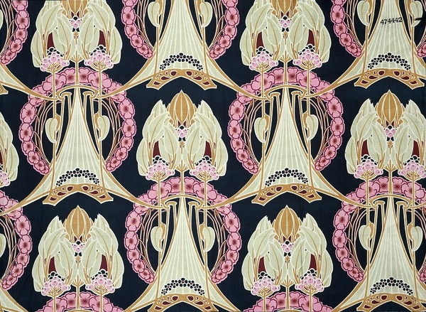
Art Nouveau style emerged in France around 1890 and quickly became internationally recognised and reproduced. It arose at the end of a century that had witnessed momentous upheavals in religious, scientific and political thought. A new modern style was needed to reinvigorate the decorative arts and express the spirit of the age. Proponents of the new style were determined to move beyond the indiscriminate jumble of historic styles and derivative decoration popular in the 19th century. Equally, they challenged the dominant canon of Classicism, which with its strict logic and certainty of proportion seemed to mock the restless fin de siècle spirit. Instead, Art Nouveau designers looked to nature for inspiration and created new vocabulary of design incorporating both desire and anxiety.
Plant forms dominated much of the Art Nouveau style and were used across the whole range of applied arts, as well as architecture, interior decoration and furniture design. Roses, poppies, irises, orchids, cyclamens, fuchsias and lilies were among the most commonly used floral motifs. Plant forms covered the facades of buildings and grew out of furniture; swirling vegetal ornament featured on glass, silver and ceramics; flowers were cast in bronze and carved in wood. Flora and fauna, including dragonflies, birds and insect forms, adorned everything from architecture to jewellery. Furniture had a lightness of dimension and proportion, expressed by elongated, graceful lines and lithe organic forms. Sinuous lines based on plant fronds, stems and tree branches were used to convey the dynamic forces of nature as well as simmering sexuality; flowers were often personified as languid maidens and long flowing hair was another eroticised decorative device. The dynamic whiplash line and the integration of human and plant forms were characteristic of Art Nouveau design.
The decorative details on Art Nouveau architectural facades were carried through to interior design and furnishings to create a remarkably coordinated style. By 1900 almost every item of use or decoration was available in the Art Nouveau style: from cutlery and biscuit tins to lampposts and railings. Hoardings were plastered with advertisements designed in the Art Nouveau graphic style. The Art Nouveau poster became one of the most ubiquitous manifestations of the style. In Paris, celebrated Art Nouveau architect Hector Guimard was commissioned to design several entrances to the metro; Guilmard’s sculptural cast iron entrances were studies in sinuous Art Nouveau detail. The city itself became an expression of the style. Selling Art Nouveau goods, Parisian department store La Samaritaine was housed from 1905 in an Art Nouveau building designed by Frantz Jourdain and decorated by Eugène Grasset. In London, Liberty & Co. commissioned designs for pewter, silver and jewellery in the Art Nouveau manner and its popular printed fabrics and wallpapers were also inspired by Art Nouveau pattern designs.
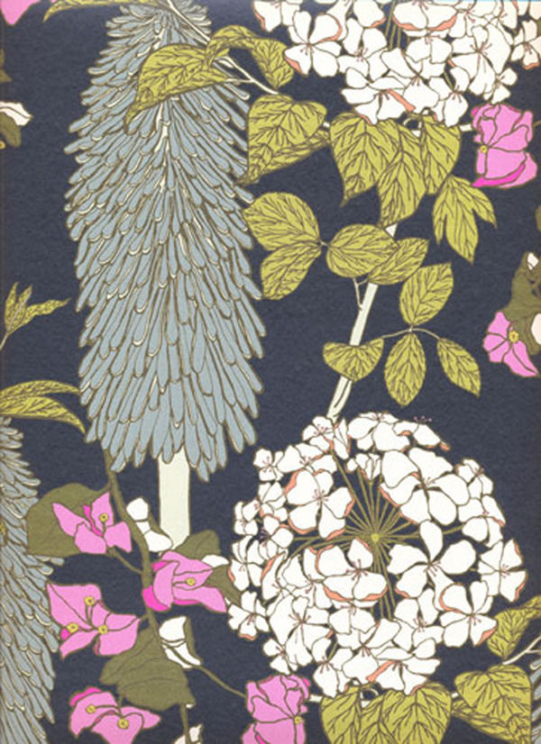
It’s easy to see an Art Nouveau influence in surface pattern design, particularly at Liberty’s, which continues to produce fabrics and accessories with its signature peacock feather and scrolling Ianthe designs. Timorous Beasties’ distinctive fabrics and wallpapers featuring winged insects, amphibians and plant forms capture the play of desire and anxiety typical of Art Nouveau. Abigail Borg’s bold floral patterns draw on the composition of abstract plant forms in both Arts and Crafts and Art Nouveau designs. Decorative accessories are another area where the influence of Art Nouveau forms endures. The silver flower loop vase and loop candleholder from black + blum exhibit the same sinuous lines characteristic or Art Nouveau ornament. In a beautiful vivid blue, the tactile 2lips vase from 95% Danish has a flower bulb shape and ridged glass detailing. Johnathan Adler’s bird bowl and Graham & Green’s sculptural dove vase recall the menagerie of birds and beasts in Art Nouveau decoration.
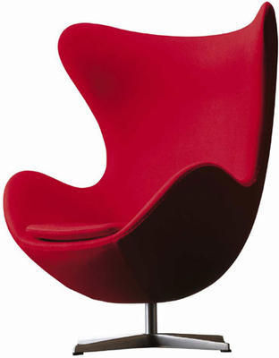
In furniture it’s interesting to look at the link between Art Nouveau and the biomorphic forms of curvilinear modernism in the mid 20th century. The modernism of the 1940s and 1950s reflected advances in biochemistry and nuclear physics; designers looked to organic models in creating a new humane style (epitomised by Eero Saarinen’s 70 MC designed in 1948 - better known as the ‘womb’ chair). The fluid lines and attenuated curves of biomorphic modernism owe much to Art Nouveau. Many of these designs are still in production today. Designed by Arne Jacobsen in 1958, the Swan Chair and Egg Chair manufactured by Fritz Hansen transpose the dynamic lines of Art Nouveau decoration into three dimensions. You can find both chairs at Utility. Another reissue from Utility, the Wishbone Chair designed in 1949 by Hans Wegner has the same grace and lightness of Art Nouveau predecessors. La Chaise by Charles and Ray Eames is an iconic biomorphic design available from the Lollipop Shoppe. A contemporary take on biomorphic modernism, the Tongue chair recalls the whiplash line and sexualised motifs of Art Nouveau.
So you don’t have to go for flower maidens and flowing hair to give a nod to Art Nouveau.
Style Guide: Chinoiserie and Exoticism

Discover Chinoiserie style and spice up your home with a hint of Eastern promise.
Chinoiserie designers tapped into European fantasies of Eastern exoticism. An insatiable desire for exotic goods fuelled the imaginative re-creation of a veiled and mysterious land for European consumption. The East became a magic lantern for the projection of European desires.
Fantasies of Eastern promise and Oriental opulence have stirred the British imagination for centuries. The opening of trade routes with the East had a huge influence on British design and exotic styles reached the height of fashion in the 18th century. A mania for porcelain, silk and lacquer imported from China and Japan inspired British designers and craftsmen to imitate Asian designs, creating their own fantasy versions of the enigmatic East. A generalised impression of mysterious Eastern lands, and the exotic allure of China in particular, inspired a fanciful style that came to be known as Chinoiserie. At the peak of its popularity in the mid 18th century, Chinoiserie was often combined with Rococo, a style characterised by exuberant asymmetrical ornament and sharing similar fantastical elements. Chinoiserie remained popular in the 19th century and Art Deco designers looked to the East once more in the 1920s.
In the 18th century Chinoiserie style was used right across applied arts, as well as for interior decoration, furniture, and garden buildings such as the pagoda at Kew. Objects featured fantastic landscapes, fanciful pavilions, exotic birds and Chinese figures. Interiors often combined genuine Asian elements such as Chinese wallpaper and porcelain with imaginative evocations of the East. Dragons were popular decorative motifs, epitomising for British designers the mysterious allure of Asia. The rooflines of Chinese pagodas were also incorporated into a wide range of Chinoiserie objects, including ornate gilt-framed mirrors and canopied four-poster beds. Wooden furniture was often lacquered, or ‘japanned’, and decorated with imaginary Oriental scenes. Chair legs might take the form of bamboo, and latticework backrests were derived from Chinese screens.
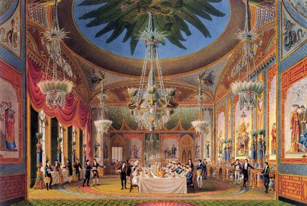
While Chinese was the most popular of the exotic styles throughout the Georgian period, by the end of the 18th century the vogue for exoticism included Egyptian, Moorish and Indian influenced designs. Along with Chinoiserie these styles were often combined in fantastical objects and interiors. A fabulous example of the plurality of exoticism is the Royal Pavilion in Brighton. Between 1815 and 1823 John Nash transformed the original neoclassical building into a fantastic (and fantastically camp) Eastern palace for King George IV. The extraordinary exterior combines Indian, Moorish and Chinese architectural styles. Mogul-inspired onion domes, minaret towers and tented roofs preside over Islamic arches and perforated screens based on Indian jalis.
The interiors underwent several phases of Chinoiserie decoration, designed by Frederick Crace and Robert Jones. Vaulted plasterwork ceilings were designed to evoke the interiors of tents and pagodas. Interior columns took the form of palm trees and oversized bamboo canes, or were decorated with plasterwork ornament in the form of lotus leaves. Serpents and dragons slivered across the walls. The cast-iron balustrades of the central staircase imitated bamboo and the walls in the long gallery, depicting an illusionistic Oriental scene, were partitioned with simulated bamboo fretwork. Painted skylights, lanterns decorated with tassels, and magnificent crystal chandeliers with glass lotus leaf shades lit up the rooms. The whole place was absolutely saturated with colour and pattern. Luxurious wall-to-wall carpets featured elaborate hand-knotted designs, and drew together the decorative elements of each room.
Personally I can’t think of anything much better than a palm tree column to bring a bit of class to a home; but if you don’t want to go for the whole Chinoiserie shebang, you can find elegant Eastern-inspired accent pieces on Furnish. OKA’s Manchu furniture range features Oriental landscapes picked out in gold on a black lacquered ground. The Manchu chest has a different scene on each of its six drawer fronts. In the traditional blue and white glaze, the Kraakware lamp base is hand-painted with Chinese warrior scenes, and crockery is available in the same pattern. The oversized Imperial vase is a striking accent piece, with characteristic blue and white pattern, long slender neck and bulbous base.
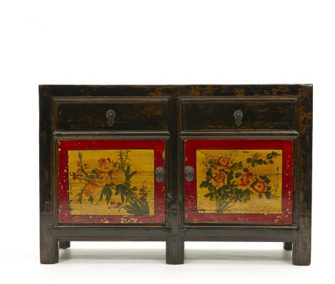
Orchid sources antique Chinese furniture and creates sophisticated Eastern-inspired pieces using sustainable materials. The Mandarin furniture collection is effortlessly elegant, displaying clean lines, lustrous black-lacquered finish and authentic brass handles and door catches. The Mandarin screen features four richly lacquered panels with traditional Chinese fretwork on the upper sections. Evoking the rich colour scheme of Chinoiserie style, Orchid’s reproduction elm cabinets have a yellow-gold lacquer finish and each door features a hand-painted red chrysanthemum in a ceramic-blue vase. Restored antique pieces include a beautiful lacquered elm sideboard (c.1870) with vivid hand-painted decoration in red, yellow and green.
Lombok sources furniture direct from factories in Indonesia and Vietnam. Highlights include the solid wood black-lacquered Canton range with distressed finish and patinated brass handles and drawer pulls. The Canton sideboard and nine-drawer chest are particularly striking. Puji specialises in the design and import of recycled hardwood furniture, which is hand made in Indonesia by local craftsmen. The Shanxi furniture range in white or black lacquer has an understated elegance and would fit in with almost any decorative scheme. I’ve got my eye on the dressing table.
Create an atmosphere of Eastern promise with exotic Chinoiserie-inspired pieces.
Colour watch: Brown
Bring a warm autumnal glow to your home with brown.
An earthy neutral that will offer a timeless look, we take a look at how brown can bring a warm, welcoming feel to your home.
Choosing the right brown
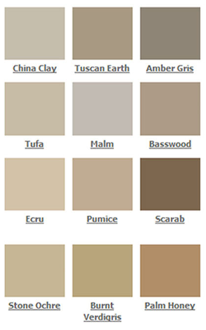
Brown is softer on the eye than black and it has a timeless quality that can suit either a traditional or contemporary interior. Made up of all the primary colours mixed together, brown hues offer a variety of different undertones that can compliment an interior based in either warm or cool shades. Mochas and chocolate shades are perfect for living areas and bedrooms because they offer warm undertones that give a natural welcoming feel.
Choose lighter browns for walls so as not to make a room feel dark or small; however, in a larger, lighter room you can experiment with darker browns to highlight a feature wall. Ralph Lauren speciality finish paint in the suede look is a good choice because it has been designed to bring a distinctive suede texture and appearance your walls. Try this in a modern bedroom to create an interesting and unique style.
Dark chocolate suede and leather furnishings are popular because they ooze luxury and opulence; both offer a classic and long-lasting element that is perfect for upholstered furniture in a contemporary home. Key furniture pieces such as leather sofas or arm chairs, or headboards or footstools, are a great way of bringing a sophisticated and masculine look to a room. The Vitra Polder leather sofa from Utility is a modern take on a traditional design.
Tonal scheme
Choose a tonal scheme to stop your room from becoming bland; layer your décor in varying shades of brown too add dimension and interest. To give the feeling of space, use darker browns nearest the floor and lighter shades nearer the ceiling. Try the dark brown Sable rug from Puji to add warmth and texture to wooden flooring. Also, try experimenting with pattern to lift your colour scheme; Orla Kiely’s Stem lambswool cushion will draw the eye and add a sense of movement.
.For a clean look, design a monochromatic scheme with whites and creams that will give a natural and earthy appearance that will soften and lighten up your room. You can introduce black into a brown interior, for example, in a bedroom you can accessorise using black blinds, curtains or cushions for a dramatic appearance.
Complementary scheme
Combine brown with rich, burnt tones of red and orange, such as terracotta, for a lavish and inviting feel. Or add a bit of spice to a bedroom with red throws or duvet covers, or choose wall art pieces of dreamy sunsets.
Unexpected combinations of blue, purple or fuchsia with brown can be integrated into your interior by using soft furnishings to add excitement to your scheme. Bright table runners, dinnerware, cushions or throws in these colours will give a cheery pop of colour. Try turquoise on an accent wall or decorative pieces, for example vases or cushions, to add a touch of serenity to your room. Greens can enhance an earthy brown, these colours make a good combination in nature, and you can incorporate this into your home by using plants and decorative vases such as the cylinder vase from Utility.
Style Guide: Arts and Crafts

We look back on Arts and Crafts style and highlight designers upholding the movement’s legacy.
We look back on Arts and Crafts style and highlight designers upholding the movement’s legacy. Celebrating quality construction, skilled craftsmanship, and the beauty of natural materials, the Arts and Crafts movement has renewed relevance in today’s hyper-commercialised world. Ideals of quality over quantity, ‘truth to materials’, and beauty in simplicity are making a resurgence, as concerns over economic and environmental sustainability are reflected by contemporary designer-makers.
Arts and Crafts designers railed against the plethora of poorly made objects and sham historical styles churned out as a result of growing industrialisation and commercialisation in Victorian Britain. Developing in the 1860s as a reaction against stuffy ornament-filled interiors, gaudy commercialism and industrial production, the Arts and Crafts movement sought to restore the link between beauty and utility, material and design, hand and object. Rejecting the division of labour in industrial manufacture as dehumanising, Arts and Crafts designers set up small workshops in which objects were made from start to finish by skilled craftsmen. Handcrafting and taking pleasure in work were seen as morally uplifting, and morality of manufacture was coupled with morality of design. ‘Truth to materials’ was the moral compass of good design. The inherent beauty of natural materials was celebrated and designers were to have a full understanding of the material being worked in order to produce well-designed objects fit for purpose.
The high moral seriousness of the Arts and Crafts movement might be a bit of a turn off. (It’s detailed in possibly the most tiresome tome in the history of design: News from Nowhere, by William Morris.) But a visit to one of the great houses of the Arts and Crafts movement, Rodmarton Manor in Gloucestershire, dispels any misgivings about the actual designs produced. Hallmarks of Arts and Crafts style include simple structural forms (used to emphasise the natural qualities of materials), exposed construction (such as wooden pegs and joints), tactile ergonomic design and organic patterns. All these are evident in the interiors at Rodmarton Manor, while the exterior draws on the bold forms of vernacular architecture in rural Britain.
Designed by Ernest Barnsley in 1909, the house features traditional Cotswold architectural details including gables, stone mullions, leaded lights and tall chimneys. Employing local craftsmen, it was built using local stone and tiles, as well as timber felled from the surrounding area. Much of the furniture was made for the house at Rodmarton workshops and includes designs by Ernest Gimson, Alfred and Louise Powell, Ernest Barnsley’s brother Sidney, and Sidney’s son Edward. Perhaps the very best work, and that which goes furthest to shake off the ‘backward provincial’ tag, is by Dutch émigré cabinet-maker Peter Waals.
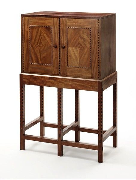
Waals produced two burr walnut writing cabinets for the drawing room at Rodmarton as well as numerous other pieces. Finished to a high lustre, the cabinets show off the beautiful grain of the walnut, featuring raised panels and drawers with chamfered edges, exposed dovetail joints, holly and ebony inlays, and handles with carved finger holds. The rooms at Rodmarton are large, and furniture was built to match: great dressers, chests and cabinets with multiple drawers, tactile grab handles and sliding wooden door catches. But the quality of detailing is remarkable: delicate inlays, turned, tapered and chamfered wood, and multiple timbers enhanced to bring out the grain. Oak floorboards are overlaid with bright hand-knotted rugs; whitewashed walls enhance feelings of light and space; curtains and drapes feature organic patterns based on floral and animal forms. In the library, a huge screen painted by Louise Powell depicts young ferns, spindly trees with delicate blossoms, and frolicking squirrels and birds. After visiting Rodmarton in 1914, C R Ashbee, an influential exponent of Arts and Crafts style, proclaimed that ‘the English Arts and Crafts movement at its best is here’.
Although the Arts and Crafts movement is associated with the country life, it had a strong cosmopolitan base. Arts and Crafts style was popularised by shops such as Liberty and Co. though which designers including C F A Voysey, Ashbee and William Morris sold their work. Liberty adopted Arts and Crafts as its signature style, and continues to produce fabrics by Arts and Crafts designers today. With the current resurgence of interest in craft, and the desire for quality over quantity in economically uncertain times, the ideals of the Arts and Crafts movement are making a comeback. Contemporary designers are spearheading a revival of craftsmanship and traditional skills.
Tom Dixon’s Beat vessels and shades are made from hand beaten brass using a traditional, rapidly vanishing skill from Indian master craftsman. His pressed glass pendant lights are hand cast and each reflects the inclusions and imperfections of the manufacturing process. Dixon established the brand in 2002 with a commitment to reviving the British furniture industry, and his work draws on Britain’s craft heritage. Dixon’s Natural Slab chair has all the Arts and Crafts hallmarks. Crafted from solid oak with a deeply brushed surface, exposing the grain of the wood, visible wooden pegs fix the seat to the frame. Innovation is combined with traditional craftsmanship to create a space-saving, stackable dining chair. Dixon’s Offcut furniture range uses scraps or ‘off-cuts’ of oak that would otherwise have been discarded, and embraces the beauty of imperfection. Arts and Crafts ideals are united with current environmental concerns.
Anna Lockwood of Lockwood Design creates unique, one-off pieces of furniture. She specialises in traditional upholstery techniques and uses natural materials such as hessian, coir fibre, horsehair and calico. Sourcing vintage and antique pieces as well as providing a complete restoration service or a simple recover, her work is environmentally friendly and craft driven. The Holland occasional chair has an Arts and Crafts look about it, with a turned wood frame and seat upholstered in orange felt. The Benjamin wing armchair has the same 100% wool felt upholstery and beautiful bees-waxed legs. It wouldn’t look amiss at Rodmarton Manor.
Running an apprenticeship scheme and employing and training up workers from the local area, Benchmark continues the legacy of the Cotswold Arts and Crafts movement responsible for Rodmarton Manor. Producing contemporary classics with sustainability in mind, Benchmark is founded on a belief in the timeless appeal of good design. Celebrating high quality materials and traditional craftsmanship, the furniture collection is hand made to order from start to finish in the workshops in West Berkshire. The angle-fronted Admiral Cabinet in American black walnut with lacquer finish epitomizes ‘truth to materials’, working to bring out the natural beauty of the wood grain. Crafted from solid fumed oak with a lacquer finish, the Jack Pedestal dining table recalls a design by Ernest Gimson in the Drawing room at Rodmarton. The Darcey table and Furrow sideboard evoke the simple sophistication of Arts and Crafts furniture.
Good design and quality construction never date. Celebrate design innovation and invest in the future of traditional craft skills.
Spotlight on: black+blum
We take a look at how black+blum bring innovative style to your home.
Creative designers Dan Black and Martin Blum complete the Anglo-Swiss partnership of black+blum. Their design consultancy business, set up in 1998, has given them the opportunity to explore and develop their passion for design through their own range of functional products.
What makes black+blum unique is that they don’t create fashion products that only have a short lifespan because they are based on current trends. Instead, their aim is to create designs that will inspire people’s imaginations and give lasting enjoyment. They’re proud to showcase designs that offer longevity; the products all serve a practical use which should still give them value in many years to come.
The Loop candelabra and the Flower loop vase showcase black+blum’s elegant yet minimal style. The Loop designs are inspired by the Fibonacci curve which can be seen throughout nature, giving a balanced and aesthetically pleasing look. The loops can be linked together and used in interesting ways; rotating it offers a different look from every angle, giving the design a fresh and changeable look. Both designs offer good functionality and they’re based on the fact that people, from history and into the foreseeable future, will always have a use for them.
black+blum are renowned for producing designs that have huge amounts of character; so, it is not surprising that one of their hero products is the award-winning James the doorstop who offers plenty of personality. Due to popular demand, this quirky design has also been remodelled into a bookend. James the bookend is made from synthetic rubber, except for the black version which is made from recycled material, and it can be used individually or as a pair. The stainless steel plate fixed to his foot gives him the strength to hold up a number of books. Transcending taste, the James products are widely recognised, and people appreciate the design for its functionality and humour.
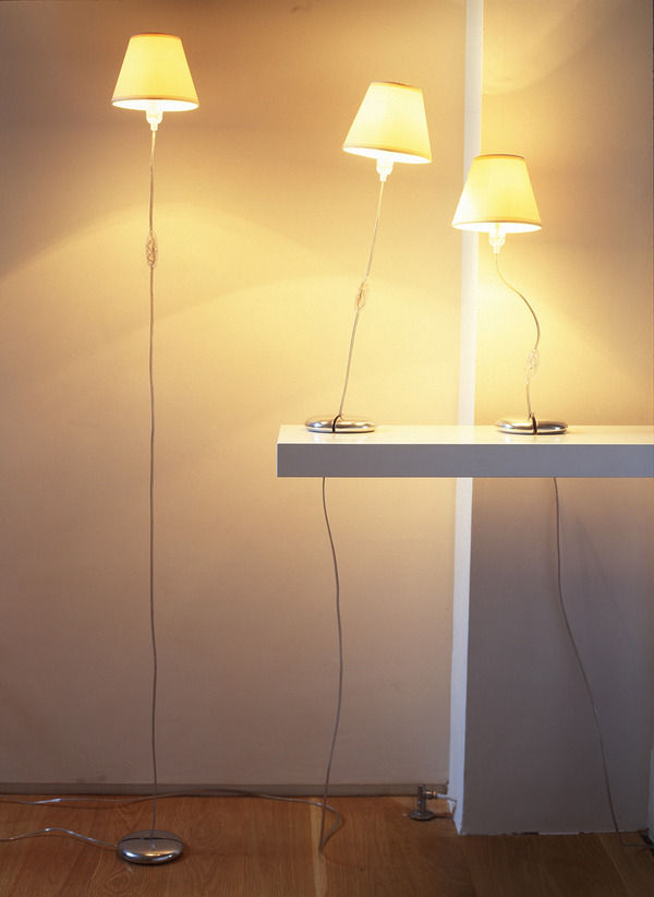
My favourite product is the Kind of Magic light which tricks the eye into believing that this is just an ordinary light. However, the shade is suspended from the ceiling with fishing wire so it appears to be floating. This illusion makes it possible to arrange and personalise the light in any way you want; it transforms easily from a floor lamp to a table lamp, creating a fascinating piece of feature lighting.
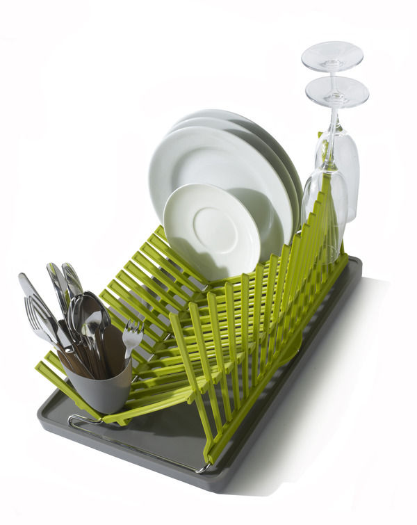
One of black+blum’s newest products is the high&dry dishrack which took them two years to develop; its distinctive style, inspired by architecture, has recently won an International Design Award in America. Dan and Martin came up with the design when they realised that there was a niche in the market. The design has a unique and appealing sculptural shape that looks good when in use, and also enables it to fold down into a compact size for easy storage. The unique flip spout on the drainage tray gives you the option to drain or not, depending on your kitchen set-up.
black+blum’s products are available on furnish.co.uk, and for their latest news and events visit their website at www.black-blum.com.
Interview: Ella Doran
We uncover Ella Doran’s inspiration and how she captures the wonders of nature in print.
Ella Doran’s prints are now iconic within the world of interior designs and can be seen on everything from blinds to table mats. Ella has received several awards including the ‘Most Influential Designer’ Award from her peers at Hidden Art, and the Laurent Perrier Eureka 2006 award. Her designs combine and translate the vivacity of nature and art, bringing colour and interest into your home.
We interviewed Ella to find out what inspires her, and here’s what she said...
If you had 3 words to describe your style what would they be?
Colourful, photographic, and bold.
Where does your inspiration come from?
It comes from the world around me; my children and family; the city; the countryside, and travelling. I constantly have my eyes open for new ideas.
What’s your ‘hero’ product and why?
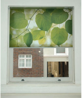
I think it would have to be our bespoke blinds and particularly the 'Sunlight through Leaves' design. Making bespoke blinds just really adds something extra and individual to a room, and that particular design works so well. If the blind is down and there is still some light outside, it makes the image glow and it’s simply stunning.
How important is colour to your designs/prints?
Massively important! It’s often the colour that draws me to a new idea. It’s always colour that I love to absorb, like a sponge. And in terms of production it is always the colour that can lift a product from good to exceptional.
The popularity of your photographic coasters, based on photos you had taken on a trip abroad, was the catalyst for developing your business. How important is photography and capturing nature/life to you and your designs?
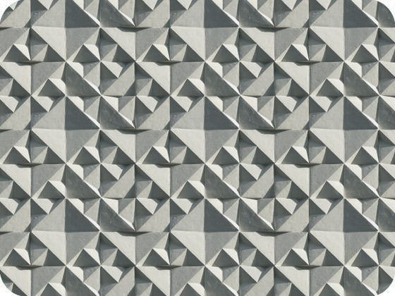
Photography is my pencil; my tool, my aid. Often I take my best shots when I’m not intending to. It’s the light that draws me towards a subject outdoors, be it leaves on a tree or a large building. Often I can see more in the photograph after I have taken it and use this in another way than I had originally intended. My Geo design is a bit like this because it came from a photo of a building I took in Berlin, and in post production I have reworked it to become something completely different. Its repetition inspires many people to see all sorts of different things.
What is the most recent design product that you have bought for your home?
I recently bought the 'Hang it All', Charles and Ray Eames coat hanger from TwentyTwentyOne (Islington). I have a long standing love affair with Eames’, the way they designed for industry and children, both with love, care, wit and attention to detail in such an all-encompassing way, and the freedom with which they applied their craft.
Who is your favourite interior designer of all time and why?
I don’t have one in particular. I look back at people like Fornasetti and how he covered everything in his crazy designs, and take great inspiration from his clarity of ideas and determination to experiment with his art onto anything and everything. I also love Marimekko and their story since the 60’s because their photoshoots of their fashion lines back then and in the 70’s are fantastic.
What’s your favourite material to work with and why?
Paper! Anything beautiful in paper excites me and makes me want to have it. The wallpapers have been brilliant to develop along with my stationery lines coming out soon! But I have made a name for myself in hard top tablemats and accessories, and I often see images applied to these in my mind as I work.
Where do you like to shop for quirky furniture pieces for your own home?
A mixture of places; I have my eye on a piece or two from the newly launched Jens Risom furniture at Rocket Gallery, produced by Bench. I have also bought from Russell Roberts on Cheshire Street; he has wonderful mid mod pieces, and is always displaying something wonderful in his window.
What advice would you give to aspiring interior designers?
Follow your own rules. There have been times during my career when I have been swayed by others, and this can lead you down the wrong path. You have to stay focused. It is your individuality that will make you successful; no one wants to see the same things churned out again and again, but by different people. Band-wagons are not always there to be jumped on.
How important do you believe UK manufacturing is to our economy and the environment?
UK manufacturing has so many benefits to the economy and bringing back craftsmanship and skills to our society gives a huge sense of independence, achievement and longevity. It means that skills can be passed on from generation to generation, giving us an invaluable legacy. Environmentally, we would definitely save on carbon footprints! But I would say that global manufacturing, on the whole, needs to consider the environment more seriously and sustainable methods need to be embraced.
Are there any designers that you would particularly like to collaborate with in the future?
I would love to collaborate with a designer or architect on something on a large scale; often I think surface design is pigeon holed and people don't relate it to 3D products or even buildings. It would be interesting to push these boundaries where the surface design influences the form and vice versa.
What new projects do you have on the horizon?
I am always developing new products - sometimes too many! My most recent projects include gift wrap, gift bags and stationery. A larger collection of stationery is something I really want to push, as well as a larger collection of wallpaper.
You can view all of Ella Doran’s designs at www.elladoran.co.uk.
Spotlight on: The French Bedroom Company
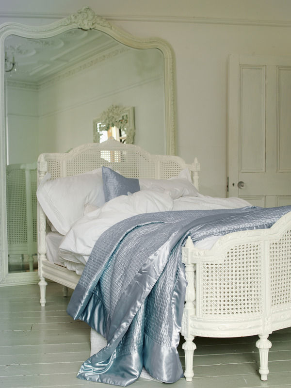
We shine the spotlight on The French Bedroom Company and uncover their elegant designs.
This week we’re saying ‘Oh là là’ as we discover sassy designs that you won’t find anywhere else. Read on as we uncover the chic and feminine style of The French Bedroom’s collection.
Online boutique, The French Bedroom Company, was created in May 2006 by Georgia Metcalfe after she realised that there was a gap in the market for elegant and affordable French style furniture. The company’s aim is to find adorable, unique furnishings that they can share with people who want to bring some glamour to their homes.
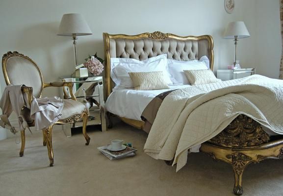
The French Bedroom Company’s collection is an array of bedroom furniture and linen, seating, storage, tables, lighting, mirrors and screens. With its beautifully curved mahogany and cane head and footboards, it’s little wonder the Lit Lit bed is one of the company’s hero products. Available in angelic white or glamorous gold, the bed is guaranteed to be the star of any boudoir.
The Provencal 3-drawer chest is part of a collection which includes products that are carved from mahogany and inspired by classic French provincial elegance. The chest is hand-finished in antique white which gives it a modest beauty. It would fit perfectly in a country-inspired home because it gives a rustic and a charming appeal; combined with the Madeleine chandelier and you’ll add instant chateau chic to your room.
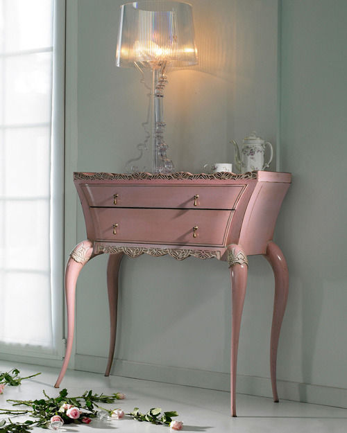
To give a bedroom a traditional and opulent feel, the antiqued gilt mahogany of the Versailles 2-drawer bedside table would be an ideal furniture piece. The distinctive cabriole legs and subtle hand carvings in the wood represent the ornate style associated with the Louis XV period. The Versailles collection also boasts an adorable petit bedroom chair, a damask stool, and a stunning mirror-fronted armoire.
My favourite piece is the Octavia mirror which stands grandly on the floor, or can be mounted on a wall in a majestic hallway or bedroom. It has an egg-and-dart style frame surround which was commonly used in eighteenth century neoclassical design. The bold detailed carved emblem is an additional embellishment, and the jet black colour of the mirror brings a modern twist to such a refined piece.
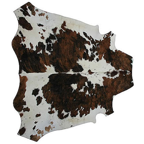
One of The French Bedroom Company’s newest products is the white cowhide which is made from organic British cows; the cowhides are tanned in the UK which ensures that there’s a low carbon footprint. Its pure white colour gives it an extremely high-shine coat, and with thick skin and fluffy hair it means that it will last twice as long as a standard hide.
We are excited to hear that The French Bedroom Company’s 2011 brochure will be launched next month. And why not take a peek inside their showroom at Apsley House, based in West Sussex, to discover the eight beautifully decorated rooms featuring their products.
The French Bedroom Company’s products are available on furnish.co.uk so why not take a look...
How to create a... masculine bedroom.
Put some swagger in your style with our tips on how to decorate a bachelor pad.
Boys will be boys... we look at how to decorate a stylish and modern masculine bedroom fit for any man.
Colour scheme
A masculine palette craves colour that invokes feelings of strength and power; colour blocking with black, white, grey, blue, green or purple will give a modern and striking look. A bold monochrome scheme will maintain a fuss-free style that limits you to two colours; however, you can keep a white and blue scheme looking fresh, for example, by bringing in boyish navy blue or grey tones in your fabrics and accessories.
Mocha browns can be enriched by cream shades or dark indigos that are accented with warmer ochre tones. Avoid pastel hues because they have a softer and more feminine feel that will contradict and confuse the look.
Wall coverings
Wallpaper, for example the Ribbed wallpaper or Monroe Special Surface, both from 95% Danish, will add texture and drama to your room. The geometric pattern in the Monroe wallpaper is in keeping with the colour block trend and shows how pattern can be incorporated into masculine style. To keep the look minimalist, try wallpaper on a feature wall behind the bed to draw attention and create impact.
Wall art is a great expression of personality as well as a form of escapism. Choose from a selection of exciting prints from 55Max available on Furnish, including images of favourite football memories and iconic film shots.
Bed linen
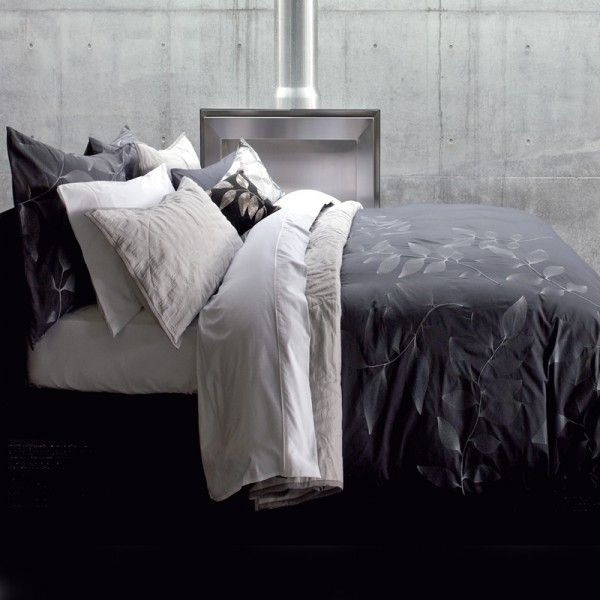
Don’t overdress the bed, this isn’t the time to go for hundreds of cushions and throws. Choose a matching duvet set and either use a solid colourway or go for plain stripes in dark colours. Pick either a lighter or darker shade of the colour you have on your walls and use this in your bedding to indulge in a cohesive look that isn’t fussy or high maintenance. The Lavina king size duvet cover from Coco Male, tailored in a deep charcoal, gives a luxurious look that any man would be proud to show off.
Lighting
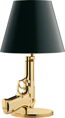
In a masculine bedroom you can’t go wrong with functional lighting that offers a quirky and innovative style. The Foscarini Diesel fork table lamp from Utility is a unique design, and the anodised metal base has the flexibility to allow the head to turn 360 degrees for directional or general ambient lighting. Or choose the Flos Gun bedside table lamp, also from Utility, which was designed by Philippe Stark who based his idea on a Baretta pistol hand gun. This feature piece instantly conjures up connotations with James Bond: how could any man resist?!
Furniture and storage
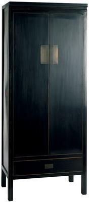
Opt for black or natural wood tones for a contemporary look. The black-antiqued lacquered finish of the Oriental Shanxi wardrobe from Puji will be set off by the earthy tones of your colour scheme. With a drawer, an internal shelf and a hanging rail, this should provide sufficient space for work suits, shirts and shoes.
The Nest bed range from Heal’s is upholstered in fabric with a padded pillow-style headboard. It has a mechanism which allows the mattress to lift to reveal storage space which is perfect for all those manly keepsakes that would otherwise clutter the room.
Flooring
For a simplistic look choose natural wood flooring in dark tones such as teak and walnut that will give a practical and contemporary feel. Rugs, such as the Sable green rug from Puji, will soften and bring texture and warmth to wood flooring. Or bring out a man’s wild and adventurous nature with some animal prints; try the Zebra print cowhide from The French Bedroom Company to match your monochrome look and add visual interest to your floor.
Accessories
A restrained masculine style is uncomplicated so accessorising will involve sticking to the essentials. The Eclipse mirror from Tom Schneider is available in a selection of wood finishes, which will make a dark room feel lighter and more spacious.
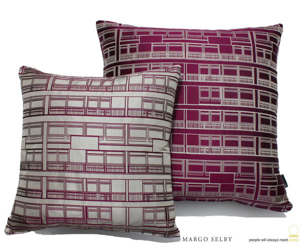
Finally, if cushions are a must then the Etch baguette cushion from Margo Selby combines black, silver and cream colours in a woven fabric giving a 3-dimension feel that will give depth to a monochrome scheme and is suitably manly.
Style Guide: Neoclassicism
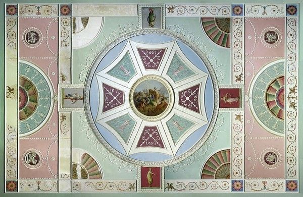
Elegant and evocative, neoclassical style has timeless appeal. Check out our period style guide and get the look at home.
Elegant and evocative, neoclassical style has timeless appeal. Check out our period style guide and get the look at home. Inspired by the ancient world, and fuelled by a spirit of adventurism, neoclassical architects transformed British design. Initially confined to handful of wealthy patrons and collectors, neoclassical style became hugely popular in the 18th century and remains an enduring influence today.
Neoclassicism emerged in Britain and France as a coherent style in the 1750s. Known to contemporaries as the ‘antique manner’, it flourished into the early years of the 19th century. Inspired by a resurgence of interest in ancient Greek and Roman design, the new style was fuelled by archaeological discoveries such as at Herculaneum and Pompeii in Italy, and Palmyra in Syria. Several publications celebrated ancient art and design, cataloguing archaeological finds and illustrating antique ornament and sculpture. This was the great era of the European Grand Tour; wealthy adventurers, architects and collectors travelled to the sites of antiquity, studying (and systematically plundering) the remains of the classical past. Architects pioneering the neoclassical style in Britain were James ‘Athenian’ Stuart and Robert Adam, both of whom had studied in Rome. These designers sought to create a distinctively modern yet eternally valid ‘true style’, arising from the ruins of the ancient world.
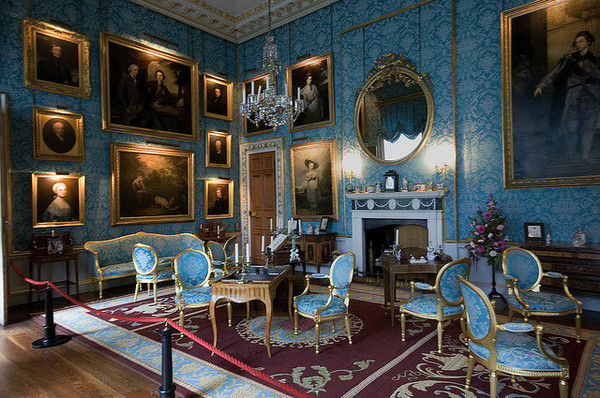
Completed by Robert Adam, Kedleston Hall in Derbyshire is a fabulous example of neoclassical architecture and interior design. The magnificence of the exterior, with its columned portico surmounted by three classical figures, stone carved roundels and niches for sculptures, is matched by the evocative interiors. The Marble Hall features twenty enormous Corinthian columns, friezes depicting ancient scenes and wall and ceiling decorations depicting classical and mythological creatures, swags and festoons. Adam’s dining room at Kedleston Hall is a characteristically unified scheme, incorporating neoclassical furniture, utensils and decoration, all of which he designed. He sought to suggest the rooms of the ancients adapted to modern usage, and created a highly distinctive decorative style. Walls and ceilings (as well as floors in the form of patterned carpets and inlays) were decorated with plasterwork tablets and small-scale plaster ornament, distilled from ancient and Renaissance sources. It was Adam’s skill as a colourist that set him apart from anything that had gone before. Inspired by the use of colour in ancient interiors, his patterned ceilings in particular were brought to life with highly pigmented hues: shades of pink and green, turquoise and blue were classic Adam choices. He was also a prolific self-publicist. Printed catalogues of Adam’s designs popularised the neoclassical style and had a lasting influence on British architecture and interiors.
The decorative vocabulary of neoclassicism was expressed across the entire visual arts, from architecture and interiors, to ornamental and useful objects of all kinds. Symbolic of the ancient world, the vase was a dominant feature of neoclassical decoration. An absolute mania for vases and urns spread rapidly in the second half of the 18th century. Josiah Wedgwood is synonymous with exploiting this insatiable market, plundering sources ranging from printed catalogues to excavated pottery, and producing a vast array of neoclassical ceramics at his Staffordshire factory (aptly named Etruria). Neoclassical designers also used the iconic vase shape for a variety of practical objects such as sugar bowls, plate warmers and stoves as well as a design motif for surface decoration.
The classical figures depicted in ancient Greek and Roman art provided 18th century designers with sources of both subject matter and style. Again associated with Wedgwood pottery, classical figures were used to decorate all sorts of objects, as well as walls, ceilings and the facades of buildings. The cameo format was especially popular and figures in cameo were applied to objects ranging from chimneypieces and furniture to jewellery. Real animals as well as creatures of mythology were also fashionable decorative devices. Dolphins, lions, sphinxes, griffins and satyrs often formed the bases or handles of neoclassical objects.
Ornamental plasterwork as well as inlaid, engraved and relief decoration on all manner of objects often took the form of swags, tassels and festoons. These hanging garlands of fabric, ribbons, flowers and scrolling foliage were based on Roman ornament. Lines of small beads were another characteristic neoclassical motif. While beading was a feature of classical architecture, it was adapted in the 18th century for use as decoration on small-scale objects. This is just one example of the way in which neoclassical designers experimented with and moved beyond the ancient models that inspired them. This imaginative response to the antique, focussing on evocative visual and scenic effects rather than strict rules of architectural logic, is typical of neoclassical design.
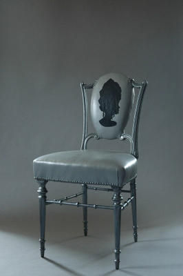
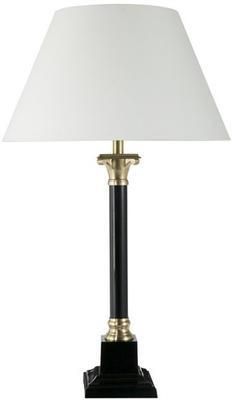
It’s this freedom of interpretation and expression that makes neoclassical design so enduring and also easily combined with other styles. For example, Greek, Roman and Egyptian motifs were taken up by Art Deco designers in the 1920s and 30s. Lamps are a simple way to introduce neoclassical accents to a room. The classical urn shape forms the base of Occa Home’s Cavendish table lamp, The French Bedroom Company’s Claridges lamp and OKA’s quirky Silhouette lamp. Roman columns inspire the Athena and Artemis lamp bases, also from OKA. Mirrors are another simple way to achieve an elegant neoclassical look. The French Bedroom Company’s Burnished Beauty mirror features Adam-style decoration including swags and beading. The Nordic Grey mirror from Sweetpea & Willow has simple yet striking architectural detailing and the Large Oval mirror is a typical neoclassical design. Ghost Furniture offers a playful take on neoclassical themes with its footstool adorned with a Roman plaster foot and Marie Antoinette chair with a cameo profile backrest. Sweetpea & Willow’s elegant Fig Leaf chair features the Greek key pattern, neoclassical beading and leaf details, with calico upholstery and a black ebonised frame. The monochrome Roman Console from Benchmark is a fabulous contemporary take on neoclassicism and reminiscent of Art Deco interpretations of the style. For a more traditional look, try the silver beaded console from Brissi.
Add a touch of elegance to any room with neoclassical accents.
Spotlight on: Margo Selby
We delve into Margo Selby’s vibrant world of woven textiles.
Margo Selby is a woven textile designer with a passion for design, colour and textiles. Since launching her first collection in 2003, with the help of a development award from The Crafts Council and with the success of her business, she has been able to showcase her beautiful designs in her own shop. The stylish design store opened in central London in November 2007.
Through her contribution to interior design, Margo has collected various craft and design awards and has been involved with high profile design projects including Hidden Art Select, Eureka and Design Nation. Her patterns and hand woven textiles have quickly become household favourites, and they are sold in many shops and galleries all over the world.
Margo’s collection optimises her love of colour and displays her skill in working with woven textiles. Margo trained at Chelsea College of Art and Design where she gained valuable experience in knitting, printing and weaving before going on to gain a postgraduate degree from the Royal College of Art. Following on from this she spent eighteen months at The Ann Sutton Foundation where she explored using industrial machinery to manufacture her unique, trademark 3-dimensional fabrics. Margo was influenced by a family tradition of cross-stitching and crochet knitting and she developed a love for making things from textiles and any other fabrics she could get her hands on. Her collection demonstrates all of her skill and passion for textile design in a selection of fabrics, cushions, throws and wallpaper that are full of vibrant colours and patterns that instantly catch the eye.
Earlier this year Margo took part in the BBC series of ‘Mastercrafts’ which saw her mentor three craft enthusiasts and teach them how to weave. This involved going behind the scenes of Margo’s studio where there is a 24-shaft dobby loom that is used to develop fabrics for future production. The hand-woven step in the design process allows for the experimentation of structure and fibre combinations. It is obvious that great care is taken throughout the design and manufacturing processes to guarantee that all products are made to the highest quality.
Margo’s bespoke fabrics are made from luxurious silk and Lycra fibres and woven in a double cloth structure to create a 3-dimensional quality.
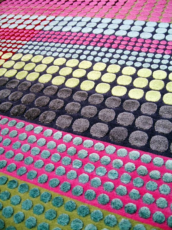
Margo’s hand knotted rugs are luxurious and encompass her signature style by using colour and geometric pattern to create aesthetically pleasing designs. The bespoke range was launched in 2008 and allows customers to choose rugs in all colours, sizes and patterns. Each one is made with a combination of wool, silk, and banana silk which is a sustainable and luxurious yarn made from the fibre of a banana tree. It’s clear why these are Margo’s hero products, achieving the ‘Best Surfaces and Finishes Product’ in the Grand Designs Awards, 2009, and they’re a great example of how sustainable materials can be used in interior design to make stylish and durable products.
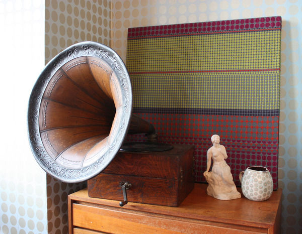
Bringing another dimension to the world of interior design, Margo’s unique upholstered panels are a fabulous way to add interest and texture to your walls. They’re carefully designed and can be made to match your colour scheme.
Collaborations
For her first collaboration, Margo teamed up with ‘People Will Always Need Plates,’ which saw a fusion of Margo’s unique and structural approach to weaving with their architectural inspiration and graphic drawing style. The project named ‘Trellick Tower’ includes a range of textiles and lifestyle products from floor cushions to wall panels, and it has gained a vast amount of interest since its launch at 100% Design 2009. The Trellick fabric marked the beginning of an ongoing relationship between both companies; in fact, Margo is currently working on another collaborative project with them for an iconic London-based company. This will involve new woven fabrics being developed to incorporate graphics designed by ‘People Will Always Need Plates’.
Also, we are eagerly anticipating Margo Selby’s new interiors range which is currently being developed; this will include a collection of upholstery fabrics, and this is due to be launched within the next year.
Visit Margo Selby on Furnish for more information about all the products, and to buy online.
Colour watch: Pink
Make your home blossom in pink.
A typically feminine colour, reminiscent of little girls bedrooms and roses, we take a look at how pink can work in the home.
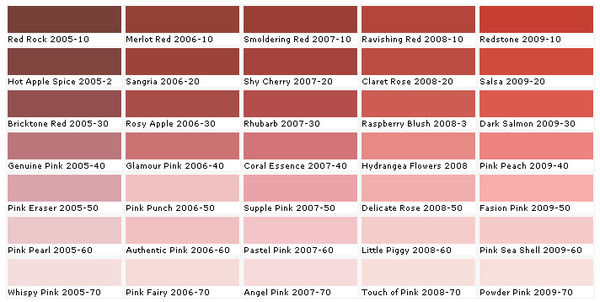
Choosing the right pink:
As pink is not a primary colour, it is important to consider mixing various shades and tones to provide a balanced colour scheme. Its versatility makes it an easy colour to decorate with, and we think it’s time you discovered the decorative opportunities that pink has to offer. ‘Shocking pink’ was fashion designer, Elsa Schiaparelli’s signature colour and she described it as: “life-giving, like all the light and the birds and the fish in the world put together, a colour of China and Peru but not of the West."
Subtlety is a key element because sweet candy shades can turn sickly, so keep your pinks sweet and innocent and play around with various tones to create a balanced colour scheme. Take your testers home and check how pink looks on your walls depending on the light; choose pinks with a warm undertone to give your room a blushing look and use pale, pastel pinks as base colours and as backdrops on walls. For a living area or bedroom, brighter and deeper shades of pink look dramatic and sharp, invoking drama and excitement. Or for a chic home office or study, add the vibrant, fuchsia pink French Kiss armchair from Sweetpea & Willow to remind you that life is not all about hard work.
Tonal scheme
Hot pinks work well with white and grey in a monochromatic scheme because when combined they give a sophisticated look and enhance the calming tones of pink. Generous amounts of white will keep your room feeling fresh and airy, whilst adding grey will give a more masculine feel. If you want to give a cool or dark room warmth, burnt oranges and reds work particularly well with magenta pinks on rich textures and fabrics, for example, try the Clarissa Hulse patchwork cushion from Heal’s which combines the rich colours on this silk, cotton and velvet cushion cover. These are considered to be warm tones but too much of them in a room can create an uneasy ambience, so restrict these colours to highlight feature pieces and they will look fabulous.
Complementary scheme
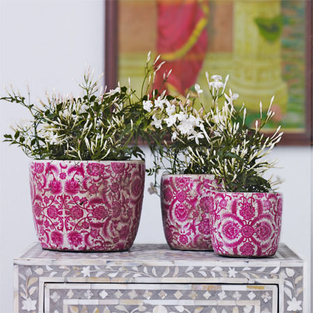
Green complements pink because it gives a stark contrast, and you may not normally think of using these colours together; however they provide a fresh and natural look that will never look outdated. For a modern look choose a pastel palette of pink and green that will give your home a fresh spring look throughout the year. Think of pink flowers in nature combined with the beautiful green foliage, and you will have instant inspiration to start accessorising with flowers and vases. Go for the Vintage ceramic rose plant pots from Graham & Green to give your room some character and choose floral wallpaper or fabrics to marry your theme together; the Rose-print cushions from Graham & Green, for example, will highlight blush pinks shades in your room to give your home a retro, period look.
Accents
Using pink as an accent offers the perfect way to inject some colour into your scheme without going over the top. Try adding a few cushions to a neutral sofa or a mixture of different shaped and textured vases along a mantelpiece. Stick to one shade of pink throughout the room for a cohesive look that will work well alongside a base shade.
Style Guide: Baroque
In the first of our new series, looking at design through the ages, we visit the wonderful world of Baroque.
Baroque your world…
Big, bold, and to modern eyes somewhat brash; Baroque is an architecture of imposing scale and exuberant detailing, a theatrical performance of mass and volume. Originating in Italy and taken up with gusto by the French monarchy, England witnessed a late blooming of Baroque style in the late 17th and early 18th centuries. Perhaps the most well known expression of English Baroque is the monumental St Paul’s Cathedral (1675-1709), designed by Sir Christopher Wren. St Paul’s epitomises Baroque handling of architectural form in a direct assault on the emotions: the vastness of scale, prodigious use of classical architectural language, and intensity of detail. Magnificent examples of English Baroque in domestic architecture, though hardly on a domestic scale, are Blenheim Palace in Oxfordshire and Castle Howard in Yorkshire; John Vanburgh and Nicholas Hawksmoor built both in the early decades of the 18th century. This was an age of palaces and era of architectural extravagance.
Intended as a monument to British military prowess, Blenheim Palace arrests the spectator the moment its fantastic roofline comes into view: a play of piers and pinnacles on a multitude of towers. Up close the awesome vastness of the classical exterior is overwhelming, with its giant order of columns and pilasters and relationships of massing that change as the spectator moves. At Castle Howard an enormous dome crowns the central block, bathing the Great Hall below it with light. The dramatic performance of mass and volume is combined in Baroque architecture with complex detailing and a sculptural attitude to the façade. Along with columns and pilasters, pediments and porticos, architectural modelling included figure sculpture; allegorical and armorial friezes; animal masks and grotesques; scrolling foliage and festoons of fruit and flowers.
Sculptural exuberance continued in Baroque interiors. Elaborate doorcases and chimneypieces, interior columns and pilasters, were meticulously stone carved. Embellished with botanical scrolling ornament, deeply projecting plasterwork on the ceilings was matched by complex three-dimensional carved wood and plaster decoration to the walls. In a play of recession and relief, illusionistic frescoes were painted within the projecting ornamental borders; these large-scale wall paintings depicted fantasy landscapes populated with biblical and mythological figures. Wall treatments also included lacquering and embossed leather, rich tapestries and damask wallpaper. Seat furniture was luxuriously upholstered, gilt-wood furniture imitated gold, and four-poster beds were swathed in sumptuous embroidered fabrics. Intense jewel colours such as crimson, emerald green and gold enhanced the splendour of Baroque interiors. Silverware took on extravagant sculptural forms, with botanical, mythological and figurative detailing. Mirrors featured carved and moulded surrounds or were overlaid with brightly painted borders depicting chubby putti, classical architectural motifs and scrolling foliage.
Decoration, furniture and furnishings were stylistically unified in Baroque interiors. This level of stylistic coordination, the ‘more is more’ attitude, and the monstrous scale of Baroque design would look spectacularly odd if replicated at home; but the spirit of Baroque, the sense of drama, richness of materials and profusion of ornament that characterised the style, can be introduced though accent pieces in modern settings. The exaggeration of architectural details and a sense of theatricality are classic Baroque hallmarks. A bold Baroque-inspired accent piece is a nod to this spirit. It’ll create a strong focal point, evoking the opulence of the era without overpowering the whole room. You can find the best of Baroque style on Furnish; just don’t go for a full on pastiche by cramming it all in one space.
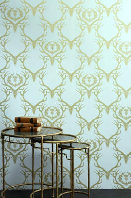
Barneby Gates’ Deer Damask wallpaper is a contemporary take on sumptuous Baroque wall coverings. In rich claret and gold, stag horns and thistles are arranged in a damask style repeat. If you’re inspired by Baroque frescos, Surface View creates bespoke wall coverings with exclusive rights to reproduce narrative, landscape and early religious masterpieces held in the National Gallery. Mirrors are a great way to introduce Baroque detailing at home without sacrificing on space. Graham & Green’s gold over-mantle mirror with shell carving and Sweetpea & Willow’s gilt-wood mirror with scrolling foliage are fabulous statement pieces for the living room or entrance hall. Perfect for the bedroom in antique white, the bevelled mirror from Oliver Bonas has an intricately carved three-dimensional surround featuring botanical ornament.
Directly influencing the development of English Baroque, the ornate furnishing style of the court of Louis XIV is emulated in the Versailles furniture range from the French Bedroom Company. Highlights include the gilt-wood and raw silk chaise, the silk damask bench and the marble topped console table. The Twilight bed from Sweetpea & Willow has four twisting pillars, reminiscent of the lathe-turned spirally twisted legs characteristic of Baroque furniture. An equally dramatic centrepiece for the bedroom, Sweetpea & Willow’s Gilt Gold bed features virtuoso gilt-wood carving and grey-gold raw silk upholstery. If you’re looking for something less overtly ornate, the high-backed sofa upholstered in black velvet from Rose & Grey captures the opulent spirit of Baroque in a simple but striking piece of furniture. And for a truly contemporary interpretation of Baroque exuberance, check out the stunning Fin chair from BODIE and FOU, upholstered in turquoise velvet and adorned with feathers.
Go bold and beautiful with Baroque-inspired style.
Spotlight On: Duffy London
Under the heat of the spotlight, we showcase the best of Duffy London’s furnishings.
Duffy London is an idea-based company that thrives on ideas not only based on similar themes and concepts but designs that are completely unique. Chris Duffy, a graduate of the University of Brighton, has always harboured a love of making and designing products, and with his own studio in east London he has achieved his dream of having his own space to work in.
Chris Duffy has created this company with the aim to encourage inventive and exciting designs that aren’t pinned down by boundaries. He has had a love for designing and making things ever since he was a young child: “I was always making crazy bikes, karts and boats while everyone else was playing football. I remember my junior school teacher asking me what I wanted to do when I grow up, and I said that I wanted to be an inventor.” Chris’ inquisitive mind drove his ambition to create his own business. With regards to where his inspiration comes from, he said “when you have been designing for a long time, you see that all design is a process, usually a very long one, and not just an inspiration, although that does occasionally happen.”
The collection includes a range of furniture, lighting, wallpaper and interior products which are predominantly designed by Chris Duffy himself, although he draws inspiration and ideas from designers that he works with. All products are handmade to order or bespoke, and they are all manufactured in the UK. One of Chris Duffy’s ‘Hero’ products is the Double-sided Hanging Chandelier Glo-Canvas which provides a stunning statement piece to hang above a dining table. It can be hung from ceiling light fittings, and to create a warm ambience each frame is installed with low energy strip lights that illuminate the Chandelier print from within. Digitally printed onto 100% cotton, the image is stretched over both sides of a wooden frame, giving a modern twist on the chandelier and the conventional use of canvases.
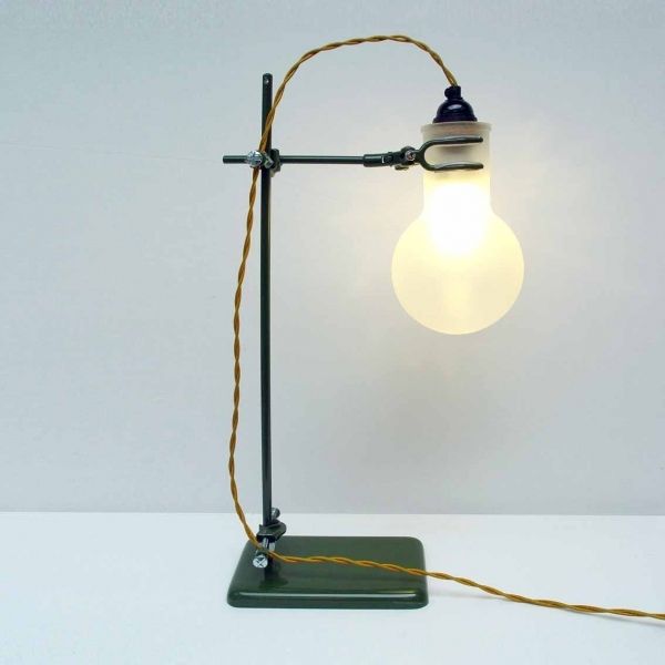
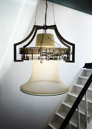
The LAB Lamp is one of Duffy London’s newest products for 2010; it’s made from genuine laboratory parts giving it an authentic style. It is available as either a desk/table or a floor lamp and is ideal for task lighting or it can simply be used as an innovative feature piece. The light is provided by an eco bulb, and the flask is sand blasted Pyrex.
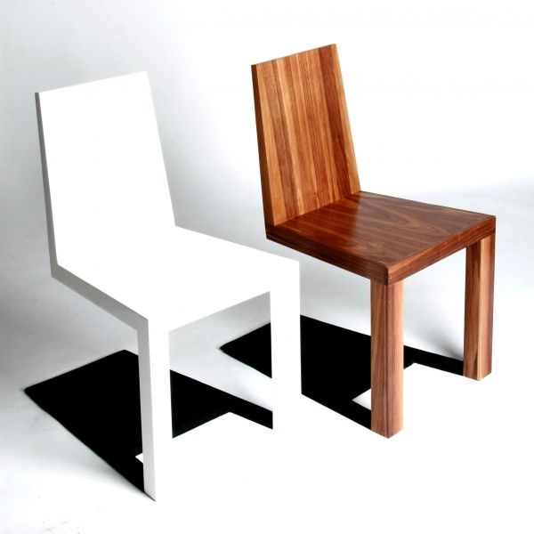
I love the quirky personality of the Shadow chair, which was launched at the Milan Salone Satellite in April 2009, because its intelligent design integrates shadow into its structure. The chair appears to defy gravity by standing on just two front legs, however with a closer look the shadow is made from steel which is attached to metal frame built inside the chair. It has a very modernist look; it plays with the representation of space and light and our perception of these things, making us question what is ‘real’. When placed in an interior space it comes into a life of its own, and will certainly make your guests look twice.
Duffy London has strong eco-credentials and Chris explained to us why he believes in the benefits of UK manufacturing: “I think it is important because it makes it possible to get a design from your head and into the shops in a very short space of time, keeping ideas and products fresh, updated, changing and improving, which is never as easy to do if you have products made in China for instance. Eco-friendly design is important not just for the obvious reasons, but because it shows an idea has been thought through properly, any design like this will take into account manufacturing processes, transportation, import duties etc.”
Coming soon...
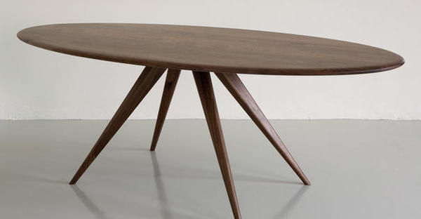
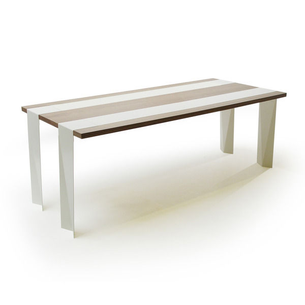
Duffy London will be launching a new dining table at London Design Week in September 2010. This new furniture piece will be another unique addition to the collection; the design cleverly incorporates its runners as its structure by having them run the full length of the table, falling off the edge to become the legs. The juxtaposition of the steel thin legs with the sturdy walnut table top gives an illusion of weightlessness, as if the table is floating. To celebrate the launch, Duffy London is offering a 25% promotional discount on orders placed before the launch. (The offer price is £1495, and the retail price will be £2000 once the offer ends.)
Duffy London products are available on furnish.co.uk and in many outlets in the UK and around the world.
How to... get your home ready for autumn
We look at the various ways you should prepare your home for the colder and darker months in style.
While we’re still hoping that our English summer lasts for as long as it can autumn is slowly approaching, so it's a great idea to get your house prepared for the colder weather and drearier days. Miserable weather can lower your mood, however with rich tones and luxurious textures you can feel warm and cosy in your home.
Try introducing oranges, reds, yellows, browns and purples into your interior as these autumn shades that will bring warmth and richness to colder rooms.
Storage
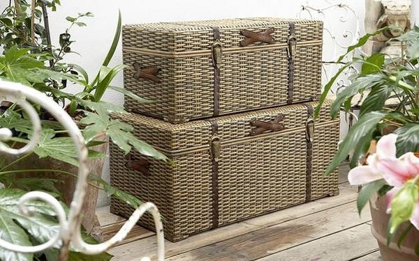
As autumn approaches, it’s time to start getting autumn accessories out of storage. Start by giving your heavy curtains an airing and cleaning your bedspreads and blankets. Store your summer accessories such as lighter duvets and throws in ottomans or chests, to keep your home organised in a stylish way. The Velvet chesterfield ottoman from The French Bedroom Company gives a warm texture and a luxurious look to your bedroom. While Lombok’s Canton black lacquer blanket chest and the Kigoma trunk from The Holding Company are both smart solutions to long term storage and come in a variety a sizes and styles to suit both traditional or contemporary schemes.
Soft furnishings
You can’t deny that changing over to your warmer, heavier weight duvet doesn’t bring a comforting feeling inside, knowing that you can snuggle up and retreat under the covers as the colder nights draw in. Also, swap your lightweight throws for heavier ones made from chenille, wool, faux fur or cashmere for ultimate luxury. Throws have a versatile quality which allows you to use them on your bed or your furniture, or even as a blanket; they are available in any colour to match your style, and why not try combining throws of different textures and shade to layer your look.
If you have natural wooden flooring it can feel cold underfoot, adding a rug to create a warm feeling and cosy appearance. Try the Kemal beige rug from Puji or the 100% pure wool Artic rugs from Rockett St George.
My favourite piece to provide comfort and warmth at any time would have to be the Ivory Sheepskin bean bag from Heal’s. Its ivory colour will match any scheme and its sumptuous soft and fluffy texture makes it the perfect treat for your home.
Window Treatments
Poorly dressed windows can allow cold air in and warm air out so make sure you choose your window treatments carefully. Swap your lightweight curtains for heavier fabric ones such as velvets or rich damasks or try layering lighter fabrics with blinds for a dramatic look. Use thermal linings to help eliminate draughts and save you some money on your heating bill; if you have a particularly cold room you can also add an interlining made from 100% cotton which makes your curtains look fuller and more lavish. For natural, made to measure curtains and blinds try www.naturalcurtaincompany.co.uk.
Accessories
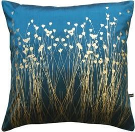
This is the time of year when you can go overboard with cushions, and you can mix and match to give a playful and colourful look that will liven up your room. With turquoise, Pantone’s colour of 2010, you can add metallic shades to bring an opulent look; this look is achieved on Clarissa Hulse’s Grassflowers hand-printed silk cushion from Heal’s. The useful yet cute Stripe Doggy draught excluder from Graham and Green made from blue stripe cotton with a wool tail, will keep the warmth in your room and keep draught at bay.
Lighting
With the days and sunlight hours getting shorter you will want to make the most of the natural light in your rooms; try hanging mirrors opposite a window to reflect the light throughout a space. The rectangular Venetian mirror from Sweet Pea & Willow has eye-catching detail, and would look stunning in a living or dining area, or a bedroom to create the illusion of more light and space. For extra light, invest in some pendant lighting which is more atmospheric and aesthetically pleasing than ceiling mounted lighting. Pendants look great as decorative pieces hanging singularly for task lighting, or they can work well when placed in a row above a dining table. Decorate tables and fireplaces with candles to create a relaxing and welcoming ambience that is perfect for evenings spent at home.
A stitch in time: Siren Elise Wilhelmsen, Nadine Sterk and Merel Karhof
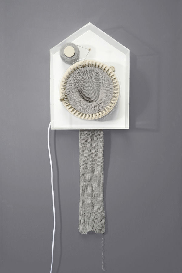
Designers take on the knitting machine.
We’re used to seeing time divided up neatly on diary pages and calendars, and attributing the convenient labels of past, present and future. But time marches on regardless: the future becomes present the present becomes past, and time becomes indefinable. Intangible and beyond our grasp, time is essentially an abstract concept: the invisible fourth dimension.
German designer Siren Elise Wilhelmsen’s knitting clock, ‘365’, gives materiality to this invisible presence. The passage of time is translated in the lengthening of knitted fabric. Shaped like a house, evoking traditional German cuckoo clocks, 365 holds a circular knitting machine with 48 needles, a thread spool, a thread holder and a ball of alpaca wool. Moving in a clockwise direction, each needle denotes half an hour, and one round of knitting is completed in a day. Rolls of ‘more time’ yarn last for a year, by the end of which the clock has created a two metre long knitted scarf. Presenting the knitting clock, Wilhelmsen was one of six graduates from the Berlin University of the Arts (UdK) who showcased their work at DMY International Design Festival in June this year. 365 will be on show at 100% Design London in September.
Mimicking organic growth over time, like the lengthening of human hair, Wilhelmsen’s clock is reminiscent of another innovative take on the knitting machine by Dutch designer Nadine Sterk. Sterk’s Sleeping Beauty is a mechanical lamp that ‘grows’ like a plant in the light. And just like a living organism, the lamp is equipped with all it needs to develop. Switch on the bulb and it begins knitting slowly around the light to create its own shade, pausing only when the light is turned off. The bulb generates enough energy to keep the knitting machine moving, at a rate of two rows an hour. Nadine Sterk exhibited Sleeping Beauty at Dutch Design Week’s Graduation Galleries in 2006.
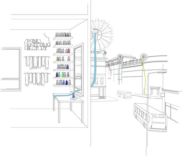
Animating space, both these beguiling objects have a Willie Wonker appeal to them and a surreal presence in the home. Exhibited at the Royal College of Art graduate show in 2009, London-based Dutch designer Merel Karhof’s Wind Knitting Factory seems to epitomise this gonzo style of thinking. Connected to a wind turbine attached to a building like a satellite dish, the circular machine knits from the outside of the building through the window, powered by the wind. The knitted material is harvested from time to time and rounded-off into individually packaged scarves. Each scarf has its own label documenting how much ‘time’ has been knitted into it and on which date. The Wind Knitting Factory was installed at THEKEY.TO, an international event celebrating green fashion, lifestyle and culture, during Berlin Fashion Week earlier this month.
All these designs use knitting to give a physical presence to the passage of time. Time is no longer lost, but captured in the knitted creations. These designs speak to a modern desire for more time, and a tendency to regret its passing. Siren Elise Wilhelmsen’s contention that time is something that unites us all, probably goes some way to explain why these knitting automata are so captivating.
Spotlight on: Original BTC
We turn the spotlight on Original BTC to learn more about their collection of lighting.
Design luminary, Peter Bowles, founded Original BTC in 1990, upon his knowledge of retail, manufacturing and design that has come from the depths of his family history. Peter’s designs are a collaboration of original and classic pieces which have been inspired by traditional factory fittings, childhood toys and iconic 1940’s design. Entirely manufactured in the UK, Original BTC lighting is hand-assembled in Oxford from the finest chrome, aluminium and bone china.
First and foremost, at Original BTC quality of style and design naturally coincides with producing sustainable and practical lighting in order to give the best result. The company is renowned for its relaxed lighting that is suitable for either contemporary or traditional homes. Creating the perfect ambience is essential and Original BTC use precision in detailing and a mix of materials to achieve this; metallic painted, glass or china shades are paired with polished satin or chrome bases. Peter claims that his aim was “to design and produce lights that you are instantly at home with, that will fit easily and comfortably for many years to come.”
The stylish collection covers all your lighting needs with wall and floor lamps sitting alongside table and pendant lights. From bone china, metal and prismatic glass, there are so many fabulous designs to choose from that offer both style and versatility. The influence behind the designs comes from the clean lines of traditional factory fittings and the versatility of mid-century style. Over 70% of the company’s lighting is exported worldwide, and widely recognised by acclaimed French designer Andrée Putman, John Pawson and Terence Conran. Also, you will find Original BTC products lighting up the likes of Gordon Ramsey’s Maze Grill restaurant in London, and making us say ‘Oh là là’ about Paris’ new concept store, Merci. Their lighting is being used in these well known places because it has a classic style that draws attention.

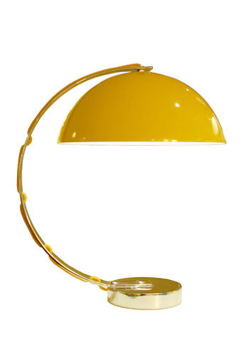
New for Spring/Summer 2010, the retro-inspired London desk light, designed by Charles Bowles (the son of Founder, Peter Bowles), epitomises modern design with its simple clean lines. It has a spun aluminium semi-sphere shade, solid chrome base and a matching cotton braided flex to give it a tailored finish. The London is available in black, putty grey and yellow to suit any sophisticated study, and its intriguing shape looks great from all angles. Original BTC have also released a new limited edition task light known as ‘Jack’; this is made to order and features a hand-painted British flag featuring the iconic patriotic colours of red, white and blue.
The Stanley Range includes three sizes of pendants which are available in solid copper, solid brass, or nickel plate. Made to order, you can choose a hammered or smooth reflective finish, and they give a spectacular look when grouped together or you can mix metals for a contemporary and interesting appeal. These provide a stunning effect because their narrow cylindrical shape creates a spotlight over a feature, or they simply be used as decorative pieces. The Stanley range was launched in September 2009 along with the Cosmo pendants and table lights, available in ribbed prismatic glass shades, which sparkle and refract light to create beautiful shadow play on the polished chrome bases.
My favourite is ‘The Tea Range’ for its fanciful tea cup and tea pot shaped pendants and table lights which are inspired by 1930’s tableware. They are ideally suited to dining rooms or kitchens to create an imaginative style that takes traditional pieces of tableware, and evolves them into fantastical designs. Staying true to their original design, they are made from bone china like a fine English tea set, giving them a delicate appeal.
So, here is yet another example of how British manufacturing is building and increasing in popularity to support the economy. Original BTC is founded on values that encourage British-made products and designs; in fact Peter Bowles strongly believes in producing excellent quality and good value designs and takes pride in the fact that they are manufactured in the UK.
Original BTC will be exhibiting at 100% Design in London, Sept 23rd-26th 2010. For the complete range of Original BTC lighting, visit www.originalbtc.com, and for more information tel: 0207 351 2130.
Colour watch: Yellow
Even on a cloudy day, sunshine yellow shades will brighten up your home and put a smile on your face.
From citrus hues and bright daisy yellows to creamy and buttery shades, yellow is a comforting and warming colour. Yellow denotes happiness and colour researchers have found that it raises self-esteem. Yellow daffodils are associated with unrequited love, but yellow can supposedly sharpen memory and concentration skills. Van Gogh saw the potential and power of colour, and claimed that ‘yellow is capable of charming God’: he observed the strength and influence of yellow on our feelings, and this illustrates the impact that this colour can have in your home.
Choosing the right yellow
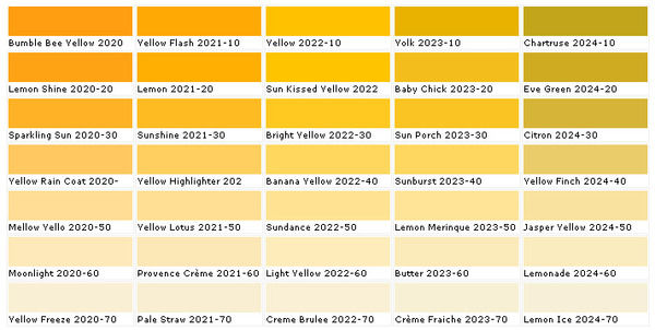
When choosing a shade of yellow, think about the mood you want to create and how the lighting in your room will affect the look. Daylight won’t make yellow paint so intense, whereas most incandescent bulbs have a very yellow cast that will strengthen your paint colour. Yellow can have warm undertones such as red or orange, or cooler tones of green or brown: choose warm yellows for warm-toned rooms with dark wood furnishings for example, and cooler yellows for a neutral and natural décor. Decide whether you want to use yellow as the focus or as an accent in your room; a room decorated in soft, creamy yellows can give a quaint, country home style, while a splash of bright yellow in a dark room can make a space look modern and give a cheerful feel.
Tonal scheme
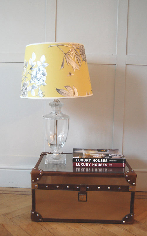
Rich, sunset yellows work well in a monochromatic scheme with black and white because they create a stark contrast whilst neutralising each other’s dramatic effect. While straw and cream shades on walls are offset beautifully by sun-kissed yellows on cushions, vases, lampshades, and other accent pieces. You can compliment yellow with lots of white; drawing inspiration from nature, you can use daisies as an example of how you can create a simple, clean and fresh look. Any living area or bedroom with warm yellow walls can be enhanced and modernised with crisp white furniture, fabric, curtains, throws and mirrors.
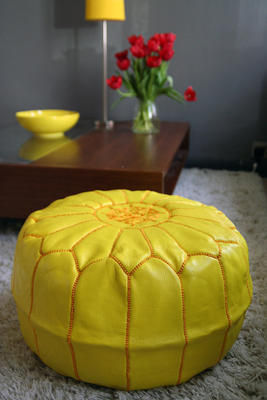
If you want to introduce yellow furniture, minimalism is the key because too many large-scale pieces will not work as well together. Block colour is a desired trend and can work well in this case where you can use a couple of small key furniture pieces in yellow, for example an armchair and a pouffe, to inject the power of yellow into your living room without it becoming too overwhelming.
Complementary colour schemes
Since it is a primary colour, yellow can be paired with almost any other shade: use orange and red hues to enhance the warmth in a room. Choose one dominant shade and one secondary colour to make this scheme work; varying tones can give a room depth and they keep your space feeling fresh.
For visual contrast use purple, the complementary colour of yellow, to create an equal balance of tone and intensity. Purples and blues bring out the cooler tones in yellow; if you are keen to follow a pastel colour scheme try lilacs and pale lemon shades for a calming and relaxing ambience.
Warmer orange tones of yellow create a sensual and exotic look when combined with luscious aubergines; try this in a bedroom for a rich and sensual ambience.
Accents
Accents are great if you are a bit cautious about decorating all over with yellow; it is one of the most luminous of the colours and reflects a lot of light. Pair yellow with a cooler accent shade such as soothing grey which will neutralise the brighter tones. Choose bountiful floral arrangements to bring a feminine and spring-like feel to any room. Or try gold accents in your artwork, accessories and fabric, to lift your scheme and add a feeling of opulence.
Focus on: Michelle Mason
Introducing one of the hottest designers of the moment, designer-maker Michelle Mason.
Michelle Mason has become renowned for her contemporary interior products, and since launching her début collection of home wares in 2006 her colourful and exciting surface patterns have been very well received. Before becoming a successful designer, Michelle graduated in Fine Art and has a BA in illustration. Since then she has conquered the world of interior design, and achieved many prestigious awards including winner for ‘Best Press Profile’ from the Hidden Art Annual Awards in 2009. Michelle’s unique Stella wool rug was shortlisted for the Homes & Gardens Classic Design Award, 2009.
Inspired by repeating plant forms, nature and everyday life has influenced Michelle’s bold graphic style and characteristic organic designs. Michelle’s products are British made, and locally sourced and manufactured in the UK to ensure that only environmentally friendly materials are used. The first collection included Perspex laser-cut table lights, and fabric lampshades that are printed onto eco-friendly unbleached cotton satin. Michelle says that “everywhere I look I find inspiration- I keep my eyes wide open and try never to miss a design opportunity.” Also, commenting on her cushion collection featuring digital prints of London life, Michelle said: “I’ve thoroughly enjoyed working on this collection and the opportunity to return to my first love of illustration.” Her love of design and drawing on aspects of everyday life shines through in her work which draws on poignant childhood memories, and is inspired by old picture postcards, vintage biscuit tins and fabrics, and walks in the park.
Egg Candle Holders
Made with English fine bone china, the egg candleholders have an aesthetically pleasing shape. Happy childhood memories of dipping bread into soft boiled eggs were Michelle’s inspiration behind the design. The design was selected for the Hidden Art Select Collection due to its originality and it was launched at 100% Design in 2007. This unique piece brings together style and functionality; it can hold a standard 20mm diameter candle, and it can also be used to hold a single flower head, plant cutting or a bamboo stem.
Stella rug
The Stella rug is Michelle’s ‘hero’ product because of its decorative style, and the naturally irresistible texture makes it a talking point for any room. It is made from 100% wool felt, a biodegradable and sustainable material that is soft to the touch. Elegant and stylish, the rug is ideal for living or bedroom areas for textual interest, but due to its cut-away nature it is not intended for high-traffic areas such as hallways. Michelle’s inspiration came from wanting to recreate in large scale the fine detail of antique lace. The design exemplifies a new, contemporary take on lace-making, and it’s beautiful surface and texture looks equally stunning on carpet or natural wood floors. It is available in black, natural cream and purple but can be made to order in a variety of colours that can work individually or be used in multiples on a large floor space.
‘London Calling’ cushion collection
The London Night cushion is one of the newest illustrations to Michelle’s collection of cushions called ‘London Calling.’ Its quirky illustration depicts a fanciful evening scene in the busy Capital and it links in with the other cushions in the collection which similarly show familiar scenes from London life, some feature the iconic red Routemaster bus or a black cab, and other famous buildings. The designs are digitally printed onto soft but hardwearing cotton satin and backed with unbleached calico. Her illustrations bring colourful scenes and each one tells a story which makes them a unique and quaint addition for your home. The Flower Market cushion is my personal favourite, featuring east London’s famous Columbia Road Flower Market, because it tells an imaginative story of the colourful and exciting aspects of everyday life.
Complementing her range of cushions, Michelle’s Melamine mugs, tumblers, trays and tea towels follow the same London theme including prints of London Art Deco tube stations. The London Transport Museum shop commissioned the mug and tray designs to coincide with their exhibition, Suburbia.
Excitingly, Michelle’s up-and-coming project sees her working with the National Gallery on a range of products to be launched this year. She launched several new designs at Pulse London 2010 in June including her All Aboard cushions, London Life Trainer cups, and further illustrations of the London Life cushions.
Michelle will be exhibiting her products at 100% Design in Earl’s Court Arena, 23rd-26th September 2010, at stand H60. Visit michellemason.co.uk for further product information and stockists.
Hot off the press…fabric
Our hot picks from the world of fabrics.
We’ve been rummaging around in the wonderful world of fabrics to bring you the latest news from established brands and emerging talent.
Timorous Beasties
Founded in Glasgow, and once described as ‘William Morris on acid’, the design studio Timorous Beasties has developed an iconoclastic style, printing surreal and provocative imagery on traditional textiles and wallpaper. Timorous Beasties are experimental in approach to both hand-printing methods and machine production. This innovative approach is reflected in an evolving aesthetic: from early surrealistic and distorted naturalistic images of insects, plants and fish, to a new graphic style which explores social and political themes. The Glasgow Toile, featured in the recent Quilts exhibition at the V&A museum, epitomises this uncompromisingly contemporary graphic style. At first glance it looks like one of the bucolic pastoral vistas depicted on 18th century Toile de Jouy textiles, but closer inspection reveals a nightmarish vision of contemporary Glasgow, in which addicts, prostitutes and the homeless are depicted against a threatening backdrop of decaying tower blocks and scavenging seagulls. Other fabrics for 2010 include the ethereal Lace collection, which has a hint of Miss Havisham about it, and the Digital collection, a development of Timorous Beasties trademark naturalistic imagery, with fabrics depicting moths, insects, amphibians and plant forms. Naturalistic, lace fretwork, damask and Toile de Jouy imagery is repeated across the Velvet, Linen and Woven fabric collections.
Abigail Borg
Since launching her wallpaper collection in 2009, illustrator and surface pattern designer Abigail Borg has received a clutch of industry awards. Influenced by traditional pattern design, particularly that of William Morris and the Arts and Crafts movement, Abigail combines a timeless approach to drawing and pattern design with the latest in digital printing methods and a passion for vibrant colour. Her striking, vintage-inspired floral prints, rendered in a series of luscious colourways, now feature in the recently launched fabric collection. Available by the metre as well as hand finished feather-filled cushions; it’s a beguiling collection of bold English country-garden prints and vivid, saturated colour, achieved through digital printing. Perfect for curtains and upholstery, the dramatic colour ways and graphic style give the collection a contemporary edge, offering vintage-inspired design for a modern setting. Our favourites are the Polka Polka fabric, depicting hydrangeas and red-hot pokers in white, duck egg blue, pea green, and shades of pink on black ground; and the soon to be released Peonie Fox, featuring peonies and foxgloves in white, pink and pea green on a pale turquoise ground. We’ll be interviewing Abigail soon, so watch this space.
Designers Guild
Designers Guild is a well-established brand with a well-deserved position in the world of interiors, consistently offering original, stylish and liveable fabric and wallpaper collections in coordinating colourways and patterns. Designers Guild does colour exceptionally well, with new combinations each season and its own line of complementary paints. Textiles range from the block-coloured Essentials collections, containing over 2000 plain and textured fabrics, through contemporary and vintage-inspired florals, to architectural patterns and graphic geometric motifs. We love the striking hexagonal repeat pattern on the Leopold fabric (2010 Darly collection) and the fretwork, interlocking motif on the Rheinsburg fabric (2010 Pavilion collection). These dynamic geometric prints are accompanied by nostalgic florals and flowing arabesques in complementary colourways. The Designers Guild furniture range, encompassing both contemporary and vintage-inspired designs, is available to be upholstered in any Designers Guild fabric. And as well as fabrics by the metre, Designers Guild has a fantastic range of cushions, bed linen and blankets, throws and table linen. Rugs feature oversized patterns and motifs taken from the wallpaper and fabric collections. Designers Guild is a distributor of The Royal Collection, inspired by the interiors of Buckingham Palace and Windsor Castle; the Ralph Lauren Home fabric and wallpaper collections; and William Yeoward’s luxurious fabric and wallpaper ranges.
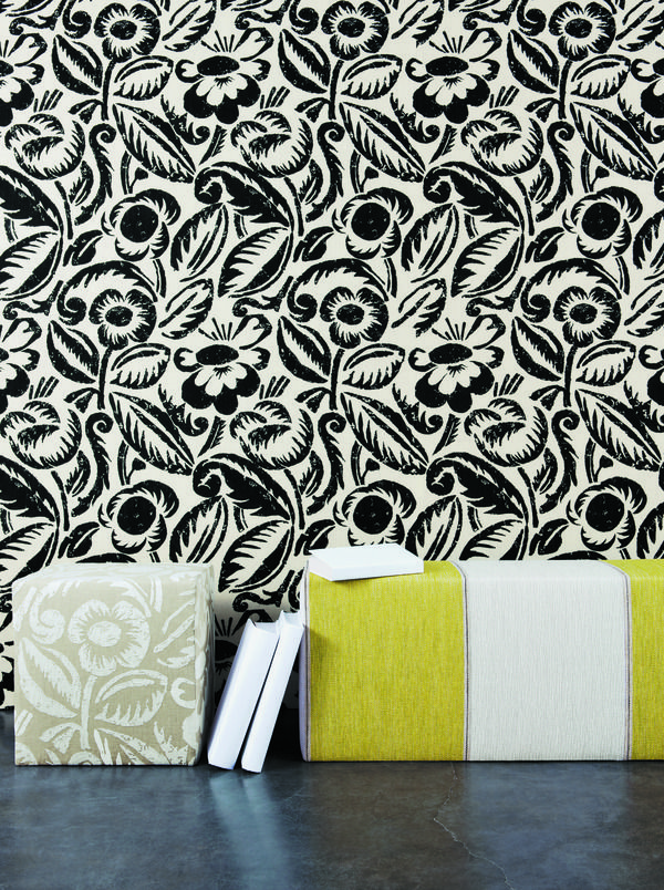
Manuel Canovas
Part of the Colefax Group (of Colefax & Fowler fame), Manuel Canovas is a Parisian design studio producing sumptuous and stylish wallpapers and complementary fabrics. The Millennium collection follows a seafaring and naturalistic theme, with twiggy coral fronds, oriental koi carp, fluid plant forms, seashells and stripes, adorning linens, cottons and velvets. New collections for 2010 include a series of fabulous French toile patterns in contemporary colourways such as orange and grey, dark brown and pale blue, rose pink and graphite. Sophisticated florals, bold stripes and geometric motifs in a distinctive colour palette are featured throughout the new collections. Our favourite new pattern has to be the Vence fabric. Reminiscent of the woodblock textiles produced by Duncan Grant and Vanessa Bell of the Bloomsbury group in the early 20th century, the stylised florals have a hand-printed appearance with the imperfections of the woodblock process adding to the charm of the fabric. Available in black, mauve or ecru, Vence is a stylish fabric choice for upholstery projects and window treatments.
Check back soon for more hot of the press homeware.
Colour watch: Blue
From daring midnight blues to breezy, calming baby blue hues you can blend and contrast different tones, shades and palettes to create a harmonious room.
Colour sparks individuality, creativity and mood which is why it is such an integral part of art and interior design as well as influencing the way we perceive the world. Whether you want to create a room that has a relaxing ambience or simply to add some drama and excitement there is a shade of blue for you. Blue is a primary colour and one of the cooler shades on the colour wheel that will bring a calming influence to a room. Blue shades are associated with the sky and sea, and also loyalty, stability and relaxation which makes it a popular choice in many homes.
Choosing the right blue
There are plenty of versatile shades and huesof blue to choose from that will work their tranquil magic in any room of your home. Consider the size of your room and how much natural light it gets because choosing a darker shade will make a small room feel less spacious and more enclosed. Use a colour wheel to help you make the right choices with colour; it is a visual aid to help you understand the relationship between different colours. For example, midnight and sapphire blues are great for feature walls in fair sized living rooms or bedrooms because deeper shades, when used sparingly, create a dramatic impact but do not darken the atmosphere and mood of your interior. To make the right decision for your wall colour, a top tip is to get a sample pot or tester from any paint supplier and try it out in different parts of the room where the light will hit it differently. If in doubt, go for a lighter shade with warm tones that will prevent the room feeling cold and unwelcoming.
Tonal scheme
You can create a harmonious room by choosing various tones of blue which are created by adding grey or black in order to make a dulled or muted shade, or with white to give a cooler, pastel shade. Use deeper tones nearer the floor and work upwards into lighter hues to give a feeling of space. For example, an exotic blue rug will bring texture and depth to wooden flooring.
A monochrome interior is great for contrasting light and shade and will bring a different dimension to your interior. The key to this look is to experiment with pattern and texture to prevent the colours becoming too bland. A monochromatic room in blue should use a single shade of blue paired with white; sky blue walls with deeper sea blue furnishings can be combined with white fabrics and accessories such as flowing curtains, tablecloths or cushion covers. You can even bring a nautical touch to your home with classic blue and white stripes.
Analogous colour scheme
An analogous colour scheme is as easy to create as the monochromatic scheme but it provides more nuances to complete a richer look. Blue can be combined with green and purple hues that bring a deeper interest and encourage feelings of serenity because the colours are reminiscent of the ocean. Avoid combining warm and cool colours in this scheme because they will not work well together. Instead, combine light and dark blues from the same colour family that use the same undertone. This is important in maintaining a natural and desirable scheme that uses colours that you would normally find together in nature.
Complementary colour scheme
Complementary colours are aesthetically pleasing and they are placed opposite to each other on the wheel for the correct pairing. For the best results you should place cool hues against warm tones. Orange is the complementary colour of blue because together they provide an exciting combination that will accentuate the best features in your room. Use orange highlights in patterned fabrics or accessories, for example, because you can overdo it and create an unwanted clash of dominant colours.
Pairing one light and one dark tone of each of your chosen colours works well to give an aesthetically pleasing contrast. The pair can be combined using a muted version of one colour on the walls, and a more intense version of the other colour in furnishings and accessories. Blue with red orange and yellow orange is known as a split complementary scheme which can be used to promote a high contrast and a dramatic look. Complementary colours will work well when used in floral fabrics, drapery and upholstery to naturally highlight texture and brighten your interior.
Accents
Rather than painting an entire room in blue, you can introduce the colour into a white based room with vases, art work, cushions, and other decorative pieces. Accents can also fall out of the basic colour scheme; use complementary colours such as turquoise or fuchsia pinks to brighten up the subtle or deep blue tones in your room. Also, with metallic shades being a hot trend this season you can use hints of silver or gold throughout your room to create a feeling of opulence.

