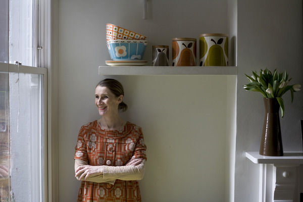
It's our Interior Design Magazine!
The hottest interior design ideas, fab finds for the home and buying advice. We're always looking for new finds, designers to feature or anything else lovely for the home, so if you've seen something gorgeous and would like it featured in our interior design magazine, please get in touch!
Our weekly pick of interiors blogs…
This week we’re visiting San Francisco, Marrakesh and New York City.
SF Girl by Bay unsurprisingly hails from San Francisco and the blog is as beautiful as the city. The photographs have a dream-like nostalgia to them and the blog is known for representing ‘bohemian modern style’. Created by Victoria Smith, it’s a scrapbook of interiors inspiration, showcasing art and craft, new designers, products and trends, with a heap of shopping tips thrown in. She’s a flea market junky with a love of photography, and her fabulous finds are shared with all. There’s a great recent post on Scandinavian style. You could get caught up on here all day.
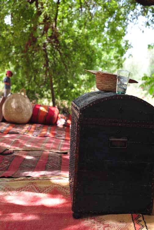
My Marrakesh is brought to you by ‘Moroccan Maryam’ and billed as ‘the tales of an American family’s quest to build a guesthouse in Marrakesh.’ But it’s much more than that. Maryam’s a travel obsessive, a guidebook writer and a human rights specialist. With a job that’s taken her all over the world, she’s developed a passion for global textiles, carpets and Moorish culture. And the blog’s definitely got that ‘global traveller’ feel, a wonderful riot of colour, pattern and sun-drenched style. The guesthouse, Peacock Pavilions, is a real find if you’re thinking of a Moroccan trip. And the family have three peacocks as pets, which just about sums up the lifestyle.
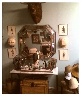
Hollister Hovey is such a charming blog, it’s just mesmerising: a string of pearls. Beautiful photographs, printed ephemera, Polaroid snapshots, flea market finds, and design historical bits and pieces, are a continuous source of intrigue and delight. The ‘acquisitions’ posts bring out an alarming covetousness, and the blogger’s house, stuffed full of beautiful vintage finds, is enough to make me weep. I’m actually quite lost for words when it comes to describing the wonder of this blog. If you live anywhere near New York or you’re planning a visit, it’s a must-see for insider tips on the best places for ferreting out a vintage bargain. But if a trip stateside is out of the question, just go on here and dream the dream.
Once again, get in touch if you want us to feature your very own blog next time.
Interview: Ella Doran
We uncover Ella Doran’s inspiration and how she captures the wonders of nature in print.
Ella Doran’s prints are now iconic within the world of interior designs and can be seen on everything from blinds to table mats. Ella has received several awards including the ‘Most Influential Designer’ Award from her peers at Hidden Art, and the Laurent Perrier Eureka 2006 award. Her designs combine and translate the vivacity of nature and art, bringing colour and interest into your home.
We interviewed Ella to find out what inspires her, and here’s what she said...
If you had 3 words to describe your style what would they be?
Colourful, photographic, and bold.
Where does your inspiration come from?
It comes from the world around me; my children and family; the city; the countryside, and travelling. I constantly have my eyes open for new ideas.
What’s your ‘hero’ product and why?
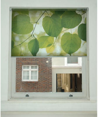
I think it would have to be our bespoke blinds and particularly the 'Sunlight through Leaves' design. Making bespoke blinds just really adds something extra and individual to a room, and that particular design works so well. If the blind is down and there is still some light outside, it makes the image glow and it’s simply stunning.
How important is colour to your designs/prints?
Massively important! It’s often the colour that draws me to a new idea. It’s always colour that I love to absorb, like a sponge. And in terms of production it is always the colour that can lift a product from good to exceptional.
The popularity of your photographic coasters, based on photos you had taken on a trip abroad, was the catalyst for developing your business. How important is photography and capturing nature/life to you and your designs?
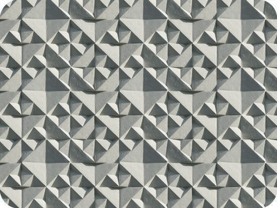
Photography is my pencil; my tool, my aid. Often I take my best shots when I’m not intending to. It’s the light that draws me towards a subject outdoors, be it leaves on a tree or a large building. Often I can see more in the photograph after I have taken it and use this in another way than I had originally intended. My Geo design is a bit like this because it came from a photo of a building I took in Berlin, and in post production I have reworked it to become something completely different. Its repetition inspires many people to see all sorts of different things.
What is the most recent design product that you have bought for your home?
I recently bought the 'Hang it All', Charles and Ray Eames coat hanger from TwentyTwentyOne (Islington). I have a long standing love affair with Eames’, the way they designed for industry and children, both with love, care, wit and attention to detail in such an all-encompassing way, and the freedom with which they applied their craft.
Who is your favourite interior designer of all time and why?
I don’t have one in particular. I look back at people like Fornasetti and how he covered everything in his crazy designs, and take great inspiration from his clarity of ideas and determination to experiment with his art onto anything and everything. I also love Marimekko and their story since the 60’s because their photoshoots of their fashion lines back then and in the 70’s are fantastic.
What’s your favourite material to work with and why?
Paper! Anything beautiful in paper excites me and makes me want to have it. The wallpapers have been brilliant to develop along with my stationery lines coming out soon! But I have made a name for myself in hard top tablemats and accessories, and I often see images applied to these in my mind as I work.
Where do you like to shop for quirky furniture pieces for your own home?
A mixture of places; I have my eye on a piece or two from the newly launched Jens Risom furniture at Rocket Gallery, produced by Bench. I have also bought from Russell Roberts on Cheshire Street; he has wonderful mid mod pieces, and is always displaying something wonderful in his window.
What advice would you give to aspiring interior designers?
Follow your own rules. There have been times during my career when I have been swayed by others, and this can lead you down the wrong path. You have to stay focused. It is your individuality that will make you successful; no one wants to see the same things churned out again and again, but by different people. Band-wagons are not always there to be jumped on.
How important do you believe UK manufacturing is to our economy and the environment?
UK manufacturing has so many benefits to the economy and bringing back craftsmanship and skills to our society gives a huge sense of independence, achievement and longevity. It means that skills can be passed on from generation to generation, giving us an invaluable legacy. Environmentally, we would definitely save on carbon footprints! But I would say that global manufacturing, on the whole, needs to consider the environment more seriously and sustainable methods need to be embraced.
Are there any designers that you would particularly like to collaborate with in the future?
I would love to collaborate with a designer or architect on something on a large scale; often I think surface design is pigeon holed and people don't relate it to 3D products or even buildings. It would be interesting to push these boundaries where the surface design influences the form and vice versa.
What new projects do you have on the horizon?
I am always developing new products - sometimes too many! My most recent projects include gift wrap, gift bags and stationery. A larger collection of stationery is something I really want to push, as well as a larger collection of wallpaper.
You can view all of Ella Doran’s designs at www.elladoran.co.uk.
Interview: Abigail Borg
Award-winning surface designer Abigail Borg tells all.
Abigail Borg has taken the world of interiors by storm since graduating from Leeds College of Art in 2008 with a First in Printed Textiles & Surface Pattern Design. Picked out from thousands of graduates, she was named ‘New Designer of Year 2008’ and went on to set up on her own in January 2009. She’s continued to wow industry professionals and interiors obsessives alike with her beguiling floral prints, and was short-listed by Elle Decoration at the British Design Awards 2009. We caught up with Abigail to have a bit of a gossip.
How would you describe the Abigail Borg style?
All of my work begins with hours of hand drawing – an integral part of my style. I see it as a fading craft, and there is no comparison to a hand drawn illustration against something that has been knocked up in a few minutes on a computer screen.
I have then chosen to digitally print my wallpapers and fabrics, as I don’t have to compromise on colour or levels of details that I perhaps would if screen printing. If I could sum it up I’d say: ‘Hand drawn; Vintage Inspired; Contemporary.’
What’s your personal style at home?
I love going to car boots, charity shops and buying things off eBay, so there’s lots of knick-knacks: battered picture frames and prints, scuffed storage boxes and jars, old textiles, fabrics, and so on. I’d much rather buy an old chest of draws that’s been used constantly for 50 years, than a shiny, chip-free one. I also love being in the garden and spend lots of time planting and growing different flowers to photograph and draw, so there are lots of dried flowers about.
Your wallpapers and fabrics have a William Morris feel to them. What draws you to the Arts and Crafts movement and do you have any other favourite eras of interior design?
I love vintage design, particularly from the late Victorian period right up until the 1960’s – lots of patterns, hand drawing, colour and craftsmanship. I enjoy looking at styles from each period and incorporating them into my own style.
As an illustrator, are there particular artists that have influenced your work?
Designers such as CFA Voysey and Walter Crane, and companies such as F. Steiner & Co and the Calico Printers Association all influence me – I love the daring use of colour and the bold lines and pattern.
You have a very distinctive colour palette. How do you put together your colour schemes and what comes first – pattern or colour?
I generally hand draw and put together a pattern, and decide from there what sort of colour palette I’d like to incorporate. As always, I’ll look at archival patterns, as well as dipping into current colour trends to come up with something that has a good balance of the old and the new.
Why do you think florals work so well in interior design?
Florals have played a major part in interior design and decoration for centuries, starting off as tapestries, mural paintings and textiles, moving into the high fashion, modern settings of today. I think it’s because of this that floral patterns never date and will always work well in an interior setting. Wallpapers designed by Morris and Voysey during the late 1800s could easily be applied to a room today and not look out of place. I think the basis of good design is being able to apply a product into a setting from any era and it still looking bang up to date.
How is new technology and traditional handcraft combined in your work? What is the aesthetic result of this approach?
I love to hand draw as the level of detail and the slight imperfections are so much nicer to see that a perfected and pruned computer file. I experimented with screen printing a lot whilst at art school, and found that I had to alter the detail and reduce the amount of colours. From then on I started digitally printing, as this allowed me to have as much detail and colour as I like, resulting in designs that had both bold colours and intricate, contemporary patterns.
As well as producing your wallpaper and fabric collections, you work with clients on bespoke commissions. What has been your favourite project?
I love working on all commissions as each one is a new challenge, and no matter what the end product is you learn so much along the way. I really liked working with Johnson & Johnson on illustrations for some of their products. It’s nice to work on a brief together with an art director – and to think my drawings are in hundreds of bathroom cabinets makes me smile.
What’s your favourite high-street and high-end home furnishing brand/store?
Topshop! It’s affordable, with higher end pieces if you’re wanting to splash out, as well as having a bit of vintage in there.
And Liberty – there’s so much in there and every time I visit there’s always something new to look at. Plus the tea room is nice for a little sit down.
What’s been your best interiors bargain?
This isn’t so much a bargain, but salvage. My parents were cleaning out the loft of their house a few years ago, and on the ‘take to the tip’ pile was a shiny brown object. When I had a look it was a Guzzini mushroom ceiling light, which had been left there by the previous owner. They were going to throw it away as it was ‘ugly and dated’, so I immediately claimed it as my own!
Which three objects would you save if your house was on fire?
The Singer 3004; my mom bought it 27 years ago and it’s the best sewing machine I’ve ever used. A box I keep lots of photos, cards, notes etc in from friends and lastly my collection of design books, journals, bibles which I’d hate to lose.
What do think will be the next big trends in interiors?
From a wallpaper point of view, perhaps some new finishes or printing methods with larger scale patterns, particularly florals.
What’s next for Abigail Borg?
I’ll be moving into a studio space by the end of the year, with new products and lines in the new year. I’ll also be releasing a series of letter pressed Christmas cards in the next few months, as well as working on commissions for interior fabrics.
Find out more and buy online at www.abigailborg.com.
Spotlight on: The French Bedroom Company
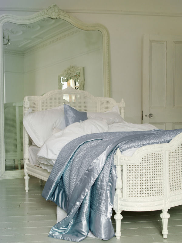
We shine the spotlight on The French Bedroom Company and uncover their elegant designs.
This week we’re saying ‘Oh là là’ as we discover sassy designs that you won’t find anywhere else. Read on as we uncover the chic and feminine style of The French Bedroom’s collection.
Online boutique, The French Bedroom Company, was created in May 2006 by Georgia Metcalfe after she realised that there was a gap in the market for elegant and affordable French style furniture. The company’s aim is to find adorable, unique furnishings that they can share with people who want to bring some glamour to their homes.
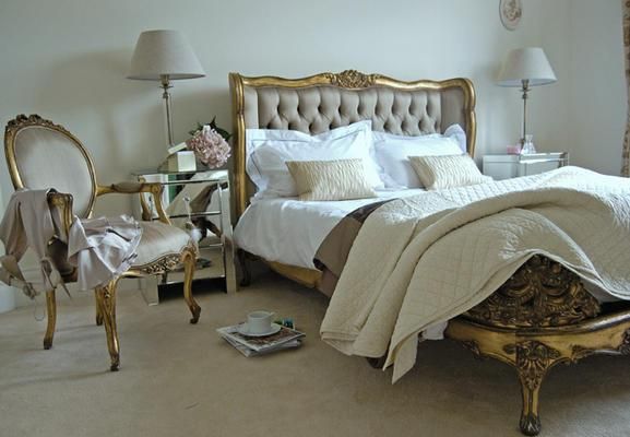
The French Bedroom Company’s collection is an array of bedroom furniture and linen, seating, storage, tables, lighting, mirrors and screens. With its beautifully curved mahogany and cane head and footboards, it’s little wonder the Lit Lit bed is one of the company’s hero products. Available in angelic white or glamorous gold, the bed is guaranteed to be the star of any boudoir.
The Provencal 3-drawer chest is part of a collection which includes products that are carved from mahogany and inspired by classic French provincial elegance. The chest is hand-finished in antique white which gives it a modest beauty. It would fit perfectly in a country-inspired home because it gives a rustic and a charming appeal; combined with the Madeleine chandelier and you’ll add instant chateau chic to your room.
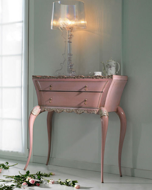
To give a bedroom a traditional and opulent feel, the antiqued gilt mahogany of the Versailles 2-drawer bedside table would be an ideal furniture piece. The distinctive cabriole legs and subtle hand carvings in the wood represent the ornate style associated with the Louis XV period. The Versailles collection also boasts an adorable petit bedroom chair, a damask stool, and a stunning mirror-fronted armoire.
My favourite piece is the Octavia mirror which stands grandly on the floor, or can be mounted on a wall in a majestic hallway or bedroom. It has an egg-and-dart style frame surround which was commonly used in eighteenth century neoclassical design. The bold detailed carved emblem is an additional embellishment, and the jet black colour of the mirror brings a modern twist to such a refined piece.
One of The French Bedroom Company’s newest products is the white cowhide which is made from organic British cows; the cowhides are tanned in the UK which ensures that there’s a low carbon footprint. Its pure white colour gives it an extremely high-shine coat, and with thick skin and fluffy hair it means that it will last twice as long as a standard hide.
We are excited to hear that The French Bedroom Company’s 2011 brochure will be launched next month. And why not take a peek inside their showroom at Apsley House, based in West Sussex, to discover the eight beautifully decorated rooms featuring their products.
The French Bedroom Company’s products are available on furnish.co.uk so why not take a look...
Our weekly pick of interiors blogs… Aug 27th
This week we check out three home renovation projects.
Making it Lovely follows Nicole Balch and family as they transform a ‘so-so’ century old house into a lovely home. Nicole posts the pictures of her home renovation handy-work in a photo gallery; and there’s plenty more inspiration in the form of product reviews and fabulous finds, craft projects, lifestyle stories and interiors advice. She regularly puts together a collage of home furnishings ‘chosen’ by James and Eugenia, a ‘fictional couple with exceptionally good taste in furniture’. But if you need reminding that it’s Nicole who’s got the great taste, just take a look at her house.
The Rambling Renovators are a couple of design-loving DIYers who invite you to tag along as they revamp their home, room by room. It’s another chance to be nosy and have a good old snoop around somebody else’s stylish home. As well as the customary ‘before and after’ photos you can expect loads of lifestyle images, plenty of vintage finds, product reviews and a whole lot of interiors ideas. From mock-ups and mood-boards, to DIY tips and decorating dilemmas this blog’s great if you’re thinking about renovating. And if you live anywhere nearby, the Christie Antiques Show in southern Ontario looks absolutely amazing.
The Brick House is right up my alley (in terms of style, that is; the house is in California). Originally built in the 1950s, this super stylish bungalow is being restored to its former glory, complete with mid-century modern furnishings. Shaking off any lingering associations with retirement villages, it’ll change your mind about bungalows in an instant. The photographs look like something straight off the pages of Elle Decoration or The World of Interiors. Draw dropping stuff. There’s not one thing I don’t like about it; although I really hope they’re keeping the pink and black tiles in the original bathroom. The tiles alone would have made me buy the place. The Brick House is a must-see for any mid-century modern fans and a lesson in sympathetic restoration. Perfection.
How to create a... masculine bedroom.
Put some swagger in your style with our tips on how to decorate a bachelor pad.
Boys will be boys... we look at how to decorate a stylish and modern masculine bedroom fit for any man.
Colour scheme
A masculine palette craves colour that invokes feelings of strength and power; colour blocking with black, white, grey, blue, green or purple will give a modern and striking look. A bold monochrome scheme will maintain a fuss-free style that limits you to two colours; however, you can keep a white and blue scheme looking fresh, for example, by bringing in boyish navy blue or grey tones in your fabrics and accessories.
Mocha browns can be enriched by cream shades or dark indigos that are accented with warmer ochre tones. Avoid pastel hues because they have a softer and more feminine feel that will contradict and confuse the look.
Wall coverings
Wallpaper, for example the Ribbed wallpaper or Monroe Special Surface, both from 95% Danish, will add texture and drama to your room. The geometric pattern in the Monroe wallpaper is in keeping with the colour block trend and shows how pattern can be incorporated into masculine style. To keep the look minimalist, try wallpaper on a feature wall behind the bed to draw attention and create impact.
Wall art is a great expression of personality as well as a form of escapism. Choose from a selection of exciting prints from 55Max available on Furnish, including images of favourite football memories and iconic film shots.
Bed linen
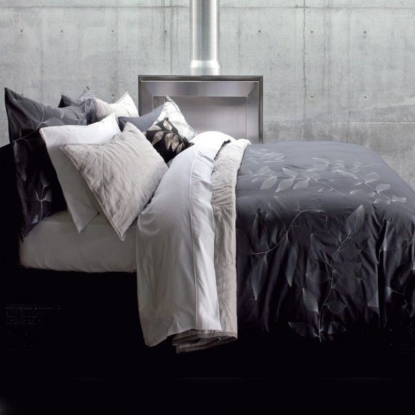
Don’t overdress the bed, this isn’t the time to go for hundreds of cushions and throws. Choose a matching duvet set and either use a solid colourway or go for plain stripes in dark colours. Pick either a lighter or darker shade of the colour you have on your walls and use this in your bedding to indulge in a cohesive look that isn’t fussy or high maintenance. The Lavina king size duvet cover from Coco Male, tailored in a deep charcoal, gives a luxurious look that any man would be proud to show off.
Lighting
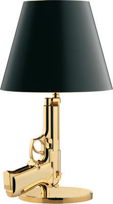
In a masculine bedroom you can’t go wrong with functional lighting that offers a quirky and innovative style. The Foscarini Diesel fork table lamp from Utility is a unique design, and the anodised metal base has the flexibility to allow the head to turn 360 degrees for directional or general ambient lighting. Or choose the Flos Gun bedside table lamp, also from Utility, which was designed by Philippe Stark who based his idea on a Baretta pistol hand gun. This feature piece instantly conjures up connotations with James Bond: how could any man resist?!
Furniture and storage
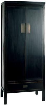
Opt for black or natural wood tones for a contemporary look. The black-antiqued lacquered finish of the Oriental Shanxi wardrobe from Puji will be set off by the earthy tones of your colour scheme. With a drawer, an internal shelf and a hanging rail, this should provide sufficient space for work suits, shirts and shoes.
The Nest bed range from Heal’s is upholstered in fabric with a padded pillow-style headboard. It has a mechanism which allows the mattress to lift to reveal storage space which is perfect for all those manly keepsakes that would otherwise clutter the room.
Flooring
For a simplistic look choose natural wood flooring in dark tones such as teak and walnut that will give a practical and contemporary feel. Rugs, such as the Sable green rug from Puji, will soften and bring texture and warmth to wood flooring. Or bring out a man’s wild and adventurous nature with some animal prints; try the Zebra print cowhide from The French Bedroom Company to match your monochrome look and add visual interest to your floor.
Accessories
A restrained masculine style is uncomplicated so accessorising will involve sticking to the essentials. The Eclipse mirror from Tom Schneider is available in a selection of wood finishes, which will make a dark room feel lighter and more spacious.
Finally, if cushions are a must then the Etch baguette cushion from Margo Selby combines black, silver and cream colours in a woven fabric giving a 3-dimension feel that will give depth to a monochrome scheme and is suitably manly.
Style Guide: Neoclassicism
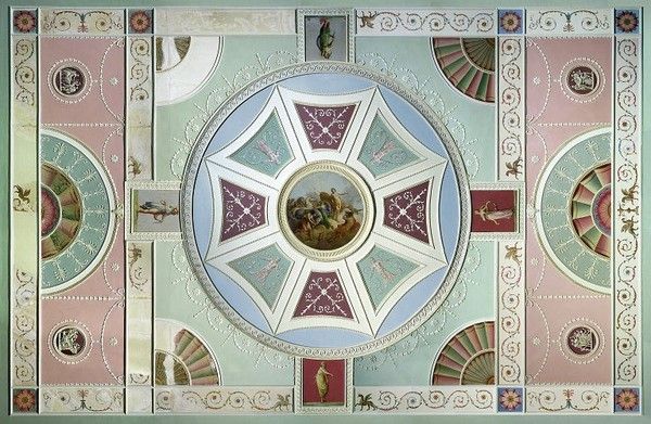
Elegant and evocative, neoclassical style has timeless appeal. Check out our period style guide and get the look at home.
Elegant and evocative, neoclassical style has timeless appeal. Check out our period style guide and get the look at home. Inspired by the ancient world, and fuelled by a spirit of adventurism, neoclassical architects transformed British design. Initially confined to handful of wealthy patrons and collectors, neoclassical style became hugely popular in the 18th century and remains an enduring influence today.
Neoclassicism emerged in Britain and France as a coherent style in the 1750s. Known to contemporaries as the ‘antique manner’, it flourished into the early years of the 19th century. Inspired by a resurgence of interest in ancient Greek and Roman design, the new style was fuelled by archaeological discoveries such as at Herculaneum and Pompeii in Italy, and Palmyra in Syria. Several publications celebrated ancient art and design, cataloguing archaeological finds and illustrating antique ornament and sculpture. This was the great era of the European Grand Tour; wealthy adventurers, architects and collectors travelled to the sites of antiquity, studying (and systematically plundering) the remains of the classical past. Architects pioneering the neoclassical style in Britain were James ‘Athenian’ Stuart and Robert Adam, both of whom had studied in Rome. These designers sought to create a distinctively modern yet eternally valid ‘true style’, arising from the ruins of the ancient world.
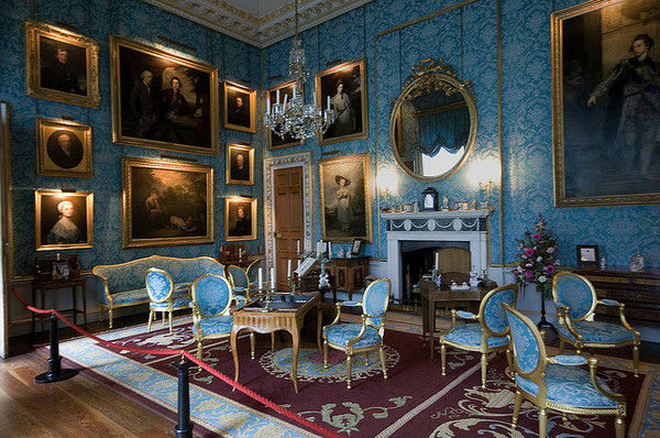
Completed by Robert Adam, Kedleston Hall in Derbyshire is a fabulous example of neoclassical architecture and interior design. The magnificence of the exterior, with its columned portico surmounted by three classical figures, stone carved roundels and niches for sculptures, is matched by the evocative interiors. The Marble Hall features twenty enormous Corinthian columns, friezes depicting ancient scenes and wall and ceiling decorations depicting classical and mythological creatures, swags and festoons. Adam’s dining room at Kedleston Hall is a characteristically unified scheme, incorporating neoclassical furniture, utensils and decoration, all of which he designed. He sought to suggest the rooms of the ancients adapted to modern usage, and created a highly distinctive decorative style. Walls and ceilings (as well as floors in the form of patterned carpets and inlays) were decorated with plasterwork tablets and small-scale plaster ornament, distilled from ancient and Renaissance sources. It was Adam’s skill as a colourist that set him apart from anything that had gone before. Inspired by the use of colour in ancient interiors, his patterned ceilings in particular were brought to life with highly pigmented hues: shades of pink and green, turquoise and blue were classic Adam choices. He was also a prolific self-publicist. Printed catalogues of Adam’s designs popularised the neoclassical style and had a lasting influence on British architecture and interiors.
The decorative vocabulary of neoclassicism was expressed across the entire visual arts, from architecture and interiors, to ornamental and useful objects of all kinds. Symbolic of the ancient world, the vase was a dominant feature of neoclassical decoration. An absolute mania for vases and urns spread rapidly in the second half of the 18th century. Josiah Wedgwood is synonymous with exploiting this insatiable market, plundering sources ranging from printed catalogues to excavated pottery, and producing a vast array of neoclassical ceramics at his Staffordshire factory (aptly named Etruria). Neoclassical designers also used the iconic vase shape for a variety of practical objects such as sugar bowls, plate warmers and stoves as well as a design motif for surface decoration.
The classical figures depicted in ancient Greek and Roman art provided 18th century designers with sources of both subject matter and style. Again associated with Wedgwood pottery, classical figures were used to decorate all sorts of objects, as well as walls, ceilings and the facades of buildings. The cameo format was especially popular and figures in cameo were applied to objects ranging from chimneypieces and furniture to jewellery. Real animals as well as creatures of mythology were also fashionable decorative devices. Dolphins, lions, sphinxes, griffins and satyrs often formed the bases or handles of neoclassical objects.
Ornamental plasterwork as well as inlaid, engraved and relief decoration on all manner of objects often took the form of swags, tassels and festoons. These hanging garlands of fabric, ribbons, flowers and scrolling foliage were based on Roman ornament. Lines of small beads were another characteristic neoclassical motif. While beading was a feature of classical architecture, it was adapted in the 18th century for use as decoration on small-scale objects. This is just one example of the way in which neoclassical designers experimented with and moved beyond the ancient models that inspired them. This imaginative response to the antique, focussing on evocative visual and scenic effects rather than strict rules of architectural logic, is typical of neoclassical design.
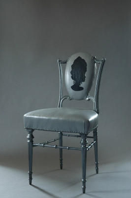
It’s this freedom of interpretation and expression that makes neoclassical design so enduring and also easily combined with other styles. For example, Greek, Roman and Egyptian motifs were taken up by Art Deco designers in the 1920s and 30s. Lamps are a simple way to introduce neoclassical accents to a room. The classical urn shape forms the base of Occa Home’s Cavendish table lamp, The French Bedroom Company’s Claridges lamp and OKA’s quirky Silhouette lamp. Roman columns inspire the Athena and Artemis lamp bases, also from OKA. Mirrors are another simple way to achieve an elegant neoclassical look. The French Bedroom Company’s Burnished Beauty mirror features Adam-style decoration including swags and beading. The Nordic Grey mirror from Sweetpea & Willow has simple yet striking architectural detailing and the Large Oval mirror is a typical neoclassical design. Ghost Furniture offers a playful take on neoclassical themes with its footstool adorned with a Roman plaster foot and Marie Antoinette chair with a cameo profile backrest. Sweetpea & Willow’s elegant Fig Leaf chair features the Greek key pattern, neoclassical beading and leaf details, with calico upholstery and a black ebonised frame. The monochrome Roman Console from Benchmark is a fabulous contemporary take on neoclassicism and reminiscent of Art Deco interpretations of the style. For a more traditional look, try the silver beaded console from Brissi.
Add a touch of elegance to any room with neoclassical accents.
Heritage Open Days: 9 – 12 September 2010
Sneak a peak behind closed doors.
Heritage Open Days celebrates England’s architectural and cultural history by throwing open the doors to interesting properties either normally closed to the public or normally charging an entrance fee. Every year on four days in September visitors can satisfy their nosey inclinations for free, peaking into properties ranging from castles to factories, town halls to tithe barns, Buddhist temples to Masonic lodges, mines, windmills and private homes. Coordinated by English Heritage it’s a once yearly chance to discover hidden architectural gems and enjoy a range of tours, talks and activities bringing local history and culture to life. Simon Thurley, English Heritage Chief Executive says: ‘Heritage Open Days is about people and places; it celebrates community and reflects the importance of the built environment in our lives and to our quality of life. It is organised by local people who dedicate their spare time to opening properties and staging activities, and it is their knowledge and enthusiasm that makes Heritage Open Days happen.’ The Event Directory has just been launched and allows you to search more than 4,000 buildings of every style, period and function, to find out what’s on in your area.
Highlights this year include Bentley Priory in Stanmore, Hertfordshire, the Battle of Britain Command centre which has been closed to the general public during its 70 years as an RAF base. The Second World War Beacon Hill Radar Tower at Harwich, Essex, and the Royal Air Force College in Cranwell, Lincolnshire are also well worth a snoop. The 18th century ironstone Gothic Temple at Stowe, Buckinghamshire will also open its doors, with its wonderful circular domed vault and magnificent views over the Stowe Landscape Gardens. Built in 1845 in the Gothic Revival style, The Grange in Ramsgate, Kent is well worth exploring as the former home of Augustus Pugin, oddball architect of the Houses of Parliament.
In Bristol, the Aardman Animation headquarters offers a glimpse of a cutting-edge sustainable building, home to the creators of Wallace and Gromit. A pioneering example of energy conscious design, Norman Foster’s kidney shaped, glass sheathed office block, the Willis Building in Ipswich, Suffolk, is the youngest building to receive grade I listed status. Completed in 1975 it’s a must-see for modern design devotees. Anderton House in Barnstaple, Devon is another exceptional example of 1970s design, still furnished with contemporary curtains, furniture, ceramics and paintings. And a quintessential Modernist home, The Concrete House in Bristol, was built in 1934 and designed by Basil Ward of architectural firm Connell, Ward and Lucas.
Romantics and music lovers will enjoy the honeymoon destination of composer Edward Elgar, No.3 Alexandra Gardens in Ventnor on the Isle of Wight, one of eight grand Victorian villas overlooking the Isle’s south coast. Heritage Open Days properties associated with the arts also include the former home of Jane Austen’s brother, Chawton House in Hampshire, and the Elizabethan North Lees Hall in the Peak District National Park: said to be the inspiration for Charlotte Bronte’s description of Mr Rochester’s House, Thornfield Hall in Jane Eyre.
An interesting historical curiosity, The Fisherman’s Hospital in Great Yarmouth, Norfolk, was founded in 1702 to provide housing for old or ‘decayed’ fishermen who could no longer support themselves. There are charming ornamental details and Saint Peter, patron saint of fishermen, stands proud on the roof of the brick building. Staying on the English coast, one of Hastings’ intriguing net shops in East Sussex, built in 1835 to store fishermen’s equipment, will reveal its old nets, ropes, corks and sails, all evoking salty sea dogs and the perilous high seas.
Up North, some of England’s great Victorian theatres open their doors with special backstage tours of both The Journal Tyne Theatre and The Theatre Royal in Newcastle and Leeds’ Grand Theatre & Opera House. And for sports fans, there’ll be tours of the Victorian Jesmond Dene Real Tennis Club in Newcastle, Chester Racecourse, the country’s oldest racecourse dating to the early 16th century, and Molineux Stadium, home to Wolverhampton Wanderers since 1889. Dip your toes into local history at Georgian swimming pool, The Cleveland Pools in Bath, Somerset and 1930s lidos including Broomhill Pool in Ipswich, Suffolk and Sandford Parks Lido in Cheltenham, Gloucestershire.
Heritage Open Days is England’s contribution to European Heritage Days, in which 49 countries now participate. In the UK, four other schemes open doors in September: Open House London, Doors Open Days in Scotland, Open Doors Days in Wales and European Heritage Days in Northern Ireland.
Spotlight on: Margo Selby
We delve into Margo Selby’s vibrant world of woven textiles.
Margo Selby is a woven textile designer with a passion for design, colour and textiles. Since launching her first collection in 2003, with the help of a development award from The Crafts Council and with the success of her business, she has been able to showcase her beautiful designs in her own shop. The stylish design store opened in central London in November 2007.
Through her contribution to interior design, Margo has collected various craft and design awards and has been involved with high profile design projects including Hidden Art Select, Eureka and Design Nation. Her patterns and hand woven textiles have quickly become household favourites, and they are sold in many shops and galleries all over the world.
Margo’s collection optimises her love of colour and displays her skill in working with woven textiles. Margo trained at Chelsea College of Art and Design where she gained valuable experience in knitting, printing and weaving before going on to gain a postgraduate degree from the Royal College of Art. Following on from this she spent eighteen months at The Ann Sutton Foundation where she explored using industrial machinery to manufacture her unique, trademark 3-dimensional fabrics. Margo was influenced by a family tradition of cross-stitching and crochet knitting and she developed a love for making things from textiles and any other fabrics she could get her hands on. Her collection demonstrates all of her skill and passion for textile design in a selection of fabrics, cushions, throws and wallpaper that are full of vibrant colours and patterns that instantly catch the eye.
Earlier this year Margo took part in the BBC series of ‘Mastercrafts’ which saw her mentor three craft enthusiasts and teach them how to weave. This involved going behind the scenes of Margo’s studio where there is a 24-shaft dobby loom that is used to develop fabrics for future production. The hand-woven step in the design process allows for the experimentation of structure and fibre combinations. It is obvious that great care is taken throughout the design and manufacturing processes to guarantee that all products are made to the highest quality.
Margo’s bespoke fabrics are made from luxurious silk and Lycra fibres and woven in a double cloth structure to create a 3-dimensional quality.
Margo’s hand knotted rugs are luxurious and encompass her signature style by using colour and geometric pattern to create aesthetically pleasing designs. The bespoke range was launched in 2008 and allows customers to choose rugs in all colours, sizes and patterns. Each one is made with a combination of wool, silk, and banana silk which is a sustainable and luxurious yarn made from the fibre of a banana tree. It’s clear why these are Margo’s hero products, achieving the ‘Best Surfaces and Finishes Product’ in the Grand Designs Awards, 2009, and they’re a great example of how sustainable materials can be used in interior design to make stylish and durable products.
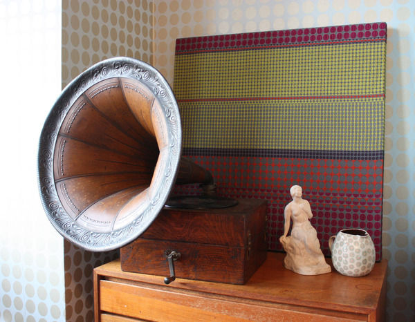
Bringing another dimension to the world of interior design, Margo’s unique upholstered panels are a fabulous way to add interest and texture to your walls. They’re carefully designed and can be made to match your colour scheme.
Collaborations
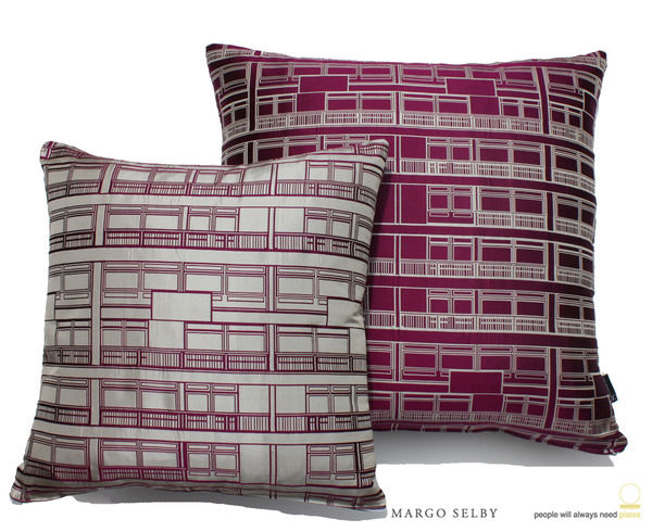
For her first collaboration, Margo teamed up with ‘People Will Always Need Plates,’ which saw a fusion of Margo’s unique and structural approach to weaving with their architectural inspiration and graphic drawing style. The project named ‘Trellick Tower’ includes a range of textiles and lifestyle products from floor cushions to wall panels, and it has gained a vast amount of interest since its launch at 100% Design 2009. The Trellick fabric marked the beginning of an ongoing relationship between both companies; in fact, Margo is currently working on another collaborative project with them for an iconic London-based company. This will involve new woven fabrics being developed to incorporate graphics designed by ‘People Will Always Need Plates’.
Also, we are eagerly anticipating Margo Selby’s new interiors range which is currently being developed; this will include a collection of upholstery fabrics, and this is due to be launched within the next year.
Visit Margo Selby on Furnish for more information about all the products, and to buy online.
Colour watch: Pink
Make your home blossom in pink.
A typically feminine colour, reminiscent of little girls bedrooms and roses, we take a look at how pink can work in the home.
Choosing the right pink:
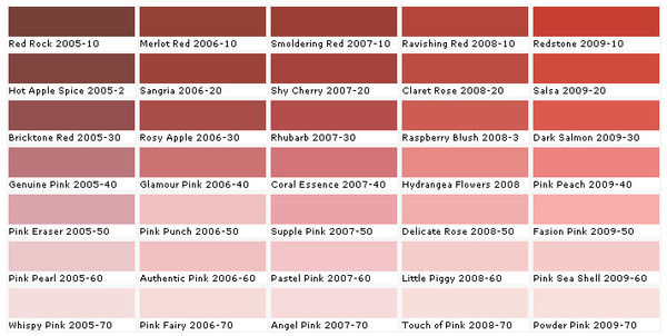
As pink is not a primary colour, it is important to consider mixing various shades and tones to provide a balanced colour scheme. Its versatility makes it an easy colour to decorate with, and we think it’s time you discovered the decorative opportunities that pink has to offer. ‘Shocking pink’ was fashion designer, Elsa Schiaparelli’s signature colour and she described it as: “life-giving, like all the light and the birds and the fish in the world put together, a colour of China and Peru but not of the West."
Subtlety is a key element because sweet candy shades can turn sickly, so keep your pinks sweet and innocent and play around with various tones to create a balanced colour scheme. Take your testers home and check how pink looks on your walls depending on the light; choose pinks with a warm undertone to give your room a blushing look and use pale, pastel pinks as base colours and as backdrops on walls. For a living area or bedroom, brighter and deeper shades of pink look dramatic and sharp, invoking drama and excitement. Or for a chic home office or study, add the vibrant, fuchsia pink French Kiss armchair from Sweetpea & Willow to remind you that life is not all about hard work.
Tonal scheme
Hot pinks work well with white and grey in a monochromatic scheme because when combined they give a sophisticated look and enhance the calming tones of pink. Generous amounts of white will keep your room feeling fresh and airy, whilst adding grey will give a more masculine feel. If you want to give a cool or dark room warmth, burnt oranges and reds work particularly well with magenta pinks on rich textures and fabrics, for example, try the Clarissa Hulse patchwork cushion from Heal’s which combines the rich colours on this silk, cotton and velvet cushion cover. These are considered to be warm tones but too much of them in a room can create an uneasy ambience, so restrict these colours to highlight feature pieces and they will look fabulous.
Complementary scheme
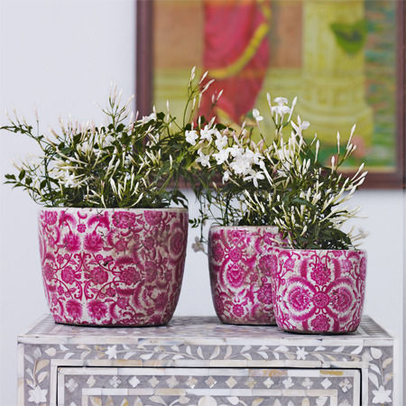
Green complements pink because it gives a stark contrast, and you may not normally think of using these colours together; however they provide a fresh and natural look that will never look outdated. For a modern look choose a pastel palette of pink and green that will give your home a fresh spring look throughout the year. Think of pink flowers in nature combined with the beautiful green foliage, and you will have instant inspiration to start accessorising with flowers and vases. Go for the Vintage ceramic rose plant pots from Graham & Green to give your room some character and choose floral wallpaper or fabrics to marry your theme together; the Rose-print cushions from Graham & Green, for example, will highlight blush pinks shades in your room to give your home a retro, period look.
Accents
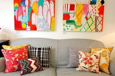
Using pink as an accent offers the perfect way to inject some colour into your scheme without going over the top. Try adding a few cushions to a neutral sofa or a mixture of different shaped and textured vases along a mantelpiece. Stick to one shade of pink throughout the room for a cohesive look that will work well alongside a base shade.
Style Guide: Baroque
In the first of our new series, looking at design through the ages, we visit the wonderful world of Baroque.
Baroque your world…
Big, bold, and to modern eyes somewhat brash; Baroque is an architecture of imposing scale and exuberant detailing, a theatrical performance of mass and volume. Originating in Italy and taken up with gusto by the French monarchy, England witnessed a late blooming of Baroque style in the late 17th and early 18th centuries. Perhaps the most well known expression of English Baroque is the monumental St Paul’s Cathedral (1675-1709), designed by Sir Christopher Wren. St Paul’s epitomises Baroque handling of architectural form in a direct assault on the emotions: the vastness of scale, prodigious use of classical architectural language, and intensity of detail. Magnificent examples of English Baroque in domestic architecture, though hardly on a domestic scale, are Blenheim Palace in Oxfordshire and Castle Howard in Yorkshire; John Vanburgh and Nicholas Hawksmoor built both in the early decades of the 18th century. This was an age of palaces and era of architectural extravagance.
Intended as a monument to British military prowess, Blenheim Palace arrests the spectator the moment its fantastic roofline comes into view: a play of piers and pinnacles on a multitude of towers. Up close the awesome vastness of the classical exterior is overwhelming, with its giant order of columns and pilasters and relationships of massing that change as the spectator moves. At Castle Howard an enormous dome crowns the central block, bathing the Great Hall below it with light. The dramatic performance of mass and volume is combined in Baroque architecture with complex detailing and a sculptural attitude to the façade. Along with columns and pilasters, pediments and porticos, architectural modelling included figure sculpture; allegorical and armorial friezes; animal masks and grotesques; scrolling foliage and festoons of fruit and flowers.
Sculptural exuberance continued in Baroque interiors. Elaborate doorcases and chimneypieces, interior columns and pilasters, were meticulously stone carved. Embellished with botanical scrolling ornament, deeply projecting plasterwork on the ceilings was matched by complex three-dimensional carved wood and plaster decoration to the walls. In a play of recession and relief, illusionistic frescoes were painted within the projecting ornamental borders; these large-scale wall paintings depicted fantasy landscapes populated with biblical and mythological figures. Wall treatments also included lacquering and embossed leather, rich tapestries and damask wallpaper. Seat furniture was luxuriously upholstered, gilt-wood furniture imitated gold, and four-poster beds were swathed in sumptuous embroidered fabrics. Intense jewel colours such as crimson, emerald green and gold enhanced the splendour of Baroque interiors. Silverware took on extravagant sculptural forms, with botanical, mythological and figurative detailing. Mirrors featured carved and moulded surrounds or were overlaid with brightly painted borders depicting chubby putti, classical architectural motifs and scrolling foliage.
Decoration, furniture and furnishings were stylistically unified in Baroque interiors. This level of stylistic coordination, the ‘more is more’ attitude, and the monstrous scale of Baroque design would look spectacularly odd if replicated at home; but the spirit of Baroque, the sense of drama, richness of materials and profusion of ornament that characterised the style, can be introduced though accent pieces in modern settings. The exaggeration of architectural details and a sense of theatricality are classic Baroque hallmarks. A bold Baroque-inspired accent piece is a nod to this spirit. It’ll create a strong focal point, evoking the opulence of the era without overpowering the whole room. You can find the best of Baroque style on Furnish; just don’t go for a full on pastiche by cramming it all in one space.
Barneby Gates’ Deer Damask wallpaper is a contemporary take on sumptuous Baroque wall coverings. In rich claret and gold, stag horns and thistles are arranged in a damask style repeat. If you’re inspired by Baroque frescos, Surface View creates bespoke wall coverings with exclusive rights to reproduce narrative, landscape and early religious masterpieces held in the National Gallery. Mirrors are a great way to introduce Baroque detailing at home without sacrificing on space. Graham & Green’s gold over-mantle mirror with shell carving and Sweetpea & Willow’s gilt-wood mirror with scrolling foliage are fabulous statement pieces for the living room or entrance hall. Perfect for the bedroom in antique white, the bevelled mirror from Oliver Bonas has an intricately carved three-dimensional surround featuring botanical ornament.
Directly influencing the development of English Baroque, the ornate furnishing style of the court of Louis XIV is emulated in the Versailles furniture range from the French Bedroom Company. Highlights include the gilt-wood and raw silk chaise, the silk damask bench and the marble topped console table. The Twilight bed from Sweetpea & Willow has four twisting pillars, reminiscent of the lathe-turned spirally twisted legs characteristic of Baroque furniture. An equally dramatic centrepiece for the bedroom, Sweetpea & Willow’s Gilt Gold bed features virtuoso gilt-wood carving and grey-gold raw silk upholstery. If you’re looking for something less overtly ornate, the high-backed sofa upholstered in black velvet from Rose & Grey captures the opulent spirit of Baroque in a simple but striking piece of furniture. And for a truly contemporary interpretation of Baroque exuberance, check out the stunning Fin chair from BODIE and FOU, upholstered in turquoise velvet and adorned with feathers.
Go bold and beautiful with Baroque-inspired style.
Historic Marshall Street Baths reopen to the public
Dive into an Art Deco dream...
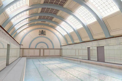
After a £25m regeneration project and more than a decade on the English Heritage ‘Buildings at Risk’ register, the iconic Marshall Street Baths in the heart of Soho has reopened to the public. The first public baths on the site were built in 1850 and the present Grade II listed building first opened in 1931 as The Westminster Public Baths. With a stunning barrel vaulted roof, white Sicilian marble-lined pool and green Swedish marble-clad walls, it’s an Art Deco masterpiece.
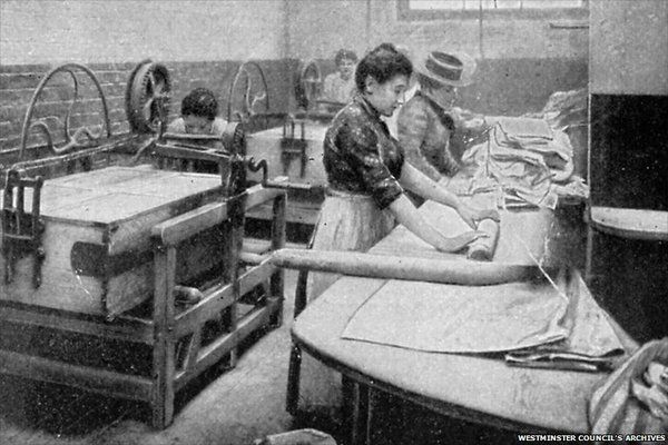
Originally built with public funds for the health and wellbeing of local people, the baths included a first and second class swimming pool, a child welfare centre, a public laundry and washing facilities. As well as retaining many of the period details such as the 30s ticket booth, gilt finials on the staircase, and a bronze fountain featuring a frolicking merchild and two dolphins, the regeneration project has maintained the public spirited ethos of the original baths.
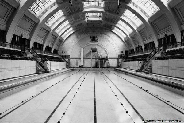
Westminster Council carried out the restoration with its development partner, Marshall Street Regeneration, and with the support of local groups such as the Friends of Marshall Street. The restored pool is the centrepiece of a new public leisure centre on the site, including a gym, sauna, and dance and exercise studios. The wider regeneration programme includes 52 new homes, 15 of which are part of an affordable housing scheme. A new street cleaning depo has also been built as part of the project.
Restored to its former glory, the stunning pool is well worth a visit. And it’s not often you get to enjoy such fabulous facilities at council prices. I recommend a bit of sedate sculling: to make the most of that fantastic vaulted roof.
Spotlight On: Duffy London
Under the heat of the spotlight, we showcase the best of Duffy London’s furnishings.
Duffy London is an idea-based company that thrives on ideas not only based on similar themes and concepts but designs that are completely unique. Chris Duffy, a graduate of the University of Brighton, has always harboured a love of making and designing products, and with his own studio in east London he has achieved his dream of having his own space to work in.
Chris Duffy has created this company with the aim to encourage inventive and exciting designs that aren’t pinned down by boundaries. He has had a love for designing and making things ever since he was a young child: “I was always making crazy bikes, karts and boats while everyone else was playing football. I remember my junior school teacher asking me what I wanted to do when I grow up, and I said that I wanted to be an inventor.” Chris’ inquisitive mind drove his ambition to create his own business. With regards to where his inspiration comes from, he said “when you have been designing for a long time, you see that all design is a process, usually a very long one, and not just an inspiration, although that does occasionally happen.”
The collection includes a range of furniture, lighting, wallpaper and interior products which are predominantly designed by Chris Duffy himself, although he draws inspiration and ideas from designers that he works with. All products are handmade to order or bespoke, and they are all manufactured in the UK. One of Chris Duffy’s ‘Hero’ products is the Double-sided Hanging Chandelier Glo-Canvas which provides a stunning statement piece to hang above a dining table. It can be hung from ceiling light fittings, and to create a warm ambience each frame is installed with low energy strip lights that illuminate the Chandelier print from within. Digitally printed onto 100% cotton, the image is stretched over both sides of a wooden frame, giving a modern twist on the chandelier and the conventional use of canvases.
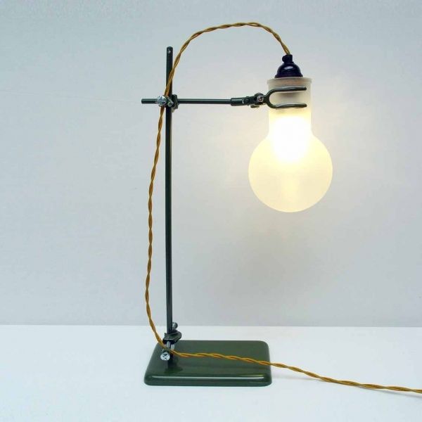
The LAB Lamp is one of Duffy London’s newest products for 2010; it’s made from genuine laboratory parts giving it an authentic style. It is available as either a desk/table or a floor lamp and is ideal for task lighting or it can simply be used as an innovative feature piece. The light is provided by an eco bulb, and the flask is sand blasted Pyrex.
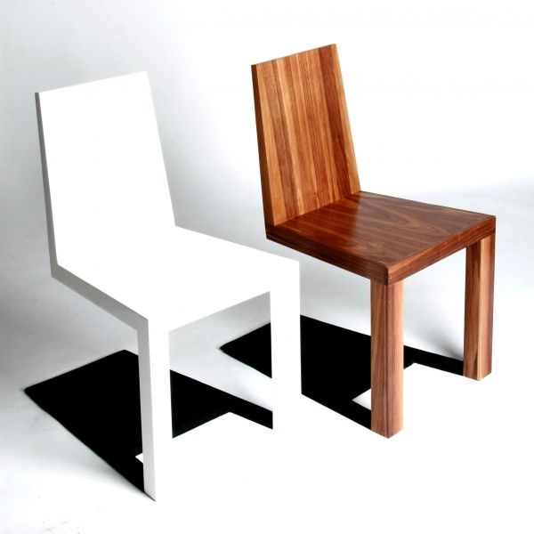
I love the quirky personality of the Shadow chair, which was launched at the Milan Salone Satellite in April 2009, because its intelligent design integrates shadow into its structure. The chair appears to defy gravity by standing on just two front legs, however with a closer look the shadow is made from steel which is attached to metal frame built inside the chair. It has a very modernist look; it plays with the representation of space and light and our perception of these things, making us question what is ‘real’. When placed in an interior space it comes into a life of its own, and will certainly make your guests look twice.
Duffy London has strong eco-credentials and Chris explained to us why he believes in the benefits of UK manufacturing: “I think it is important because it makes it possible to get a design from your head and into the shops in a very short space of time, keeping ideas and products fresh, updated, changing and improving, which is never as easy to do if you have products made in China for instance. Eco-friendly design is important not just for the obvious reasons, but because it shows an idea has been thought through properly, any design like this will take into account manufacturing processes, transportation, import duties etc.”
Coming soon...
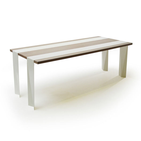
Duffy London will be launching a new dining table at London Design Week in September 2010. This new furniture piece will be another unique addition to the collection; the design cleverly incorporates its runners as its structure by having them run the full length of the table, falling off the edge to become the legs. The juxtaposition of the steel thin legs with the sturdy walnut table top gives an illusion of weightlessness, as if the table is floating. To celebrate the launch, Duffy London is offering a 25% promotional discount on orders placed before the launch. (The offer price is £1495, and the retail price will be £2000 once the offer ends.)
Duffy London products are available on furnish.co.uk and in many outlets in the UK and around the world.
Our weekly pick of interiors blogs… Aug 16th
Follow us to blogland and the wonderful world of interiors
Housemartin is brought to you from Portand Oregon, the work of a fashion industry textile designer turned interior decorator and shop owner. The shop, Ink & Peat, is an eclectic mix of vintage and modern homeware, handmade goods and floral design, while the blog offers daily inspiration in the same vein. It’s a great place to pick up on new designers and especially crafty people working in ceramics, printmaking and textiles. If you’re into handmade, vintage and quirky design, this is definitely a blog worth visiting. Named after the little house-proud bird, this blogger’s more of a beady-eyed magpie. The eclectic posts always unearth something beautiful.
You can guess what you’ll find on Absolutely Beautiful Things. Brisbane-based interior designer Anna Spiro began the blog as a record of beautiful pieces that inspire her on a daily basis. And along with posts highlighting great new interiors products, you’ll find posts on Anna’s design projects and photos of the displays in her shop, Black & Spiro. Black & Spiro offers a mix of vintage treasures and modern pieces and there are some great posts on junk shopping and flea market finds. She’s also got a passion for colour, which makes the blog a really uplifting read (love the rose pink background).
Described as a ‘passport to stylish living’ Ronda Carman’s All The Best is an insider’s guide to what’s hot in the world of design. Ronda appears to have a bulging little black book: the blog’s chock full of interviews with industry big wigs, interior designers, artists and other interesting types. Just a few of the brains she’s picked are India Hicks, Jonathan Adler, Rita Konig, and Christopher and Suzanne Sharp (of The Rug Company fame). So you get the picture that it’s a pretty big-hitting blog. Interesting and inspirational, it’s all very slick; you won’t see any flea market finds on here. But if you want to know what makes design stars tick, and what ‘global tastemakers’ are making us think, then this is the blog to visit.
As always, get in touch if you want us to feature your blog next time round.
Interview: Snowden Flood
Snowden Flood gives us insight into her inspiration and she also offers some advice to aspiring interior designers.
For interior accessories designer, Snowden Flood, ‘Home is where the art is’ and this shines through in her designs which expose her love for urban and rural landscapes across the world. Snowden’s designs beautifully capture nature as well as her experience and knowledge of what she sees around her.
Snowden took some time out to answer our questions, and here’s what she said...
If you had 3 words to describe your style what would they be?
Eccentric, British, Nostalgia
Where does your inspiration come from?
Everywhere! From junk shops, art galleries, books, magazines and children’s drawings. Just going out of my front door and looking at the kids playing some odd game in the square; could be anything really.
Your work displays your love of landscapes and scenery. How much are your designs influenced by places you have been and experiences you have had?
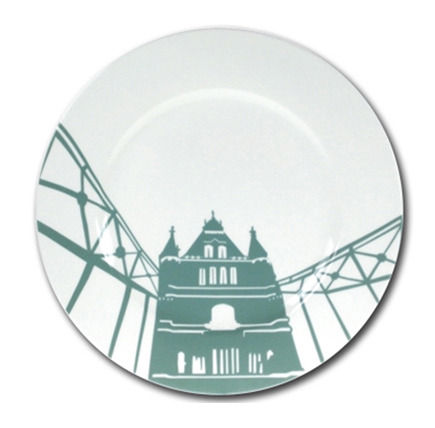
Some are much related to experience, for example my Urban Landscape plates came from living in the north in a predominantly industrial landscape and sketches I’d done at the time. Others were inspired by things I found myself drawn to like the shapes that trees make at dusk against the sky; so that developed into a set of glasses. Other products, like my Rivers of the World cups and saucers, were inspired by a book I got from the local Oxfam store called “Great Rivers of the World’ – pieces by famous travel writers about river journeys. It was so evocative that I kept mulling over how you could draw an experience like that.
What’s your ‘hero’ product and why?
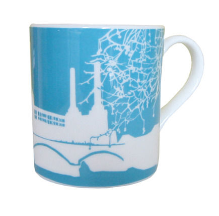
I love my world river cups and saucers because they are quite abstract and somewhat understated, and I like that it’s not immediately obvious what the design actually is! But in terms of general popularity, my hero products are the Battersea mugs, plates and aprons, because they are incredibly popular around the world!
Through your designs you explore the theme of souvenirs and keepsakes, is this influenced by your own nostalgic childhood memories and favourite holidays?
I think it has less to do with my nostalgia about my own holidays and more to do with being brought up in rural England by American parents. I was completely fascinated by their photos, stories and all the souvenirs of their former life, even their cars looked so glamorous. It all seemed so different from our lives in the UK, so far away! For example, my grandfather was a writer from California and was married to a silent film star and in a band with Bing Crosby’s brother. He later worked for William Randolph Hearst (who Citizen Kane was modeled on). I think you could say that 1960’s UK was a bit of a shock for my parents!
What is the most recent design product that you have bought for your home?
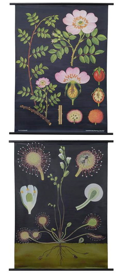
I have a bad flea market addiction! This week I became the proud owner of a 1940’s schoolroom poster of earthworms, for the princely sum of £4.
You spent many years at world-renowned New York architects Peter Marino & Associates. How much did you learn from this, and what was it like creating designs for clients such as Dior, Chanel and Louis Vuitton?
I learned lots working at Peter Marino. They are known for several things: the quality of the work but also for their ‘revolving door’ policy, i.e. it’s a very hard place to work and most don’t stay beyond 1 year (I worked for them for 8yrs!!). Part of my job was to travel to shows around the world and come up with ideas and concepts. I also had to find manufacturers to make the pieces we designed for our clients. So for example, I might attend a technical textiles show in Germany looking for manufacturers to weave a Chanel plaid in carbon fibre. Then I’d go to the Netherlands to see someone who could embed that fibre into resin panels for a new store in Japan. It was fun but stressful because these clients came to us to provide them with innovative ideas, and the level of quality always has to be the highest. The residential projects were fun, our clients were some of the richest in the world and wanted things in their houses that are completely unique. All good experience for my own business!
Who is your favourite interior designer of all time and why?
There are two that I particularly like. David Hicks for his use of colour and pattern and Oliver Hill because I love Art Deco and his mix of art deco and modernism is very stylish.
What’s your favourite material to work with and why?
I don’t really have a favourite material. I have ideas for everything and don’t really like to be restricted. If you insist I’d say bone china, I like the quality and warmth of it, the colours can be very pure.
What’s your favourite high street home furnishing brand/store?
To be honest I prefer to shop in smaller independent stores and tend to stay away from the high street in general. So… I’d head to Columbia Road in London; I like museum stores like the V&A and the Tate Modern. Other stores I like are places like Mint, Lucas Bond, Abigail Ahern. Out of London some favourites are Article in Dublin, the Craft & Design centre in Manchester, Home Autour du Monde in Paris, Rare Device in San Francisco and NY, the MoMA store and Moss in NY.
What advice would you give to aspiring interior designers?
Have fun and don’t be afraid of colour and personality! I’m not a fan of the beige and brown school of interiors I must admit! Look at people like Wary Meyers, Kelly Wearstler, Todd Oldham.
How important do you believe UK manufacturing is to our economy and the environment?
Well it’s very important to me personally. In terms of quality and integrity of a product it makes all the difference to be able to go to the factory and discuss the issues. I work very closely with my UK manufacturers, and they are following a tradition of craftsmanship that is a key part of the product. However, I would just say that it’s not always easy to manufacture here. Customers have become used to high-street prices and don’t always appreciate that those prices are a result of mass production and – sometimes – low quality. Not everyone wants to buy something that was lovingly and carefully made if it means they have to pay an extra £10 for it!
Are there any designers that you would particularly like to collaborate with in the future?
I like working with Alex Gorlizki and often find that looking at his work gives me ideas. I like Marian Bantjes and Leah Giberson and their work is interesting to me.
What new projects do you have on the horizon?
Lots! I’m working on some new products in polymers as part of a Hidden Art initiative. Also for Hidden Art, I’m part of a consortium proposing design-led gifts for the London Olympics. In addition to this I have two new product ranges in production and am finishing up production for some custom products for Chatsworth House in Derbyshire. Busy!
You can find more information and all of Snowden’s designs on her website at www.snowdenflood.com.
100% Norway goes green
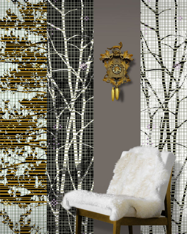
100% Norway will be at this year’s 100% Design showcasing the best Norwegian design companies and their range of sustainable designs.
Showcasing a variety of Norwegian companies, including established and up-and-coming designers’ work, 100% Norway are set to impress at this year’s 100% Design. This will be their seventh appearance at the exhibition which helps designers from Norway expose their talents and ideas to the British market.
100% Norway will be exhibiting an array of impressive sustainable and eco-friendly designs, including tables, chairs, ceramics and textiles which all utilise natural materials. The line-up of contemporary manufacturers includes LK Hjelle, Fora Form, Fjordfiesta, VAD and Variér, among many others. Designers Petter Knudsen and Steiner Hindeness collaborated with furniture company VAD to create a collection of pine seating. The designers have used traditional Norwegian methods of handling wood and local pine to bring us a stylish, contemporary and sustainable chair.
Also, Scandinavian Surface will be showcasing their selection of PVC free wall coverings which incorporate a green philosophy by using environmentally friendly ink in the manufacturing process. With striking images inspired by nature, such as dramatic coastlines, steep mountains and cascading rain, the designs provide beautiful backdrops.
With regards to the importance of producing green products, Henrietta Thompson, Curator of 100% Norway, claims that “Sustainability is an important issue for designers everywhere, and it’s come to be expected of the new generation emerging to incorporate environmental considerations in their work from the beginning. Norwegian designers are perhaps more aware of this than many, as they are so often inspired by the natural environment in their work.”
The exhibition will be taking place at stand G40 at 100% Design, Earl’s Court, from 23rd-26th September 2010. You can find out more about 100% Norway at www.norway.org.uk.
TENT London: 23 – 26 September 2010
Sneak a peak at what’s on show at TENT London.
Taking place at the Truman Brewery on Brick Lane, TENT London plays host to the best of contemporary and vintage design, digital innovation, architecture and interiors from established and emerging design studios and suppliers. With a global exhibitor list and an international audience, TENT London is a diverse and vibrant showcase of forward-thinking design across all disciplines. Competitions run throughout the event and there are five separate shows to explore, communicating a real sense of excitement around design. This year sees TENT expand its digital design show, launched in 2009, and present Origin: The London Craft Fair for the Crafts Council at Old Spitalfields Market. TENT enables exhibitors to trade in one-off orders meaning that you’ll have the opportunity to buy new and unique pieces direct from the designers.
Here’s what you’ve got to look forward to…
Tent London is the hub of the event, showcasing cutting-edge contemporary design with a rich multi-disciplinary mix of furniture and lighting, ceramics and textiles, materials, accessories and more. It’s a chance for both established and up-and-coming designers to launch new products, sell to the public and secure commissions. Expect to see an inspiring array of lighting, furniture and interior accessories from newcomers Kitty & Dude, Paola Lenti, Moore Designs, Lizzy Mary Cullen, The Modern Garden Company and Curiousa & Curiousa. Also working on new designs are Ercol, Miller Goodman, Mini Moderns, Zoe Murphy, Ikuko Iwamoto, Kyungwon Kim and Jon Male who will be returning with new and impressive exhibits.
Tent Digital is the only annual showcase for digital creatives and digitally enabled design during the London Design Festival. Launched last year, it was immediately tipped as the highlight of the Festival. Exhibitors are sourced globally within the interaction design and augmented reality industries. Described in 2009 as containing all the best bits of the Science Museum this is the playground at TENT. Work on display is thoroughly interactive, engaging and responding to visitors in beautiful, surprising and entertaining ways. With the increasing integration and intervention of technology in daily life, this is one of the fastest growing and innovative design disciplines. Digital designers and companies will show curious visitors a glimpse of the future with interactive installations and a programme of talks.
Tent Selects showcases the next generation of world-class designers, hand picked by the Tent Selects panel. The panel is seeking out the most promising design graduates from the class of 2010 in UK and abroad. The show will include the best examples of emerging talent in furniture, ceramics, textiles, graphics, jewellery and product design. The aim is to provide the next generation of designers with a platform to raise their profile and gain access to industry and media contacts. The closing date for applications to exhibit is August 10th and we’ll let you know the lucky few to be chosen.
Circa proves that good design is timeless. This biannual show features iconic designs alongside little known investment items and rare pieces of design history. This year Circa presents a refined selection of dealers who are specialists in a particular era or type of vintage furniture, lighting, accessories or art. It’s a fantastic opportunity to buy design icons and hidden gems, chat to knowledgeable dealers and celebrate the best of vintage style.
Origin: The London Craft Fair will hosted by TENT for the first time this year. Previously held at Somerset House, the Crafts Council exhibition is an annual showcase of original contemporary craft, this year bringing together 220 of the most innovative makers from the UK and abroad. Located in the newly refurbished Old Spitalfields Market (23 -29 September), Origin offers a rare opportunity to buy directly from the makers. With the new timing and new location, it’s great to see craft gaining a greater presence at the London Design Festival.
It’s a rare thing for a design show to bring together both contemporary and vintage pieces, digital technology and traditional craft in one place. It makes for a fantastic atmosphere and an absolute must-see event.
How to... get your home ready for autumn
We look at the various ways you should prepare your home for the colder and darker months in style.
While we’re still hoping that our English summer lasts for as long as it can autumn is slowly approaching, so it's a great idea to get your house prepared for the colder weather and drearier days. Miserable weather can lower your mood, however with rich tones and luxurious textures you can feel warm and cosy in your home.
Try introducing oranges, reds, yellows, browns and purples into your interior as these autumn shades that will bring warmth and richness to colder rooms.
Storage
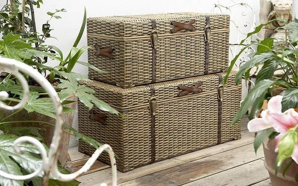
As autumn approaches, it’s time to start getting autumn accessories out of storage. Start by giving your heavy curtains an airing and cleaning your bedspreads and blankets. Store your summer accessories such as lighter duvets and throws in ottomans or chests, to keep your home organised in a stylish way. The Velvet chesterfield ottoman from The French Bedroom Company gives a warm texture and a luxurious look to your bedroom. While Lombok’s Canton black lacquer blanket chest and the Kigoma trunk from The Holding Company are both smart solutions to long term storage and come in a variety a sizes and styles to suit both traditional or contemporary schemes.
Soft furnishings
You can’t deny that changing over to your warmer, heavier weight duvet doesn’t bring a comforting feeling inside, knowing that you can snuggle up and retreat under the covers as the colder nights draw in. Also, swap your lightweight throws for heavier ones made from chenille, wool, faux fur or cashmere for ultimate luxury. Throws have a versatile quality which allows you to use them on your bed or your furniture, or even as a blanket; they are available in any colour to match your style, and why not try combining throws of different textures and shade to layer your look.
If you have natural wooden flooring it can feel cold underfoot, adding a rug to create a warm feeling and cosy appearance. Try the Kemal beige rug from Puji or the 100% pure wool Artic rugs from Rockett St George.
My favourite piece to provide comfort and warmth at any time would have to be the Ivory Sheepskin bean bag from Heal’s. Its ivory colour will match any scheme and its sumptuous soft and fluffy texture makes it the perfect treat for your home.
Window Treatments
Poorly dressed windows can allow cold air in and warm air out so make sure you choose your window treatments carefully. Swap your lightweight curtains for heavier fabric ones such as velvets or rich damasks or try layering lighter fabrics with blinds for a dramatic look. Use thermal linings to help eliminate draughts and save you some money on your heating bill; if you have a particularly cold room you can also add an interlining made from 100% cotton which makes your curtains look fuller and more lavish. For natural, made to measure curtains and blinds try www.naturalcurtaincompany.co.uk.
Accessories
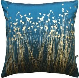
This is the time of year when you can go overboard with cushions, and you can mix and match to give a playful and colourful look that will liven up your room. With turquoise, Pantone’s colour of 2010, you can add metallic shades to bring an opulent look; this look is achieved on Clarissa Hulse’s Grassflowers hand-printed silk cushion from Heal’s. The useful yet cute Stripe Doggy draught excluder from Graham and Green made from blue stripe cotton with a wool tail, will keep the warmth in your room and keep draught at bay.
Lighting
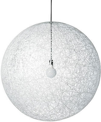
With the days and sunlight hours getting shorter you will want to make the most of the natural light in your rooms; try hanging mirrors opposite a window to reflect the light throughout a space. The rectangular Venetian mirror from Sweet Pea & Willow has eye-catching detail, and would look stunning in a living or dining area, or a bedroom to create the illusion of more light and space. For extra light, invest in some pendant lighting which is more atmospheric and aesthetically pleasing than ceiling mounted lighting. Pendants look great as decorative pieces hanging singularly for task lighting, or they can work well when placed in a row above a dining table. Decorate tables and fireplaces with candles to create a relaxing and welcoming ambience that is perfect for evenings spent at home.
A stitch in time: Siren Elise Wilhelmsen, Nadine Sterk and Merel Karhof
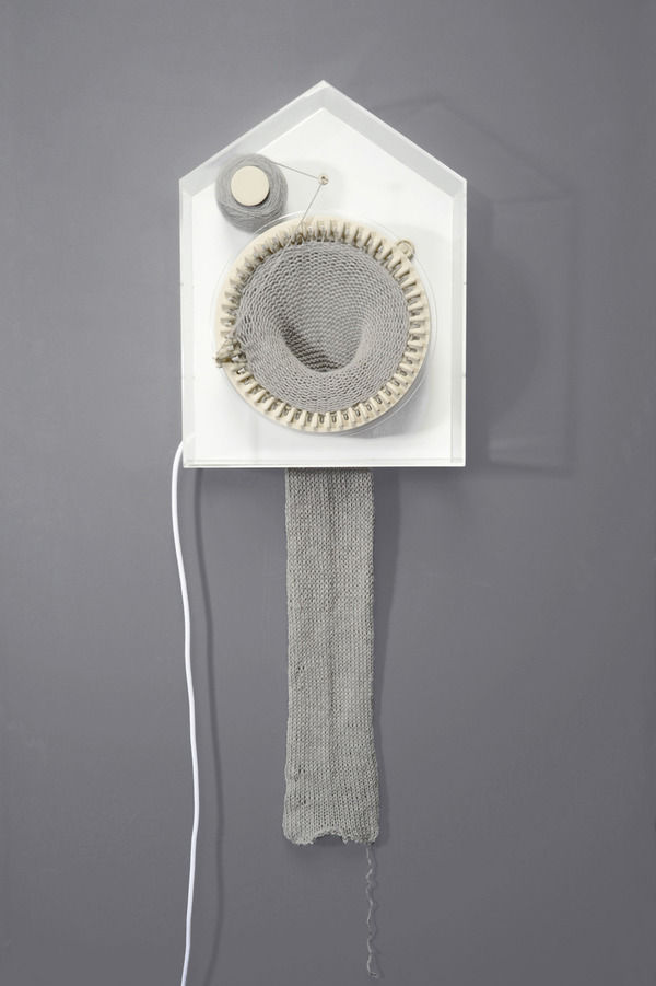
Designers take on the knitting machine.
We’re used to seeing time divided up neatly on diary pages and calendars, and attributing the convenient labels of past, present and future. But time marches on regardless: the future becomes present the present becomes past, and time becomes indefinable. Intangible and beyond our grasp, time is essentially an abstract concept: the invisible fourth dimension.
German designer Siren Elise Wilhelmsen’s knitting clock, ‘365’, gives materiality to this invisible presence. The passage of time is translated in the lengthening of knitted fabric. Shaped like a house, evoking traditional German cuckoo clocks, 365 holds a circular knitting machine with 48 needles, a thread spool, a thread holder and a ball of alpaca wool. Moving in a clockwise direction, each needle denotes half an hour, and one round of knitting is completed in a day. Rolls of ‘more time’ yarn last for a year, by the end of which the clock has created a two metre long knitted scarf. Presenting the knitting clock, Wilhelmsen was one of six graduates from the Berlin University of the Arts (UdK) who showcased their work at DMY International Design Festival in June this year. 365 will be on show at 100% Design London in September.
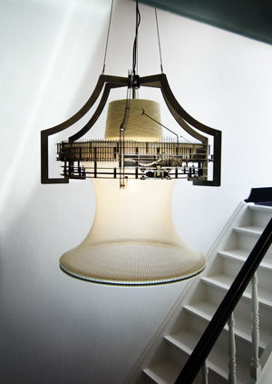
Mimicking organic growth over time, like the lengthening of human hair, Wilhelmsen’s clock is reminiscent of another innovative take on the knitting machine by Dutch designer Nadine Sterk. Sterk’s Sleeping Beauty is a mechanical lamp that ‘grows’ like a plant in the light. And just like a living organism, the lamp is equipped with all it needs to develop. Switch on the bulb and it begins knitting slowly around the light to create its own shade, pausing only when the light is turned off. The bulb generates enough energy to keep the knitting machine moving, at a rate of two rows an hour. Nadine Sterk exhibited Sleeping Beauty at Dutch Design Week’s Graduation Galleries in 2006.
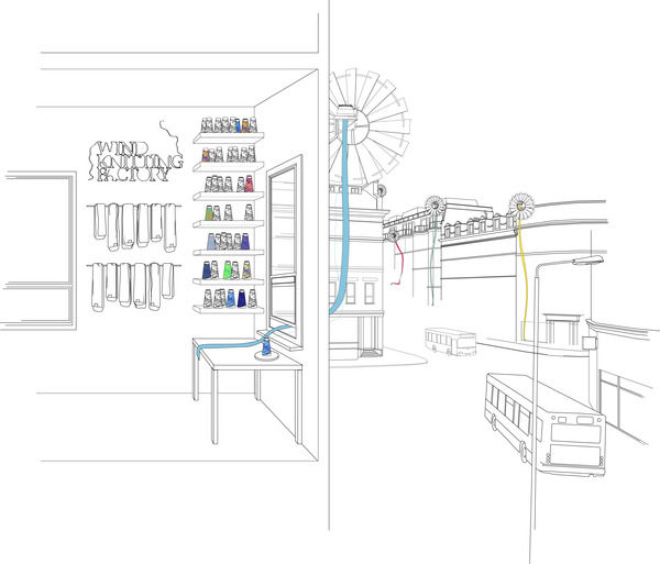
Animating space, both these beguiling objects have a Willie Wonker appeal to them and a surreal presence in the home. Exhibited at the Royal College of Art graduate show in 2009, London-based Dutch designer Merel Karhof’s Wind Knitting Factory seems to epitomise this gonzo style of thinking. Connected to a wind turbine attached to a building like a satellite dish, the circular machine knits from the outside of the building through the window, powered by the wind. The knitted material is harvested from time to time and rounded-off into individually packaged scarves. Each scarf has its own label documenting how much ‘time’ has been knitted into it and on which date. The Wind Knitting Factory was installed at THEKEY.TO, an international event celebrating green fashion, lifestyle and culture, during Berlin Fashion Week earlier this month.
All these designs use knitting to give a physical presence to the passage of time. Time is no longer lost, but captured in the knitted creations. These designs speak to a modern desire for more time, and a tendency to regret its passing. Siren Elise Wilhelmsen’s contention that time is something that unites us all, probably goes some way to explain why these knitting automata are so captivating.
Coming soon: Orla Kiely’s first book ‘Pattern’
Giving a personal account of what informs and inspires her work; Orla Kiely delves into the world of pattern and explores colours, print, texture and form.
In her first book, Orla Kiely explores the one thing that has informed and inspired her work: pattern. For everyone who has fallen in love with her unique designs, this is the perfect chance to enjoy an insight into her creative process.
‘Pattern’ is, in a sense, a gift to her followers; she gives a personal account into how pattern has had such a huge effect on her designs across all the mediums she works in: fashion, design, textiles and interiors. Inside, her knowledge of how pattern transforms objects fills the pages, and she looks at the impact of scale and proportion, rhythm and texture, and dimension of colour.
Orla Kiely’s creative passion flows throughout the book: “Pattern is not a trend for me, to be taken up one minute and abandoned the next when the winds of fashion change. Pattern is in me. Pattern is my life.” Her words are embellished with beautiful illustrated examples, and she provides her readers with a friendly guide to using pattern with finesse and confidence. The book is spilt into six chapters, one being centred on ‘Home’ which concentrates on decorating and furnishing your home, with advice from Orla on how to bring out your personality in your interior design.
‘Pattern’ by Orla Kiely is published by Conran Octopus, and will be available to buy from 6th September 2010. (Hardback, £25) It will also be available to buy from Amazon.
You can also find out more about Orla Kiely and her designs on her website at www.orlakiely.com.

