Features: June '10
Interview: Chris Sneesby
We interview Chris Sneesby, designer of the futuristic Archipod.
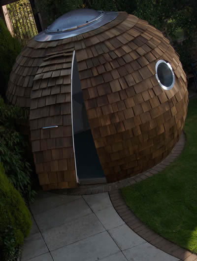
The first impression you get from the Archipod is that it could be something out of the future, with its modern and distinctive look.From the outside it looks like it could naturally be a part of your garden like a shed or a tree house, and its spherical shape makes it an interesting and flattering addition to your garden. It has a unique appeal that draws you inside, where I was pleasantly surprised, having been in a prototype of the Archipod myself, to find that it feels extremely spacious. The Pod has a generous amount of light that enters through the roof dome making it feel bigger and more comfortable.
I met Chris at this year’s ‘Grand Designs’ live exhibition and I was immediately intrigued to find out more about the Archipod. I interviewed him to find out where he gets his inspiration from, and what new and exciting ideas he has for the future of the Archipod.
How has your background and experience helped you create Archipod?
I have worked previously for Yorkon, part of the Portakabin Group, for over 13 years, which gave me a lot of experience in the way buildings can be built offsite in controlled conditions and installed.
Who is your main target buyer for the Archipod, and what type of market research did you do prior to building your design?
My main target was the increasing number of people that want to work from home, but are looking for a high quality working environment rather that a glorified shed. I figured the only effective way of doing market research was to build a prototype, get it on a website and see what interest it generated. The power of the internet is phenomenal – within three weeks of the website being launched, it was on the front page of the Danish Financial Times Website – I had people calling me from Copenhagen to see if I would export them.
What makes Archipod unique from anything else?
I think mainly the look of it – a sphere is probably the most difficult shape to make from flat materials, which dissuades people from having a go at it. I also approach it from the angle of making it as good a quality and interesting as possible, rather than compromising the design by making it easier or cheaper to build.
How have you ensured that the pod is environmentally friendly?
I have used fairly traditional and environmentally friendly materials such as timber and plaster rather than plastics or GRP to make the structure. I also made it as efficient to heat as possible by putting plenty of insulation in.
What benefits do you believe that the pod offers to people who will use it as an office/work environment?
It is a warm, quiet and well lit space to work in. Most importantly, there are no distractions such as you get working in the house. People often suggest bigger portholes so that they can see into the garden - I tell them that if they want to look at the garden, then they should focus on their work, and look at the garden when they finish earlier and can relax with a glass of wine. Another advantage is that if you are running a business from it, the cost can be offset as part of the business – it is much more difficult to do this if you build an extension on the house to use as an office.
How well is the pod insulated and how sound-proof is it?
The insulation exceeds that required by Building Regulations – There are two lots of insulation, one of which is loose rockwool in the wall panel, which also acts as a good absorber of sound coming from outside.
How much does the Archipod cost? Does the buyer need to have planning permission?
Prices start at around £12,000 plus VAT. Planning Permission should not be required as it would normally come under Permitted Development, but the customer should always check this with their Local Authority first.
What ideas do you have for the future of Archipod? Do you want to expand and use different materials?
There are lots of ideas for the future – probably too many to mention. We are looking at a bigger pod, and the possibility of joining them together. We are also looking at different claddings such as copper sheeting and painted render.
The Pod is designed primarily to be used as a garden office, but its adaptability opens up opportunities for you to use it as anything from a studio, hobby room, or even a playroom. With such an innovative design, I think that the Archipod will pave the way for future living that will rely on money and energy saving sources.
For more specific information and frequently asked questions about the Archipod, take a look at www.archipod.co.uk or email info@archipod.co.uk.
Our weekly roundup up of inspirational interiors blogs…
We’ve been scouring the blogosphere again this week, and we’ve got another three great interiors writers to introduce to you.
First up this week is found, now home, written by American Leigh who’s just crossed the pond with her family to live here in London. She’s got a great eye for vintage finds and the blog is chock full of fabulous photographs of flea markets, interiors inspiration and progress updates on her own home projects. All this is written about with an infectious enthusiasm: you can’t help but get wrapped up in it.
Another blog after my own heart, Tales of a Junkaholic follows the super crafty Artemis, and her envy-making industriousness around the home – just look at her new sewing shed. Squirreling about at boot fairs, sharing her vintage finds, and amazing upholstery projects, there’s plenty of inspiration here to get crafty yourself. With her London home overrun with vintage junk, Artemis has been thinning out the shelves by selling some of it through her online shop, The Bucket Tree. And as if that wasn’t enough, she’s also the owner of Rust Jewellery.
The final golden nugget this week is design is mine: isn’t it lovely? To which the reply is invariably: ‘Why yes.’ This is Summer’s beautiful blog, brought to you from Portland, Oregon. There’s a regular photographic thread on interiors inspiration, each post on a different theme, such as vintage masculine, think pink, European vacation and retro/modern. Covering art, craft and interiors, this is a real treat of a blog with fabulous photography and musings on all things design.
And, as always, get in touch if you write a blog yourself and we’ll feature it next time…
Colourful Gardens
We’re all hoping for a sizzling barbeque season, but if the sun fails to peep through the clouds, a colourful garden is inviting even on a drab day.
We’re all hoping for a sizzling barbeque season, but if the sun fails to peep through the clouds, a colourful garden is inviting even on a drab day. And there’s no need for green fingers: introducing colour with furniture, paint and accessories will bring your outdoor space to life.
Colourful Furniture
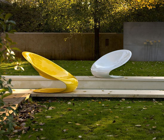
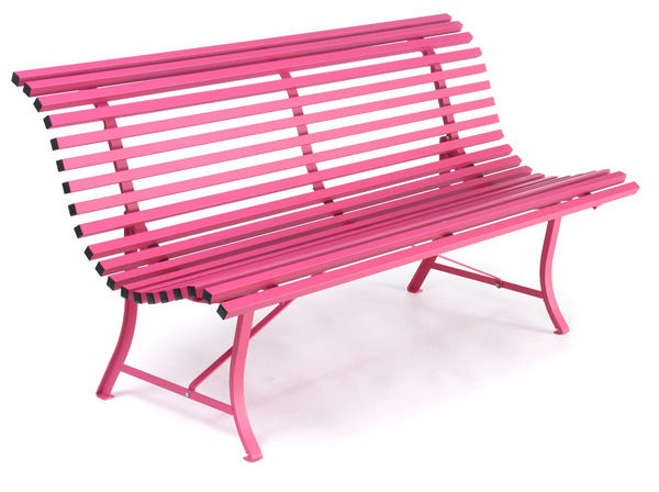
Use bright furniture for flashes of colour, leading the eye around the garden. Different furniture types help to zone your outside space: a languorous hammock strung between trees, a colourful bench in a quiet corner, or a bistro-style table and chairs perched on a patio.
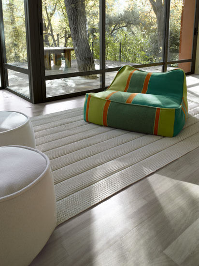
Exterior | Interior offers by far the best choice of high-style garden furniture, including modular seating systems with colourful cushions, sculptural lounge chairs in weatherproof polymers, and beanbag-style chaises for lazy afternoons. The Ami collection is fabulously tactile with bold weaves and upholsteries in innovative materials, designed expressly for exterior use.
The Worm that Turned stocks a great selection of Fermob’s metal garden furniture, a timeless choice from France, available in 24 attractive shades. Comprising chairs, tables, swing seats and benches, each collection has its own style identity and each piece its own purpose. Mix and match the colours or use different styles in different areas of the garden. In powder-coated steel with UV and rust protection, Fermob furniture is built to last.
If you’re looking for a statement piece, the Wave hammock by Royal Botania at Encompass is spectacular. With a built-in sun canopy, it rotates 360° appearing to float from one fixed point. Designed for year-round exterior use, its polished steel frame and turquoise awning make a stunning architectural feature.
Colourful Fences and Walls
Painting a tired fence or wall is a simple way to add impact to your garden with colour. Cuprinol’s Garden Shades and Heritage Shades are suitable for all garden wood, including furniture as well as fences, arbours and decking. Formulated to complement the natural colours in the garden, the range includes vivid brights (Forget Me Not), moody hues (Lavender) and subtle tones (Willow) for the perfect backdrop.
For garden walls, Sto offers a premier range of extremely hardwearing paints, colourfast in all weather conditions. Preventing water from gripping to the surface, StoLotusan Color is self-cleaning; the dirt simply washes off in the rain, keeping the surface looking good for longer. With up to 800 shades to choose from, find the perfect colour match with your planting scheme or create a stand out feature wall with year-round impact.
Colourful Accessories
Vibrant tableware, parasols and planters bring personality to the garden, adding accents of colour or unifying a theme. Shade sails have a real romance about them, creating enticing spaces. In Garden stocks shade sails in a variety of sizes, shapes and colourways, ideal over dining areas. A colourful oilcloth will instantly lift your outdoor table. Just Wipe has a huge selection while Cath Kidston is great for distinctive prints. And don’t forget the birds. Give them a home to be proud of with a colourful and quirky Astoria nesting box.
Hanging lanterns, garden flares and tea-light holders bring drama and colour into the evening. Available at Skandium, Alvar Aalto’s Votive tea-light holders in the iconic Aalto shape come in 10 colours, fantastic dotted along a wall. Exterior | Interior offers a great range of colourful planters, including the Vases collection with internal LED lighting. A beautiful chrome fire-pit from Encompass will reflect the colours, and reward your efforts.
So all you need to do now is sit back and relax, crack open a beer and keep your fingers crossed for some all-important sun.
Interview: Sharyn Dunn
Fresh from exhibiting her work at this year’s Grand Designs Live Exhibition, I interviewed Sharyn Dunn to find out more about her designs.
If three-dimensional designs attract your attention, and you are interested in designs that will bring a dynamic visual experience to your interior then you will love Sharyn Dunn’s work. I first saw Sharyn’s work at this year’s Grand Designs live exhibition and I was immediately intrigued to find out more. Sharyn is a new designer with a passion for 3-D design. So far, she has created a selection of wall sculptures, chandeliers, and free standing pieces. Her designs are created from a synthetic form of parchment which is chlorine free and also recyclable. With such interesting and unique work, I interviewed Sharyn to find out where she gets her inspiration from, and what direction she hopes to take her designs in in the future.
When and how did you first start experimenting and creating designs with paper/parchment?
I first started experimenting with shapes, repetition and folding during the first year of my degree and found I couldn’t design anything flat, it had to be 3D.
Have you been inspired by any other designers/designs?
My inspirations come from a combination of the natural organic shapes we find in nature such as shown in the works of Ernst Haeckel natural forms, his illustrations of the natural world I find fascinating, with their repetitions and some geometric forms. The modern day designers and architects such as Zaha Hadid, Frank Gehry, Tord Boontje and Shiguro Ban have also formed part of my research.
How environmentally friendly are your designs?
All of my paper works are currently made from wood-free pulp papers which are ph neutral and chlorine free and are a modern day form of parchment.
What is the first design you made and how have you progressed from that?
I discovered the shape I currently use by chance as part of an exercise in taking a shape e.g. a star and then by folding, twisting, rotating, stacking, bending etc, any way I could to move it from a flat piece of paper. The first thing I made was an etched metal and paper book, which I chose to display using lighting to accentuate the folds and detail. This led me on to folding a little more and altering the shape slightly, resulting in a range of flat pack lighting.
From there I moved onto my larger paper sculptural pieces I currently make. By introducing various ‘piercing’ and ‘embossing’ into the designs, this allows the light to shine through adding more interest to the geometric shapes.
Where can your designs be used in the home?
My current work ranges from a chandelier to various sized wall pieces and free standing sculptures. I take commissions for any required size or area in the home and they can also be used in a commercial environment.
What type of visual experience do you hope to achieve with your designs?
When the viewer moves around the work the visual experience is one of dynamic shapes and angles, highlighted by tailored lighting, which encourages you to look further. Coupled with the quality of light used, and the effect it gives, I hope the viewer is generally intrigued by what they see, is it paper? fabric? holes? shadows? Just inviting them to look a little more.
What direction do you hope to take your designs in, in the future? Do you want to experiment with other materials?
What do I hope for the future? I’m hoping my designs will get larger, they need more space! I can attach and wrap them to or around virtually anything such as around a doorway, over a table or down a table leg for example. I currently use a heavy parchment, but I’m moving into other materials now with a paper-like appearance and also stainless steel is on the horizon.
For more information about the designs you can email Sharyn at sd-psdblue@hotmail.co.uk.
Living with Colour
![Giacosa teal wallpaper £43 per 10m roll and Festival sofa upholstered in Nabucco oyster velvet £97 per metre, Designers Guild [www.designersguild.com] wallpaper](/photos/articles/regular/wallpaper/wallpaper-3281.jpg)
Lift your scheme as well as your spirits by experimenting with colour in the home. An injection of colour can transform a room’s atmosphere.
Lift your scheme as well as your spirits by experimenting with colour in the home. An injection of colour can transform a room’s atmosphere as well as your mood. Take advantage of colour cards, tester pots, fabric and wallpaper swatches, to create your perfect palette. Take your time but go with your instincts: if you fall in love with a colourful cushion or carpet, use it as inspiration for the rest of your scheme. Create a haven of subtle hues or make a statement with bold brights.
Living with Bold Colour
Consider how far you want to go to make bold colour work for you. Using it in small doses - on one wall, a statement sofa or for selected accessories - is a great way to create zingy accents, attracting the eye and lifting your scheme. If you choose to go for full colour on all four walls, make sure to use tester pots in the corners of your room to judge how the colour will look in light and shade. Choosing sofas and armchairs in subtler tones, with bold cushions or accessories in the wall colour, will draw your scheme together.
For a really dramatic and moody look, dark colours for both walls and furnishings can be fabulous. To avoid a severe finish, go for sumptuous fabrics such as silks and velvets. Combining bold and supposedly clashing colours can really work. Forget the old wives tales and create a striking look by combining colour opposites. Sto and Dulux have great tools for choosing colours with confidence. Designers Guild is fantastic for inspiration on contrasting fabric colours and wallcoverings. Sofas and armchairs in different block colours, or bold walls contrasted with accessories in a different accent colour, make for a stylish and contemporary look.
![BD Barcelona Lounger by Jaime Hayon, launched recently in Milan - price to be confirmed, Exterior | Interior [http://www.exterior-interior.com/] lounger](/photos/articles/regular/loungers/loungers-3282.jpg)
Living with Pastels
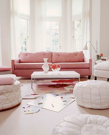
Pastel colours are no longer the saccharine shades of childhood. They’ve moved out of the nursery and away from the girly pinks and baby blues of past. Dove greys, chalky greens, duck egg blues and dusky pinks are the subtler, muted hues of now. Farrow and Ball and Fired Earth offer a great choice of sophisticated pastel paint colours. Try Rose Mallow at Fired Earth or Pale Powder at Farrow and Ball.
To make sure your room doesn’t look washed out, go for good-quality highly pigmented paint with a chalky texture. The Little Greene Paint Company’s Acrylic Matt Emulsion is perfect. For wood and metalwork choose a complementary off-white colour to bring out the walls, or go two shades lighter or darker to create depth. Paint colours at Farrow and Ball and Little Greene are linked to recommendations for complementary neutrals.
To choose the right shade for your room, always use tester pots, again in the corners so as to judge the colour in light and shade. Paint colours can look hugely different on the wall to how they look on a colour card (or on your computer screen). It’s also a good idea to see how the colour changes from day to evening.
Combine the new pastels to create a beautifully relaxed space. Colour cards and fabric samples will help you to draw together a complementary palette.
![Festival sofa upholstered in Cascina ‘Essentials’ fabrics from £41 per metre, Designers Guild [www.designersguild.com] sofa](/photos/articles/regular/sofas/sofas-3283.jpg)
Tones
On the natural spectrum of the colour wheel, tones work outwards from the centre, light to dark. Using different tones from the same colour segment or colour card will give depth to a room. Adjacent colours on the wheel are complementary, creating a subtle scheme, while those opposite one another make a dramatic contrast.
If you’re going for one colour across a whole room, varying the tones will add interest, preventing it from looking flat or becoming overwhelming. For example, taking a dark sofa as your base, layer cushions and throws in varying tones of the same colour, using a lighter shade for the walls and the rich shade of the sofa for other accessories.
If you take the time to choose, there’s no need to feel daunted. Have fun putting together your palette and live life in colour.
10 Ways with…Wallpaper
![Darly Wallcoverings: Darly Indigo wallpaper, £43 per 10m roll, with Orbit three-seater sofa, from £1750 (excluding fabric), and Manari rug, £950, Designers Guild [www.designersguild.com] wallpaper](/photos/articles/regular/wallpaper/wallpaper-3291.jpg)
Wallpaper is having a revival, with a huge diversity of patterns coming to the market, and in the range of applications they're now put in interior design.
With so many styles available and in such a versatile material, it would be shame to stop with the walls. So here are our tips on working those prints and getting the most from your wallpaper.
1. Alcoves
Wallpapering in alcoves is a great way to create a feature wall in your room, adding interest and depth to your decorative scheme. If you’ve got two alcoves either side of a fireplace, papering both and adding a console table in each with a lamp to highlight the wallpaper is a great look. Placing a chair in the alcove, upholstered in a complementary fabric, is another way to enhance the wallpaper and develop your scheme. If you have shelves in your alcove papering the back wall or even the back of the bookcase creates a great backdrop for books and accessories.
2. Lining wardrobe doors
Lift your spirits in the morning and give your clothes a treat by lining the inside of your wardrobe with beautiful printed wallpaper. You can really go all out, choosing a bold pattern or bright colours, without worrying about the wallpaper matching the rest of your room. And there’s something enchanting about a hidden surprise, even if your wardrobe is crammed with boring work clothes. If the doors have beading on the outside, papering within these panels will create a feature of your wardrobe.
3. Covering lampshades
Papering a tired lampshade is a simple way to introduce pattern and colour to your scheme. Mix your wallpaper paste with a dollop of PVA glue to make sure it won’t peel off with the heat of the bulb. Play with different combinations of complementary or contrasting papers for the inside and outside of your lampshade. Choosing a paper in the same pattern but a different colourway to go on the inside of the shade is a great look, particularly if you’re papering a pendant shade. If you’re papering walls in your room, a lampshade in the same paper will help to draw together your design.
4. MDF Panels
Wallpapered panels look great either mounted on the wall itself or leaning against it. A collection of panels in varying sizes and prints against a wall makes a lively feature. Ply or MDF can also be used to create a simple room divider with hinged panels. Use a different pattern or colourway on the front and back to add interest, or make like a Victorian lady and create a decoupage with samples. Cut out motifs from a range of samples to create a collage or use sample squares for a patchwork effect. Seal your design with a layer of PVA or varnish. Screens are great to hide messy office areas or to zone your bedroom. Facing the panels with corkboard before papering creates a lovely backdrop for pinning photographs.
5. Stretching over canvases
This is a fun way to create artwork for your room and there’s nothing more satisfying than using a staple-gun. Again PVA will ensure it sticks well. Take care folding at the corners to get a tidy finish, using a staple-gun at the back. If you’re papering a feature wall, placing canvases on the opposite wall gives the room a pleasing symmetry. If, like me, you’re cripplingly indecisive, canvases allow you to go for more than one colourway. Place canvases in a second colourway over your papered wall to animate the look.
6. Framing
Another way to create artwork, framing wallpaper is great if you live in a rented house or you’re on a tight budget. Framing allows you to take the wallpaper with you, and using large samples saves you buying a whole roll. Again you can play around with patterns and colourways, with three or four variations framed in a row. If you’re papering a feature wall, pick out your favourite motifs to enhance through framing, drawing together your scheme and making the most of the wallpaper.
7. Combining different wallpapers
The key to using different papers on the walls of one room is to create some kind of dialogue between the two. Go for either the same pattern in a different colourway or a different pattern picking out some or all of the colours of the first wallpaper. A plain, slightly textured wallpaper in one of the colours of the first also works very well to unify your scheme. A simple way to combine wallpapers is to use a different print in any alcoves in the room. This works to enhance the formal qualities of the space and makes a natural break between the two papers.
![Florimund Wallcoverings: Cabriole Gold wallpaper, £43 per 10m roll, with bed covering in Tancredi Silk, £91 per metre, Designers Guild [www.designersguild.com] wallpaper](/photos/articles/regular/wallpaper/wallpaper-3293.jpg)
8. Combining wallpaper and paint
When choosing a paint colour, always get tester pots and place your wallpaper sample against the painted area to judge the effect. Picking out one of the colours in your wallpaper to use on painted areas works well. Use the background colour for a subtle look or one of the colours from the motif for a more striking effect. For an even more dramatic look, choose a contrasting paint colour that speaks to the wallpaper in a different way. Think about the balance you want to create between the wallpaper and paint, choosing a lighter paint colour if you want to give the wallpaper greater prominence.
9. Wallpaper murals
You can get really fantastic results with wallpaper murals. A single image across a whole wall makes a fabulous feature with instant impact. Transform your space with architectural photographs, antique maps, botanical drawings, and even fine art reproductions. Surface View [http://www.surfaceview.co.uk] has a great selection of ready to roll murals, including written text and anatomical drawings, available in permanent and peel-off varieties. With a huge image library Digetex [http://www.digetex.com] create and install bespoke murals, researching your chosen theme if you can’t find what you want.
10. Headboards
Papering a tired wooden headboard or creating your own with MDF can transform your bedroom into a sumptuous boudoir. Choose a high paper grade with a flock surface or a textured weave to give a quality feel. For a really opulent look, follow the width or your bed and paper the wall behind it. Wallpapering kid’s headboards, and getting them to help, is a great way to introduce colour and pattern to the room and create a sense of fun at bedtime.
Buyers guide to... Storage
Don’t ignore that stack of magazines on your floor; de-clutter your home and your mind with some simple storage solutions from Furnish.
Use this opportunity to have a bit of a spring clean, and look at the potential your room has for storage space to fit a new elegant wardrobe, or a unique coffee table. Remember that storage isn’t simply for hiding those cluttered objects that lie around your house, it can also serve as a much more stylish and functional feature of your home.
Clothing storage
We are all guilty of getting our knickers in a twist when we can’t find something we want to wear. So, whether you have something stylish but small, or a walk-in wardrobe (we can all dream, right?), where we store our clothes should be a reflection of our lifestyle. Lombok’s stylish Keraton wardrobe has an alluring colonial look which brings a unique statement piece to your bedroom. Not only does it contain a full-width hanging rail, it also has two large drawers at the base of the wardrobe. Alternatively, for a charming furniture piece that would add a perfect feminine touch to your room, the Amelie two drawer chest from Brissi offers practical drawer space for folded garments. For long-term storage, the Kigoma trunk from Holding Company is a suitable place for keeping garments that you are putting away for the next winter.
Sideboards
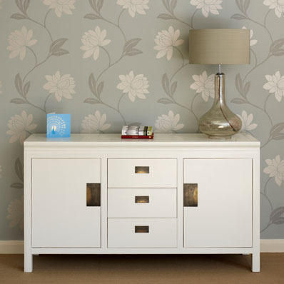
Simple and effective, the sideboard is conventionally used in the dining room; however it also works well in hallways, living rooms, or bedrooms. Go for the vintage inspired look with the Miss Print sideboard; its chic finish will add a touch of intrigue. Choose the Shanxi sideboard from Puji in white to compliment a modern decor with its smooth linen white lacquer finish with wooden edging detail. It has distinctive brass handles giving it a hint of eastern exoticism, and with two cupboards and spacious draws it offers the potential for maximum storage space. The Tactile sideboard from Utility has a seamless finish, and purposely has no handles which would only add confusion to its understated appearance. This masculine look would work well in a bachelor’s pad as it provides a no-nonsense way for the male species to create a sleek look for their decor without damaging any manly pride.
Kitchen dressers/larders
For the perfect place for you to store your finest tableware, Lombok’s Traditional glass dresser in dark teak gives that idyllic country house feel. Install it in your kitchen or dining room and there’s no need to hideaway your favourite tableware. With a display with two glass shelves for your cookery books, and drawers for table linen, this dresser not only gives a sense of pride to any kitchen, it also offers a functional and timeless charm to your home. Zenith basket trolleys from Heal’s are made from sturdy chrome wire, and they are ideal for keeping fresh fruit and vegetables as well as kitchen utensils in order.
Multifunctional furniture
Making the most of your storage is essential. Many furniture pieces available on Furnish are multifunctional and offer you space-saving opportunities to use throughout your home. Take a look at the Multi-Purpose Play table with Trundle Drawers from Great Little Trading Company. This cleverly compact play table is exciting to look at, not only does it provide your child with great fun and entertainment that will keep them occupied for hours. It also offers convenient storage space for toys and game that might otherwise clutter the floor or simply get lost in the chaos. Also, the Military coffee table from Occa Home is attractive stained oak wood coffee table but is also provides an easy-to-reach resting place magazines, books or vases. Its discreet drawers make it simple for you to store other knick knacks like placemats or notebooks.
Console tables
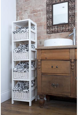
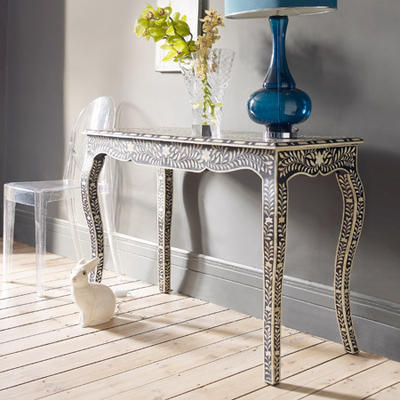
Bring versatility to your home with a console table; coming in all shapes and sizes, they offer stylish storage and add interest. Unwelcome mess within your home can be solved with the Lloyd high-console from The White Company. This incredibly neat looking set of drawers would fit extremely well within a hallway, bathroom or a bedroom, and with its strong woven baskets it is ideal for storing all kinds of belongings from magazines to umbrellas, shoes or photos, or even the phone directory. If you like detail and character is your furniture then the very stylish Black & Bone Inlay Console Table from Graham & Green would be an asset to your home. This table is beautifully hand crafted and a unique one of a kind piece that is only worthy of your most personal and cared for belongings.
Wall hung storage
If you are short of floor space don’t despair because your walls can offer an extra storage space for you to play with. The Seletti Framed CD Notorious Shelf Gold from Heal's is a great example of how storage can be useful in an attractive way. This clever series of shelves looks like a work of art with its stunning gold frame and ultra-modern box shelves. It provides a perfect balance of practicality and style. Add intrigue and a conversation starter to your room with the unique Sticklebook invisible bookshelf from Utility, which works using a combed strip that grips the covers and pages. Its deceptive powers make your mind believe the illusion that your books are floating in thin air- guaranteed to give the wow factor.
Shoe racks
Shoes are a girl’s best friend (well, after diamonds that is) and if you love your shoes then you shouldn’t be without Utility’s Floor standing shoe rack. It is the perfect design for keeping shoes tucked away neatly in cupboards without them getting crushed. However, it does only hold up to seven pairs so you may want to consider the Expandable shoe racks from Holding Company. Take advantage of the two expandable and stackable shoe racks made from classic chrome for a practical and easily accessible home for your shoes- you never know, there may be room to fit a few new pairs in too.
Kids storage
Any parent will empathise with how easily a child’s bedroom can suddenly look like a hurricane has just hit it. Children’s furniture by Great Little Trading Company is designed specifically for the helping parent and their children to live a mess free but fun life. The Horizontal six drawer unit provides accessible storage for toys and books that get frequently used, and they also encourage your child to tidy up after themselves. Ideal for use either in a playroom or bedroom, the Dolls house bookcase has three shelves and six compartments making it easier to store books, games or toys. Also, under the bed is a great place to store frequently unused items out of sight without taking up any extra floor space.
Kitchen utensil storage
Make preparing and cooking in your kitchen more enjoyable with suggestions of storage for your kitchen utensils from Furnish. Heal’s has a collection of items to help organise you utensils, and the modern style of the Simplehuman utensil holder with a removable spoon rest will give any kitchen a futuristic feel. However, if you would rather give your kitchen a retro feel than be rocketed into the future, then you should choose the Typhoon vintage kitchen utensil holder available in black, white and red. Typhoon has taken inspiration from kitchens from the early 1930’s to 50’s, and you can find their enamelled range of kitchenware on Furnish.
Bathroom storage
Let’s face it; we all spend a little longer pampering ourselves in the bathroom than we like to admit. With the right storage, life will be made easier in the mornings when the fight for the bathroom can get nasty! For an ideal way to save space and time, you can keep ‘his and hers’ toiletries separate with try the Four drawer Rattan basket rack from The Orchard. The Contemporary Home has come up with a practical solution to the problem of where to keep your toothbrush with the Suction toothbrush holder. This no fuss holder sticks to your bathroom tiles, with no drilling required, and the least mess made. Or in case of an emergency, no bathroom would be complete without a First aid box from wheredidyoubuythat.com. This cabinet is wall mountable or it can be used free-standing, but either way it’s just what the doctor ordered.
Royal College of Art SHOW 2010
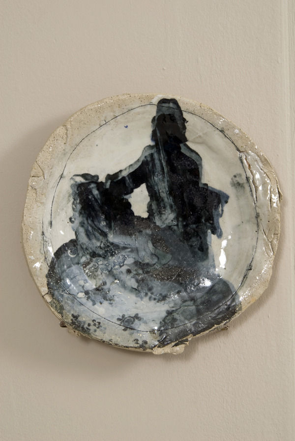
An inspiring sunny afternoon at the RCA graduate SHOW
I managed to sneak out yesterday to visit part one of the Royal College of Art end of year SHOW, including ceramics, metalwork and glass. And I’m mightily glad I made it, because not only did I spy (and not so inconspicuously point out) the subject of my long-held style crush, Sir Paul Smith; but I discovered some fabulously beautiful objects and inspiring makers. The whole afternoon made me want to get my hands on some clay and throw it and thump it about, but having neither the means nor the skill, I went to the pub to cool down and collect myself.
In the ceramics section references to the 18th century abounded, which, being the flamboyant glory years of porcelain production, isn’t really surprising but underpinned some innovative and highly original outcomes. Sun Ae Kim’s playful monochrome dinner service alludes to 18th century porcelain figurines used as talking points at the dinner table, reworking them into 21st century narratives of seduction and satire. Images manipulated from ceramic pattern books of past centuries are combined with saucy hidden surprises on the underside of plates and bowls. Amy Hughes’ gloriously tactile vases hark back to urns produced by the Royal Sèvres Porcelain factory, but allow the clay of which they’re made to break free from the constraints of their refined predecessors. The textured body speaks of the hands that shaped it and the unrefined surface richness of the clay itself, a celebration of material qualities and craft that retains the decadence of the original.

In a similar way, Hanne Mannheimer’s beguiling series of plates, ‘Memory of a Figurine’, combines the roughnesses and unrefined qualities of clay with refined decorative details of silkscreen-printed 18th century figures; detailing which reduces in sharpness as the ‘memory’ fades. This concept of unfinished and unrefined edges was another trope running though both ceramics and glass. Hanne Enemark’s ‘Cracked Rim’ series of fabulously heavy blown-glass bowls has to be my favourite of the glass students’ work. The uneven rims have a deliciously thick coating of gold, which looks like it might begin to drip into the clear glass bowls. In metalwork, I loved Victoria Delany’s, Brio-inspired, ‘Candlestack’. With a solid-silver top and base, you get a pack of lovely colourful wooden beads in different shapes and sizes that you can slot on in any configuration, creating your own bespoke candleholder.
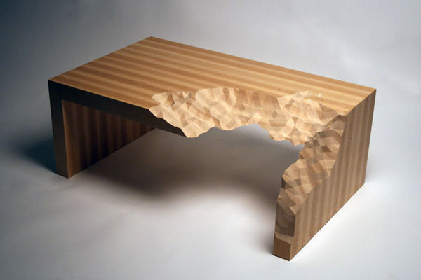
Elsewhere there were some fascinating experiments in digital design. Kathryn Hilton, on hand for a demonstration, uses a digital hammer and three-dimensional wax printing to create moulds for her beautiful multi-faceted, geometric silver bowls. And Zach Eastwood-Bloom’s work explores the interaction of the digital and the material worlds with truly stunning results. His wonderfully absurd coffee table in Beech wood, ‘Information Ate my Table’, describes a process by which the real and the virtual might collide, applying digital, binary information to a tangible, natural material. And my favourite piece of the whole exhibition, Zach’s ‘21st Century Landscape Tryptich’ was shown to full effect in yesterday’s sunshine, as the shadows on the faceted, highly textural surface changed throughout the afternoon. In white resin, it made a fabulous contrast hung against the geometric grey-black bricks of the courtyard wall.
All in all it was an utterly inspiring afternoon out. I only wish I could have persuaded Sir Paul to join me in the pub...
Living with Pattern
Whether you go for bold prints or intricate detailing, playing with pattern adds instant vitality to a decorative scheme.
Pattern is a great way to animate space and add interest to your home. Whether you go for bold prints or intricate detailing, playing with pattern adds instant vitality to a decorative scheme. And there are plenty out there to suit your style. Stir the senses with variations in scale and combinations of different patterns and textures.
Wallpaper
Patterned wallpaper brings drama to a dull room. Make an architectural statement with graphic geometric prints, or go for timeless elegance with traditional florals. Generally speaking, the smaller the wallpaper motif, the larger the room will appear. Vertical stripes will give the impression of higher ceilings, and if you have a narrow room think about hanging striped wallpaper horizontally to add width.
Large-scale pattern can work on all four walls of a room, but choosing a subtle colour palette will stop it from becoming oppressive. Similarly, intricate prints can look over-fussy if used unremittingly. Creating feature walls, hanging wallpaper in panels or using it as an accent in alcoves are often better options, broadening your scope for the scheme as a whole and allowing for greater flexibility.
Picking out the colours in the wallpaper and choosing shades from the same colour palette for soft furnishings, upholsteries and paint will unify your design. Designers Guild is particularly good on this, with complementary families of wallpapers, fabrics and even paint colours, enabling a mix and match approach to pattern, texture and tone. Zoffany and Harlequin also have fabulous ranges of coordinating wallpapers and fabrics. Colefax and Fowler is great for timeless prints, while Cole and Son have some fantastic tartans designed by Vivienne Westwood.
Flooring
Whether you choose wood, tiles or carpet, patterned flooring can transform a room. As with wallpapers, large-scale patterns generally look better on larger floors. A smaller scale pattern with a frequent repeat will look better in a smaller room. Again, pick out colours from the flooring to use elsewhere in your scheme. And if you’re going for a full-on floor pattern, let it speak for itself with plain and simple furnishings.
Parquet woodblock patterns range from the simple herringbone to the most intricate of geometric mosaics. Create a subtle pattern with parquet flooring in one type of wood or go for high drama with contrasting timbers. Weldon create beautifully crafted, bespoke parquet and marquetry floors, and Ardeco are parquet specialists with a great range of designs.
Stunning effects can be achieved with floor tiles, and the possibilities are limitless. Villa Lagoon [http://www.villalagoontile.com] has a fabulous range of floor designs with cement and ceramic tiles in all manner of patterns and colours. De Ferranti is unsurpassed for choice, with a vast product library spanning ceramic, encaustic and glass tiles, to leather, metal and bone. Tiled Perfection specialise in traditional Victorian and Edwardian geometric designs, and Fired Earth recently launched a range of encaustic tile patterns inspired by the 1951 Festival of Britain.
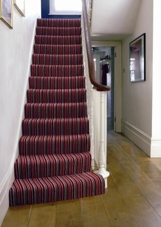
Patterned carpets are no longer the preserve of seafront hotels or granny’s front room. Crucial Trading has a stylish range of sophisticated stripes and grids in wool, and if you don’t want to go for full-colour, try a textured weave in seagrass, jute, or coir. For the commitment-phobic, rugs are a great alternative to permanent patterned flooring and can bring a room to life. The Rug Company and Christopher Farr are both outstanding on quality and design.
Soft Furnishings
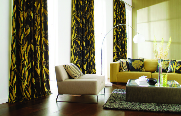
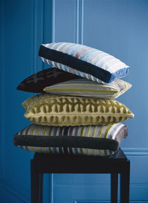
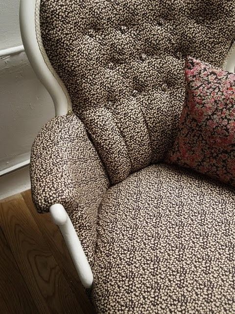
There’s plenty of scope to experiment with pattern in your choice of soft furnishings. Layering different patterns, such as stripes and florals, works well if you stick to the same colour palette to bring the look together. Play around with variations in scale and texture to add a sense of movement and depth. Again, Designers Guild is fantastic on complementary, but not ‘matchy matchy’, soft furnishings and will upholster any of its stunning sofas to your specifications. A couple of cushions or a lampshade in the same pattern as your curtains, blinds or wallpaper will to draw together a decorative scheme without looking over-done. Go for sofas and armchairs in block colours if you’re using a lot of pattern elsewhere.
Have fun with pattern and bring your home to life. Go with your instincts and create an interior with personality and style.
Trend watch: Metallics
Give your interior a sharp and dramatic look with metallics.
When metallics hit the catwalk they brought bright, bold, inspiring colours to the forefront of fashion. A common misconception about trends is that they are only acceptable and in-fashion for short periods of time, but the great quality that metallics have is that they filter into different aspects of decor to give a timeless and opulent feel to your home.
Metallics can be applied to your interior in so many ways because they ooze modernity and have a classic appearance, making them effortlessly pleasing to the eye. Use black and gold to create a dramatic statement, or use silver with pastel colours to give a more serene and natural feel to your room. Either way, go ahead and add shimmering detail and grandeur that fashion designers use so well in their clothes to dress your home.
If the rush of rich golds, silvers and bronzes on the catwalk has done anything to inspire interior design, it has certainly encouraged us to liven up neutral colour schemes with a splash of sparkle and glamour. For an accent wall in a bedroom, the fantastic Wilderness white gold wallpaper from 95% Danish will bring both texture and interest. For bed linen, try the Mink satin bedspread from The Contemporary Home to add an understated elegance and luxurious feel to your bedroom.
Take a peek at Chloe’s Spring/Summer 09 catwalk collection featuring lamé harem pants; the ‘heavy metal’ trend showcased a natural and radiant look. This use of stunning metallic shades can be dressed up or down in order to give a room a bold daytime look or a shimmering night time vibe. The Bean bag in gold leather from Heal’s has a luxurious gold finish making it perfect for a comfortable evening in, and the Small sequin cushion in silver from Rockett St George, are both perfect for achieving this thriving and versatile trend.
Why not use metallic shades to give your home a look that retains an authentic style but brings a modern, glamorous look to your interior. The Orchard’s Gold Gilt Collection is inspired by classical French themes, and the Gold gilt two drawer bedside cabinet is finished in genuine gold leaf. If you fancy giving your guests an afternoon tea to remember, then look no further than the Silver tea caddy and the Silver tea strainer from Brissi. This is a nostalgic piece that is fit for the Queen and should make us feel proud to be British.
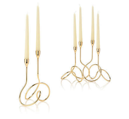
Metallic colours exude a finished look and are just the thing to bring a shiny, polished look to your home. Black and Blum’s Gold loop candelabra will provide your dining table with a stylish and stunning statement piece that will not fail to impress. Or, if you want to liven up your hallway or add a feminine touch to your living room, then choose the Flower loop for a minimal yet chic and individual piece that is inspired by the Fibonacci curve to create a balanced and aesthetically pleasing design.
These are just some examples of how you can introduce the metallic trend into your home. Don’t get too carried away by mixing too many metallic pieces in one room; use them to add visual impact and a touch of elegance as a statement piece for your room. Choose a furniture piece like the Brass stools from Lombok, made from solid brass and finished in antique silver, or use detailed fabric with metallic gold beading found in Sweet Pea and Willow’s Paris gold and lilac tie backs to give a contemporary and stylish touch that no home should be without.





![Nabucco Wallcoverings: Sussex wallpaper, £43 per 10m roll, Designers Guild [www.designersguild.com] wallpaper](/photos/articles/regular/wallpaper/wallpaper-3292.jpg)
