Features: July '10
Hot off the press…fabric
Our hot picks from the world of fabrics.
We’ve been rummaging around in the wonderful world of fabrics to bring you the latest news from established brands and emerging talent.
Timorous Beasties
Founded in Glasgow, and once described as ‘William Morris on acid’, the design studio Timorous Beasties has developed an iconoclastic style, printing surreal and provocative imagery on traditional textiles and wallpaper. Timorous Beasties are experimental in approach to both hand-printing methods and machine production. This innovative approach is reflected in an evolving aesthetic: from early surrealistic and distorted naturalistic images of insects, plants and fish, to a new graphic style which explores social and political themes. The Glasgow Toile, featured in the recent Quilts exhibition at the V&A museum, epitomises this uncompromisingly contemporary graphic style. At first glance it looks like one of the bucolic pastoral vistas depicted on 18th century Toile de Jouy textiles, but closer inspection reveals a nightmarish vision of contemporary Glasgow, in which addicts, prostitutes and the homeless are depicted against a threatening backdrop of decaying tower blocks and scavenging seagulls. Other fabrics for 2010 include the ethereal Lace collection, which has a hint of Miss Havisham about it, and the Digital collection, a development of Timorous Beasties trademark naturalistic imagery, with fabrics depicting moths, insects, amphibians and plant forms. Naturalistic, lace fretwork, damask and Toile de Jouy imagery is repeated across the Velvet, Linen and Woven fabric collections.
Abigail Borg
Since launching her wallpaper collection in 2009, illustrator and surface pattern designer Abigail Borg has received a clutch of industry awards. Influenced by traditional pattern design, particularly that of William Morris and the Arts and Crafts movement, Abigail combines a timeless approach to drawing and pattern design with the latest in digital printing methods and a passion for vibrant colour. Her striking, vintage-inspired floral prints, rendered in a series of luscious colourways, now feature in the recently launched fabric collection. Available by the metre as well as hand finished feather-filled cushions; it’s a beguiling collection of bold English country-garden prints and vivid, saturated colour, achieved through digital printing. Perfect for curtains and upholstery, the dramatic colour ways and graphic style give the collection a contemporary edge, offering vintage-inspired design for a modern setting. Our favourites are the Polka Polka fabric, depicting hydrangeas and red-hot pokers in white, duck egg blue, pea green, and shades of pink on black ground; and the soon to be released Peonie Fox, featuring peonies and foxgloves in white, pink and pea green on a pale turquoise ground. We’ll be interviewing Abigail soon, so watch this space.
Designers Guild
Designers Guild is a well-established brand with a well-deserved position in the world of interiors, consistently offering original, stylish and liveable fabric and wallpaper collections in coordinating colourways and patterns. Designers Guild does colour exceptionally well, with new combinations each season and its own line of complementary paints. Textiles range from the block-coloured Essentials collections, containing over 2000 plain and textured fabrics, through contemporary and vintage-inspired florals, to architectural patterns and graphic geometric motifs. We love the striking hexagonal repeat pattern on the Leopold fabric (2010 Darly collection) and the fretwork, interlocking motif on the Rheinsburg fabric (2010 Pavilion collection). These dynamic geometric prints are accompanied by nostalgic florals and flowing arabesques in complementary colourways. The Designers Guild furniture range, encompassing both contemporary and vintage-inspired designs, is available to be upholstered in any Designers Guild fabric. And as well as fabrics by the metre, Designers Guild has a fantastic range of cushions, bed linen and blankets, throws and table linen. Rugs feature oversized patterns and motifs taken from the wallpaper and fabric collections. Designers Guild is a distributor of The Royal Collection, inspired by the interiors of Buckingham Palace and Windsor Castle; the Ralph Lauren Home fabric and wallpaper collections; and William Yeoward’s luxurious fabric and wallpaper ranges.
Manuel Canovas
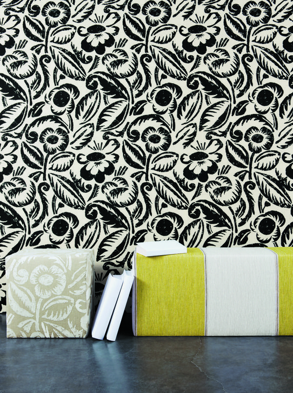
Part of the Colefax Group (of Colefax & Fowler fame), Manuel Canovas is a Parisian design studio producing sumptuous and stylish wallpapers and complementary fabrics. The Millennium collection follows a seafaring and naturalistic theme, with twiggy coral fronds, oriental koi carp, fluid plant forms, seashells and stripes, adorning linens, cottons and velvets. New collections for 2010 include a series of fabulous French toile patterns in contemporary colourways such as orange and grey, dark brown and pale blue, rose pink and graphite. Sophisticated florals, bold stripes and geometric motifs in a distinctive colour palette are featured throughout the new collections. Our favourite new pattern has to be the Vence fabric. Reminiscent of the woodblock textiles produced by Duncan Grant and Vanessa Bell of the Bloomsbury group in the early 20th century, the stylised florals have a hand-printed appearance with the imperfections of the woodblock process adding to the charm of the fabric. Available in black, mauve or ecru, Vence is a stylish fabric choice for upholstery projects and window treatments.
Check back soon for more hot of the press homeware.
Our weekly pick of interiors blogs…
Roll up, roll up, and see who’s been added to our blog roll.
With a dedicated group of weekly contributors from the field of art and design, Poppytalk is a Vancouver-based blog founded by husband and wife team, Jan and Earl. It’s an online scrapbook of interiors inspiration, craft projects and design innovation, featuring emerging talent as well as established names. It’s quite craft-driven and there are regular features on decorating tricks, budget living and creative weekend projects, along with great posts on design, art and architecture. Jan and Earl also curate Poppytalk Handmade, an online monthly exhibition showcasing handmade and vintage goods from around the world. And in another offshoot of the blog, you can follow the progress of Jan and Earl’s renovation project: a 70s townhouse in the Pacific Northwest. It’s a decorating dream.
Atlanta-based blog, Things to Inspire is chock full of just that: inspirational finds from the worlds of interior design, architecture and art. I loved this post on Astor Courts, a sprawling estate in Rhinebeck, NY, designed by American architect Stanford White in 1902. If anyone’s interested it’s also the rumoured location for Chelsea Clinton’s impending nuptials. Holly, aka Things to Inspire, shares her eclectic finds and love of beautiful things. She’s an industry insider and there’s also a section on her favourite architecture and design books. Holly’s another blogger with her own online store, Quatrefoil Design, which specialises in sourcing unique items that can’t be found elsewhere.
Design for Mankind is the work of Erin Loechner. With an irreverent take on the design industry, and scouring the web daily for fabulous finds, Erin delights in the quirky side of design, featuring the beautiful and the downright bizarre. The layout, typography and graphics are stylishly simple, and each image in the continuous reel is followed by few words and quick links the designer, artist or architect featured. Design for Mankind offers daily inspiration in a effortlessly simple package, allowing you to navigate away to find out more, and with a roundup of everything featured at the end of each week.
Get in touch if you’ve got a blog of your own and we’ll feature it next time.
Hot off the press...wallpaper
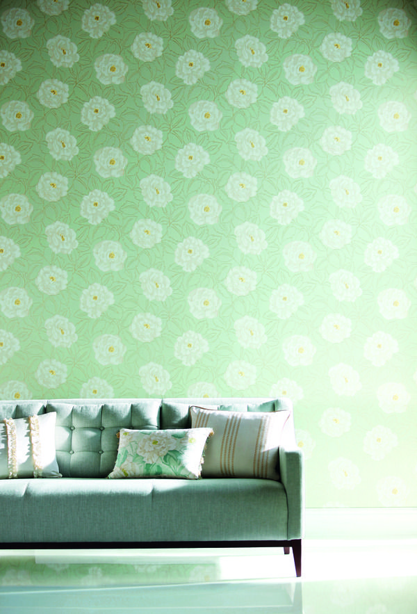
Look no further because we have found out what’s new in the world of wallpaper.
We are showcasing the newest wallpapers in interior design and keeping you up-to-date with the hottest trends. With big prints and florals gracing the catwalks, we knew it wouldn’t be long before our décors would be blooming with these large, contemporary prints. 2010 is the year for focusing on brighter and more optimistic designs, and wallpaper has certainly earned its right to be back in our homes. Wallpaper is officially back in trend with eco-friendly paper making it a superb choice for all who are aspiring to create a sustainable yet stylish interior.
Dandelion wallpaper (MissPrint)
The ‘Dandelion’ wallpaper was launched in September 2009, and due to its increasing popularity MissPrint has recently launched two new colourways: Porcelain with powder blue and Mist green with white. The design originates from hand drawn illustrations and it is reminiscent of the fifties with a modern twist featuring wild dandelions. Another new addition is the well-received ‘Leaves’ design which is available in four colourways, including dove grey with white in a matt/pearlescent finish. It has been made with a high quality woven fabric and the geometric design fits nicely in with the rest of their collection. The whole wallpaper range is PEFC certified, and printed with organic, non-toxic pigment inks which are better for the environment and for our homes.
Amilie wallpaper (Harlequin)
‘Amilie’ is a new wallpaper collection at Harlequin that includes seven designs which have been inspired by beauty of English country gardens and a classic French style. With interior design turning to nature and all things eco-friendly, this wallpaper brings the timeless beauty of floral bouquets into your home and provides a fresh and modern look. The collection offers colourful designs that would lift any colour scheme and create a perfect backdrop; the palette offers vibrant shades of lime and fuchsia, warm metallics and neutrals, and pastel hues to suit your style and offset the mood of your room. The collection captures the beauty and quaintness of a traditional country home but has the elegance and boldness of modern design.
Nabucco wallcoverings (Designers Guild)
The Nabucco collection offers over sixty luxurious designs that are printed to suit any décor. If you are looking for print that is more conservative but sophisticated then you will love the sussex designs that are available in a variety of calm pastel shades, or in noir or platinum for a more dramatic look. The collection includes a modern stripe on the bridgeport designs which have an interesting woven texture effect in tonal shades. With stripes striding out on the catwalks recently this is a great time to introduce them into your interior; try stripes on a feature wall to either help create a feeling of height or simply to add visual interest.
Archive Traditional Collection wallpaper (Cole and Son)
New for Spring 2010, the Archive Traditional Collection wallpaper includes twelve designs that are a selection of familiar and traditional prints. The ‘Dorset’ is one of the most popular of Coles designs because of its classic and restrained design that is perfect if you want a more traditional and simplistic style for your dining or living area. It comes in off white on warm sand, gold on almost black, gold on earthy red, off white on old white, and gold on duck egg and natural white. Or have a look at the ‘Woolverstone Hall’ which has been taken from an eighteenth century silk design giving its small-scale damask elegance. It is available in three colourways including warm silver on pales ducks egg, white on champagne lustre, and warm silver on muted navy.
Amy Butler’s wallpaper collection (Graham and Brown)
Graham and Brown have released Amy Butler’s new and exclusive collection of wallpaper which is very feminine and print-focused. She is best known and loved for her gorgeous fabrics and this collection, her first line of wallpaper, has been highly anticipated and it does not disappoint. The collection includes six colour palettes and six designs, and her signature style shines through in her modern bold prints with predominant floral patterns. She is clearly inspired by nature in English and tropical gardens with such passionate colours and exotic designs. Amy also has a collection of custom wall art which are inspired by her floral and textile designs to liven up your walls with a bold splash of colour.
Spotlight on: Benchmark

Wondering what’s special about suppliers on Furnish? Take a look at Benchmark.
Established by Terence Conran and Sean Sutcliffe in 1984, Benchmark is a design-led manufacturer of bespoke furniture. Producing contemporary classics with sustainability in mind, Benchmark furniture is handmade and built to last. Benchmark was the first furniture maker to receive the Queen’s Award for Enterprise in Sustainable Development. The company is founded on a belief in the enduring appeal of good design, celebrating high-quality materials and traditional craftsmanship, while harnessing the latest in modern technology, machinery and tooling.
Excellence in design and a passion for furniture is expressed across the entire collection, which includes the work of well known designers such as Thomas Heatherwick, Russell Pinch and, of course, the indomitable Terence Conran. Alongside these big names are pieces from up-and-coming independent designers, as well as the Benchmark in house team. Supporting young designers, Benchmark also runs an award-winning apprenticeship programme, providing training for the designer-makers of the future.
The furniture collection is exclusive to Benchmark and handmade to order from start to finish by highly skilled wood and metalworkers. Benchmark encourages customers to visit its showroom and workshops in West Berkshire to see the furniture being made and provides a personalised service, tailored to meet your specific requirements. Once purchased, each individual piece is marked with a polished pewter disk and registered as an authentic Benchmark original. The disk is individually numbered and you can also choose a personalised inscription of up to 12 characters.
The Benchmark style exudes timeless elegance, simplicity of design, and sophisticated craftsmanship. Innovative contemporary pieces often make reference to the great eras of interior decoration, such as the 1950s-style Emily Console with oblique tapering legs, or the Art Deco-inspired Roman Console with its black lacquered, D-shaped, oak frame and limestone top. The collection pays tribute to the inherent beauty of natural materials, using certified timbers from sustainable sources, as well as stone, leather and metals such as zinc, pewter, copper and bronze. The combination of beautiful materials and expert craftsmanship make this a sensuous collection, both tactile and visually striking. And alongside furniture, Benchmark also produces contemporary lighting such as Partridge & Walmsley’s Fingers Crossed wall light with its beguiling counterbalanced pulley system.
To choose a star product from this captivating collection is difficult, but we think the Normandie chairs, designed by Terence Conran, embody the style and spirit of Benchmark. Drawing inspiration from the second class dining chair on the Art Deco cruise liner, the SS Normandie, the chairs are available in a variety of different options, epitomising the bespoke service offered by Benchmark. You can choose between an upholstered or burr oak backrest, and a natural or mocha stained oak frame. The chairs are upholstered in any fabric of your choice and are available with or without armrests. Angular back and armrests are combined with softly tapered legs for an understated look that’s also high on style. These elegant chairs will last generations and never go out of fashion.
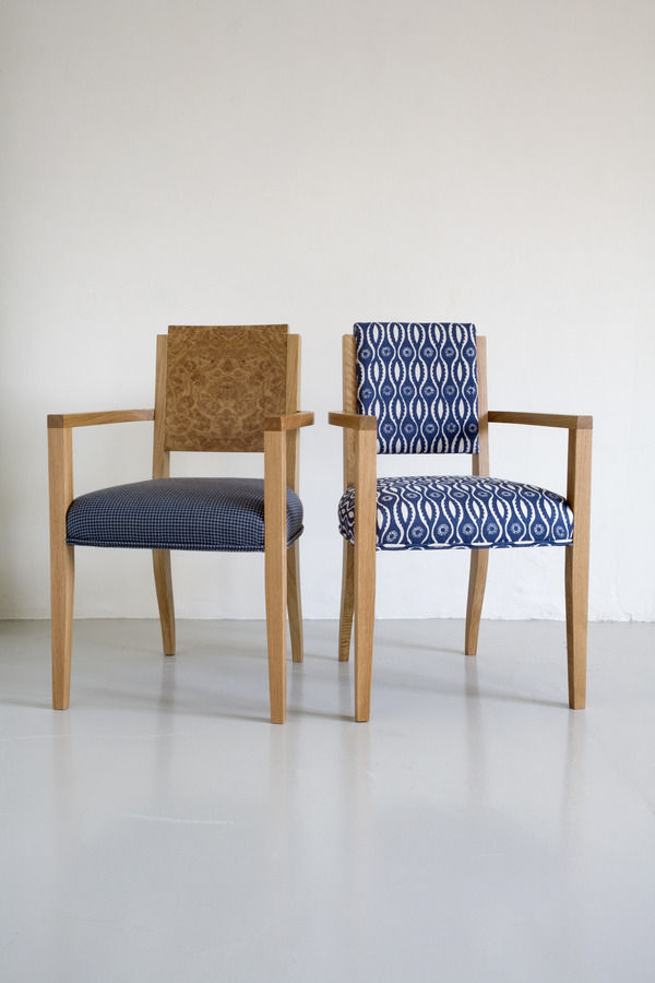
Demonstrating Benchmark’s design historical sensibilities, the company recently teamed up with the Rocket Gallery in London and Danish-American designer Jens Risom to reissue his 1950s and 60s furniture designs. Made by Benchmark with the close involvement of 94-year-old Risom, the first collection of nine pieces to be reissued includes an easy chair and a side chair, a desk and a magazine table, four coffee tables and Risom’s iconic upholstered bench. An exhibition of the collection runs to September 4th 2010 at the Rocket Gallery, in the Tea Building, 56 Shoreditch High Street. Risom describes his designs as ‘an American version of Scandinavian modern furniture’ and the exhibition is well worth a look for mid-century design devotees. The result of another collaboration with the Rocket Gallery, the Hexad coffee table by Tomoko Azumi won Benchmark a Wallpaper* Design Award earlier this year, and further products designed by Azumi are due to be launched as part of the London Design Festival in September.
As well as its collection of handmade furniture, Benchmark provides a specialist service for commercial and public projects, working with architects and interior designers. Benchmark has recently completed a bespoke commission on a grand scale for the London Library. Patinated brass, dark oak, reeded glass and leather in shades of oxblood have been incorporated throughout the library, linking the rooms together and seamlessly combining old and new. Working with architects, Haworth Tompkins, Benchmark have made around one hundred pieces of individual furniture, all with contemporary lines and designed for modern day use while harmonising with the historical setting, existing furniture and architectural features.
Benchmark is one of the great success stories of British manufacturing. Looking to the future with respect for designs of the past, Benchmark is committed to innovation and technological advancement while celebrating and fostering the continuation of craft practices. Supporting 45 staff, running an apprenticeship scheme and employing and training up workers from the local area, the business as well as the furniture is built to last.
Colour watch: Blue
From daring midnight blues to breezy, calming baby blue hues you can blend and contrast different tones, shades and palettes to create a harmonious room.
Colour sparks individuality, creativity and mood which is why it is such an integral part of art and interior design as well as influencing the way we perceive the world. Whether you want to create a room that has a relaxing ambience or simply to add some drama and excitement there is a shade of blue for you. Blue is a primary colour and one of the cooler shades on the colour wheel that will bring a calming influence to a room. Blue shades are associated with the sky and sea, and also loyalty, stability and relaxation which makes it a popular choice in many homes.
Choosing the right blue
There are plenty of versatile shades and huesof blue to choose from that will work their tranquil magic in any room of your home. Consider the size of your room and how much natural light it gets because choosing a darker shade will make a small room feel less spacious and more enclosed. Use a colour wheel to help you make the right choices with colour; it is a visual aid to help you understand the relationship between different colours. For example, midnight and sapphire blues are great for feature walls in fair sized living rooms or bedrooms because deeper shades, when used sparingly, create a dramatic impact but do not darken the atmosphere and mood of your interior. To make the right decision for your wall colour, a top tip is to get a sample pot or tester from any paint supplier and try it out in different parts of the room where the light will hit it differently. If in doubt, go for a lighter shade with warm tones that will prevent the room feeling cold and unwelcoming.
Tonal scheme
You can create a harmonious room by choosing various tones of blue which are created by adding grey or black in order to make a dulled or muted shade, or with white to give a cooler, pastel shade. Use deeper tones nearer the floor and work upwards into lighter hues to give a feeling of space. For example, an exotic blue rug will bring texture and depth to wooden flooring.
A monochrome interior is great for contrasting light and shade and will bring a different dimension to your interior. The key to this look is to experiment with pattern and texture to prevent the colours becoming too bland. A monochromatic room in blue should use a single shade of blue paired with white; sky blue walls with deeper sea blue furnishings can be combined with white fabrics and accessories such as flowing curtains, tablecloths or cushion covers. You can even bring a nautical touch to your home with classic blue and white stripes.
Analogous colour scheme
An analogous colour scheme is as easy to create as the monochromatic scheme but it provides more nuances to complete a richer look. Blue can be combined with green and purple hues that bring a deeper interest and encourage feelings of serenity because the colours are reminiscent of the ocean. Avoid combining warm and cool colours in this scheme because they will not work well together. Instead, combine light and dark blues from the same colour family that use the same undertone. This is important in maintaining a natural and desirable scheme that uses colours that you would normally find together in nature.
Complementary colour scheme
Complementary colours are aesthetically pleasing and they are placed opposite to each other on the wheel for the correct pairing. For the best results you should place cool hues against warm tones. Orange is the complementary colour of blue because together they provide an exciting combination that will accentuate the best features in your room. Use orange highlights in patterned fabrics or accessories, for example, because you can overdo it and create an unwanted clash of dominant colours.
Pairing one light and one dark tone of each of your chosen colours works well to give an aesthetically pleasing contrast. The pair can be combined using a muted version of one colour on the walls, and a more intense version of the other colour in furnishings and accessories. Blue with red orange and yellow orange is known as a split complementary scheme which can be used to promote a high contrast and a dramatic look. Complementary colours will work well when used in floral fabrics, drapery and upholstery to naturally highlight texture and brighten your interior.
Accents
Rather than painting an entire room in blue, you can introduce the colour into a white based room with vases, art work, cushions, and other decorative pieces. Accents can also fall out of the basic colour scheme; use complementary colours such as turquoise or fuchsia pinks to brighten up the subtle or deep blue tones in your room. Also, with metallic shades being a hot trend this season you can use hints of silver or gold throughout your room to create a feeling of opulence.
Emily console table from Benchmark
Bag yourself a bargain and a design classic at the same time with this Emily console table from Benchmark. Was £1450 Now £1160
Benchmark are one of my favourite design companies when it comes to classic yet innovative furniture.
It's no surprise that the godfather of design, Sir Terence Conran heads up this emporium of gorgeous home wares.
Beautifully crafted dining tables sit alongside elegant yet cutting edge and oh-so comfortable sofas that are being added to my wish list at a rate of knots. Top of my list at the moment however, is this stunning Emily console table.
Made from solid walnut, the drawer is covered in pewter making it an simply stunning choice.
Use it as a sleek addition to a hallway as intended, a simple yet show-stopping dressing table or in your dining room as extra storage space.
Best of all, this beautiful piece of furniture is now has a whopping £290 off in the summer sale, which means you really have no excuse not to invest, do you...
Colour Watch: Red
If ever there was a colour that could be characterised by ambivalence, it’s red.
Colour triggers an emotional response and while some find red to be warm and seductive, others consider red to be too strident a colour and are repelled by its intensity. ‘My mother warned me to avoid things coloured red’, Swedish artist Claes Oldenburg recalled (as he studiously ignored her advice). Cultural interpretations of red are as polarised as emotional responses to it: red is the colour of revolution as well as royalty, of passion as well as danger, and of prosperity as well as debt. It’s the very ambivalence of red that has designers returning to the colour again and again for inspiration.
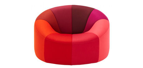
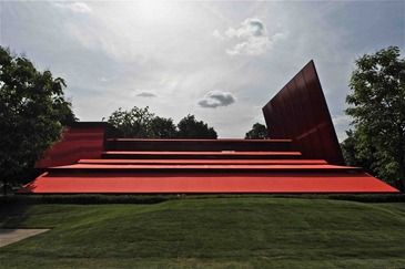
In Pantone’s spring 2010 colour report, the fashion director of Neiman Marcus, Ken Dowling, was in no mood to capitulate: ‘RED is the message from the catwalks; bright lipstick to deep Bordeaux will fill…a colour saturated season.’ In the world of interiors, Ligne Roset is celebrating its 150th anniversary this year with a trio of limited edition products, including a reissue of the 1971 Pumpkin chair by Pierre Paulin, upholstered for 2010 in a segmented spectrum of reds. And if another bold statement was needed, it’s the latest temporary Pavilion to be commissioned for the Serpentine Gallery’s annual series. Opening in Hyde Park on July 10th and designed by French architect Jean Nouvel, the entire structure is rendered in the vivid red of vine-ripe tomatoes, London buses, and traditional telephone boxes.
On trend for 2010, red has been applied in interior decoration for centuries. Louis XIV covered Versailles in the ruby colour, dressing 435 royal beds in red damask. Dining room walls in palaces and stately homes were decorated in rich burgundy reds as a signifier of status and a complement to gilt framed paintings, a centuries old fashion that reappeared in Victorian town houses of the 1800s. Influencing architectural modernists, and gathering around Dutch artist Piet Mondrian, designers of the early 20th century De Stijl movement used pillar-box red with black, white and primary colours to suggest the energy and vitality of modern life, and the promise of a utopian future. 1950s suburban semis were adorned with peachy and pinkish red tones, while the influence of Pop Art in the 60s and 70s saw a move back to bright reds, as well hot pinks and oranges.
While true reds are not for everyone, the red colour palette is as various as its historical applications in interior decoration: from bright tomato to dark blood red, and rich cherry to deep plum tones; from peachy reds to terracotta and rust tones; and from scarlet and crimson to soft berry blushes. Reds with orange or pink undertones are the hottest hues, while reds with blue undertones, such as burgundy or maroon, create a sultry and seductive feel. If you’re looking for depth and warmth, pair red with one of the colours next to it on the colour wheel, such as shades of purple, orange or brown. If red is to be your accent colour, pair it with a neutral such as grey or tan. And if you’re going for high impact, pair your chosen shade of red with its opposite on the colour wheel: a shade of green. Bright colours go well with others of the same intensity and saturation, and if you’re combining different shades of red in the same room, remember that crisp clean shades rarely work together with those of a dirtier dusky hue. While light and dark or warm and cool shades will work together, the clean/dirty combination can be jarring.
For an atmospheric dining room, try a deep red on the walls with accents in gold and grey green. In the living room, a bright red sofa with hot pink and orange cushions will create a retro feel, while combining ruby red with other jewel colours, such as purple or deep blue creates a sumptuous look. In the kitchen, red accessories create a sense of activity, lifting the spirits and leading the eye. Create a really fresh look by teaming red with turquoise, or pair reds with greys for a sophisticated and indisputably modern feel. For a romantic and restful bedroom, raspberry, moss green and dark brown are a great combination.
Take the risk out of red with fabric swatches, wallpaper samples, and tester pots; experiment with different shades and colourways to create your perfect palette.
Little Greene to support Breast Cancer Awareness Month
Donations to be made from every can of paint sold during October 2010
The Little Green Paint Company, renowned for its sophisticated wallpapers and inspirational paint colours, has a long-standing commitment to supporting Breast Cancer charities. This year is no exception, and Little Greene will be making a special donation from every can of paint sold during Breast Cancer Awareness Month, October 2010. Charity begins at home, after all.
Extensive research goes into each highly pigmented paint colour in Little Greene’s exclusive English Heritage, Catwalk and Original collections, for spectacular coverage and depth of colour. There are few things more satisfying than a freshly painted room, and by choosing a Little Greene paint you’ll be making a difference that extends well beyond four walls.
Paint cans specially labelled with the Breast Cancer Awareness pink ribbon will be sold via the internet and UK stockists for the month of October, with Little Greene committing to donate 15p from the sale of every can of paint. And what’s more, as customers we’ll have a say in how the money generated will be spent. An online vote will determine how the money raised is shared out across a selection of breast cancer charities partnering Little Greene’s campaign. Have your say via Little Greene’s website from 1st October to the end of November.
By visiting www.thelittlegreene/charity, you’ll also be able to follow the progress of major breast cancer charities that have joined up with Little Greene to raise awareness and provide much needed resources for breast cancer research and support networks.
As interiors obsessives, we’re all aware of how much our mood and sense of wellbeing is influenced by our environment, and many of these charities are working to improve those of patients and their families.
David Mottershead, Little Greene’s MD said “We are delighted to support such an important issue, one that is close to our hearts at Little Greene; this is part of a long-term commitment to help breast cancer sufferers and the associated research to beat this disease. I am confident the programme will be a success.”
Best of British
Celebrate the best of British design with stylish and sustainable furnishings.
There are plenty of reasons why you should be proud to be British, one of these being our enthusiastic and imaginative contribution to the art and design industry. An important aspect which the following designers have in common is that they design and manufacture their products in the UK. They draw their inspiration from natural and everyday surroundings, and they aim to help the local community and the environment too.
Design Company: MissPrint London (missprint.co.uk)
MissPrint design a collection of wallpapers, wall vinyl, vintage furniture and lampshades. All of their fabrics are silk-screen printed by hand which means they are handled with great care and with precision in the detailing to give a beautiful finish. Also, all MissPrint products are designed in a small East London studio by mother and daughter, Yvonne and Rebecca Drury. Their Dandelion Mobile wallpaper has proved to be very popular, and its success has led to MissPrint adding two new colour ways to the collection. Its illustration style is influenced by 1950’s design which gives it character with a modern twist.
MissPrint’s studio overlooks a park which helps them understand and get their inspiration from nature and their urban environment. With nature being close to their hearts, all of their products are produced in an environmentally friendly way, including their wallpaper range which is PEFC certified and printed with organic inks. Yvonne claims that they manufacture their designs in the UK “because it is beneficial to our communities, it stimulates trade and helps local employment. It also supports other small UK business.” So, from design through to production a lot of thought goes into the way their designs make it into your home.
Designer: Claire Coles Design (clairecolesdesign.co.uk)
Claire Coles designs a range of wallpapers that are rich in texture and are very intricate and artistic. In 2005 she launched a range of embroidered ceramics, including mugs, tea cups and vases, and also framed artworks. Claire is based at her Bloomsbury studio at Cockpit Arts in London, where all wallpapers are made to order and designed to fit individual personal requirements.
Coles’ hero product is undoubtedly her beautiful wallpaper that uses traditional imagery such as florals and birds which give it a vintage, English garden appeal. Her wallpaper display for Liberty of London was one of her first commissions. Her designs include fragments of hand-sourced vintage wallpapers with silks and leather that give them a luxurious and distinctive style. However, I imagine her tea cups are a popular choice for the perfect, quaint addition to any garden tea party. What could be better than a traditional British afternoon cuppa?
Claire manufactures her designs in the UK and all of her wallpapers are designed and handmade in house; they are made to order and they are also promoted through design/craft fairs and galleries. She has previously exhibited at 100% Design in London which encourages the use of sustainable materials.
Designer: Lorna Syson Textiles (lornasyson.co.uk)
In 2009, Lorna set up her own label Lorna Syson Textiles with help from the Princes Trust, and she is now based in Coventry. She designs and creates hand-made textiles, including cushions and wall flowers that are predominantly floral inspired. Her most popular designs are the oversized wall flowers, particularly the stunning double sided dahlia pieces because each petal is sewn on individually ensuring that every flower is unique. These are three dimensional wall sculptures that are organic and decorative art pieces.
Lorna manufactures in the UK because she feels “it is important to utilize and support UK skills, and it also reduces the carbon footprint dramatically for the products.” She is also excited about a new collection that she is working on which she ensures “will be completely eco-friendly, so as well as the products having a very low carbon footprint they will be 100% Eco-friendly and sustainable.” Lorna believes that sourcing from UK companies and manufacturing her products in this country will help to support the British economy. Her large Leaf cushion is made with wool from a UK company, which means that her products are designed, manufactured and sold in the UK, right down to the finer details such as laser cutting, cushion inner and labels.
Design Company: MARK Product (markproduct.com)
MARK Product is a furniture and lifestyle brand from Cornwall that combines style with comfort and sustainability. During the Clerkenwell Design Week, the award winning Net Chair designed by Sam Johnson and the Wave table by Kay and Stemmer were both used. The Net Chair was inspired by fishing nets left to dry in the sun. John Miller from MARK product says that Tomoko Azumi’s Spin side tables are “so handy and portable, and have a special kind of “personality" and that they are “a very "MARK" product, exemplifying our two guiding principles of sustainability and practicality”. They are available in European Oak and Black American Walnut woods, and with Blue, White and Pebble grey tops/shelves.
The company champions local craftsmanship and presents the very best designs and values from contemporary Cornwall. Outside of London, Cornwall has the highest number of artists and designers. 80% of the company’s products are manufactured in Cornwall and the remaining 20% in the UK as part of their policy of using local resources which “reduces manufacturing miles, sustains and develops local craft skills, and benefits the customer though a more responsive service.”
These designers prove that style and sustainability can be combined to create some of the most dynamic designs of our time. They are in keeping with the change our lifestyles towards an eco-friendly environment both inside and out.
Fashion Houses and Interior Décor
Fashion's foray into interior design...
Over the past ten years or so, an increasing number of fashion designers and fashion stores have decided to try their hand at interior decoration. It just goes to show the close relation between the worlds of fashion, architecture and interiors. And if you like a particular brand’s clothes it’s interesting to see how the design philosophy is translated into an interiors range. Here’s our pick of some of the best fashion houses turned interior decorators.
Zara Home
Taking inspiration from its popular high-street fashion collections, Zara’s interiors range is characterised by classic elegance and original detailing. A fashion edge is introduced each season to the base palette of neutrals – white, cream, greys, silver and gold - with new trend-led colourways and patterns. This season’s colours are hot pink, mimosa yellow and bright green, seen on bed linen, soft furnishings and tableware. Nostalgic touches such as vintage florals and eastern influences such as paisley prints, complement the classic yet quirky aesthetic. All reasonably priced, Zara Home’s product range spans occasional furniture and tableware to bed linen, soft furnishings and decorative accessories. Our pick of the collection has to be the Plates Tea Towel set. The brightly coloured print, featuring cups, teapots and plates, has a fun 1950s look about it and will add some pizzazz to your kitchen.
Missoni Home
Just like its eye-popping clothing designs, the Missoni Home range is a sensuous mix of intense colour, sumptuous fabrics and beautiful patterns. An Aladdin’s cave of lovely stuffs and shapes, Missoni’s 2010 collection is a heart stopping feast for the eyes. Curvaceous oversized furniture and gloriously plump footstools are upholstered in lush coloured fabrics with distinctive prints, repeated on cushions, throws and table linen. Rugs in stylised floral designs such as the Luanda, Bontanica and Bouquet have a 1930s feel, while others feature Missoni’s trademark zigzag stripes. Uplifting, opulent and visually striking, it’s difficult to choose a standout product from the bewildering array of beautiful pieces. But for its distinctive Missoni colour palette and sense of fun, the Rajahstan rug is our pick. A tactile wool rug in the shape of a tiger skin, it’s a fabulous interpretation of the tribal trend, with raised tiger stripes in jewel bright colours on a black background.
Armani Casa
Renowned for its sleek tailoring, the sophisticated simplicity of Armani’s clothing designs is translated into home furnishings at Armani Casa. As with the clothes, Armani’s emphasis is on high quality materials, finish, and attention to detail. The neutral colour palette allows material and formal qualities to take precedence in a contemporary collection with timeless elegance. Simplicity of design is combined with sensuous materials such as leather and lizard skin, glass and polished metal, wood and semi-precious stone. Furniture and lighting has a luxurious hotel feel, and it’s unsurprising that the next venture for the brand is the creation of a hotel chain, Armani Hotels and Resorts. Our pick of the collection, the limited edition Club cocktail cabinet has a 1930s cruise liner feel to it. The cabinet stands on an Art Deco style cross-legged metal frame, with a grey lizard skin exterior, and metallic bronze lacquered interior compartments.
Calvin Klein Home
Another fashion brand characterised by purity of design and modern luxury, Calvin Klein’s interiors range follows on from the classic clothing line. Again, the colour palette is predominantly neutral, with furniture upholstered in creams, greys and browns, and with an emphasis on the beauty of natural materials such as wood and leather. A recent addition to Calvin Klein’s home furnishings range, the exceptional wool and silk rug collection has a broader palette of vivid, rich natural tones as well as subtle hues. Our favourite is the painterly Luster rug in grey-green Beryl Wash. Luxuriously textured and handcrafted in 100% New Zealand wool, it’s a beautiful take on the naturals trend, the subtle wash of colour evoking abstract landscape painting.
Orla Kiely
Orla Kiely’s 1950s and 60s inspired prints are now available on a whole range of interiors products, from wallpaper and lampshades to rugs, cushions and blankets. Translated from the well-known prints on handbags, purses and clothing that made Kiely’s name, retro patterns in bright colours featuring stylised florals and fruits dominate the fun and uplifting interiors collection. Expanding the collection in 2009 Orla Kiely launched a 1950s inspired furniture range with Heal’s. Chairs and sofas in classic 50s shapes are upholstered in Kiely’s trademark fabrics, tactile walnut tables have softly tapered legs and subtly curved tops, while sideboards and cupboards are perforated with the signature Stem design. Our pick of the crop is the Flower Blossom bed linen in teal, white and brown. It’ll give your bedroom a bold new look for summer and touch of mid-century modern style.
Day Birger et Mikkelson
Danish fashion house Day Birger et Mikkelson has a built its reputation on an aesthetic of relaxed glamour and an emphasis on craftsmanship. Fashion collections are a fusion of contemporary styling, classic elegance and bohemian detailing. The home collection exhibits the same ‘global traveller’ aesthetic, with eastern-influenced prints and embroidered cushions, such as the Kasbah, sensuous fabrics including velvets and natural linens, and campaign-style occasional furniture such as the Camp table in black-stained mahogany. Decorative accessories such as bell jars and pierced silver-plated trinket boxes have a classic colonial feel. And continuing the expeditionary theme, our hot picks are the Bee and Beetle cushions, which highlight the trend for naturalist prints and imagery in interior decoration.
There are sure to be more forays into the world of interiors by fashion designers in the next few years, so keep a close eye on your favourite brands.
Colour Watch: Green
Nature’s favourite colour, green works so well in interior design because it’s both reassuringly familiar and alluringly escapist.
Conjuring images of rolling hills, grassy meadows and mossy forest glades, green is an uplifting and soothing colour that evokes a sense of wellbeing. In religious and folkloric tradition, green symbolizes eternal life, renewal, and hope. Yet, negative associations of poison and decay, inexperience and envy, sickness and institutionalisation, sit alongside the positive associations of green with healing and safety, freshness and rejuvenation, purity and calm. It’s a question of choosing the right shade. When Johnny Cash sang ‘Forty Shades of Green’ he wasn’t far wrong: occupying more space in the spectrum visible to the human eye, there are more shades of green than any other spectral hue.
Historically, different periods have favoured different variations of green. The dark olive greens of Georgian estates spoke of hunting lodges and ancestral woods, while the Regency period moved towards a softer, more muted shade of sage. Victorian interiors featured dark and atmospheric forest green, while an emphasis on light and space in 20th century interior design brought with it paler shades of mint in the 1930s and hints of lime in the 1950s. The last few years have seen a return to the sage grey-greens of the Regency, and elegant duck egg blue-greens remain ever popular. However, if Pantone’s 2010 colour of year, a vivid shade of turquoise, is anything to go by, we’ll be seeing crisper and brighter shades of green springing up in the world of interiors.
Green is a balancing colour, invigorating yet restful to the eye, making it a calming agent and a particularly liveable colour in the home. When choosing a shade of green, think about the mood you want to create: rich and dramatic, uplifting and refreshing, or soothing and meditative. Greens with yellow undertones are generally warmer, while blue greens are more tranquil. Green is a particularly versatile colour in that different shades can be combined harmoniously with relative ease. Unlike other colours, and taking nature as a model, clean and dirty shades of green can be used together in one space. For a sea of greens to work in one room, just make sure that the undertone (either yellow or blue) is the same across each shade.
Fresh, crisp greens work particularly well with black and white as neutrals, while emerald green goes fabulously well with other jewel tones such as purple and sapphire blue. Grey, yellow and gold tones are also great with green and don’t let anyone tell you that ‘pink and green should never be seen’. Pea green and rose pink is a joyful pairing, and combines well with brown tones. But the colour that unites every shade of green - from the misty greys through duck egg and teal, to racing green, lime and apple – is navy. Tying together the enduring sage greens and duck eggs with the current trend for fresher and brighter greens, navy is definitely a colour to watch; use it as a neutral with any shade of green and it’ll give the look a contemporary edge.
Green can work in almost any space because of the huge variety of shades, but take extra care with bathrooms. Depending on your skin tone, covering the smallest room in the house with green can make you look pallid, which isn’t a good look when you’re getting ready to go out (unless it’s Halloween). A blue green rather than a yellow green is often more forgiving. As with any colour choice, always use tester pots in the corners of the room and judge the effect of variations in natural and artificial light. Introducing green through soft furnishings and accessories is a great way to harmonise a room scheme. It’s the central position of green on the colour spectrum that creates that sense of balance. Draw the eye with vivid accessories in a single shade of bright green, or create a varied landscape of different shades and textures with cushions and throws. A beautiful way to accessorise with green is with leafy plants. A variety of ferns in decorative pots bring a lovely finishing touch your home.
Breathe new life into your home and capture the essence of springtime with green.
Trend watch: Wood
Stay in style and go green by choosing some gorgeous wood furnishings that will give your home a long-lasting, natural look.
Wood inspires a naturally beautiful interior that exudes texture and will provide you with a long-lasting stylish look. Its inviting feel makes it an irresistible choice for anyone looking to give their home an eco-friendly makeover. It isn’t hard to bring this current trend into your home, whether you are redecorating a whole room or just looking for a stunning feature piece you can mix and match different tones of wood furniture or find decorative pieces to suit your personal style.
Furniture and storage
Wood furniture has a versatile look whether it is polished or rustic to suit either a modern or traditional style interior. There are some fabulous dark wood furnishings available from Lombok (lombok.co.uk) including the simplistic Malang writing desk and the rustic Tallboy chest of drawers. The darker stains found in teak or mahogany, for example, can be complimented with oranges and earthy paint colours to bring warmth and drama to a bedroom or living room.
Lighter wood tones such as oak and pine work well in living and dining areas to maintain a light and spacious feel. The pine Rustic open book shelves from Rose & Grey combine shelf storage with natural style; the wood markings are something to treasure as they make your furniture unique. Enhance your wood’s finish with wall colours and fabrics that will bring out the dominant hues in the stain.
Or bring a natural, Zen feel to your bathroom with a wooden bath from William Garvey that you can relax in at the end of a hard day’s work.
Flooring
Solid wood flooring creates a natural warm ambience and it’s very long lasting, although it must be installed by a professional. Despite needing a larger budget to complete this look, in the long run it is an excellent investment for its authenticity and durable beauty which improves with age. Engineered wood flooring is more resistant to moisture changes. Pre-finished wood gives you a wide range of choice of finishes and styles. Alternatively, laminate flooring does not use real wood but imitates the look, and it is a popular choice because it is affordable for those with a lower budget and it is easy to lay and fit. The disadvantage with this type of wood is that it will not be as durable as natural wood and they won’t feel as warm underfoot. For specialist floors try 1926 Trading Co. Ltd.
Bamboo is a lightweight sustainable material used for furniture that makes it easy to rearrange and it will give a room a calm and modern feel. However, it is most commonly used for flooring because it’s an eco-friendly resource that is not only strong but durable too. Check out Urbane Living’s bamboo flooring or for more ideas try Moso bamboo surfaces.
Accessories
Don’t be afraid to mix and match with wood types and styles because this is very much in vogue this season. Interior designers are encouraging us to mix the old with the new and to embrace the beautiful natural appearance of wood.
Choose accessories that aren’t permanent fixtures, for example, a large piece like the solid mahogany Limed screen from The French Bedroom Company. Wooden screens or dividers give a stunning chateau-chic impression that will suit any lavish boudoir.
Try a few statement pieces to lift your interior, for example, vases or picture frames are great for adding a personal touch. Accessorising with wood doesn’t have to be expensive; John Lewis supply vases in different shapes and sizes to make your home flourish with texture. If you have a small bathroom, try a wooden framed mirror such as the handmade Faux driftwood mirror from Pebbles to Sand to bring a washed-up beach look.
For an inspiring pendant lighting to illuminate your interior, try Tom Raffield’s Ribbon pendant from MARK Product (available in ash or walnut), for a unique sustainable wood design that has a contemporary and stylish allure.
Our weekly pick of interiors blogs… Jul 18th
Another week’s rolled by, adding three new writers to our blog roll.
First up this week is Australian interior designer Shannon Fricke. Shannon started her eponymous blog as a photo scrapbook for all of us in need of a bit of decorating inspiration and it definitely does the trick. You’ll always find something worth squirreling away, whether it’s a great colour combination, a beautiful wallpaper pattern or a whole room scheme. Shannon runs decorating workshops in her hometown of Bangalow (love the name), and the blog makes me think a whole day in the air might actually be worth it.
Next up is the fabulous Please Sir. It’s the work of textile designer and flea market aficionado, Diana Martini, whose eye for style and grasp of design makes this blog a delight to read. It’s an eclectic and uplifting blog, chock full of interesting bits and pieces. Whether she’s waxing on about a vintage find or an artist she’s just discovered, Diana’s well-informed posts and charming writing style will keep you coming back for more. And if you love mid-century style, it’s definitely one to watch.
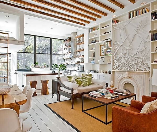
Lastly this week, it’s Traci French with Bliss. And it’s a blissful read. There’s plenty of interiors inspiration to keep you going on here, and even more so since Traci started remodelling her own home. She’s got an engaging writing style and shares the discoveries of her wandering eye with fabulous photographs. Traci’s weekly ‘I heart…’ posts are great for virtual window-shopping and she’s always got a new designer/architect/artist up her sleeve; a blissful blog indeed.
As always, get in touch if you want us to feature your blog next time round.
Trend Watch: Animal Prints
Less is most definitely more when letting animal prints loose in your home.
Interior designers have answered the call of the wild and animal prints are a fierce trend for 2010. Prowling the catwalks for some time, leopard, zebra and tiger prints show no signs of fading from view; in fact it’s looking more like a stampede. But there’s a fine line between style and sleaze. Allowed to run riot, a profusion of animal prints will have your living room looking like Peter Stringfellow’s bachelor pad. So tame the beast and introduce these graphic prints as accent pieces to add visual drama and dynamism to your space, without swamping it. A monochrome zebra print rug in a whitewashed room makes a sophisticated statement; leave it to speak for itself.
The sensual appeal of animal prints in texture, colour and pattern is what makes these pieces work in the home as striking accents. Engage the senses with different textural effects and team animal print accents with simple furnishings and block colour. Used in small doses, the graphic patterning of animal furs and skins in their natural colourings will lend an air of luxury and elegance to your scheme, while animal prints in bright colours make a playful addition to a plain interior. From wallpaper to ottomans, accessories and soft furnishings, almost any interiors product you can imagine has had the animal print treatment this season, and designers have introduced giraffe print to the usual mix of zebra, leopard, cheetah and tiger. As long as you go for only one or two pieces per room, you won’t get bitten.
Transcending fashion, cowhide floor coverings have timeless appeal, adding textural interest, visual impact and a sense of understated luxury to both period and modern room settings. No two hides have the same patterning meaning you have a unique piece and an investment to treasure. Used on the floor, draped across the back of a sofa or over a bed, cowhides are versatile and extremely hardwearing: a stylish and sustainable approach to the animal print trend. Combining an exotic animal print with the enduring elegance of monochrome, zebra printed cowhides are a stylish choice. Used in isolation, cowhide footstools, ottomans and cushions add just a touch of animal print to a room without overpowering it. London Cows has a small giraffe print cowhide footstool that’d be perfect in an otherwise understated scheme. Sweetpea & Willow’s Corbusier-inspired cowhide Rodeo Recliner in brown and white, and Hide Armchair in black and white are great choices for simple modern settings.
But you don’t have to go for the real thing to create an elegant look with animal prints. Occa Home’s Zebra cushion in soft velvet is available in beige and cream, brown and black or grey and black. The restrained colour palette and bold print creates an impression of understated glamour. Pair with a plain block-coloured sofa and other cushions with textural detailing in varying sizes. In a simple colour palette of grey and silver (zebra) and gold and silver (leopard), the Aura sequin cushion range from Heal’s is another clever balancing act. Catching the light with a subtle shimmer these cushions are perfect paired with white bed linen. Depicting a cheetah lounging amid oversized and stylised foliage, the Sininen wall hanging from Sheerhome is a great alternative to animal print soft furnishings and looks fabulous against off-white walls. At nearly a metre square it’s a high-impact piece, but the muted colourings of browns, creams and greens on a black background make it a stylish and sophisticated way to introduce animal print to your scheme.
The striking graphic qualities of animal prints, especially in monochrome, have enduring appeal for designers. Chosen carefully, animal prints will engage the senses and bring energy and elegance to your home.
Buyers Guide: Lighting
Bring a spectrum of light into your home with everything from traditional table lamps to contemporary feature lighting.
When it comes to lighting there are plenty of choices to suit every budget and style. The most successfully lit homes have a combination of practical and atmospheric light. Choosing your lighting doesn’t have to be a chore because there are many styles and designs to use in the home.
Table lamps
Table lamps are a traditional and reliable form of lighting that can serve decorative as well as practical purposes. Graham and Green supply table lighting to suit all types of interior style, for example if you want to give your home office a retro look try the Task Table lamp which is made from chromed metal and inspired by an early 1930’s design. Or choose the colourful Slant table lamps which are a fun and quirky idea for a children’s bedroom. Lamps provide a softer, less intense light in your bedroom or living area which creates a relaxing mood. The Paris Antique table lamp from Puji has a gorgeous green glass base which gives it a natural beauty that would bring a subtle yet elegant look to any modern living room.
Floor lamps
Floor lamps offer the perfect way to brighten up a gloomy corner or alcove. Usually slim and tall, this option is perfect for those who are short of space. From antique brass to modern metal bases, floor lamps or standard lamps as they are also known are available in a variety of designs. The Scala Floor Lamp from Brissi will surely make a statement in both contemporary and traditional interiors and you can choose from a variety of lampshades including a pale grey and damask print. Alternatively, an arched floor lamp is extremely versatile because its curved arm can be adjusted to illuminate different parts of a room, and they also come in many different shapes and sizes. The Belleville arch floor lamp is an example of how these types of lamps can be simply used to fill an empty corner or they can be positioned over a bed or a chair to provide excellent task lighting. Place two matching floor lamps on either side of a bed or sofa to complete the look of your room.
Pendants & ceiling lights
Pendant lighting looks great in dining areas and if you have an open plan living area you can use a row of pendants to separate two rooms. Create this effect with Kathleen Hill’s Star Light from Rockett St George (available from Furnish). Pendants are also great for kitchen islands. in hallways or above desks because they can be combined with other types of lighting. The Victo 4250 lights are like hanging pieces of art designed by interior architect Seppo Koho; these would create a perfect romantic ambience in any bedroom.
Chandeliers are best placed in an extravagant hallway or above a dining table because they are the ultimate statement of grandeur and magnificence to leave your guests in awe. They do not provide a huge amount of light however so it’s wise to invest in other lighting too. The Round crystal chandelier from Sweetpea & Willow has an array of crystals that will reflect glimmering light around your room. Or for a fantastic range of elegant crystal chandeliers check out the Chandelier and Mirror Company.
Bathroom lighting
The bathroom is probably one of the last places you think of when deciding on lighting for your home, but we all spend enough time in the bathroom to realise that it is important to get the right balance of light and to ensure that it’s safe too. Mirror lighting needs to be flattering so go for something bright but not glaring; most vanity fixtures are linear so go for something like the Padova light from Heal’s is ideal when placed on the wall above your mirror. A ceiling fixture in your bathroom will provide you will general lighting for the whole room, but for setting a relaxing ambience to enjoy your soak in the bath try the ultra-modern Arezzo light, also from Heal’s, to give the impression of gentle candle light.
Lighting design
The current climate has given lighting design the challenge to create something that is both stylish and eco-friendly. By 2011 traditional bulbs are going to be replaced by compact florescent lamps (CFL’s) most commonly known as energy-saving bulbs. These will screw into standard lamp sockets and the benefits are that they can be applied nearly anywhere that incandescent lights are used. Use specific dimmable CFL’s for lights that use a dimmer switch; using a regular CFL with a dimmer can shorten the bulbs lifespan.
As always interior design is all about being unique and we all want to see something that’s a bit different; I love the Jeeves & Woosters pendant lights from Graham & Green that are based on iconic British hats because they mix traditional designs and give them a new, fresh look. Or for a design completely driven by its eco-credentials, the eccentric Sticky Lamp by Droog from Leigh Harmer can be stuck to doors, walls or ceilings for an innovative way of lighting a room.
Choosing bulbs
Incandescent bulbs are commonly used in lamps and other types of lighting because they are inexpensive; widely available, and they are great for ambience lighting. Halogen bulbs emit an extremely bright light which makes them perfect for spots and downlights, and they are best used for task lighting. They are brighter and longer lasting than incandescent bulbs; however they produce a lot more heat so it’s recommended that you keep them away from curtains.
For a selection of different types of bulbs to suit your needs go to B&Q (www.diy.com). And for more information and advice on the choosing the right bulbs have a look at www.doityourself.com.
We hope this guide has shed some light on where to start with choosing the right lighting for you and your home.
Our weekly pick of interiors blogs… Jul 13th
Another week, another three great blogs.
First up is interior designer Brooke Giannetti’s Velvet & Linen. Brooke owns Giannetti Home, a treasure trove of a shop stuffed with vintage pieces and architectural antiques. The main reason I love this blog is looking at the photos of her amazing finds and how they’re displayed. Brooke’s got a roving eye and real flair for interesting vintage and antique pieces, which she uses in her interior design projects. Not only that, she has a descriptive talent for writing about the pieces she loves. A feast for the eyes, this blog’s a constant source of inspiration and style ideas.
Despite the name, My Notting Hill is actually brought to you from Washington DC (which I was pleased to find out because I’m afflicted by an irrational loathing of West London). This blogger is happy for you tag along on her shopping trips and these are some of my favourite posts because it’s window-shopping without the fear of spending. Most of the photographs on here are hers, which makes the blog intriguing and personal. As you follow vicariously in her footsteps, you’ll be peeking at hotel rooms, interiors shops, and her own and her friends’ homes; just the thing for nosy parkers like me.
Finally this week, a flying visit to Canada to stop off in Vancouver with interior designer Patricia Grey. Patricia Grey Inc is an insider’s guide to what’s hot in the world of interior design. It’s fabulous blog, covering colour trends, great new products, decorating ideas, interviews, and interesting design books. The writing and the photographs are great, and there’s always something interesting on here whether you’re looking for advice or inspiration. But steer clear of the post on Patricia’s holiday in Mexico; it’s enough to make you sick with envy.
Again and as always, get in touch if you’d like us to feature your blog next time.
10 ways with…Paint
Revamp your décor with a splash of paint.
The surface preparation might be a bore, but in this weather you won’t be watching it dry for long. There are few things more satisfying than a freshly painted room, but with our 10 ways, there are plenty more options with paint. Time to get the overalls out.
1. Feature Wall
A feature wall is a great paint option, particularly if you want to go for bold colour. It’ll lift the room, add drama and create a natural focal point. Use a paler shade of the same colour on the other walls, or complementary wallpaper, to make sure your scheme ties together. Accent walls are particularly appropriate in modern homes and open plan spaces. Use the feature wall to zone your space, for example if your dining room flows into your living room. An accent wall will add life to a stairwell and a sense of drama used behind the bed. Colour-blocking is also a huge trend at the moment in both fashion and interiors. Get the look at home with a bold feature wall teamed with accessories in the same colour or sofas and chairs in a contrasting block colour.
2. Painting Furniture
As long as it’s not a 20th century icon, a beautiful 17th century cabinet or some such wondrous antique, painting furniture can be a great way to revive an old piece or change it to fit in with a new decorative scheme. And if you’re into the shabby chic, relaxed coastal look, then this could be the thing for you. Equally a flea-market find might be brought into the 21st century with a splash of shocking pink gloss. Painting furniture for kids’ rooms, and getting them involved, is a great way to add personality to their rooms. Think about where you want the piece to go and have some fun with it. If the piece has been painted before, sand off old or flaking paint, going with the grain of the wood. If it’s unpainted, use a knotting solution to seal any knots and apply a wood primer. For your topcoat, a water-based acrylic paint is less messy, environmentally friendly, and available in matt, gloss and eggshell finishes.
3. Blackboard Paint
Blackboard paint is now widely available and it’s a playful, versatile medium. Use it in the kitchen for shopping lists, the hallway for reminders, home offices for to-do lists, or kids’ rooms just for fun. Magnetic blackboard paint allows you to add photographs, postcards or anything else that takes your fancy. Blackboard paint adds personality and dynamism to a space, with scrawls and doodles providing an evolving record of family life. Make a bold statement in a light-filled kitchen or studio workspace with an entire wall in blackboard paint, or use it in small doses in panels or on cupboards and drawers to mark the contents. IIf your child’s room is on the small side, blackboard paint looks wonderful on toy boxes or painted in cloud shapes on the wall with bright blue raindrops and a sun peeping out of the top.
4. Floor Paint
Make a feature of your floorboards with paint. The Little Greene Paint Company has beautiful soft sheen floor paint in the full range of colours, from neutrals to brights and everything in between. Farrow & Ball has eggshell finish floor paint, also available in the complete colour range. Painting the floor will transform your room, so it’s important to think carefully about the colour, taking into account the amount of light in the room, and use tester pots. Durable and hardwearing, floor paint is suitable for almost anywhere in the house, and can be a great way to brighten up kids’ bedrooms, hallways and kitchens.
5. Stencils
Stencils have moved on from the sponged horrors of the 90s. But, that being said, there’s a fine line between style and vile when it comes to using and choosing stencils. A great way to create a focal point, or a feature wall, it’s best to use stencils as accents. For kids’ rooms they’re great fun, especially to jazz up furniture and toy boxes. The Stencil Library has a huge range to choose from, including Alice in Wonderland, character stencils for children, animal prints, Art Deco patterns, and classical architectural motifs. The Stencil Studio also has a useful ‘How To’ guide, and even stocks Banksy-style stencils, if you want to jump on that bandwagon.
6. Combining Matt and Gloss finishes
Combining a chalky matt paint on the walls with a high gloss for skirting and windows creates a crisp finish. Whichever colour you choose for the walls ensure that the gloss trim colour provides enough of a contrast. With rich wall colours a creamier trim colour, rather than bright white, will be more flattering. If you want to go for a coloured trim, rather than a neutral, choose a lighter or darker shade of the same colour as the walls, to create contrast. For a really dramatic effect, use full gloss on the walls or ceiling, using a matt finish for the trim.
7. Painting Tiles
Painting over tired or nasty looking tiles is a good way to revive your bathroom or kitchen on a tight budget. Any painting job requires surface preparation, but with tiles this is absolutely crucial. The surface must be spotlessly clean in order for the paint to adhere properly. Wash the tiles with sugar soap and rinse clean to remove any residue. Use a hand-held orbital sander with fine grit paper to lightly scuff the tile glaze and wash again to remove dust. A primer such as Ronseal’s One Coat Tile Primer will prevent the topcoat paint from pealing. When applying paint, use a small gloss roller to avoid brush marks and apply several thin coats to build up adhesion in layers. Specialist tile paint is available in a limited colour range, but any latex or oil based paint is suitable for the job.
8. Using Tester Pots on Canvases
Create art that fits in with your room scheme using tester pots on canvases. Having no artistic skill, I think I’d stick to letting the kids do it. Messing around with a few pots of paint and a canvas sounds like fun, but it can be a hit and miss affair when it comes to interior design. Short of taking an Art Foundation course, there are two options for the artistically challenged. Spontaneous and simple figurative pictures can add a lively element to a room. But abstract work is more forgiving. For example, Rothko-esque fields of colour, or Pollock-style splatters, painted on several canvases can look great in a drab hallway or open plan space.
9. Paint Effects
With a roll of low-tack masking tape you can create all sorts of geometric patterns with paint. Use vertical stripes to give the illusion of higher ceilings or horizontal stripes to add width. For a subtle stripe, use two different tones of the same colour, or make a bold statement with two or more contrasting colours in varying widths. Creating a pattern with paint is a great way to create a feature wall behind your bed, brighten up a playroom or add some drama to a hallway. Whatever pattern you want to go for, and especially with spots and circles, mark it out in pencil first. With stripes, use a spirit level to make sure your lines are straight.
10. Revamping Garden Furniture
Revive a rusty patio set or a tired wooden bench with paint. With metal furniture, wash down with hot soapy water and remove any rust or flaking paint with a wire brush and coarse sandpaper. Use an anti-rust primer and paint, such as Plasti-Kote’s Metal Primer and Super Spray Paint. Really easy to apply, Super Spray Paint is available in a huge range of colours. For wooden furniture, sand the item along the grain until smooth and then use a primer, such as Cuprinol’s clear Wood Preserver. Cuprinol’s Garden Shades and Ronseal’s Woodland Trust Colours will give tired wood a new lease of life.
Get your overalls on and have some fun with paint.
Trend watch: Stripes
Earn your stripes with a contemporary and chic take on a classic style.
Whether you are looking to update your wardrobe or your décor, it seems that fashion and interior designers simply cannot resist the reliable, classic style of stripes. Catwalk fashion has been dominated by Parisian chic whilst interior design has been inspired by this geometric print for fabrics, carpets, wallpaper and furniture.
Wallpaper
Use stripes on your wall to enhance the shape and size of your room; horizontal stripes running along the midpoint of a wall extend and elongate a smaller room, and lighter cooler tones will make a space seem larger. Hang Stripey Wallpaper from Flock Your Wall or Gradient Wallpaper from Graham and Brown vertically or horizontally to give a contemporary look to any room. Using vertical stripes in moderation will make a low ceiling feel higher; an overload of pattern will crowd a room therefore making it seem more enclosed. A feature wall behind a bed or surrounding a fireplace, for example, will help break up the pattern. Laurence Llewellyn-Bowen’s Mosaic Stripe from Graham and Brown, interprets stripes in a unique way that adds interest to the design.
Painting stripes are a simple design that will add depth and interest, but you will need to do a bit of preparation in terms of measuring and taping to get your stripes aligned. For helpful hints and tips try doityourself.com.
Flooring
Put a bounce in your step with soft and luxurious stripy carpet; if you are carpeting all over then you can elongate a room and create a vibrant look. Try the Mississippi or Tiffany collections in 100% wool from Crucial Trading for comfort and durability. Jazz up your stairs with a vertical stripe runner that will draw your eye. Brintons offer many stylish runners that will work brilliantly on hardwood stair floorings, and it will also help draw the eye into your home. Paul Smith has inspired and popularised stripes in interiors; his Stripe rug from The Rug Company combines striking colour and texture to really liven up a room.
Furniture
Stripes are best used in moderation so if you choose to make your furniture a feature in your room then avoid stripes on your walls, instead you can use subtle accessorise to repeat the pattern elsewhere. For a stripy feature piece try the Vertical Stripe Chest of Drawers from Bassett which is given a contemporary and chic look with its bold black and fruitwood stripes on cherry veneer. The Hampton velvet stripe chair from Sheer Home has a stripy fabric that comes in a choice of five colourways to suit your colour scheme. Or to add a nautical touch to your child’s bedroom use the Small Blue Striped Chair Wisteria which would be perfect for a sailor theme.
If you want to update your furnishings and bring some Parisian chic into your home, then you can choose from a selection of Striped fabrics from Tinsmiths or check out Ian Mankin’s natural and organic fabrics, which are all ideal for upholstering.
Accessories
Upholstery, cushions and throws can be updated with a simple stripe. The classic pinstripe doesn’t just look great on suits; in fact it can achieve a suave, masculine look and it will bring clean, straight lines to a bedroom. The Woven Linen Stripe Bed Linen has a fresh, nautical feel with its pure whites and deep blue tones. For a more feminine touch, mix in some florals to give a warm and playful style. Or try Frilled Edge Cushions from Graham and Green to add some summer style to your garden or dining chairs or your sofa. The Catrine Stripe tablecloth from Sally Bourne Interiors use multi-coloured stripes which will allow you to introduce lots of colour into your living or dining area.
Bring out the best of the playful and optimistic feel of stripes by using rainbow colours.
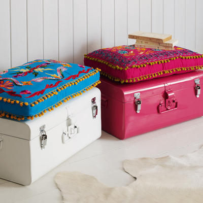
Colourful Metal Storage Trunks from Graham & Green
Jazz up your storage with these colourful trunks from Graham & Green. £119
I've made no secret about just how much I love everything Graham & Green do. If money were no object, I would grab my purse and shopping list and hot foot it to their nearest store to buy the lot.
Lucky for you lot, Graham & Green are having an amazing summer sale and we have got the inside info.
Top of my wish list is a couple of these fabulous metal storage trunks.
Available in Hot Pink or White, they are big enough without being intrusive and are super stylish too. But that's not all, oh no. They also come complete with a folk-inspired seat cushion (surely one of the hottest trends around) which turns them into a comfy seat.
Use them anywhere from bedroom to home office to stash away unsightly belongings and your home will soon be clutter free.
Focus On: Selina Rose
Introducing the hottest designers of the moment.
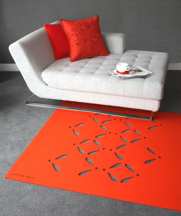
Designer-maker Selina Rose creates fashion-forward textiles, homewares and bespoke surfaces using renewable and biodegradable wool felt: ‘If I were to sum up my style I would describe it as bold, colourful, tactile, natural, simple yet sophisticated.’ Turning heads in the international design world, Selina’s received a raft of awards and nominations including the Arts Council’s grant for the arts, Homes and Gardens Classic Design awards in 2007 and Craft Central’s Bright Ideas award in 2008. Launching an exclusive collection for Heal’s in 2009, you can find Selina’s felt furnishings at www.selinarose.co.uk.
A fresh approach to a familiar material, Selina’s innovative cutwork designs harness new technology while referencing natural forms and architectural geometries. These highly original, beguiling surfaces are suitable for a multitude of interior applications including rugs, throws and runners, acoustic wall panels, window treatments, room dividers, lighting and upholstery. Manufactured entirely in the UK, Selina’s high-impact designs are coloured using environmentally friendly dyes in her own distinctive colour palette of rich jewel tones and vivid brights, paired with soft pastels, greys and black. Breaking away from traditional woven textiles, these pierced felt surfaces create a visually striking, modern aesthetic celebrating the timeless appeal of plant forms, geometric motifs and meticulous craft. Visual drama in colour and pattern is united with the enticing tactility of cut and folded felt. Rugs, throws and table runners feature poetic botanical patterns, such as the enchanting rose petal and foliate Bloom design. Contemporary felt room dividers and window panels allow light to pass through the intricate cutwork creating a play of shadows and animating interior space.
New for 2010, Selina’s Connect panels feature layers of contrasting coloured felt with circular incisions revealing a geometric grid pattern of colourful dots. A unique interpretation of the colour-blocking trend in interior design, Connect demonstrates Selina’s innovative fashion-conscious approach. Another new addition, the stylised Oli pattern is inspired by the winged propeller-like structure of sycamore seedpods. Combining both botanical and geometric forms in one textile, the Oli design exemplifies Selina’s simple yet sophisticated aesthetic. This new cutwork pattern features on rugs, throws and coordinating coasters in a choice of 14 vibrant colours. The hugely popular Flutterby cushions are also given a 2010 makeover in three additional colourways: lime, hot pink and orange. Partial cuts are made in the top layer of felt, folded to reveal a contrasting coloured felt behind and creating a three-dimensional textured surface. The same origami-inspired Cut + Fold technique is used on Selina’s fabulous Scale stool, a statement piece reminiscent of Christopher Kane’s Spring-Summer 2009 catwalk collection, which secured his rising-star status in the world of fashion. Made to order in your chosen colourway, the semi-circular scales fan out around the stool to reveal the layer of felt beneath.
Best known for her botanical cutwork rugs, throws and runners, this exceptional Cut + Fold technique has elevated Selina’s felt surfaces to a new level of design innovation.
‘My ‘Cut + Fold’ range of felt surfaces can be used for acoustic paneling, blinds, screens, room dividers and upholstery. I wanted to create something new and innovative for the contract interiors market. Following on from the success of my cut-out, fretwork style felt designs I was experimenting in the studio with concepts inspired by traditional origami. I wanted to create a 3 dimensional surface using the felt playing on its paper-like qualities, for example the way it cuts without fraying, you can fold, pleat and manipulate it into shape. I developed a technique of making partial cuts into the surface and folding shapes back to create advent calendar style flaps or windows revealing contrasting coloured felts behind. I launched the collection at 100% Design 2009 and it was really well received and designs such as Scale, Faceted and Flutterby now adorn the walls and windows of luxury hotels, offices and residential interiors.’
The Cut + Fold technique caught the eye of international design and engineering firm Arup, which commissioned Selina to create bespoke acoustic felt panelling and window treatments for its new London Headquarters in Fitzrovia. The architectural qualities of Selina’s Cut + Fold surfaces are a perfect match for this innovative design firm, leading the field in structural engineering since its Modernist projects of the 1930s. Across 200 linear metres, spanning two buildings and 17 rooms, Selina produced 150 bespoke Cut + Fold panels in her geometric Faceted, Arrows and Scale designs, featuring grey on blue and grey on yellow felt layers. Functional, tactile and visually interesting, the acoustic panels absorb and reduce reverberant noise, making them ideal for music rooms, studios and playrooms at home.
Including the Scale stool and Cut + Fold felts, Selina’s new collection will be on show at 100% Design in Earls Court Arena, 23rd-26th September 2010, stand H12. Visit www.selinarose.co.uk for more information on bespoke services and to buy online.

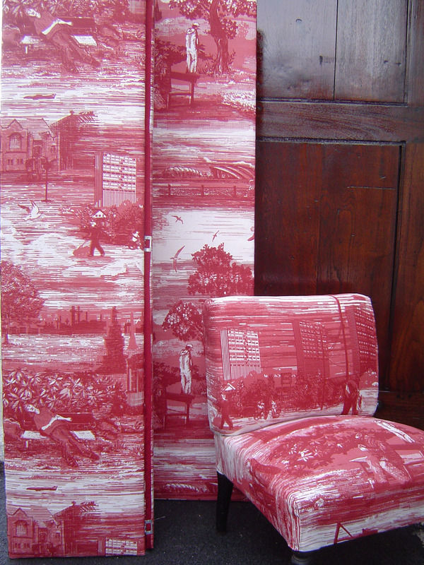
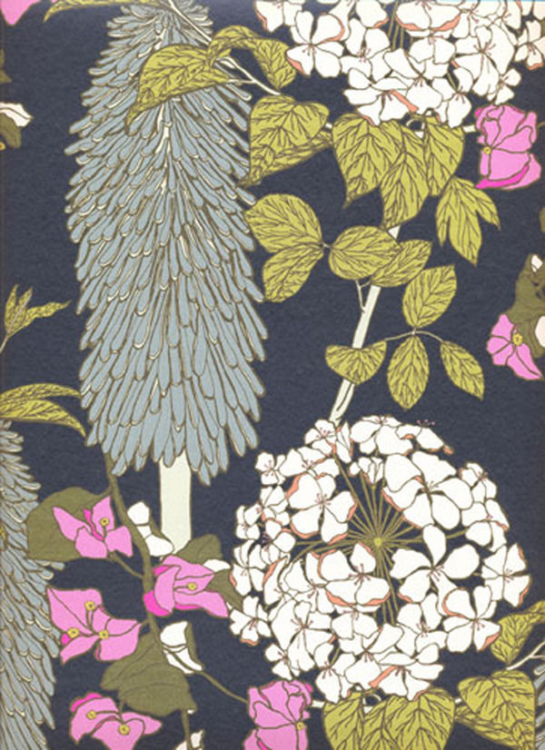
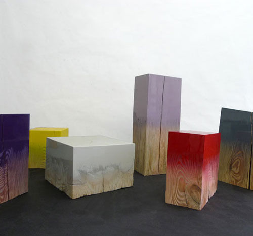
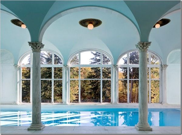
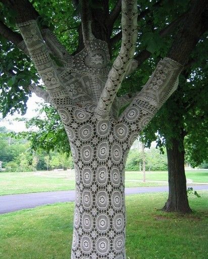
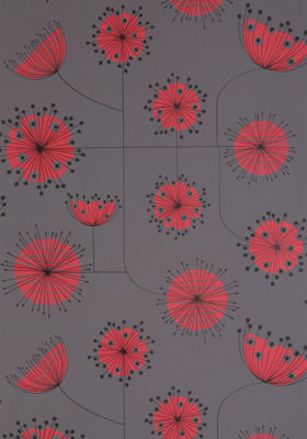
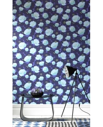
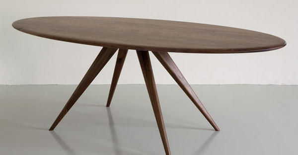
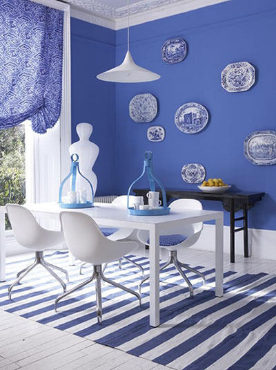
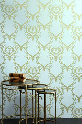
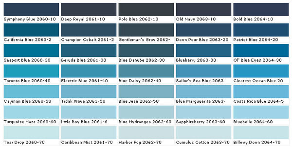
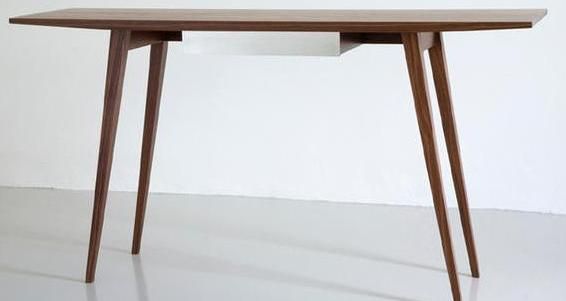
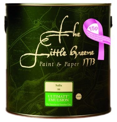
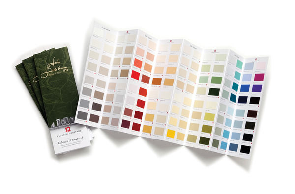
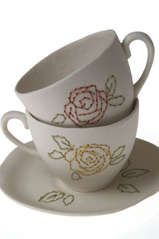
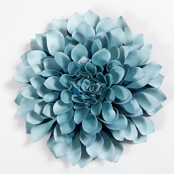
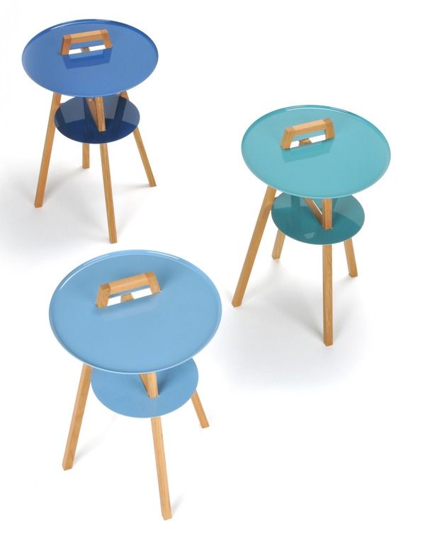
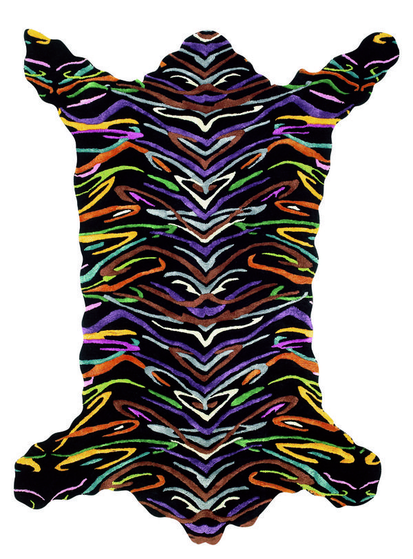
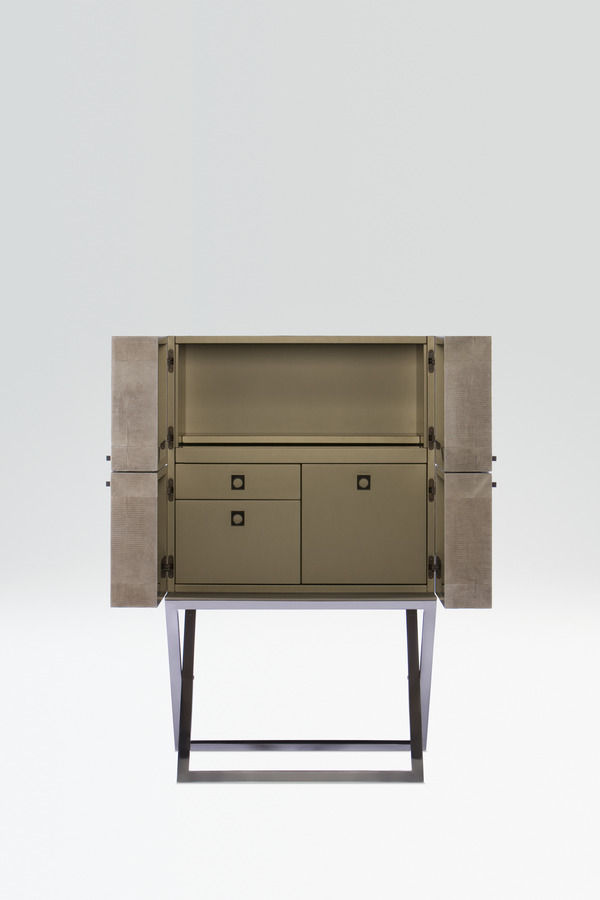


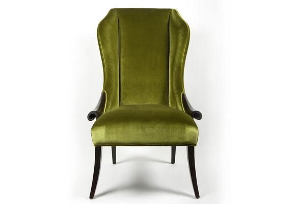
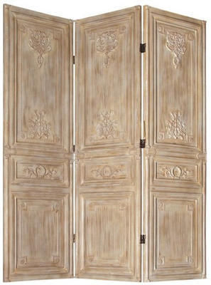
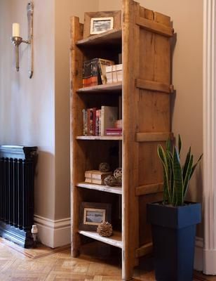
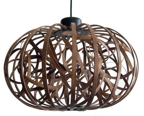


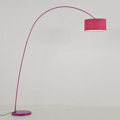
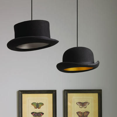
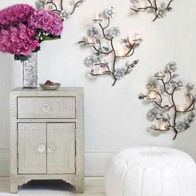
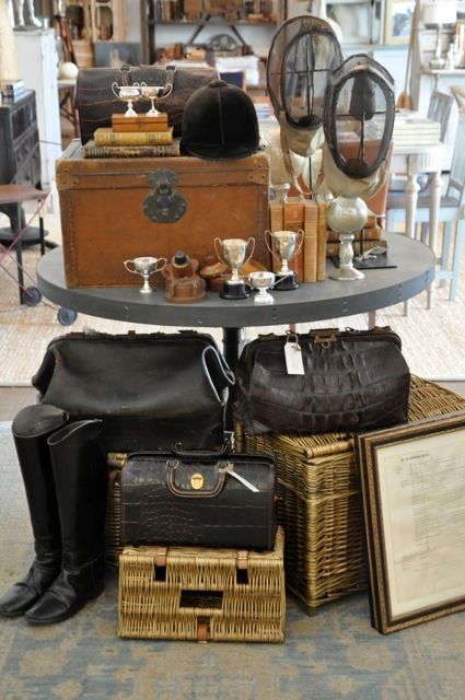
![International One Coat Blackboard Paint, £9.99 for 750ml, Homebase [www.homebase.co.uk] office accessory](/photos/articles/regular/office-accessories/office-accessories-3871.jpg)
![Eco Floor Paint in Down Pipe No.26, from £19.50 for 750ml, Farrow & Ball [www.farrow-ball.com] furnish](/photos/articles/regular/furnish/furnish-3872.jpg)

