Features: Living
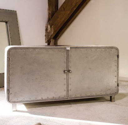
Chloe Metal Sideboard from Love Your Home For Less
Add a touch of industrial chic to your space with this Chloe Metal Sideboard from Love Your Home For Less. £595
I absolutely adore sideboards and while you’d struggle to part me from my 60s G Plan beauty, you might just about be able to convince me with this little gem from Love Your Home For Less.
The Chloe Metal Sideboard offers the perfect way to tap into the industrial trend without making your interior look too austere.
Made from distressed metal, I adore its retro shape and simple styling.
The generous size means it’s big enough to stash away all your stuff and will become a truly useful piece of furniture.
Try using in the dining room to stash crockery and table linen or your living room for magazines and other bits and bobs you want to keep out of sight.
* Unfortunately, this item is no longer available, however, this Rivet Industrial Metal Sideboard would make a great alternative.
Living with White
Forget the bland and clinical; make white work for you with our guide to Living with White.
A monochrome white palette provides ample opportunity to experiment with pattern and texture. We show you how to transform even the smallest rooms by maximising the space enhancing, calming and, believe it or not, cosy properties of white. Best of all white can suit almost any taste or space, from white-on-white minimalism to a whitewashed New England-style. Each texture absorbs light differently creating a wealth of different tones with minimal effort.
White furniture
White furniture needn’t be impractical. Many design classics are at their most versatile in white, such as Vitra’s Eames Daw plastic armchair. Similarly, taken out of their industrial context and softened with white, filing cabinets can become practical, contemporary storage for a study space.
For a more vintage appearance, try antique-style furniture in white. The soft lines of this Willows White Scroll Bed from Sweetpea and Willow, combined with a soft grey headboard prevent any possibility of a stark or clinical appearance. Finish the look with a mismatched white console table for a not-too-polished but distinctly French appeal White bookshelves make fantastic foils for the potentially clinical nature of white. Filled with books of varied textures and colours, a white bookshelf will allow the book spines to become a work of art in their own right.
Wallpaper
White wallpapers are perfect for adding subtle texture and pattern to walls. If you don’t have your own extensive library, or have perhaps ‘gone digital’ in pursuit of minimalism, consider a feature wall using an unconventional but understated wallpaper, such as the Vintage Bookshelf wallpaper by Y & B from BODIE and FOU, providing interest whilst still maximising a sense of space and light.
Paint
Choosing the right white for paint colours is all-important, colours with a yellow or grey undertone will appear warmer, slightly aged, and not as harsh, whereas whites described as crisp or brilliant are likely to have an icy blue undertone. Alongside your choice of shade, consider how the paint’s finish will diffuse light. Matte paints will appear softer, whilst gloss can add a sleek contemporary feel. Similarly Farrow & Ball has a fantastic selection of heritage white paints with a low sheen to flatter most rooms. Their paint named James White #2010 is a soothing off-white with a subtle green undertone, which would complement a modern bedroom.
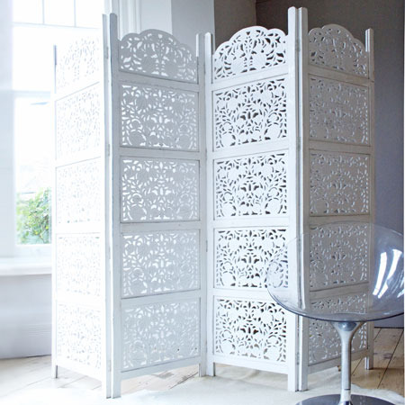
If you can’t or would rather not paint your walls, try introducing large areas of white through moveable furniture, such as this hand carved wooden decorative screen from Graham & Green.
Flooring
If you are lucky enough to have intact exposed floorboards painting them white makes for an economically sound and easily maintainable décor decision. Try Farrow & Ball’s floor paint in Pointing, a warm white named after the lime pointing of traditional brickwork. Alternatively utilise the undertones of white walls to match textured carpets in shades of grey and off-white, or consider pale wood flooring such as Ash.
Accessories
Predominantly white colour schemes are the perfect canvas for striking coloured accessories. However we think the scheme has perhaps the most impact when varying the texture rather than the colour of your accessories: think white ceramics, enamels, linens, baskets, leather and papers.
Make a bold but unfussy statement with a modern and dramatic pendant light in white. Alternatively white looks striking against dark wood but for a softer, Scandinavian look consider paler woods such as birch or ash like Heal’s stunning White Ash Veneer Lampshade.
Take the edge of a minimalist white look with quirky touches, such as these white rabbit coat hooks.
White kitchen appliances make a refreshing change from black or stainless steel and can often be found in softer off-white and cream shades. Likewise off-white enamel tableware lends a lived in vintage feel. The combination of wood and matte ceramic of these Square Ceramic storage jars from Occa Home create a modern but soft look.
Textiles
Whilst a white rug may not be the most practical choice for areas of heavy traffic in the home, you don’t have to banish white textiles. Consider layering a design classic white plastic or wire chair with a fluffy sheepskin for added texture and comfort. Alternatively, adorn sofas and beds with a generous quantity of throws and cushions in varying shades and textures for a lived-in feel. Our favourites are the Cream Wool Throw and Felt Petal Cushion, both from Primrose & Plum.
Diaphanous curtains, such as John Lewis’s Plain Slot Voile panels, provide an almost ethereal diffusion of light. Maintain a sense of serenity without forgoing practicality in the bedroom with simple white blackout blinds.
So, why not make the most of the decidedly sunnier rays (finally!) creeping through the windows by brightening up your décor with white?
Focus on Pattern: Checks
Think outside the box with our guide to how checks can work in your home
From gingham to tartan, checks are one of the most versatile ways of bringing pattern into your home. Whether you’re looking for a pop of pattern with a checked cushion or bed cover, or for the bold impact of a checked floor or statement piece of furniture, we’ve got everything covered in this guide on how to make checks work for you.
Furniture
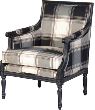
Checked furniture often works well as an isolated statement piece set amongst plainer items of furniture. This stunning checked armchair from Sweetpea and Willow uses a classic check and elegant mahogany finish, for a quintessentially English feel.
For a more contemporary take on checked furniture, this bedside table from Coco Male uses a simple linear checked door to add interest to the simple white design.
Flooring
A vibrant doormat is a cost effective way of injecting pattern into your interiors, as well as providing an eye catching entrance to your home. This multi-coloured doormat from Heal’s is perfect for making a technicolour statement.
Similarly, rugs are a great way of trying out a new style without having to completely redecorate. This sisal rug from OKA, is great for bringing pattern to your floors without the bold splash of colour. The soft colour, and gentle square pattern is sure to blend seamlessly into any room. Contrastingly, this bright pink gingham rug from Great Little Trading Company would look lovely in a little girl’s bedroom or a child’s playroom.
One of the most classic examples of checked flooring has to be the black and white checkerboard tiles, often seen in the bathrooms or kitchens of period townhouses. You can buy tiles individually in your chosen colours to tile the floor yourself or, alternatively, there are plenty of checkerboard lino’s available in home interior stores. If you are after a timeless marble finish, then check out these checkerboard tiles available from Living House.
Wallpaper
Heavily patterned wallpaper is perfect for making an impact but can often be overpowering in the home. When going for checked patterns, it often works well to choose one statement wall to paper and then go for a plain but complementary colour on the surrounding walls.
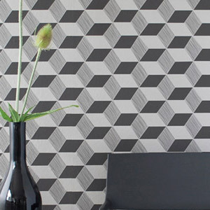
Inspired by checks, this
Fabric
Checked fabric looks gorgeous as bed linen or curtains, and there are plenty of options to choose from at the moment. This check bed linen from Heal’s uses a modern check, with warm tones of plum and pistachio, for a crisp contemporary feel.
If you prefer your checks to be more traditional, then this tartan throw from Occa Home will provide some comforting warmth on chilly evenings; being made from 100% lambswool means it’s extra cosy!
Gingham is another traditionally popular choice of checks, and this gorgeous tablecloth from The Contemporary Home has a lovely large gingham check in a practical grey colour, with a white ric rac trim for a cute finish.
Accessories
Accessories are the place to really experiment with pattern and colour! This cute dog door stop from John Lewis is made from a vibrant tartan material; adding a homely touch to your doorway.
If your little ones are known to leave a trail of disaster behind them, this gingham bed tidy from Great Little Trading Company, available in navy or pink, is perfect for hiding away their bits and bobs as well as adding some colour to their bed frame.
For just a pop of colour, why not try a colourful lampshade. This yellow gingham shade from Hunkydory Home will add some sunshine to your room on even the most dull days! Or use this blue gingham jug from The Contemporary Home as a quirky way of displaying fresh flowers.
Checks work well in every home, and come in a great array of styles to suit all tastes. Try traditional tartan to create a warm and cosy space, or girly gingham for the ultimate shabby chic palace. For those of you that might be wary of pattern in the home, try adding a few checked accessories for a nod to the style, or try out a statement wall for a bolder interior! No matter what your taste, checks are incredibly versatile so have fun experimenting!
Buyer's guide to Blinds
We've put together a handy guide fulll of the best blinds for your home
Blinds provide a great modern alternative to curtains, and look just as great in the kitchen or bathroom as they do in the living room; making a bold feature of an otherwise dull window. We’ve put together a selection of gorgeous blinds in styles to suite every home, in this handy buyer’s guide.
Roller Blinds
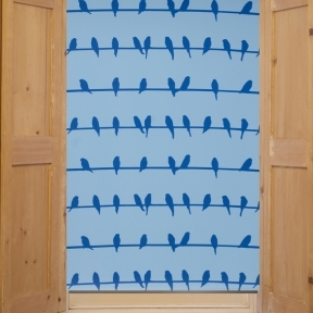
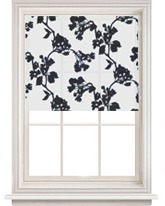
Roller blinds are one of the most popular window dressing options, are often the most economical choice. The blinds are made of a stiffened fabric that rolls up completely when open, allowing plenty of light into a room during the day. This stylish bird print roller blind from BODIE and FOU has a quirky design that would look great in a bathroom or kitchen. For a more classic look, this woodland roller blind from John Lewis, has a delicate leaf print that would suit a more neutral home.
Venetian blinds – wood
Venetian blinds add a contemporary finish to windows, and look great in an office or the rest of the home. Made from horizontal wooden slats, they provide a huge amount of light control. Most hardware shops and department stores offer a great selection; for a wide variety to choose from, in various colours and sizes, John Lewis is a great place to start. They offer wooden venetian blinds in a range of different colour finishes and widths, with prices starting from £35.
Venetian blinds – plastic
Plastic venetian blinds are great in kitchens and bathrooms due to their wipe clean surface. They are easy to find on the high street, with the majority of venetian blinds being made from either plastic, wood or aluminium. Companies like Keeleys Blinds are also a good option, as they offer a wide range of colours and materials in bespoke sizes; you can even request free samples so you can check the style in your room before you purchase.
Roman blinds
Roman blinds are made from soft fabric that hang flat when fully extended, but gather into pleats when raised for a beautifully luxurious way to frame your window. These gerbera print blinds from John Lewis are a lovely classic cream colour, with a bold floral print that would look great in a living room or bedroom.
Black out blinds
Blackout blinds are made from densely woven fabric, and are perfect for completely blocking out unwanted sunlight; a great idea for your bedroom, or for a child’s room in the summer months. This <a href=” http://furnish.co.uk/items/24873-botanica-readymade-white-blackout-roller-blind-range”>blackout roller blind from Heal’s has a stunning floral print that would look great in any room. Heal’s also offer a wide selection in plainer fabrics, for example this linen blackout blind which would be ideal for putting underneath curtains, if you want to limit the amount of light entering your home but prefer the look of drapes.
Picture blinds
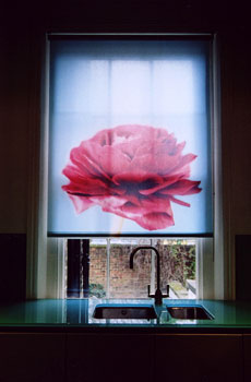
Picture blinds are a fantastic way of making a real feature of your windows, and make a funky alternative to wall art. This gorgeous Georgia blind from Elle Doran has a stunning print of a red peony flower, and would be perfect for brightening up a kitchen. Picture blinds are a great idea in small rooms when there is little wall space for hanging pictures or other images. This gorgeous forest print blind ,also from Elle Doran, would make an eye catching feature in any room; the serene image of the forest clearing creating a feeling of calm and space.
Before purchasing it is important to take accurate measurements of your window recess to make sure that your blinds will be able to fully extend, and that there is room for the operating mechanism that allows you to close and open your blinds. It is also important to measure outside of the window recess to decide how far you want the fabric of the blinds to extend on either side.
Blinds are certainly a great alternative to curtains, and with a wide selection of stylish and practical blinds to choose from in this guide you’re sure to find the perfect pair for making a bold statement in your home.
Easy Updates
Want to inject some life into your home without spending a fortune? Check out our brilliant guide to updating your interior without breaking the bank.
While you might be a little strapped for cash, it doesn’t have to mean you can’t give your home an update. With a little creativity and time, you can give your home a new look whilst still watching the purse strings. Have a look at our guide to see what you can do!
Painting a Piece of Furniture
We’ve all got a favourite piece of furniture. It’s been in the home for years – perhaps passed down from the older generation – and it’s been loved, enjoyed and, quite frankly, worn-out. But, parting with such treasured items, no matter how shabby, seems a bit heartless. Instead, why not infuse with a new lease of life with a little splash of paint? Plasti-Kote has a fantastic range of decorative spray paints that are easy to use and come in an amazing range of colours. Check out the fantastic Super Spray, available in three beautiful finishes – matt, gloss, and satin. Plasti-Kote paints can be used on most surfaces too, so it’s incredibly versatile, too; I treated myself to a can of Cameo Pink Satin to give a wooden chair I got from a flea-market a girlish makeover. The website also features a charming ‘Ideas Library’ for handy tips on rejuvenating tired furniture.
International Paints also stock a paint specifically developed for this type of mini interior-design project: the fantastic Furniture and Cupboard Paint. It comes in a range of beautiful muted colours with delicious names like ‘Mystical Mushroom’, ‘Lovely Olive’ and ‘Antique Cream’: the perfect paint for updating a home with a neutral colour-palette.
Adding Cushions and Throws
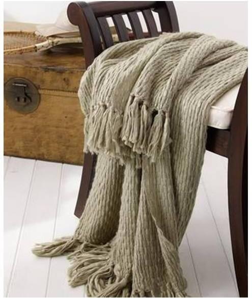
If you don’t want to part with your trusty old sofa or bed but feel that it’s looking a bit old-fashioned, you need some new cushions or throws (or both if you’re feeling particularly flush). A beautiful throw can cover a wealth of sins – wine spills, coffee stains, children’s hand-prints – for a fraction of the cost of replacing your furniture. But, beware: you might become so attached to your new throw that using the sofa/bed is banned. I adore the Missoni Home Erode Throw by Occa Home; the fusion of rustic Italian chic with bright stripes makes it a sure-fired contemporary classic. The Chunky Slub Throw from Lombok is perfect for something simpler but equally stylish (and its name is excellent, too). For something a bit cheaper, check out the excellent-value Cara Throws from John Lewis. In funky purple or classic navy, this lovely throw is wonderfully cosy – and an absolute bargain to boot.
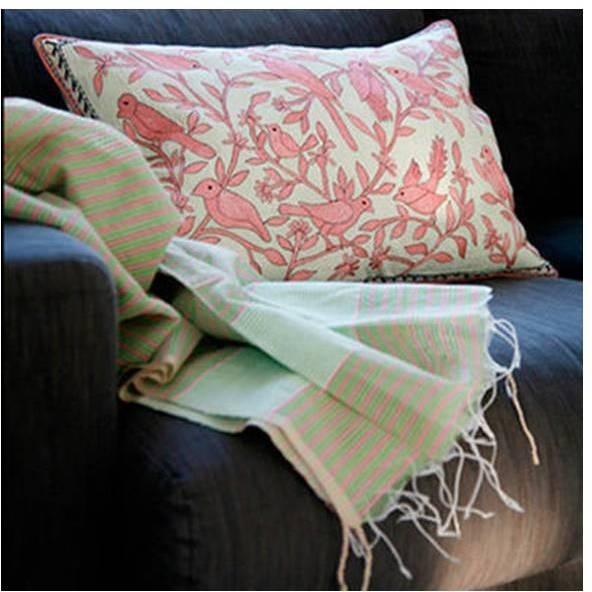
We’ve got an incredible range of cushions to suit all styles and cater to all tastes, too. For all pattern-lovers out there, have a peep at this delightful selection: the sweet Embroidered Bird Cushion from Coco Boat, the stunning Emperor Red Square Cushion from Sweetpea and Willow, and the beautiful Niki Jones Samakand Suzani Crimson Rectangular Cushion from Heal’s. If you’re after a stylish but simple cushion to update your home, the sumptuous Velvet Cushion from Lockwood Designs in soft green might be just the ticket. The Silk Velvet Cushions from Primrose and Plum have a similar feel, and a beautiful oil-in-a-puddle style shimmer to them, too. For something a little more quirky (but still simple), check out the sweet Button Cushion from Rose and Grey.
Using Wall-Stickers
Wall-stickers are having something of a renaissance at the moment, and it’s no wonder. They’re a superb and cheap way to add a quirky touch or focal point to a wall, without the laborious task of re-painting, and they usually come with a humorous edge, too. The fabulous Fashion Wall Sticker from 95% Danish has a great ‘cameo’ feel to it, and despite the fact that fashion changes faster than I can type, it’s a wall-sticker that will remain stylish for years to come. If you’re a true fashionista, this sticker is the one for you.
I love the wonderful Donkey Wall Sticker from Rockett St George – perfect for kids’ rooms. For designs that are a little more classic, check out the Branches Wall Sticker and Falling Leaves Wall Sticker, again by Rockett St George. I also adore the simply lovely Love Birds Wall Sticker from 95% Danish. I find looking at it makes me feel peaceful; it may have the same effect on your home.
Covering a Canvas with Fabric
Covering a canvas with a fabric is a great way to add a totally original touch to your home. You can buy a cheap artist’s canvas from http://www.artistsblankcanvas.co.uk, and use any leftover fabric you may have lurking in a cupboard. Or, why not chop up an old dress or pair of curtains to use, for an eco-friendly splash of style? The brilliant website E-How offers a simple step-by-step guide on how to cover a canvas; they’ve also got a guide to re-covering headboards with fabric to give your bed a fresh look. When you’ve finished your handiwork, you’ve got a wonderful piece of homemade art to display anywhere you like; plus, craft-projects are indisputably good for the soul.
If you don’t have any fabric to hand, check out Ikea’s range; it’s very purse-friendly and there’s a wealth of choice. Now, roll up your sleeves, put some inspiring music on and get creative!
Adding a Rug
This might sound like a ridiculously simple idea, but a new rug can transform the character of a room that’s getting a little staid – especially if it’s a rug that’s quirky and directional, like Rockett St George’s brilliant 62p Stamp Rug. It’s a great way to add a little humour to your surroundings with very minimal effort.
The incredible Dahlia Rug from Caroline McGrath is a real statement piece, and will look fantastic on wooden floorboards. It’s available in Blue/Grey, Orange/Corn and Red/Pink, so you can pick a colour to suit your home. It’s got an amazing futuristic edge to it, thanks to the illusion of it being three-dimensional; however, it reminds me of compass patterns I used to draw as a child, creating a strange but extremely stylish paradox between nostalgiac notions and contemporary styling.
If you like your rugs classic, check out the Designers Guild range from Heal’s; the gorgeous wine-coloured Bernadini Damson and the rustic Amagansett Stripe rugs are perfect for simple contemporary chic.
Changing your Curtains
Changing your curtains is a great way to update a room, particularly as the seasons change. Try light fabrics for spring and summer, and for autumn and winter opt for a cosier feel with velvets and damasks. If you’re handy with a sewing machine, you could even make your own.
The elegant yet quirky Peacock Paisley Curtains from OKA are a fantastic little investment; the colour is neutral enough to work well within most colour-schemes, and the pattern is simple enough to look great in any room. For a beautiful vintage feel, have a peep at the wonderful Vintage Inspired Lace Curtains from Rockett St George. Available in Lipstick (Hot Pink), Candy (Pale Pink), Blue, Aubergine, Pure White or Ivory, there’s a colour for everybody; they can also double up as stunning table-runners. Vintage and retro-styling is super trendy, so add a splash to your home for a modern nod to the past.
Changing your Lampshades
Less tricky than changing your curtains, but no less effective an update to your home, changing your lampshades is a simple way to achieve a new look. We’ve got a fantastic range available to make choosing one that little bit simpler.
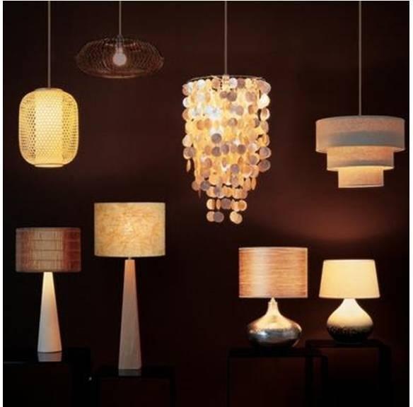
I love the ’60’s vibe of the funky Leaf Lampshades from Primrose and Plum: modern shape meets with retro pattern and produces a beautiful result. For a truly stand-out lampshade, look no further than the glorious Abi Pendant Shade from John Lewis. It’s an exquisite piece; the way the shells cascade is simply gorgeous, and it’ll add a beautiful feminine touch to any room. For a lampshade that’s equally striking but more unusual, look no further than the extraordinary Twisted Rattan Pendant Shade from Coco Male. It’s an exotic fusion of earthy material and contemporary styling, creating a piece that is truly unique. Or, check out the incredibly directional Innermost Kapow White Pendant Shade from Heal’s. It’s an innovative piece that’s made from a mass of tubular mesh, but despite its modern material, it somehow works in any scheme.
So, there you have it: easy ideas for you to update your home without impoverishing yourself. Enjoy!
Quick shop: Coffee tables
We've put together a great range of coffee tables, from the ultra modern to the super traditional
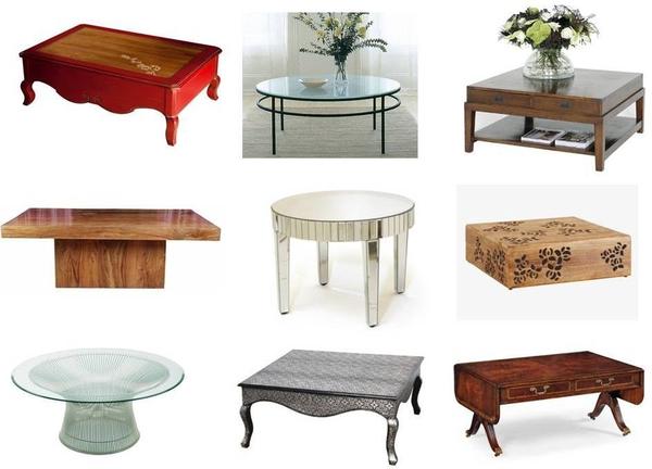
Adding a coffee table to your living area can be the perfect finishing touch; making a stylish statement whilst providing the perfect place to rest your cup of tea! These stunning coffee tables are sure to suit any home, whether you prefer contemporary glass pieces or the timeless nature of a mahogany table.
Clockwise from left: Lady Estelle Coffee Table from Sweetpea and Willow, £995. Albany Round Coffee Table from Tom Faulkner, £999. Eichholtz Oakwood Military Coffee Table Square from Occa Home, £1,450. PALONIA Coffee table from Habitat, £350. Mahogany Folding Coffee Table- Mahogany from Pavilion Broadway, £1,471. Embossed silver coffee table from Lover’s lounge, £275. Knoll Platner Large Coffee Table from Utility, £1,152. Oak coffee table from Rocomara, £726. Deco Mirrored Venetian Round Coffee Table from Alexander and Pearl, £395.
The Colour of the Year 2011: Honeysuckle
Pantone Colour of the Year - Honeysuckle 18 - 2120
Pantone, the emperor of the colour world, has decreed that Honeysuckle 18 – 2120 is the colour of the year for 2011 and it’s little wonder why. It’s not even February yet and we’ve already been hit by increased VAT, atrocious weather and depressing stories in the news. But, fear not – Honeysuckle can help us through the horrendous winter mire.
“Honeysuckle is a captivating, stimulating colour that gets the adrenaline going – perfect to ward off the blues,” says Leatrice Eiseman, Executive Director of the Pantone Color Institute. “Honeysuckle derives its positive qualities from a powerful bond to its mother colour red, the most physical, viscerally alive hue in the spectrum.” This makes it perfect for beating the January blues and providing welcome distraction from failed New Year’s resolutions.
Honeysuckle has the power to uplift and embolden, and as the importance of environment for one’s wellbeing is undeniable, it’s well worth introducing a dose of this vibrant beauty into yours. Eiseman also says that the “intensity of this festive reddish pink allures and engages. In fact, this colour, not the sweet fragrance of the flower blossoms for which it was named, is what attracts hummingbirds to nectar.” If we apply this principle to interior-design, honeysuckle in the house means that your home will become a hive of social activity – perfect for boosting the spirits in troubled times.
Honeysuckle is, essentially, a glorious meshing together of red, the colour of passion and courage, and pink, the colour of softness and femininity. This means that it’s perfect for men and women alike, and its cheerful, reddish-pink hues will look great in both male and female homes. A splash of honeysuckle is just the ticket for a dash of dynamic decorating: rose-tinted spectacles for the interior. It is, says Pantone, the colour of “verve and vigour”, and will instil in us the “confidence, courage and spirit to meet the exhaustive challenges that have become part of everyday life”.
And, despite its strong and vibrant tones, it works fantastically well with a huge variety of other colours. Setting it against a neutral palette will make the colour really pop – imagine this Mosaic Silk Cushion from Heals on a pale sofa or chair. The contrast between the two would be fantastic, and as we’ve all got a piece of furniture that could do with a lift, choose honeysuckle as the colour to reinvigorate yours. It also looks brilliant set against a punchy turquoise (ironically, turquoise was Pantone’s colour of 2010). That might sound a little over the top – but trust me, it looks fantastic. Turquoise is, says Pantone, the colour of “escape”, whereas honeysuckle is the colour to spur us on through the challenges of modern life. So, the two together are a great combination for the home that demands both calming and energising. I also think that honeysuckle and orange look brilliant together, and as colour-clashing is set to be huge this year, very on-trend too. Again, you might think that the combination of the two could be hideous, but it truly works (probably because they share the same mother colour). If you’re still not convinced, check out the amazing Clarissa Hulse Larch Amber and Fuchsia Silk Cushion from Heal’s and you will be very surprised indeed.
If you’d rather have your honeysuckle in a more artistic form, consider introducing a print of the fantastic Andy Warhol Flowers Red/Pink into your home as a great focal point for any room. Warhol is synonymous with being utterly cool, and he clearly recognised the power of honeysuckle hues way back in 1964 – thus, we know honeysuckle belongs in trendy interiors. Pantone also say that honeysuckle is “guaranteed to produce a healthy glow when worn by both men and women”. This is the perfect reason to paint a wall of a room or your hallway with this delicious colour; it’ll be like an instant detox (never a bad thing after the excesses of the festive season).
So, there you have it. Honeysuckle is the colour of the year, and it’s a rather wonderful thing too. A colour to elevate, soothe and inspire; what more can you ask for? In the words of Pantone, it’s “a colour for everyday – with nothing ‘everyday’ about it”.
Mixed Up Side Table from Rose & Grey
Keep your storage stylish with this Mixed Up Side Table from Rose & Grey. £425
I’ve been searching for a bedside table for what seems like an age but nothing has seemed quite right.
I want drawers but not too many, something stylish but not overbearing and most importantly enough room to rest a glass of water and a good book.
I had almost given up all hope but then a quick tour around Rose & Grey and I found just what I’d been looking for in a matter of minutes.
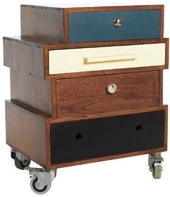
The Mixed Up Side Table is a truly eclectic piece of furniture comprising of four differently-designed drawers stacked together.
I love the off-centre arrangement which makes it feel like a vintage-shop find and this table isn’t just perfect for the bedroom either; try it as a telephone table in a hallway, or even as stylish alternative to a filing cabinet in your home office.
Filisky Pear Pendant Light from Liberty
Add some Eastern charm with these Filisky Pear Pendant Lights from Liberty. From £65
If there’s one shop in the world I could happily wander around all day, it’s Liberty.
I adore everything about it, from the wonderful service (even Mary Portas would be hard pushed to find something to moan about in here) and the bag department (where I lose my heart each time I go) to the brilliant interiors floor.
Here you’ll find rugs that cost the same as a small car next to affordable bits and bobs for the home; which is what I think I love about Liberty the most – its inclusiveness.
So as impossible as it is to choose a favourite from Liberty, these Filisky Pear Pendant lights have definitely caught my eye.
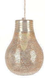
Available in two sizes, they’re made from punched, silver-plated copper and will add a touch of the East to any room.
Cosmo mirrors from Omelo
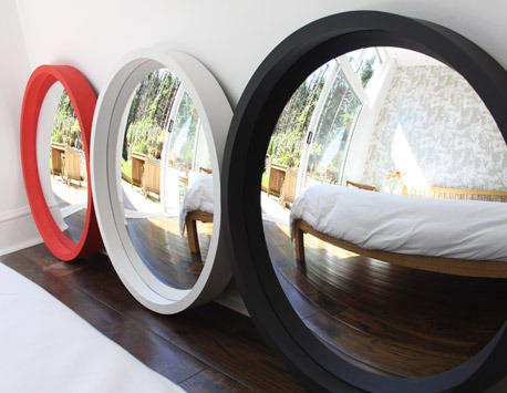
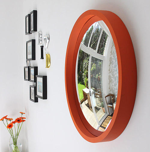
Brighten up your room with one of these Cosmo mirrors from Omelo. £355
Omelo is a new interiors company to me but I am sure glad I’ve found them as sell some of the nicest mirrors around.
All of Omelo’s mirrors are convex which means they’ll bounce even more light around your room, which is perfect is you’re lacking in natural light.
There are a whole host of designs to choose from classic to contemporary but my favourites are these Cosmo mirrors.
Deliciously simple, these round, thick-rimmed mirrors make the perfect choice for hallways, bathroom and bedrooms alike.
Available in Orange, Off White, Black and Red, one of these mirrors will instantly add a pop of colour to your room’s scheme.
But that’s not all, Omelo also offers a bespoke service which allows you to choose from a range of colours and finishes and even flat mirrors if convex ones aren’t your thing.
All they need to do now is introduce a wedding list service, as one of these mirror would definitely make it on to mine.
(We don’t list these products yet but sign up to our newsletter and we’ll let you know if/when we do)
Happy Birds cushions by Roddy & Ginger
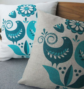
Add some retro flair with these Happy Birds cushions from Roddy & Ginger. £25
I have a thing about retro textiles, which I mostly attribute to a 70s bedspread my Mum had when I was growing up. It had huge, brightly coloured flowers and was my favourite, so the passion for all things retro obviously started at a young age.
Which is why I adore the range of cushions from Roddy & Ginger. The sweetest owls sit alongside bold geometric prints but my pick is these Happy Birds cushions.
Available in teal and turquoise and grey and olive, they’re screenprinted onto natural linen and hand made.
I love the vibrant colours and gorgeous attention to detail in the design.
Perfect for adding a pop of colour to a living room or bedroom, I’m going to use mine on a neutral chair.
See this product at Roddy & Ginger...
(We don’t list this product yet but sign up to our newsletter and we’ll let you know if/when we do)
Spotlight on: Original BTC
We turn the spotlight on Original BTC to learn more about their collection of lighting.
Design luminary, Peter Bowles, founded Original BTC in 1990, upon his knowledge of retail, manufacturing and design that has come from the depths of his family history. Peter’s designs are a collaboration of original and classic pieces which have been inspired by traditional factory fittings, childhood toys and iconic 1940’s design. Entirely manufactured in the UK, Original BTC lighting is hand-assembled in Oxford from the finest chrome, aluminium and bone china.
First and foremost, at Original BTC quality of style and design naturally coincides with producing sustainable and practical lighting in order to give the best result. The company is renowned for its relaxed lighting that is suitable for either contemporary or traditional homes. Creating the perfect ambience is essential and Original BTC use precision in detailing and a mix of materials to achieve this; metallic painted, glass or china shades are paired with polished satin or chrome bases. Peter claims that his aim was “to design and produce lights that you are instantly at home with, that will fit easily and comfortably for many years to come.”
The stylish collection covers all your lighting needs with wall and floor lamps sitting alongside table and pendant lights. From bone china, metal and prismatic glass, there are so many fabulous designs to choose from that offer both style and versatility. The influence behind the designs comes from the clean lines of traditional factory fittings and the versatility of mid-century style. Over 70% of the company’s lighting is exported worldwide, and widely recognised by acclaimed French designer Andrée Putman, John Pawson and Terence Conran. Also, you will find Original BTC products lighting up the likes of Gordon Ramsey’s Maze Grill restaurant in London, and making us say ‘Oh là là’ about Paris’ new concept store, Merci. Their lighting is being used in these well known places because it has a classic style that draws attention.

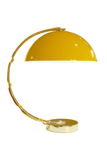
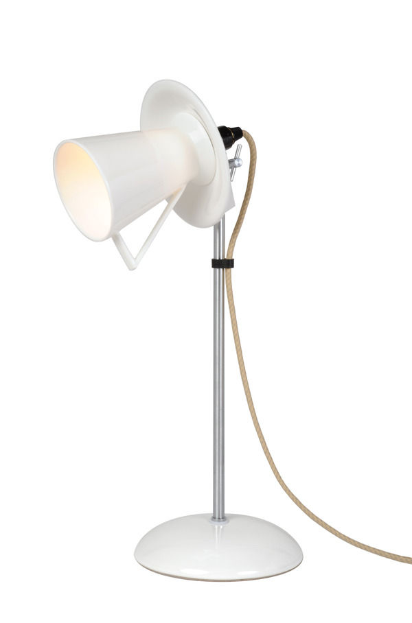
New for Spring/Summer 2010, the retro-inspired London desk light, designed by Charles Bowles (the son of Founder, Peter Bowles), epitomises modern design with its simple clean lines. It has a spun aluminium semi-sphere shade, solid chrome base and a matching cotton braided flex to give it a tailored finish. The London is available in black, putty grey and yellow to suit any sophisticated study, and its intriguing shape looks great from all angles. Original BTC have also released a new limited edition task light known as ‘Jack’; this is made to order and features a hand-painted British flag featuring the iconic patriotic colours of red, white and blue.
The Stanley Range includes three sizes of pendants which are available in solid copper, solid brass, or nickel plate. Made to order, you can choose a hammered or smooth reflective finish, and they give a spectacular look when grouped together or you can mix metals for a contemporary and interesting appeal. These provide a stunning effect because their narrow cylindrical shape creates a spotlight over a feature, or they simply be used as decorative pieces. The Stanley range was launched in September 2009 along with the Cosmo pendants and table lights, available in ribbed prismatic glass shades, which sparkle and refract light to create beautiful shadow play on the polished chrome bases.
My favourite is ‘The Tea Range’ for its fanciful tea cup and tea pot shaped pendants and table lights which are inspired by 1930’s tableware. They are ideally suited to dining rooms or kitchens to create an imaginative style that takes traditional pieces of tableware, and evolves them into fantastical designs. Staying true to their original design, they are made from bone china like a fine English tea set, giving them a delicate appeal.
So, here is yet another example of how British manufacturing is building and increasing in popularity to support the economy. Original BTC is founded on values that encourage British-made products and designs; in fact Peter Bowles strongly believes in producing excellent quality and good value designs and takes pride in the fact that they are manufactured in the UK.
Original BTC will be exhibiting at 100% Design in London, Sept 23rd-26th 2010. For the complete range of Original BTC lighting, visit www.originalbtc.com, and for more information tel: 0207 351 2130.
Michelle Mason collaborates with Livia Firth to reveal the Roseta rug.
This gorgeous, eco-friendly rug is sure to bring a feminine touch and beautiful detailing to any floor.
The collaboration between Michelle Mason and Livia Firth has produced spectacular results. Designed exclusively for Eco Age, the duo have created an environmentally-friendly rug which exudes style and boasts excellent sustainability.
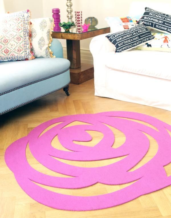
The Roseta rug is uniquely made out of felt from 100% recycled plastic bottles, and will be available in pink and black. However, Eco Age offer a bespoke service which means that the rug can be custom made in a gorgeous range of colours. It has hardwearing qualities but it is soft underfoot and its texture gives a stylish appearance to natural wood floorings.
Livia Firth, Creative Director of Eco Age, has commented on why she chose to work with Michelle on this design: “I fell in love with Michelle's work a couple of years ago when we were sourcing ethical interiors for Eco Age - it is always elegant and unusual at the same time and totally feminine. We are very excited to do this collaboration with her and to have the first ever plastic bottles rug.... By looking at it, you won't believe it!”
Similar to Michelle’s Stella rug, the Roseta is a contemporary take on lace-making with its intricate cut-out style, giving it a very delicate and feminine look. A perfect talking point for any living area or bedroom, the Roseta encompasses the strength of modern design and the ability to create products that are sustainable and kind to the environment.
Michelle will be unveiling the Roseta rug at 100% Design Earl’s Court, London, Sept 23rd-26th, Stand No. H60. The Roseta rug will be exclusively available from www.michellemason.co.uk and www.eco-age.com.
Spotlight on: Benchmark

Wondering what’s special about suppliers on Furnish? Take a look at Benchmark.
Established by Terence Conran and Sean Sutcliffe in 1984, Benchmark is a design-led manufacturer of bespoke furniture. Producing contemporary classics with sustainability in mind, Benchmark furniture is handmade and built to last. Benchmark was the first furniture maker to receive the Queen’s Award for Enterprise in Sustainable Development. The company is founded on a belief in the enduring appeal of good design, celebrating high-quality materials and traditional craftsmanship, while harnessing the latest in modern technology, machinery and tooling.
Excellence in design and a passion for furniture is expressed across the entire collection, which includes the work of well known designers such as Thomas Heatherwick, Russell Pinch and, of course, the indomitable Terence Conran. Alongside these big names are pieces from up-and-coming independent designers, as well as the Benchmark in house team. Supporting young designers, Benchmark also runs an award-winning apprenticeship programme, providing training for the designer-makers of the future.
The furniture collection is exclusive to Benchmark and handmade to order from start to finish by highly skilled wood and metalworkers. Benchmark encourages customers to visit its showroom and workshops in West Berkshire to see the furniture being made and provides a personalised service, tailored to meet your specific requirements. Once purchased, each individual piece is marked with a polished pewter disk and registered as an authentic Benchmark original. The disk is individually numbered and you can also choose a personalised inscription of up to 12 characters.
The Benchmark style exudes timeless elegance, simplicity of design, and sophisticated craftsmanship. Innovative contemporary pieces often make reference to the great eras of interior decoration, such as the 1950s-style Emily Console with oblique tapering legs, or the Art Deco-inspired Roman Console with its black lacquered, D-shaped, oak frame and limestone top. The collection pays tribute to the inherent beauty of natural materials, using certified timbers from sustainable sources, as well as stone, leather and metals such as zinc, pewter, copper and bronze. The combination of beautiful materials and expert craftsmanship make this a sensuous collection, both tactile and visually striking. And alongside furniture, Benchmark also produces contemporary lighting such as Partridge & Walmsley’s Fingers Crossed wall light with its beguiling counterbalanced pulley system.
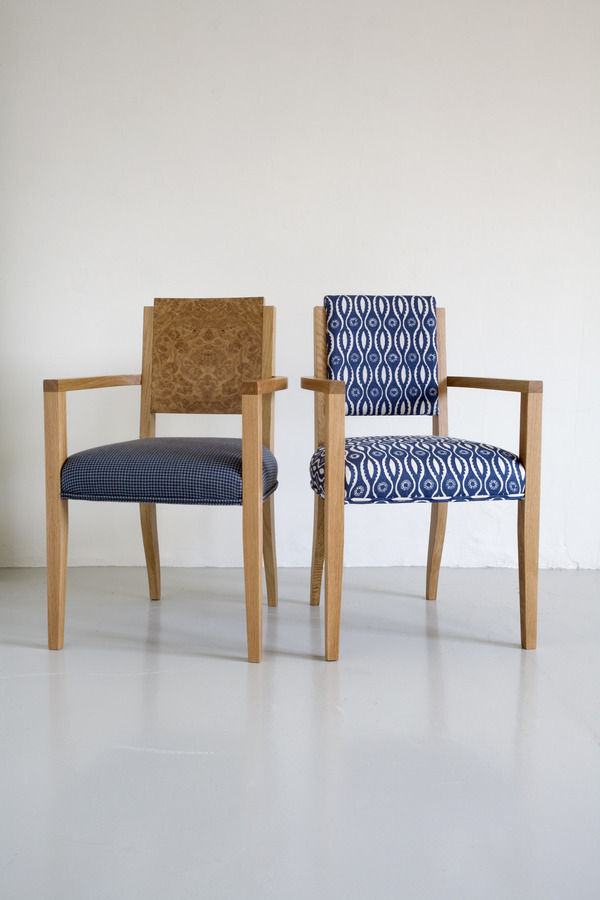
To choose a star product from this captivating collection is difficult, but we think the Normandie chairs, designed by Terence Conran, embody the style and spirit of Benchmark. Drawing inspiration from the second class dining chair on the Art Deco cruise liner, the SS Normandie, the chairs are available in a variety of different options, epitomising the bespoke service offered by Benchmark. You can choose between an upholstered or burr oak backrest, and a natural or mocha stained oak frame. The chairs are upholstered in any fabric of your choice and are available with or without armrests. Angular back and armrests are combined with softly tapered legs for an understated look that’s also high on style. These elegant chairs will last generations and never go out of fashion.
Demonstrating Benchmark’s design historical sensibilities, the company recently teamed up with the Rocket Gallery in London and Danish-American designer Jens Risom to reissue his 1950s and 60s furniture designs. Made by Benchmark with the close involvement of 94-year-old Risom, the first collection of nine pieces to be reissued includes an easy chair and a side chair, a desk and a magazine table, four coffee tables and Risom’s iconic upholstered bench. An exhibition of the collection runs to September 4th 2010 at the Rocket Gallery, in the Tea Building, 56 Shoreditch High Street. Risom describes his designs as ‘an American version of Scandinavian modern furniture’ and the exhibition is well worth a look for mid-century design devotees. The result of another collaboration with the Rocket Gallery, the Hexad coffee table by Tomoko Azumi won Benchmark a Wallpaper* Design Award earlier this year, and further products designed by Azumi are due to be launched as part of the London Design Festival in September.
As well as its collection of handmade furniture, Benchmark provides a specialist service for commercial and public projects, working with architects and interior designers. Benchmark has recently completed a bespoke commission on a grand scale for the London Library. Patinated brass, dark oak, reeded glass and leather in shades of oxblood have been incorporated throughout the library, linking the rooms together and seamlessly combining old and new. Working with architects, Haworth Tompkins, Benchmark have made around one hundred pieces of individual furniture, all with contemporary lines and designed for modern day use while harmonising with the historical setting, existing furniture and architectural features.
Benchmark is one of the great success stories of British manufacturing. Looking to the future with respect for designs of the past, Benchmark is committed to innovation and technological advancement while celebrating and fostering the continuation of craft practices. Supporting 45 staff, running an apprenticeship scheme and employing and training up workers from the local area, the business as well as the furniture is built to last.
Emily console table from Benchmark
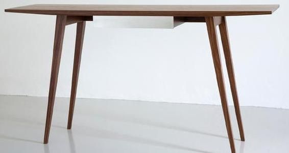
Bag yourself a bargain and a design classic at the same time with this Emily console table from Benchmark. Was £1450 Now £1160
Benchmark are one of my favourite design companies when it comes to classic yet innovative furniture.
It's no surprise that the godfather of design, Sir Terence Conran heads up this emporium of gorgeous home wares.
Beautifully crafted dining tables sit alongside elegant yet cutting edge and oh-so comfortable sofas that are being added to my wish list at a rate of knots. Top of my list at the moment however, is this stunning Emily console table.
Made from solid walnut, the drawer is covered in pewter making it an simply stunning choice.
Use it as a sleek addition to a hallway as intended, a simple yet show-stopping dressing table or in your dining room as extra storage space.
Best of all, this beautiful piece of furniture is now has a whopping £290 off in the summer sale, which means you really have no excuse not to invest, do you...
Buyers Guide: Lighting
Bring a spectrum of light into your home with everything from traditional table lamps to contemporary feature lighting.
When it comes to lighting there are plenty of choices to suit every budget and style. The most successfully lit homes have a combination of practical and atmospheric light. Choosing your lighting doesn’t have to be a chore because there are many styles and designs to use in the home.
Table lamps
Table lamps are a traditional and reliable form of lighting that can serve decorative as well as practical purposes. Graham and Green supply table lighting to suit all types of interior style, for example if you want to give your home office a retro look try the Task Table lamp which is made from chromed metal and inspired by an early 1930’s design. Or choose the colourful Slant table lamps which are a fun and quirky idea for a children’s bedroom. Lamps provide a softer, less intense light in your bedroom or living area which creates a relaxing mood. The Paris Antique table lamp from Puji has a gorgeous green glass base which gives it a natural beauty that would bring a subtle yet elegant look to any modern living room.
Floor lamps
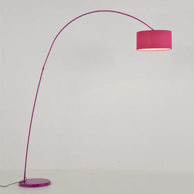
Floor lamps offer the perfect way to brighten up a gloomy corner or alcove. Usually slim and tall, this option is perfect for those who are short of space. From antique brass to modern metal bases, floor lamps or standard lamps as they are also known are available in a variety of designs. The Scala Floor Lamp from Brissi will surely make a statement in both contemporary and traditional interiors and you can choose from a variety of lampshades including a pale grey and damask print. Alternatively, an arched floor lamp is extremely versatile because its curved arm can be adjusted to illuminate different parts of a room, and they also come in many different shapes and sizes. The Belleville arch floor lamp is an example of how these types of lamps can be simply used to fill an empty corner or they can be positioned over a bed or a chair to provide excellent task lighting. Place two matching floor lamps on either side of a bed or sofa to complete the look of your room.
Pendants & ceiling lights
Pendant lighting looks great in dining areas and if you have an open plan living area you can use a row of pendants to separate two rooms. Create this effect with Kathleen Hill’s Star Light from Rockett St George (available from Furnish). Pendants are also great for kitchen islands. in hallways or above desks because they can be combined with other types of lighting. The Victo 4250 lights are like hanging pieces of art designed by interior architect Seppo Koho; these would create a perfect romantic ambience in any bedroom.
Chandeliers are best placed in an extravagant hallway or above a dining table because they are the ultimate statement of grandeur and magnificence to leave your guests in awe. They do not provide a huge amount of light however so it’s wise to invest in other lighting too. The Round crystal chandelier from Sweetpea & Willow has an array of crystals that will reflect glimmering light around your room. Or for a fantastic range of elegant crystal chandeliers check out the Chandelier and Mirror Company.
Bathroom lighting
The bathroom is probably one of the last places you think of when deciding on lighting for your home, but we all spend enough time in the bathroom to realise that it is important to get the right balance of light and to ensure that it’s safe too. Mirror lighting needs to be flattering so go for something bright but not glaring; most vanity fixtures are linear so go for something like the Padova light from Heal’s is ideal when placed on the wall above your mirror. A ceiling fixture in your bathroom will provide you will general lighting for the whole room, but for setting a relaxing ambience to enjoy your soak in the bath try the ultra-modern Arezzo light, also from Heal’s, to give the impression of gentle candle light.
Lighting design
The current climate has given lighting design the challenge to create something that is both stylish and eco-friendly. By 2011 traditional bulbs are going to be replaced by compact florescent lamps (CFL’s) most commonly known as energy-saving bulbs. These will screw into standard lamp sockets and the benefits are that they can be applied nearly anywhere that incandescent lights are used. Use specific dimmable CFL’s for lights that use a dimmer switch; using a regular CFL with a dimmer can shorten the bulbs lifespan.
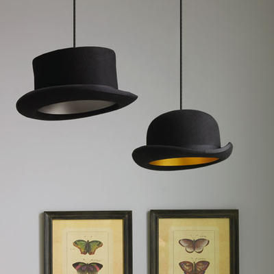
As always interior design is all about being unique and we all want to see something that’s a bit different; I love the Jeeves & Woosters pendant lights from Graham & Green that are based on iconic British hats because they mix traditional designs and give them a new, fresh look. Or for a design completely driven by its eco-credentials, the eccentric Sticky Lamp by Droog from Leigh Harmer can be stuck to doors, walls or ceilings for an innovative way of lighting a room.
Choosing bulbs
Incandescent bulbs are commonly used in lamps and other types of lighting because they are inexpensive; widely available, and they are great for ambience lighting. Halogen bulbs emit an extremely bright light which makes them perfect for spots and downlights, and they are best used for task lighting. They are brighter and longer lasting than incandescent bulbs; however they produce a lot more heat so it’s recommended that you keep them away from curtains.
For a selection of different types of bulbs to suit your needs go to B&Q (www.diy.com). And for more information and advice on the choosing the right bulbs have a look at www.doityourself.com.
We hope this guide has shed some light on where to start with choosing the right lighting for you and your home.
Our weekly pick of interiors blogs… Jul 13th
Another week, another three great blogs.
First up is interior designer Brooke Giannetti’s Velvet & Linen. Brooke owns Giannetti Home, a treasure trove of a shop stuffed with vintage pieces and architectural antiques. The main reason I love this blog is looking at the photos of her amazing finds and how they’re displayed. Brooke’s got a roving eye and real flair for interesting vintage and antique pieces, which she uses in her interior design projects. Not only that, she has a descriptive talent for writing about the pieces she loves. A feast for the eyes, this blog’s a constant source of inspiration and style ideas.
Despite the name, My Notting Hill is actually brought to you from Washington DC (which I was pleased to find out because I’m afflicted by an irrational loathing of West London). This blogger is happy for you tag along on her shopping trips and these are some of my favourite posts because it’s window-shopping without the fear of spending. Most of the photographs on here are hers, which makes the blog intriguing and personal. As you follow vicariously in her footsteps, you’ll be peeking at hotel rooms, interiors shops, and her own and her friends’ homes; just the thing for nosy parkers like me.
Finally this week, a flying visit to Canada to stop off in Vancouver with interior designer Patricia Grey. Patricia Grey Inc is an insider’s guide to what’s hot in the world of interior design. It’s fabulous blog, covering colour trends, great new products, decorating ideas, interviews, and interesting design books. The writing and the photographs are great, and there’s always something interesting on here whether you’re looking for advice or inspiration. But steer clear of the post on Patricia’s holiday in Mexico; it’s enough to make you sick with envy.
Again and as always, get in touch if you’d like us to feature your blog next time.
10 ways with…Paint
Revamp your décor with a splash of paint.
The surface preparation might be a bore, but in this weather you won’t be watching it dry for long. There are few things more satisfying than a freshly painted room, but with our 10 ways, there are plenty more options with paint. Time to get the overalls out.
1. Feature Wall
A feature wall is a great paint option, particularly if you want to go for bold colour. It’ll lift the room, add drama and create a natural focal point. Use a paler shade of the same colour on the other walls, or complementary wallpaper, to make sure your scheme ties together. Accent walls are particularly appropriate in modern homes and open plan spaces. Use the feature wall to zone your space, for example if your dining room flows into your living room. An accent wall will add life to a stairwell and a sense of drama used behind the bed. Colour-blocking is also a huge trend at the moment in both fashion and interiors. Get the look at home with a bold feature wall teamed with accessories in the same colour or sofas and chairs in a contrasting block colour.
2. Painting Furniture
As long as it’s not a 20th century icon, a beautiful 17th century cabinet or some such wondrous antique, painting furniture can be a great way to revive an old piece or change it to fit in with a new decorative scheme. And if you’re into the shabby chic, relaxed coastal look, then this could be the thing for you. Equally a flea-market find might be brought into the 21st century with a splash of shocking pink gloss. Painting furniture for kids’ rooms, and getting them involved, is a great way to add personality to their rooms. Think about where you want the piece to go and have some fun with it. If the piece has been painted before, sand off old or flaking paint, going with the grain of the wood. If it’s unpainted, use a knotting solution to seal any knots and apply a wood primer. For your topcoat, a water-based acrylic paint is less messy, environmentally friendly, and available in matt, gloss and eggshell finishes.
3. Blackboard Paint
Blackboard paint is now widely available and it’s a playful, versatile medium. Use it in the kitchen for shopping lists, the hallway for reminders, home offices for to-do lists, or kids’ rooms just for fun. Magnetic blackboard paint allows you to add photographs, postcards or anything else that takes your fancy. Blackboard paint adds personality and dynamism to a space, with scrawls and doodles providing an evolving record of family life. Make a bold statement in a light-filled kitchen or studio workspace with an entire wall in blackboard paint, or use it in small doses in panels or on cupboards and drawers to mark the contents. IIf your child’s room is on the small side, blackboard paint looks wonderful on toy boxes or painted in cloud shapes on the wall with bright blue raindrops and a sun peeping out of the top.
4. Floor Paint
Make a feature of your floorboards with paint. The Little Greene Paint Company has beautiful soft sheen floor paint in the full range of colours, from neutrals to brights and everything in between. Farrow & Ball has eggshell finish floor paint, also available in the complete colour range. Painting the floor will transform your room, so it’s important to think carefully about the colour, taking into account the amount of light in the room, and use tester pots. Durable and hardwearing, floor paint is suitable for almost anywhere in the house, and can be a great way to brighten up kids’ bedrooms, hallways and kitchens.
5. Stencils
Stencils have moved on from the sponged horrors of the 90s. But, that being said, there’s a fine line between style and vile when it comes to using and choosing stencils. A great way to create a focal point, or a feature wall, it’s best to use stencils as accents. For kids’ rooms they’re great fun, especially to jazz up furniture and toy boxes. The Stencil Library has a huge range to choose from, including Alice in Wonderland, character stencils for children, animal prints, Art Deco patterns, and classical architectural motifs. The Stencil Studio also has a useful ‘How To’ guide, and even stocks Banksy-style stencils, if you want to jump on that bandwagon.
6. Combining Matt and Gloss finishes
Combining a chalky matt paint on the walls with a high gloss for skirting and windows creates a crisp finish. Whichever colour you choose for the walls ensure that the gloss trim colour provides enough of a contrast. With rich wall colours a creamier trim colour, rather than bright white, will be more flattering. If you want to go for a coloured trim, rather than a neutral, choose a lighter or darker shade of the same colour as the walls, to create contrast. For a really dramatic effect, use full gloss on the walls or ceiling, using a matt finish for the trim.
7. Painting Tiles
Painting over tired or nasty looking tiles is a good way to revive your bathroom or kitchen on a tight budget. Any painting job requires surface preparation, but with tiles this is absolutely crucial. The surface must be spotlessly clean in order for the paint to adhere properly. Wash the tiles with sugar soap and rinse clean to remove any residue. Use a hand-held orbital sander with fine grit paper to lightly scuff the tile glaze and wash again to remove dust. A primer such as Ronseal’s One Coat Tile Primer will prevent the topcoat paint from pealing. When applying paint, use a small gloss roller to avoid brush marks and apply several thin coats to build up adhesion in layers. Specialist tile paint is available in a limited colour range, but any latex or oil based paint is suitable for the job.
8. Using Tester Pots on Canvases
Create art that fits in with your room scheme using tester pots on canvases. Having no artistic skill, I think I’d stick to letting the kids do it. Messing around with a few pots of paint and a canvas sounds like fun, but it can be a hit and miss affair when it comes to interior design. Short of taking an Art Foundation course, there are two options for the artistically challenged. Spontaneous and simple figurative pictures can add a lively element to a room. But abstract work is more forgiving. For example, Rothko-esque fields of colour, or Pollock-style splatters, painted on several canvases can look great in a drab hallway or open plan space.
9. Paint Effects
With a roll of low-tack masking tape you can create all sorts of geometric patterns with paint. Use vertical stripes to give the illusion of higher ceilings or horizontal stripes to add width. For a subtle stripe, use two different tones of the same colour, or make a bold statement with two or more contrasting colours in varying widths. Creating a pattern with paint is a great way to create a feature wall behind your bed, brighten up a playroom or add some drama to a hallway. Whatever pattern you want to go for, and especially with spots and circles, mark it out in pencil first. With stripes, use a spirit level to make sure your lines are straight.
10. Revamping Garden Furniture
Revive a rusty patio set or a tired wooden bench with paint. With metal furniture, wash down with hot soapy water and remove any rust or flaking paint with a wire brush and coarse sandpaper. Use an anti-rust primer and paint, such as Plasti-Kote’s Metal Primer and Super Spray Paint. Really easy to apply, Super Spray Paint is available in a huge range of colours. For wooden furniture, sand the item along the grain until smooth and then use a primer, such as Cuprinol’s clear Wood Preserver. Cuprinol’s Garden Shades and Ronseal’s Woodland Trust Colours will give tired wood a new lease of life.
Get your overalls on and have some fun with paint.
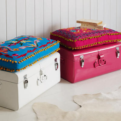
Colourful Metal Storage Trunks from Graham & Green
Jazz up your storage with these colourful trunks from Graham & Green. £119
I've made no secret about just how much I love everything Graham & Green do. If money were no object, I would grab my purse and shopping list and hot foot it to their nearest store to buy the lot.
Lucky for you lot, Graham & Green are having an amazing summer sale and we have got the inside info.
Top of my wish list is a couple of these fabulous metal storage trunks.
Available in Hot Pink or White, they are big enough without being intrusive and are super stylish too. But that's not all, oh no. They also come complete with a folk-inspired seat cushion (surely one of the hottest trends around) which turns them into a comfy seat.
Use them anywhere from bedroom to home office to stash away unsightly belongings and your home will soon be clutter free.
Focus On: Selina Rose
Introducing the hottest designers of the moment.
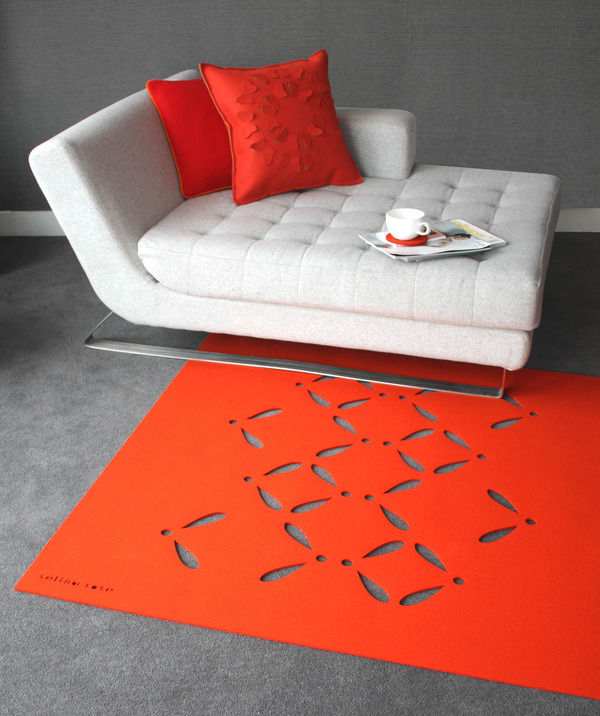
Designer-maker Selina Rose creates fashion-forward textiles, homewares and bespoke surfaces using renewable and biodegradable wool felt: ‘If I were to sum up my style I would describe it as bold, colourful, tactile, natural, simple yet sophisticated.’ Turning heads in the international design world, Selina’s received a raft of awards and nominations including the Arts Council’s grant for the arts, Homes and Gardens Classic Design awards in 2007 and Craft Central’s Bright Ideas award in 2008. Launching an exclusive collection for Heal’s in 2009, you can find Selina’s felt furnishings at www.selinarose.co.uk.
A fresh approach to a familiar material, Selina’s innovative cutwork designs harness new technology while referencing natural forms and architectural geometries. These highly original, beguiling surfaces are suitable for a multitude of interior applications including rugs, throws and runners, acoustic wall panels, window treatments, room dividers, lighting and upholstery. Manufactured entirely in the UK, Selina’s high-impact designs are coloured using environmentally friendly dyes in her own distinctive colour palette of rich jewel tones and vivid brights, paired with soft pastels, greys and black. Breaking away from traditional woven textiles, these pierced felt surfaces create a visually striking, modern aesthetic celebrating the timeless appeal of plant forms, geometric motifs and meticulous craft. Visual drama in colour and pattern is united with the enticing tactility of cut and folded felt. Rugs, throws and table runners feature poetic botanical patterns, such as the enchanting rose petal and foliate Bloom design. Contemporary felt room dividers and window panels allow light to pass through the intricate cutwork creating a play of shadows and animating interior space.
New for 2010, Selina’s Connect panels feature layers of contrasting coloured felt with circular incisions revealing a geometric grid pattern of colourful dots. A unique interpretation of the colour-blocking trend in interior design, Connect demonstrates Selina’s innovative fashion-conscious approach. Another new addition, the stylised Oli pattern is inspired by the winged propeller-like structure of sycamore seedpods. Combining both botanical and geometric forms in one textile, the Oli design exemplifies Selina’s simple yet sophisticated aesthetic. This new cutwork pattern features on rugs, throws and coordinating coasters in a choice of 14 vibrant colours. The hugely popular Flutterby cushions are also given a 2010 makeover in three additional colourways: lime, hot pink and orange. Partial cuts are made in the top layer of felt, folded to reveal a contrasting coloured felt behind and creating a three-dimensional textured surface. The same origami-inspired Cut + Fold technique is used on Selina’s fabulous Scale stool, a statement piece reminiscent of Christopher Kane’s Spring-Summer 2009 catwalk collection, which secured his rising-star status in the world of fashion. Made to order in your chosen colourway, the semi-circular scales fan out around the stool to reveal the layer of felt beneath.
Best known for her botanical cutwork rugs, throws and runners, this exceptional Cut + Fold technique has elevated Selina’s felt surfaces to a new level of design innovation.
‘My ‘Cut + Fold’ range of felt surfaces can be used for acoustic paneling, blinds, screens, room dividers and upholstery. I wanted to create something new and innovative for the contract interiors market. Following on from the success of my cut-out, fretwork style felt designs I was experimenting in the studio with concepts inspired by traditional origami. I wanted to create a 3 dimensional surface using the felt playing on its paper-like qualities, for example the way it cuts without fraying, you can fold, pleat and manipulate it into shape. I developed a technique of making partial cuts into the surface and folding shapes back to create advent calendar style flaps or windows revealing contrasting coloured felts behind. I launched the collection at 100% Design 2009 and it was really well received and designs such as Scale, Faceted and Flutterby now adorn the walls and windows of luxury hotels, offices and residential interiors.’
The Cut + Fold technique caught the eye of international design and engineering firm Arup, which commissioned Selina to create bespoke acoustic felt panelling and window treatments for its new London Headquarters in Fitzrovia. The architectural qualities of Selina’s Cut + Fold surfaces are a perfect match for this innovative design firm, leading the field in structural engineering since its Modernist projects of the 1930s. Across 200 linear metres, spanning two buildings and 17 rooms, Selina produced 150 bespoke Cut + Fold panels in her geometric Faceted, Arrows and Scale designs, featuring grey on blue and grey on yellow felt layers. Functional, tactile and visually interesting, the acoustic panels absorb and reduce reverberant noise, making them ideal for music rooms, studios and playrooms at home.
Including the Scale stool and Cut + Fold felts, Selina’s new collection will be on show at 100% Design in Earls Court Arena, 23rd-26th September 2010, stand H12. Visit www.selinarose.co.uk for more information on bespoke services and to buy online.








![International One Coat Blackboard Paint, £9.99 for 750ml, Homebase [www.homebase.co.uk] office accessory](/photos/articles/regular/office-accessories/office-accessories-3871.jpg)
![Eco Floor Paint in Down Pipe No.26, from £19.50 for 750ml, Farrow & Ball [www.farrow-ball.com] furnish](/photos/articles/regular/furnish/furnish-3872.jpg)
